Feedback on recent piece
-
Hey all,
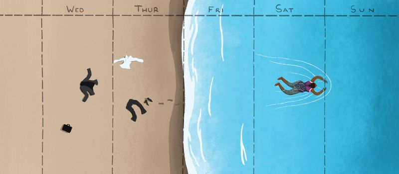
I recently finished this piece for an article on 'What if we worked less' - which focused on the 4 day workweek and it's benefits for productivity as well as job satisfaction and general happiness
Anyway the deadline has long since been and the magazine printed but I thought i'd share it here in case anyone had feedback/critiques for me to keep in mind! There's a few things I wasn't totally happy with, but as deadlines are short it's hard to pore over it for too long
Thanks!!
-
What I wouldn't give to have a 4 day working week

I really love the concept of your piece, it reads really well and I love your unique style!
I think the only thing I would change is the shape of the tide coming in, it falls just on your dashed line, which I know it's supposed to do to show the change of working day to non working day, but maybe just make those white lines of the tide as bit curvy?
If that makes any sense at all? haha! -
@hannahmccaffery Tell me about it! In the article it said that if we did work 4 days we'd still get roughly the same amount done, but just all be a lot happier - seems about right to me!
Thanks very much, i'm glad it reads well!! Definitely see what you mean, and you're completely right, I drew the image first then just sort of plonked on the dashed lines at the end so I think more care on that was needed
-
@AndyIllo Seems right to me too! Fingers crossed the UK give it a try soon like Sweden did

It's still a brilliant piece anyway, I'm just nit picking really! Really cool stuff, looking forward to seeing more!
-
@AndyIllo Your illustration not only looks really good, it also effectively conveys the message of the article (which is crucial in editorial, I understand). Going through the ideation process on a short turnaround must be challenging!
Apart from the curvy line suggested by @hannahmccaffery, I don't really have any other pointers, either. It's working really well.
-
@hannahmccaffery Thanks very much!! Nit picking is what I was hoping for so you helped a lot
")
@animatosoor Thank you too! I always find the idea stage the hardest and most daunting so it's reassuring to hear the message comes aross clearly !
Thank you both!
-
This is such a cool illustration. Like the others have said, it really tells a story, and it tells it in an engaging way too.
I love your style and the colours you used. Well done.
-
Gorgeous work! I think you really conveyed the message in a creative way. I agree with every one about where the wave line falls. Other than that, I think if the woman was posed so she was floating on her back, with her hands behind her head, it would have had a slightly more relaxing, weekend feel. Right now her pose is propelling her forward straight back to Monday. Just a thought!
-
@ShannonBiondi Thank you Shannon! I'm so glad the story comes across
Also i'm glad you like the colours! Usually that's something I am not so fond of in my work but this time I was secrelty quite proud - still yet to see the printed version but hoping it came across as vivid on paper!@TessaW Thanks for the help! You're absolutely right , that would have worked really well
Also would have got around the slightly dodgy leg positioning - great idea!