"The Moment Before I Lost My Mom" Kids Book Project Progress for SCBIW Portfolio Preview. . .and eventually Self Publish by April 2020
-
@MichaelaH Wow, that is a really cool project! But its sad too. I love what the three friends did to keep the stories and memories alive. That must have been such a cool project to work on
 Thanks Michael
 -
Thanks @animatosoor I hope it will be uplifting too. Hahahaha, thanks, I wish I still had my garden, but I travel so much now, it would look a wee bit more weedier then it was then.
-
@Squirrel-Size this is one of those images that has really stuck in my mind ever since you posted it. I am so glad to read that you are turning this into a book. It will be wonderful to watch your progress
 ️
️ -
Wow that touches my heart! I'm excited to have you @BichonBistro along for the ride

-
@Squirrel-Size wishing you the best on your journey here. Just keep in mind it will get very overwhelming after a few days/weeks working on it. Just take a break and recharge your mind. I know for experience if I don't take that break I start to turn out work I am not happy with. After a short break of a day or two, things seem to spark again.
-
What a lovely project! I'm wishing you all the best as you tackle it and offering any kind of feedback/support if needed. I can't wait to see this come to life!
-
Thanks man! Wow good advice @Chip-Valecek! I will be taking that to heart. That would be a good excuse to go visit my buddies for a few days lol
-
Awe! thanks @Alicja-W! Yes, any feedback/support would be awesome!

-
STORYBOARD!
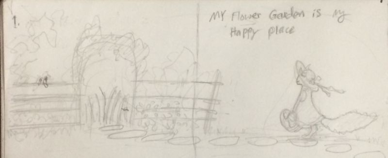
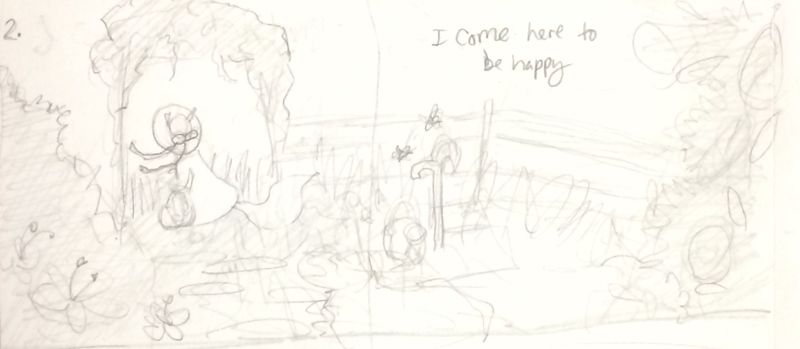
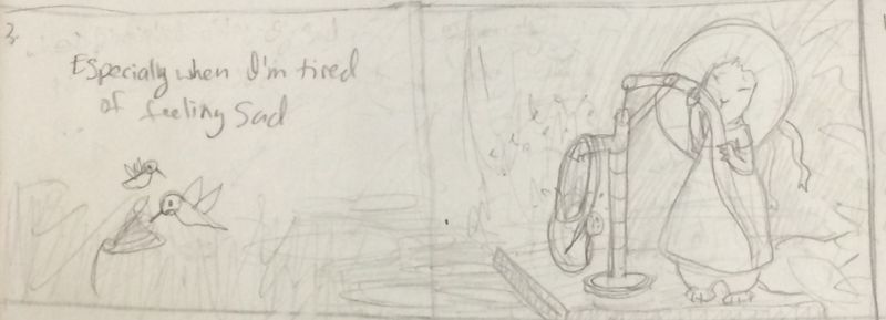
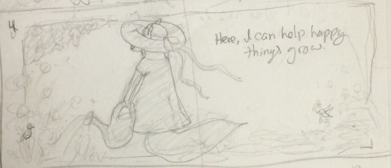
here is my lovely sketchy storyboard. My text is not set in gold yet. I'm still trying to figure out the best wording and what not. Anyone good at word-flow stuff out there? Feel free to put some cents in. I've been working on this storyboard for several weeks now. I did some last minute touches before posting them below.
The composition of the pictures are also not set in gold either, i'm just trying to get an idea of the flow of the book. Any tips, suggestions or ideas about the flow/composition are welcome! Each spread has a number on the top left. Right now this book project only contains 24 pages. A standard kids book usually has around 32 pages. So I might be inserting a spread or two more. Maybe somewhere near the end? What do you all think? My page formate is the same ratio as 11 x 8.5 (landscape) but it will be a bit smaller when printed (the line in the middle of each spread is about where the gutter would be). I also plan to have a title page art too, but I'll get to that later.
If you notice I've included a pair of humming birds in each page (a mama and daughter bird). My moms favorite bird was the humming bird, and I saw them in my garden all the time. I thought it fitting to include some in the illustrations.I've self-published several books before, but never made a kids book "the proper way." Like taking all the steps such as: storyboarding, thumbnails, color/ value studies and all. This is my first book I plan to do proper like. I've also never done a legit Dummy book before. I heard a lot of Art Directors/Agents like to see a book idea all black & white line work. Not that I necessarily want an Agent at this time though. But I figured it could be good practice for the future perhaps. But from my experience as a graphic designer and building a GD portfolio, I've have found high praise by showing the different stages of a project as well as the finished product/project in a portfolio. So my plan right now is to have some pages of the Dummy book fully rendered while others will be in different stages of rendition (Black and white). What are your all thoughts on that?
I think my biggest concern at the moment is the end of the book; the last two spreads. I feel like it might be a bit choppy.
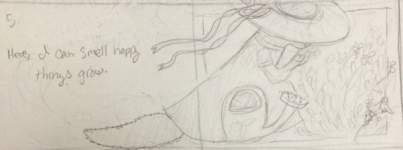
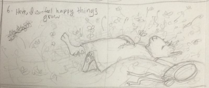
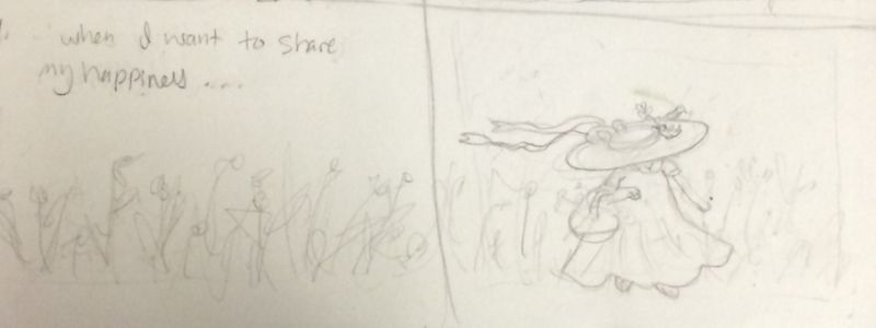
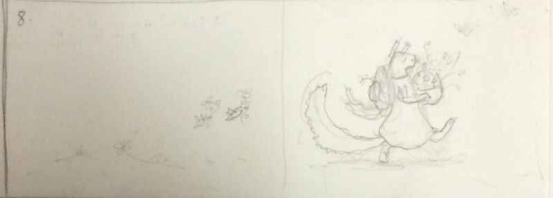
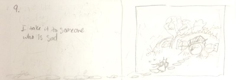
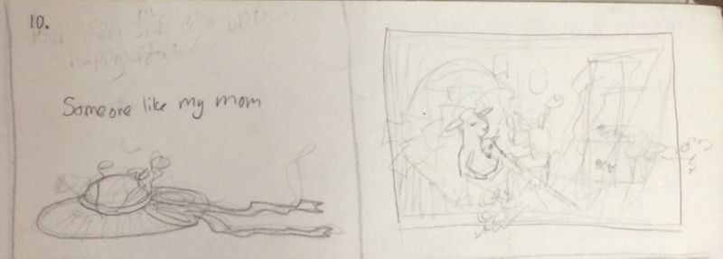
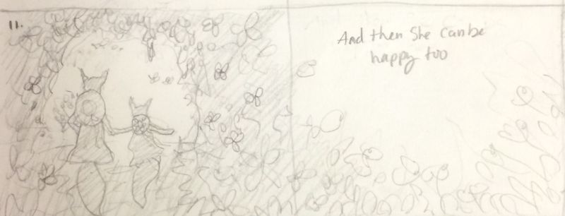
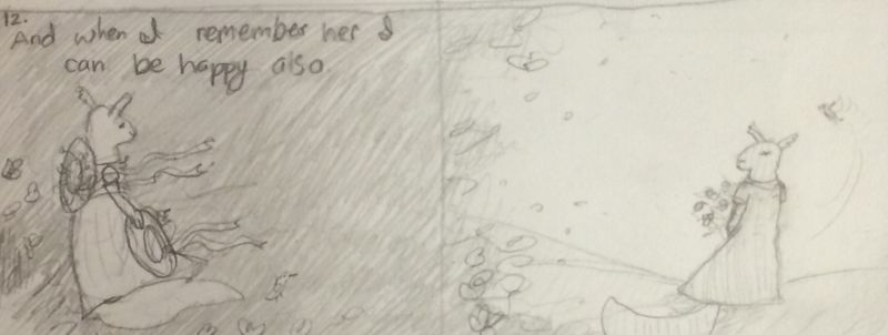
P.S. Also, I'm a hug fan of goats. I have been one since I was a wee tike. Most of my books have goats in them. So if any of you all spot a squirrel that looks a lot like a goat, shout it out, so I can make the changes accordingly (I feel like I tend to give the squirrels longer necks and snouts then they should have). Thanks you all for your support so far

-
@Squirrel-Size I am not a writer, so take this with a grain of salt, but I really like the lyrical flow of pages 4-6. I think you might consider eliminating the word “can” on those pages and the word “also” on the last page.
-
@BichonBistro Oh yes! I really like how the text on pages 4-6 sound without the word "can"! I'll be editing those out
 I think I'll also be taking out the "also" on the last page too, thanks!
 -
@Squirrel-Size - it was so wonderful to see the development for "The Moment Before" challenge and I'm so excited to hear you are pursuing this project.
The storyboard is unfolding so beautifully. I might wait until the next stage to provide any feedback, but just wanted to let you know how much I love your project.
-
Awe, thanks @djly! I'm looking forward to have your feedback and support!
-
@Squirrel-Size I can tell that page 6 is going to be another memorable image—it conveys the sense of peace and contentment you found in your happy place so well!
I don’t know if it was a conscious decision, but the illustration of the water pump on layout 3 reinforces the concept of the sad feeling with subtlety, almost as if the pump is a metaphor for the tears you shed.
I believe this will be a wonderful book where your pictures tell the story in a way that doesn’t require a lot of text. For some reason (I can’t explain why, because your images are very different), this called to mind an old children’s book I have by Cooper Edens titled “if you’re afraid of the dark, remember the night rainbow”.
Maybe it’s the fact that you find comfort in memories of your mom in that happy place. The last line in that book is “if there is no happy ending...make one out of cookie dough”.Your story in pictures is a bit like haiku—not many words are required to evoke a visceral response
 ️
️ -
@BichonBistro Oh my! I didn't realize that about spread 3! But that is a wonderful coincidence! That brings on a whole new light to it. Thanks for pointing that out

I looked up Cooper Edens. I like how simple the illustrations are and the simple phrases that go with them. I can see some similarities there. I love the ending phase especially so bc I love cookies. hehehehe
Thank you so much, I love your input!
-
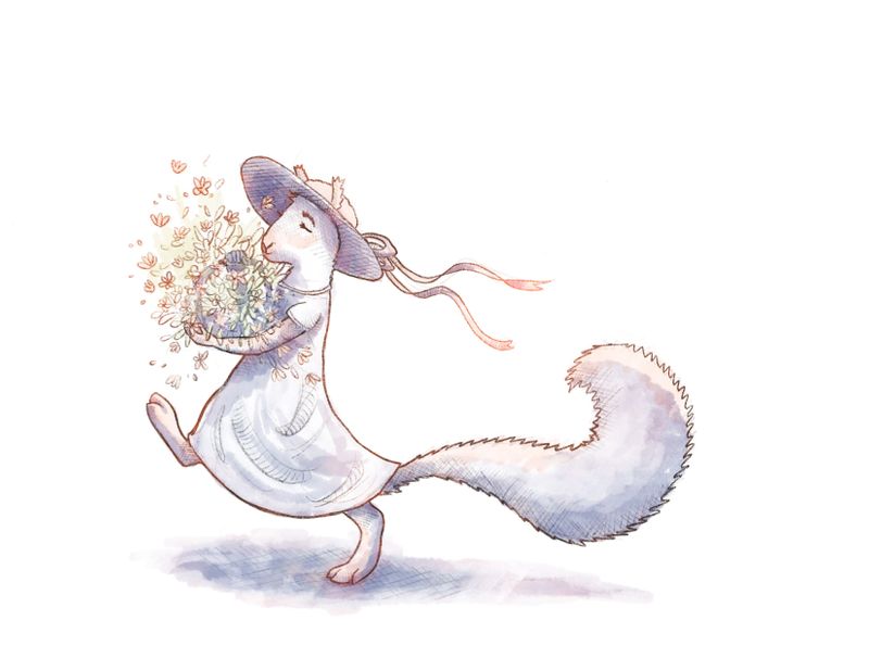
Spread 8 has been one of the first ones I've been working on so far. Mostly because it hasn't require too many thumbnails to start, hehehe. Its been a bit of a challenge to try to keep the same color palette as the original piece (at the top of this thread). I've been going back and forth trying to remember all the affects. I still have some tweaking to do on this one, but I wanted to post it and see if anyone had any thoughts.

-
@Squirrel-Size Ohhh what a nice fluffy breathy style you choose. It look beautiful
-
@Squirrel-Size I haven't been able to be on the forum for months, but opening it up today and finding this post is really inspiring! I really connected with your "Moment Before" entry back in April, as I think many others did as well, and I am happy to see that it has been the springboard for so much more. I believe this is a truly worthwhile project, and am convinced that the final product will be beautiful and meaningful. Best of luck,
Sue -
@suenaumi Awe! Thanks Sue! That means so much. Its really blowing me away how much you all are excited about this project too. You all keep propelling me! Thanks for the sweet post

-
This is so sweet.