Dream Portfolio Assignment (Looking For Feedback)
-
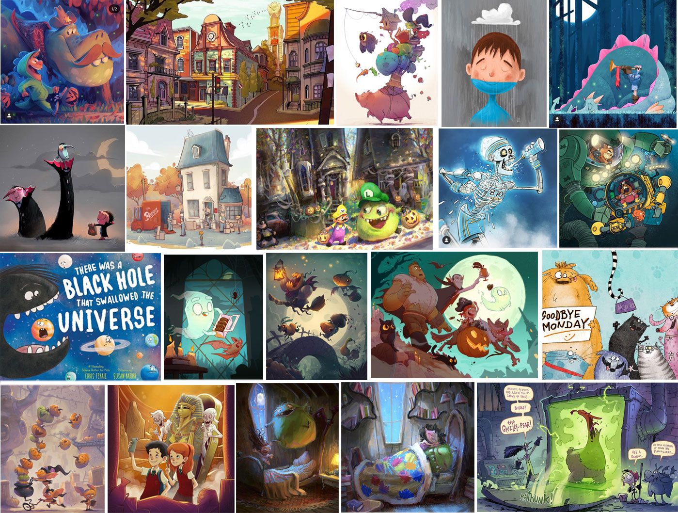
Below is step 1 in my Dream Portfolio Assignment. The act of putting it together has already taught me so much and I am starting to see a pattern emerge. Next, I would really appreciate some feedback on what you guys see as the common threads that tie these all together!
So far this is what I see...
-
There are some standout artists whose pieces I keep returning to including Marco Bucci, John Loren, Susan Batori, and Shiloh Gordon.
-
I seem to be drawn to a painterly style, specifically digital oil paint. I used to do a lot of oil painting when I was younger, so that makes sense to me (but still surprising).
-
Two recurring themes are humour and spooky concepts.
What do you guys see?
-
-
@Erin-Cortese Great work and such a beautiful selection! I see a lot of very cartoony proportions, bold shapes in both the characters and backgrounds regardless of rendering. Despite your liking for digital oil rendering, you definitely seem to favor a bold stylization rather than a realistic approach. I love that, so much possibility!
-
I agree with everything @NessIllustration said. It's clear you have a strong preference for clearly delineated shapes. I also see a preference for strong contrasts--lights vs. darks and strong lighting. The color saturation is high, but that always seems balanced against neutrals or greys or the presence of de-saturated shadows.
-
@NessIllustration Thank you so much for pointing that out, I did not even notice the shape/style consistency! I wondered what connected certain pieces and that is exactly what it is. That really demystifies things for me.
@Coreyartus Thank you for being so descriptive with the colour themes! My husband was trying to point out a consistency in colour theme but was only able to describe it in terms of the feeling the colours created in each composition. I knew what he meant, but I was struggling to figure out specifically what was causing that. I saw that you posted your Dream Porfolio as well, this is very new to me, but I hope I will be able to offer you some helpful feedback too!