July contest thumbnails
-
My favorites are 4 and 6. I like the perspective and cropping of the sixth one the most but I love the "gives no f---s" look on the eagles face in the fourth one. I would personally combine them if possible
-
@juliekitzes thanks so much I appreciate you taking a look and your feedback
")
-
I really like this idea! The dynamics in the second composition to the bottom is nice, the eye contact to the boy really helps the flow of the piece!
-
@Amie thank you!
-
@lmrush i really like the first thumbnail, even though it’s really simple I love the angles and how small/ far away the boat looks. I think your fine to crop body parts, as long as you still get the gist of what’s going on
Hope this helps
-
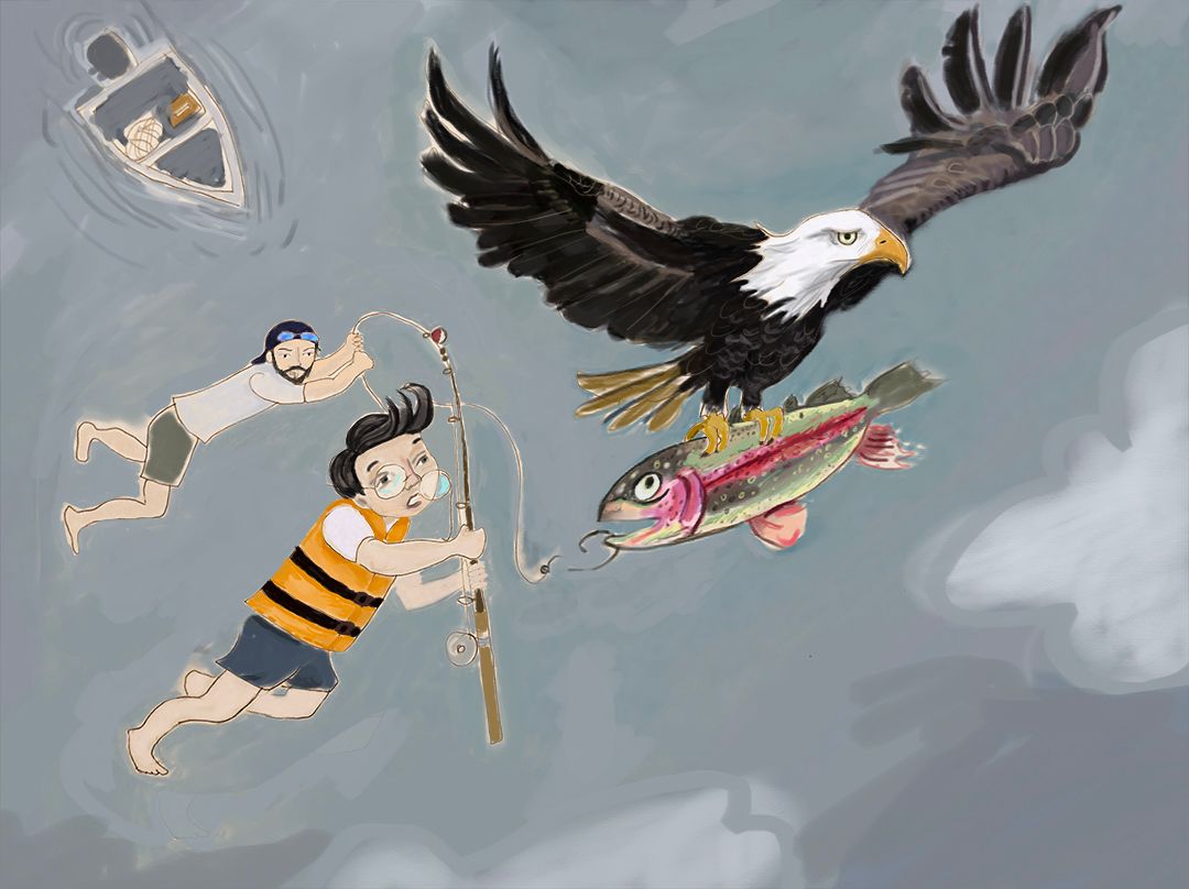
I tried to combine many of your suggestions and comments you all made and here is what I have come up with so far. I usually work in watercolor but this one was calling out to be digital. In the process of rendering and struggling with water, any ideas on how to do the water? Also any and all critiques welcome-changes are easy; the beauty of digital over watercolor
-
For water I would suggest collecting a lot of reference and also see how other artists have tackled it. Light reflecting off water, reflections and ripples/waves will all be important parts and make sure you consider from which viewpoint you are looking at the water.
-
@Gary-Wilkinson thanks so much!
-
@lmrush Pushing the blue tones further and deeper should help it to read more like water. Even on overcast days, water can still pick up a blue tone. If you haven’t already, try working directly from aerial reference photos of water. I think the characters would read better if their faces were more expressive, maybe a look of shock or fear.
-
Thank you everybody, incorporating all your comments
; much better-but still a ways to go--love this forum!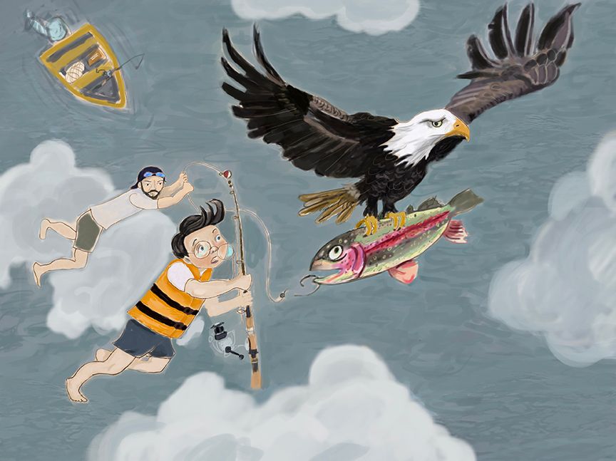
-
It might be fun if the man holding on (on the left) was popping through the cloud, in a whisk away movement.