Society of Visual Storytelling

    SVSLearn Forums

    • Register
    • Login
    • Search
    • Recent
    • Tags
    • Popular
    • Users
    • Groups
    • Search

    Would love feedback on this sketch

    General Discussion
    7
    15
    624
    Loading More Posts
    • Oldest to Newest
    • Newest to Oldest
    • Most Votes
    Reply
    • Reply as topic
    Log in to reply
    This topic has been deleted. Only users with topic management privileges can see it.
    • BichonBistro
      BichonBistro @juliekitzes last edited by

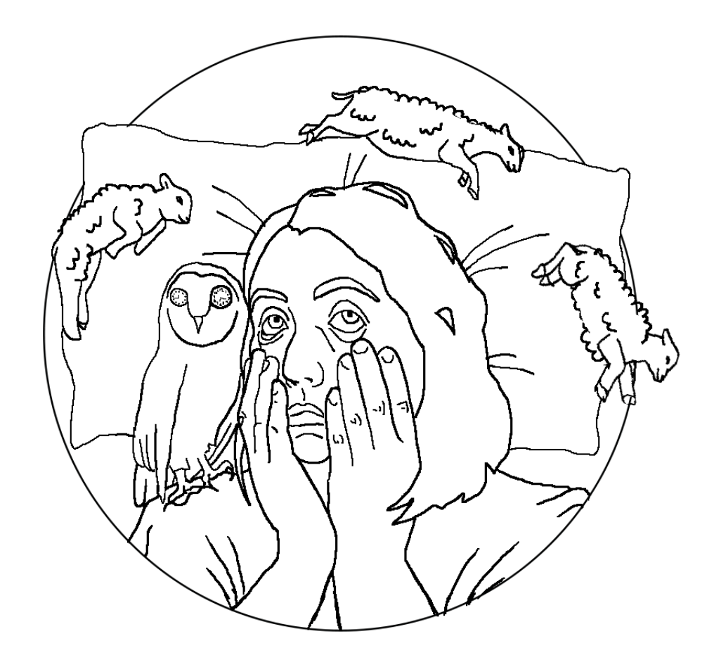
      @juliekitzes i do like the fact that the high numbers indicate long counting time. Yes, fluffy coats will read better as sheep and the ear on the one on the left reads better as a sheep’s ear to me.

      https://www.instagram.com/bichonbistro
      http://www.heartfeltimpressions.com
      https://www.facebook.com/patty.burke.9655
      https://twitter.com/BichonBistro

      1 Reply Last reply Reply Quote 1
      • juliekitzes
        juliekitzes last edited by

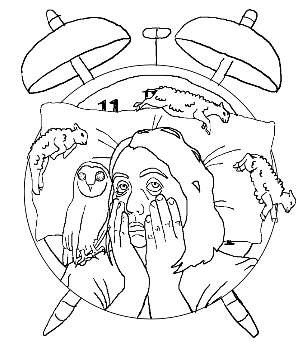
        I made the sheep fluffy and removed the numbers from them. I also had the idea to turn the whole circular shape into the face of an alarm clock but I don't know if I like it or not. Thoughts?
        Screen Shot 2019-07-17 at 2.43.37 PM.png Screen Shot 2019-07-17 at 2.43.25 PM.png

        www.JulieKitzes.com
        www.Instagram.com/JulieKitzes

        Erin.Cortese 1 Reply Last reply Reply Quote 1
        • Erin.Cortese
          Erin.Cortese Moderator @juliekitzes last edited by Erin.Cortese

          @juliekitzes I really love the way the alarm clock reads, you have it covered just the right amount! The composition with the alarm clock feel like it has better balance than the first one, and it has more impact on first impression. If you are not sure about the look of the alarm clock, you could make it more subtle by removing the alarm bells and feet and just use the clock face. I think it would work either way. I definitely like the look of the fluffy sheep. I agree with @BichonBistro about the sheep on the left. It is more recognizable as a sheep than the other because of the way you have drawn the ear.

          1 Reply Last reply Reply Quote 0
          • ajnewman
            ajnewman last edited by

            I like the change you made with the alarm clock! I think it fits in well thematically with the image.

            The one thing I'd like to point out is that the left sheep is creating a bit of a tangent with the edge of the circle/alarm clock. A way to fix this and add a bit more symmetrical weight is to maybe change the angle of its legs so its kicking out into the white space on the left (like the head of the sheep on the right!).

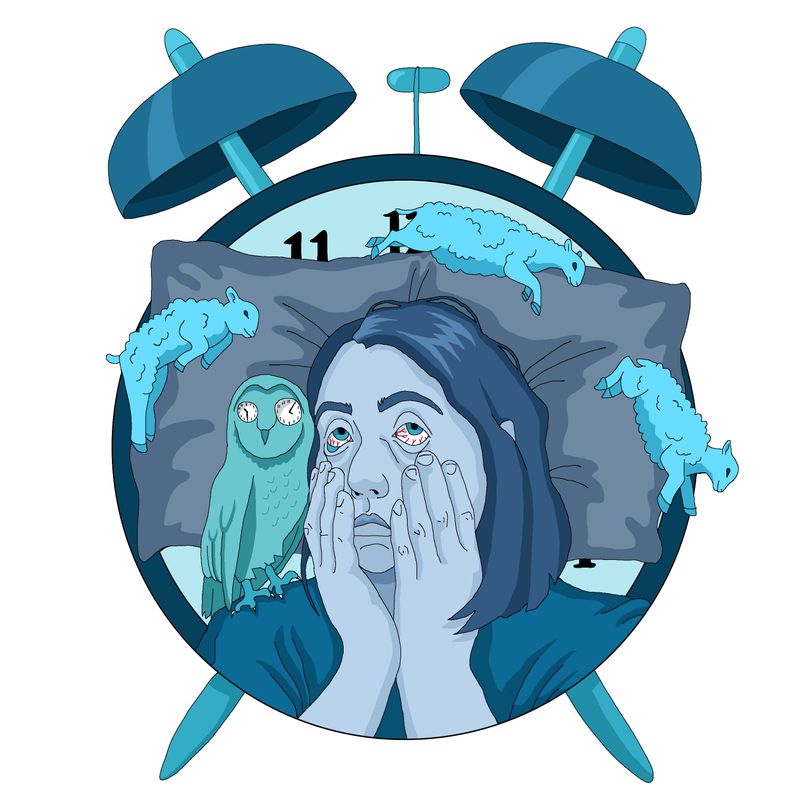
            Great colors and expression- it makes me feel restless and tired just looking at that character! Oof!

            Instagram: https://www.instagram.com/newman.illustration/
            Website: http://www.ajnewman.art/

            1 Reply Last reply Reply Quote 0
            • juliekitzes
              juliekitzes last edited by

              Thanks so much for all the feedback guys. @ajnewman I tried to fix the tangent with adding more of a tail to that lamb.
              Here's the finished piece.
              Insomnia.jpg

              www.JulieKitzes.com
              www.Instagram.com/JulieKitzes

              Erin.Cortese 1 Reply Last reply Reply Quote 6
              • jwing
                jwing last edited by

                Wow, this is super impressive! I love how much of a story it tells and yet looks so simple 🤯

                1 Reply Last reply Reply Quote 0
                • ?
                  A Former User @juliekitzes last edited by

                  @juliekitzes wonderful editorial style. This would be a great spot illustration, at the very least. I like the night owl, maybe larger in scale??

                  1 Reply Last reply Reply Quote 0
                  • Erin.Cortese
                    Erin.Cortese Moderator @juliekitzes last edited by

                    @juliekitzes I love the final piece! It has great style and colour.

                    1 Reply Last reply Reply Quote 0
                    • ajnewman
                      ajnewman last edited by

                      Oooh, great! It looks fantastic!

                      Instagram: https://www.instagram.com/newman.illustration/
                      Website: http://www.ajnewman.art/

                      1 Reply Last reply Reply Quote 0
                      • DOTTYP
                        DOTTYP last edited by

                        I saw this on Instagram I think it looks amazing. I love the colours you used and it really gives the feeling of insomia.

                        scribbles.artstation.com
                        www.instagram.com/dottypaints

                        1 Reply Last reply Reply Quote 0
                        • juliekitzes
                          juliekitzes last edited by

                          @ajnewman @DOTTYP @Erin-Cortese @Tom-Shannon @jwing Thanks all! It was a fun piece to make 🙂

                          www.JulieKitzes.com
                          www.Instagram.com/JulieKitzes

                          1 Reply Last reply Reply Quote 0
                          • First post
                            Last post