Destroy me.
-
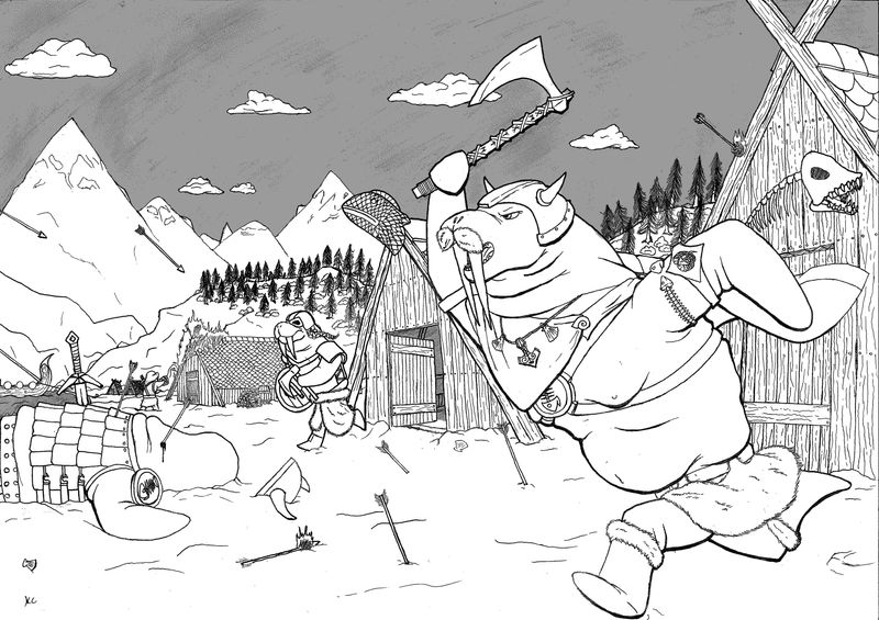
Heya all, recently i decided i need to return to working on my fundamentals and such so after going through the drawing everything course and working on the exercises abit i started working on this.
The goal with this is post it and have you all tell me everywhere i went wrong and things i should be looking out for or work on as i continue to practice. (I've noticed a few fudge ups already but I'm probably missing alot)
it was done with pencil, micron, no ruler and the grey was added digitally just for some contrast (cause the scan didn't pick up the pencil shading), it was scanned at UPS so the quality is a little meh overall on my lines.
so yeah, any critical feedback in regards fundamentals primarily is greatly appreciated.
-
@Kevin-Cochran so here goes...
You have created a tangent with the walrus guy and the lodge. You need to move one or the other.
Your line weight is all over the place. As a general rule, the thicker the line, the more emphasis you have. It also messes with perspective. A thick line implies close proximity to the viewer. For example, look at your arrows. The closer ones should be thicker lines but they look about the same.
It does read well as a story, though. Your world building is spot on and believable.Does that help?
-
@Kevin-Cochran , just so you know, I changed the Topic Category of this post to "Serious Critique Requested". I think you'll get more appropriate response that way.
My biggest concern is the visual balance of your walrus characters... I understand the theory behind making the characters heavier on top, but given that the realistic nature of the rest of the drawing implies a certain attention to detail, I wonder if the top-heavy nature of the warriors contradicts that... That's just something that stuck out to me.
Your wood texture is lovely!! Do you plan to continue this in color?
Children's Illustration Portfolio: https://www.coreyartusillustration.com
Art Portfolio: https://www.coreyartusimagery.com
Mastodon: https://mindly.social/@Coreyartus
Pixelfed: https://pixelfed.social/Coreyartus -
I think it's been mentioned but there is the big tangent between the roof and the front walrus which is distracting. There's also some smaller ones against the belt on the walrus in the background too. The walrus in the back has the same line weight as the front walrus which flattens the image. The sketch itself is inconsistent, there's a cartoony fish head on the second cabin but then really realistic fur on the walrus's mustache and realistic clouds/trees. The piece seems to lack composition, as my eye is dancing all over trying to find something to focus on but that can be easily solved eg. using arrows pointing to the main walrus? Also to achieve more depth you might want to either reduce the detail in the things in the background or lighten their lines. We normally don't see that much detail for things in the distance.
These are all fixable. So don't give up
")
-
@chrisaakins for sure
-
@Coreyartus no I've never been a color person and am focusing mostly on lines and fundamentals currently.
-
You have a really great handle on perspective and composition. were you planning on taking this to color?
-
Thanks all, I'll be adding all these to my watch out for list.
-
I think you need to sort out the weight distribution for the walrus characters, the main one looks like he’s floating.nI’m doing the tutorial ‘posing characters’ I think that would help with your characters.
Love the dead walrus, I’d like to see who they’re raiding, I can’t tell who’s attacking/ who’s defending or if they’re all attacking.
I really like the details, like the dead fish motifs and the shells with the Thor’s hammer. I don’t think you need as much detail in the distance as it just ends up pulling focus to the wrong places.
Hope this helps