WIP Critique Wanted : Bear = Unfair
-
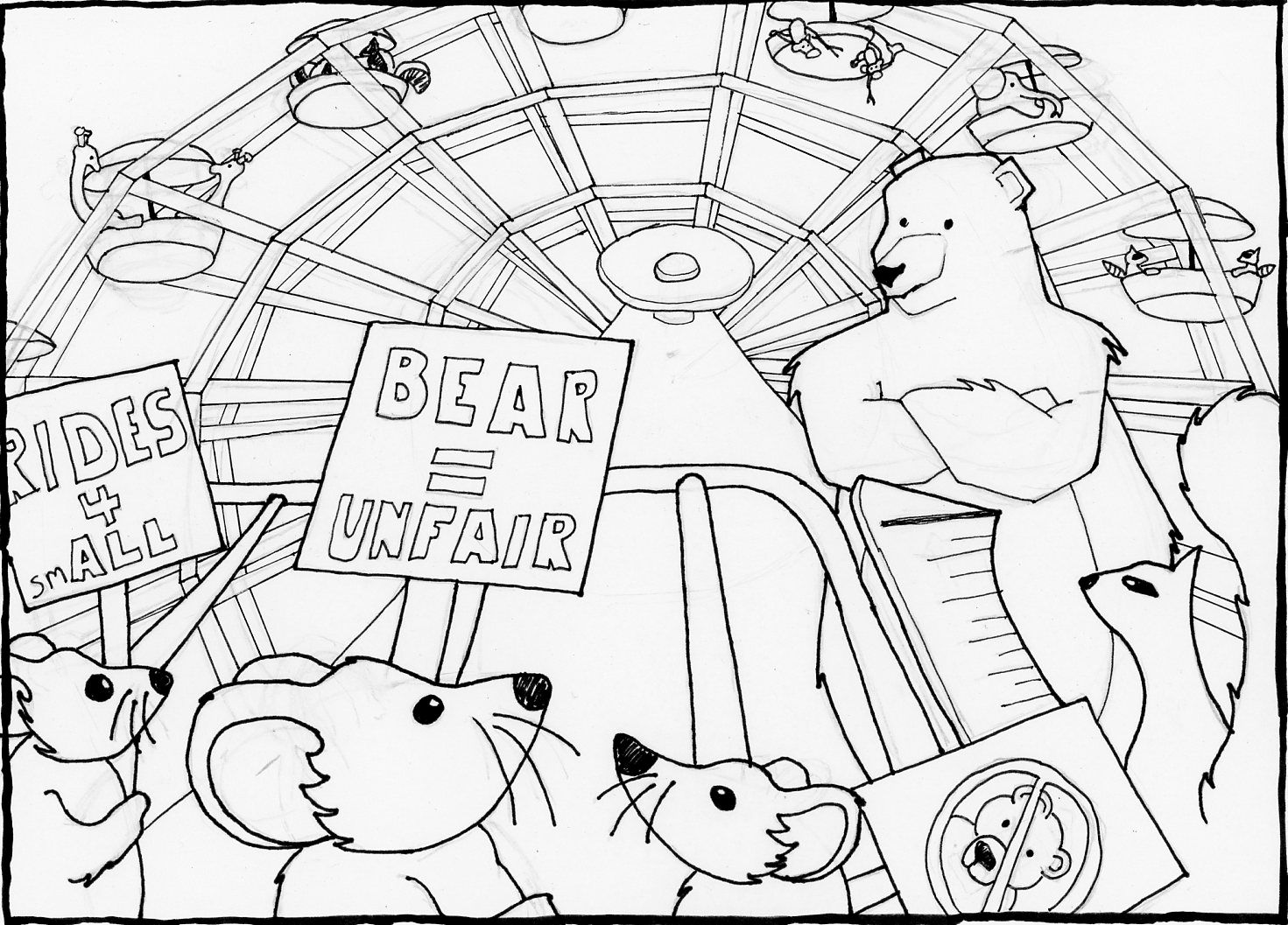
I was working on this for the SCBWI prompt "It's Not Fair" this month but couldn't finish in time. But I liked it so much I am going to finish it for my portfolio.
The premise is that the mice are protesting because they are not allowed to ride the ferris wheel because they are too short!
Here are the inks:
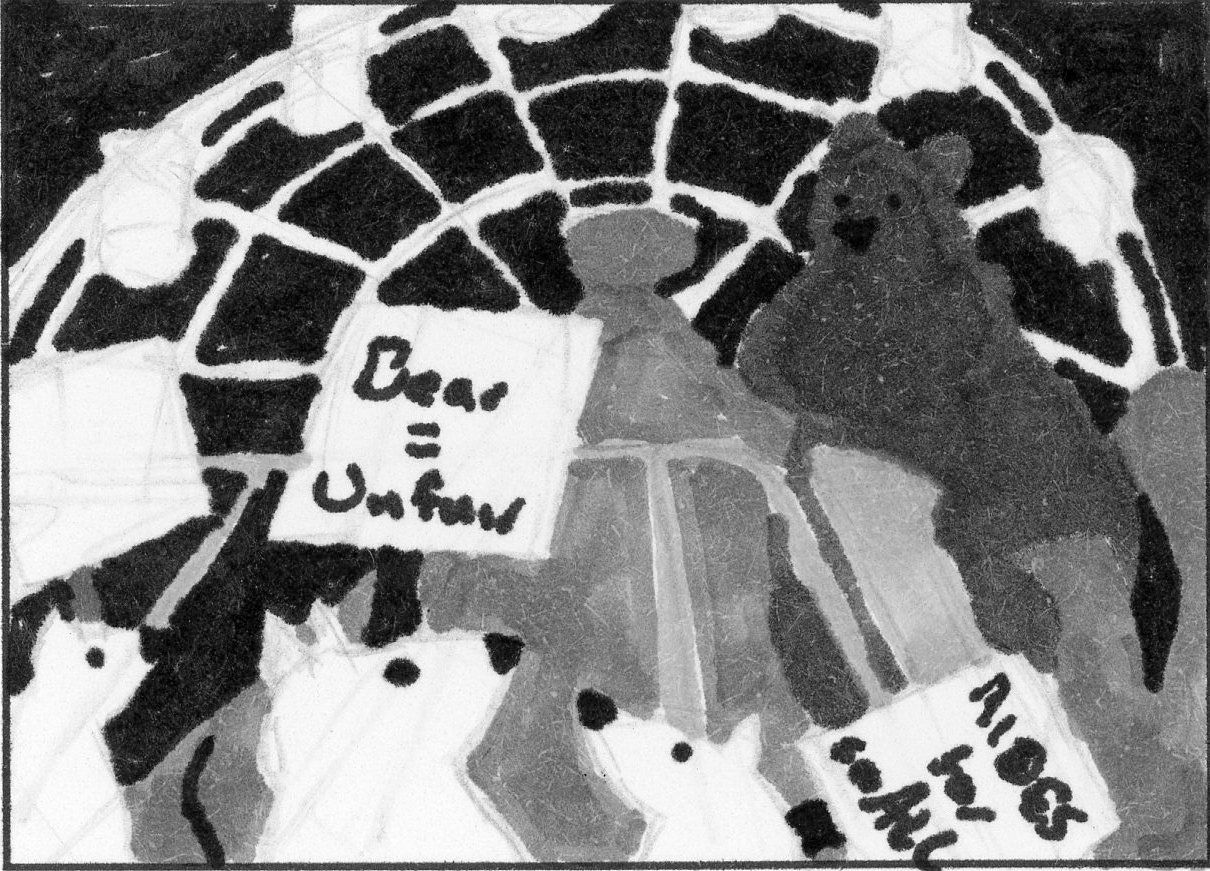
Here is the value study/thumbnail it was derived from:
I would like feedback on things that don't look right or cleanup as well as anything that is not reading. I will be finishing this as an etching and will be doing a bunch of line work to detail out the values next. It gets hard to change then.
Let me know what you think.
-The Prairie Fox
https://www.instagram.com/theprairiefox
https://www.theprairiefox.com -
@theprairiefox what an interesting idea. I can tell that you put a lot of thought into the Ferris wheel. You might consider making the perspective more extreme to tell more of the story. Right now I feel like I am looking straight on for the bear, but looking up at a bear from the height of a mouse could make the bear look scarier and the mice braver!
-
I think you are making this image to be more of a challenge than it needs to be. The angle and perspective you have chosen is quite a challenging one and I would probably study more about perspective before working on such a piece.
If I were you, I would try out quite a few thumbnail sketches for this concept to see what works compositionally. As it stands it's very busy and overwhelming, which makes the simple concept hard to understand. Try and play around with it in it's basic shapes and elements before adding detail.
-
@juliepeelart good thoughts on the bear. After reviewing, I think I got the perspective on the bear incorrect. It should look taller, the base should be wider and the head smaller. I will clean that up.
@Gary-Wilkinson I like where you are going with the the thumbnails. I did a few thumbs and picked this one (the value study is a thumbnail blown up.) I partially wanted the challenge of the perspective. I think that the perspective is correct for most of image though as @juliepeelart pointed out the bear is not adhering to the perspective and I would get a greater impact if it did. I am using some reference photos as well.
Thank you both for your feedback, I will update as I move on.