Society of Visual Storytelling

    SVSLearn Forums

    • Register
    • Login
    • Search
    • Recent
    • Tags
    • Popular
    • Users
    • Groups
    • Search

    Superstition WIP

    Artwork
    14
    39
    2004
    Loading More Posts
    • Oldest to Newest
    • Newest to Oldest
    • Most Votes
    Reply
    • Reply as topic
    Log in to reply
    This topic has been deleted. Only users with topic management privileges can see it.
    • eroomba
      eroomba last edited by

      I personally like the blue tint best but the full color is good, too. Maybe full color but kind of tinted towards blue? Not sure how or if that would work.

      Allen B. Moore
      https://twitter.com/eroomba
      https://www.instagram.com/albmoore/
      http://www.lizardmin.com
      http://www.bugandworm.com

      1 Reply Last reply Reply Quote 1
      • A
        Amanda Jean last edited by Amanda Jean

        I like the blue one and the middle one myself. They could work really well.

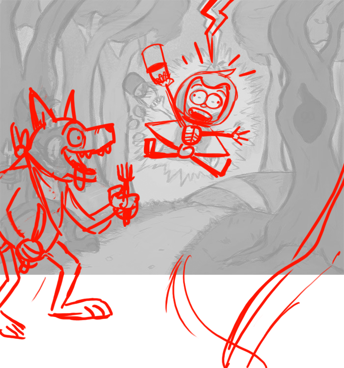
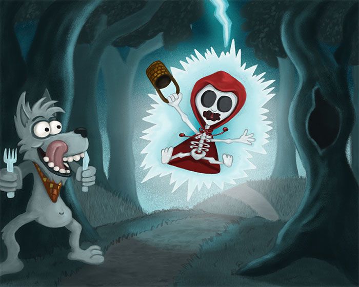
        As for other things... I hope this isn't stepping on your toes, but you could push those poses a little more perhaps? Maybe have the lightning just offset from Red, because it could be considered a follow-on from actual moment of strike. I love the electricity around her, just pull that lightning strike up a bit.

        Also, you can really try and push her pose and facial expression... lightning strikes are part of nature, nature is powerful, so you could try and show that as much as you can in the subject that's being hit. I don't think there's such a thing as just a "little zap" when it comes from the sky!

        You can make things more interesting by offsetting limbs so that they're not all going in similar directions. In animation this is called "twinning" and can make the pose feel flat.

        How long has it been since Mr. Wolf ate? Is he ravenous? Is he just peckish? Honestly if my dinner was served to me in this fashion, my attitude would be something a bit stronger than what looks like victorious success. I would say it's closer to "utter delight" at the gift from the gods personally 😉

        Again push his pose too, even my example can be pushed further. Perhaps he's leaning towards Red for even more emphasis.

        Here is my attempt to illustrate what I mean.

        chipTest.png

        Chip Valecek 1 Reply Last reply Reply Quote 2
        • Nyrryl  Cadiz
          Nyrryl Cadiz SVS OG @Chip Valecek last edited by

          @Chip-Valecek LOL! 😅😅😅 hahahaha I don’t know where they’re getting these from. They are strange I’ll give you that.

          Portfolio: nyrrylcadiz.com
          Instagram: https://www.instagram.com/nyrryl_cadiz/
          YouTube: https://www.youtube.com/channel/UCbJCF1Im8ZO7hpGWTKOJMuA

          Chip Valecek 1 Reply Last reply Reply Quote 1
          • Chip Valecek
            Chip Valecek SVS Team SVS OG @Amanda Jean last edited by

            @Amanda-Jean great feedback! I see what you are saying with it.


            https://www.instagram.com/chipvalecek/
            https://www.facebook.com/cvalecek
            http://www.cshellmedia.com/

            1 Reply Last reply Reply Quote 0
            • Chip Valecek
              Chip Valecek SVS Team SVS OG @Nyrryl Cadiz last edited by

              @Nyrryl-Cadiz It might not even be real, but at least it is giving me a good superstition to work with LOL


              https://www.instagram.com/chipvalecek/
              https://www.facebook.com/cvalecek
              http://www.cshellmedia.com/

              1 Reply Last reply Reply Quote 1
              • Chip Valecek
                Chip Valecek SVS Team SVS OG last edited by

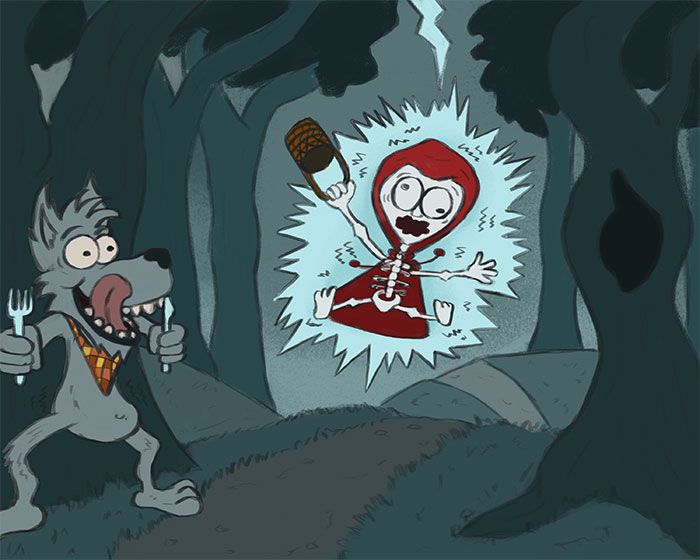
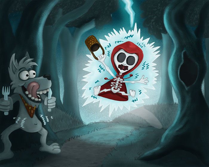
                Moving along, here are the local color and first pass on shadows and highlights.

                local_color.jpg

                first_pass.jpg


                https://www.instagram.com/chipvalecek/
                https://www.facebook.com/cvalecek
                http://www.cshellmedia.com/

                1 Reply Last reply Reply Quote 3
                • Chip Valecek
                  Chip Valecek SVS Team SVS OG last edited by

                  Here is a couple more steps. I have a few things to add still and clean up. I hope to finish this weekend. Please let me know if you see anything that needs to be tweaked.

                  second_pass.jpg

                  3rd_pass.jpg


                  https://www.instagram.com/chipvalecek/
                  https://www.facebook.com/cvalecek
                  http://www.cshellmedia.com/

                  1 Reply Last reply Reply Quote 1
                  • A
                    Amanda Jean last edited by

                    Looking great, but do you think the lines around wolf's stomach is a bit naff... maybe too much visual exposition? I personally think it's better without them, but your choice. His expression is great 🙂

                    Chip Valecek 1 Reply Last reply Reply Quote 1
                    • Chip Valecek
                      Chip Valecek SVS Team SVS OG @Amanda Jean last edited by

                      @Amanda-Jean I am torn about the lines, also around little red, should I remove those? Is it to much? I wanted to show some sort of action with it.


                      https://www.instagram.com/chipvalecek/
                      https://www.facebook.com/cvalecek
                      http://www.cshellmedia.com/

                      BichonBistro A 2 Replies Last reply Reply Quote 0
                      • BichonBistro
                        BichonBistro @Chip Valecek last edited by

                        @Chip-Valecek could you have the wolf’s leg up as if ready to lunge forward and his body leaning a bit backward in oppositional motion?

                        https://www.instagram.com/bichonbistro
                        http://www.heartfeltimpressions.com
                        https://www.facebook.com/patty.burke.9655
                        https://twitter.com/BichonBistro

                        Chip Valecek 1 Reply Last reply Reply Quote 1
                        • A
                          Amanda Jean @Chip Valecek last edited by

                          @Chip-Valecek I thought the ones around Red were fine, although I might play with shape/colour of them. If it's movement you're trying to emphasise (that is reacting to several thousand volts travelling through her bones), try following the contours of her silhouette as opposed to the electricity maybe?!

                          1 Reply Last reply Reply Quote 1
                          • Chip Valecek
                            Chip Valecek SVS Team SVS OG @BichonBistro last edited by

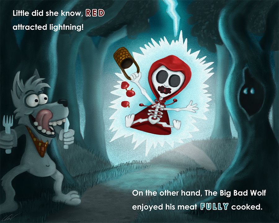
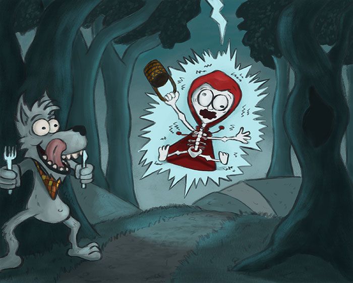
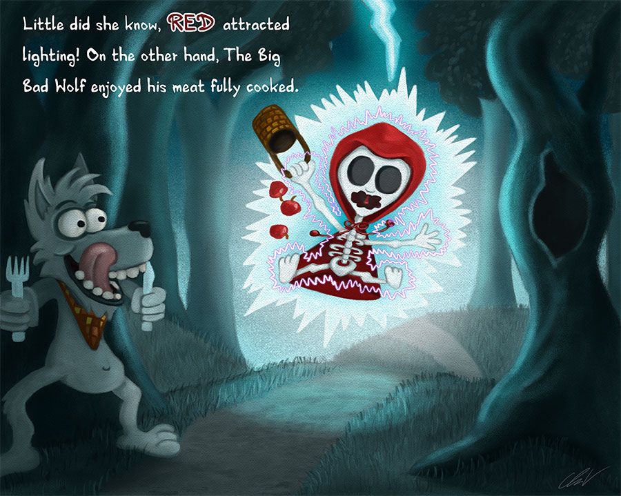
                            Here is my final pass and with text. What do you think about the text? How about the treatment of the text?

                            final_pass.jpg


                            https://www.instagram.com/chipvalecek/
                            https://www.facebook.com/cvalecek
                            http://www.cshellmedia.com/

                            1 Reply Last reply Reply Quote 0
                            • Chip Valecek
                              Chip Valecek SVS Team SVS OG last edited by

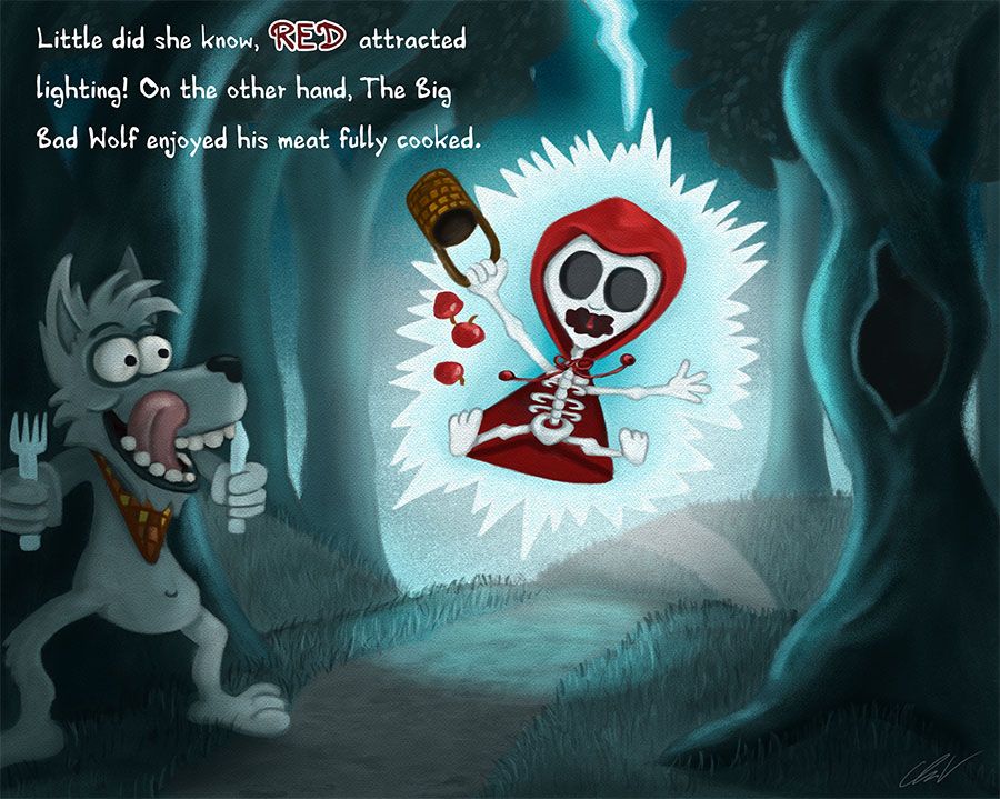
                              or this one without the purple lines of shock

                              final_pass2.jpg


                              https://www.instagram.com/chipvalecek/
                              https://www.facebook.com/cvalecek
                              http://www.cshellmedia.com/

                              demotlj BichonBistro A 3 Replies Last reply Reply Quote 2
                              • demotlj
                                demotlj SVS OG @Chip Valecek last edited by

                                @Chip-Valecek You have a typo “lighting” where I assume you meant lightening. It looks great though.

                                Laurie DeMott
                                instagram.com/demotlj

                                1 Reply Last reply Reply Quote 1
                                • BichonBistro
                                  BichonBistro @Chip Valecek last edited by

                                  @Chip-Valecek I like the one without lines of shock

                                  https://www.instagram.com/bichonbistro
                                  http://www.heartfeltimpressions.com
                                  https://www.facebook.com/patty.burke.9655
                                  https://twitter.com/BichonBistro

                                  Chip Valecek 1 Reply Last reply Reply Quote 1
                                  • Chip Valecek
                                    Chip Valecek SVS Team SVS OG @BichonBistro last edited by

                                    @BichonBistro i agree, i like it better without.


                                    https://www.instagram.com/chipvalecek/
                                    https://www.facebook.com/cvalecek
                                    http://www.cshellmedia.com/

                                    1 Reply Last reply Reply Quote 1
                                    • braden H
                                      braden H last edited by

                                      I kinda wanna see her teeth. For some reason seeing skeleton bits like ribs and eye sockets but no teeth is unnerving to me 🙂

                                      Wolf's not even gonna have to cook her :smiling_face_with_open_mouth_closed_eyes:

                                      1 Reply Last reply Reply Quote 1
                                      • A
                                        Amanda Jean @Chip Valecek last edited by

                                        @Chip-Valecek the second one is what I'd go with. Not so sure about the font choice myself, but I guess I'm a bit of a traditionalist and would choose a simple serif font. I also feel it's a bit too close to the edge of the frame. You have more space down in the bottom right. What do you think about getting the reader to view the picture then read the text instead of vice versa? Or even breaking the sentences up? One top left, one bottom right.

                                        1 Reply Last reply Reply Quote 1
                                        • eroomba
                                          eroomba last edited by

                                          I like the second one, too, and I also like the idea of breaking the sentences up. I like that you can see the texture more without the shock lines and I personally think the texture is more visually interesting. Nice work!

                                          Allen B. Moore
                                          https://twitter.com/eroomba
                                          https://www.instagram.com/albmoore/
                                          http://www.lizardmin.com
                                          http://www.bugandworm.com

                                          1 Reply Last reply Reply Quote 0
                                          • Chip Valecek
                                            Chip Valecek SVS Team SVS OG last edited by

                                            Thank you everyone for the feed back. I updated the text and added some eyes into the tree. I meant to do that before but forgot.

                                            final_pass3.jpg


                                            https://www.instagram.com/chipvalecek/
                                            https://www.facebook.com/cvalecek
                                            http://www.cshellmedia.com/

                                            1 Reply Last reply Reply Quote 2
                                            • First post
                                              Last post