Indoor scenes, critiques welcome.
-
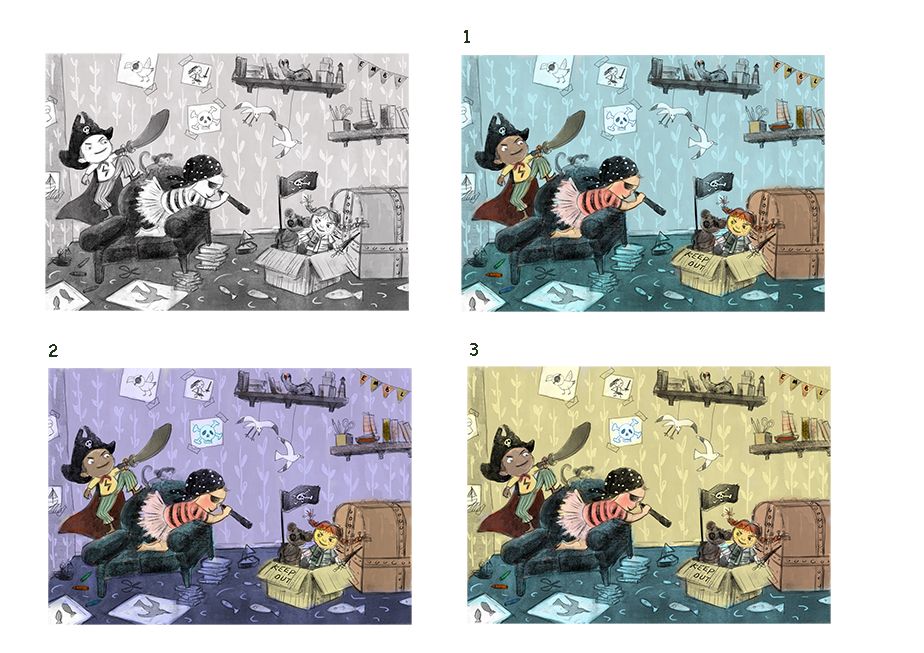
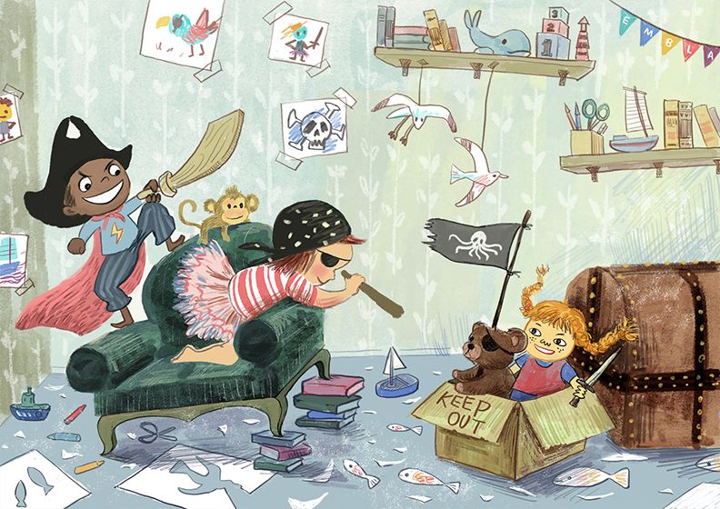
Trying to get "Dress Up" piece done before the SCBWI monthly deadline. I Am struggling with value and color on this piece, but manage to make osme progress. Any thoughts?
-
@xin-li I like number 3 the most
-
I like #3 as well.
-
These are awesome! 2 is my fav.
-
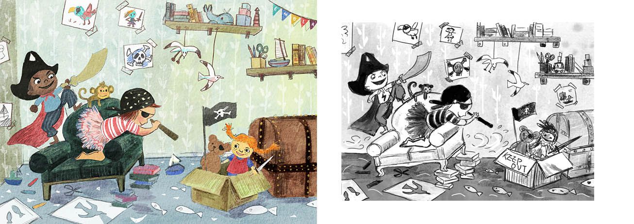
Doing the final push on this piece, still hoping to finish it today. I toned down the color for the background, trying to make the character stand out more.
I found myself keep feeling that the tight painting lost some of the inital enegy. I am also not sure if the background is a bit too busy, even though I kept things farely low contrast.Any thoughts?
-
Hi
") I really like the concept of this, and the characters are looking great!
I really like the concept of this, and the characters are looking great!I think the characters and the chair are standing out well from the background now, but the sword and the books the chair is standing on could be darker or outlined to separate more from the background and be more grouped with the children.
There is something about the box with the doll in it that is not quite working for me, it’s maybe a little stiff, less energetic and low contrast compared to the rest of the image.
The background looks very nice, but I think that right now it is a bit more «in focus» than the foreground, because the linework is more prominent than in some of the elements in the foreground. Maybe either adding linework in the foreground, or remove/tone down more in the background would help?
-
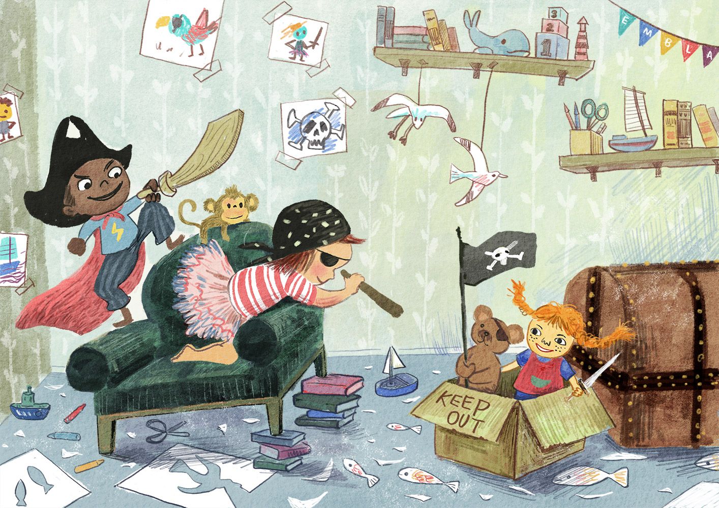
@karolifo thank you for the comments. I made some more progress, Added more line work in the forground. Hope this balance it out with the background. I might need to adjust the lines on the character to be a bit more prominent, and maybe adding more details on the characters.I think I might have to redrew the box with doll, you are right - it is kind of stiff.
Thank you for helping out.
-
@xin-li I think you’ve managed to keep a lot of the energy in the original sketch, but it always seems like a little is lost, doesn’t it? For some reason, maybe because there are a lot of angles in papers, boxes, etc, I like the curved legs on the chair in the sketch—it’s such a minor detail that I wouldn’t bother if it’s a pain to change. I also like the boy’s wider mouth in the sketch—he looks more engaged with it. I find environments very challenging and yours is fun to look at!
-
@BichonBistro thank you for the feedback. It is always very helpful to have other people take a look of the piece I am working on. I definitely will give another try on the facial expression on the boy. It is just going to be where people first.
I will see if I have time to work on a bit more of the sofa leg. I agree that the curved line look for interesting.
-
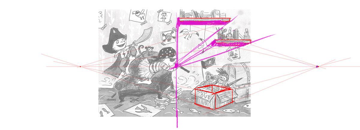
@StudioLooong It's sort of a tricky scene to figure out vanishing points and things like that. Its a somewhat stylized approach, so realism rules don't fit perfectly here. But there are some clues on how to solve it within the image. If you look at the floor plane, it's perfectly horizontal to the viewer. That means that you would use a 1 point perspective for the room itself. Since the shelves are also part of that box, it would also fall within the 1 point perspective. Anything within the room that is rotated would turn into a 2 point perspective like you have drawn on the box. Hope that makes sense. : )
That said, I like the finish that she chose better than using the vanishing points. Nice work @xin-li!
SVS Faculty Instructor
www.leewhiteillustration.com -
@Lee-White thank you so much for explaining the rule of perspective in this context. I looked up some video tutorials, I think I understood the principles of 1 point and 2 points perspective, I just did not know how to apply them here. :smiling_face_with_open_mouth_closed_eyes: I think I will have a better idea next time.
It is interesting how much I can get away from realism rules by focus on the emotion of the image. That said, maybe I should familiarise myself more with perspectives - a good tool to have in my artist toolbox.
-
Call this one done for now. As a tradition, I am sure I will go back and fiddle with it later :-). Thank you so much for the help along the way. -
Hi Xin Li,
I wanted to comment that I absolutely LOVE the sketch you did of "Tim liked the red cape very, very much!" It has such a great energy and flow across the page. That is the illustration that I am longing to read the story about. If you had the inclination to finish that one I think you'd have a fantastic piece for your portfolio.
While I like your pirate illo, the cape illo sings to me and touches my heart. 🥰
Best,
Su -
Love where you took it! Turned out great! Well done!
-
@xin-li This turned out really good! And the box with the bear and doll looks much more interesting now. I also like your other sketch with the cape, it really feels like Tim is dancing
-
@xin-li it turned out great!
-
@Su Thank you for the encouragement. I am moving on the the Tim superkid piece next
@karolifo Thank you. Your previous coment was super helpful to push this piece further.
@Amanda-Jean and @BichonBistro Thank you so much for the kind words.
-
@Lee-White Ahh yeah that makes sense! I knew it didn't look quite right how I had done it.
This turned out lovely @xin-li ! I love the colors you chose and all the playful linework.
-
Hi @xin-li! I just read through this thread, a little late. I really like the second piece better overall, the one with the cape. Looking quickly, I did tend to read it as a living room, but the overall sense of space and movement work really well and fits with what you're trying to convey. And it's not entirely unheard of to have a plant in a bedroom! I had a potato plant experiment as a child, and it grew all the way down to the floor without me doing much to care for it. So if that could fit into your story-scape, maybe it could work!
As for the pirate piece, I like the idea and the details of the room, and Lee's perspective comments helped, but I still think the space in the other piece is more dynamic. In this one it feels like all the furniture is in a line in a shoebox diorama. Sometimes that works, but since I saw the second drawing immediately and liked it so much, I can't help but compare them. It might be something as easy as changing the angle or position of the big chair or the box/boat. Of course, then you have to re-evaluate the site lines, but if you decide this is something you want to do, it doesn't require redrawing the whole piece.
Overall, I think it's psychologically realistic and specific enough to be interesting! What @Su said!
-
@LauraA Thank you so much for your feedback. I might fiddle a bit more with the pirate piece later this week.
I think I try to give viewers very different feelings of the space with these 2 images:
- With the pirate image, I want to make the viewers feel they are also in the middle of the game, they are close with the characters.
- with Tim and the cape image, I want to viewers feel that they are standing by the door wathcing a kid dancing accross the room.
The second image is part of the dummy picture book I am working on. It is so encouraging to get positive feedback on it, making me very motivated to continue the dummy book.