Society of Visual Storytelling

    SVSLearn Forums

    • Register
    • Login
    • Search
    • Recent
    • Tags
    • Popular
    • Users
    • Groups
    • Search

    Work on my Portfolio (ongoing)

    Artwork
    11
    29
    1816
    Loading More Posts
    • Oldest to Newest
    • Newest to Oldest
    • Most Votes
    Reply
    • Reply as topic
    Log in to reply
    This topic has been deleted. Only users with topic management privileges can see it.
    • jakecrowe
      jakecrowe @Nathalie Kranich last edited by

      @Nathalie-Kranich I like your blue monster, he reminds me of one of the monsters from Where the Wild Things Are.

      jakecrowe.com

      1 Reply Last reply Reply Quote 0
      • Laurel Aylesworth
        Laurel Aylesworth @Nathalie Kranich last edited by

        @Nathalie-Kranich I LOVE the robot and the flower. OMG. So good.

        www.laurelaylesworth.com
        instagram.com/laurelaylesworth

        1 Reply Last reply Reply Quote 0
        • Nathalie Kranich
          Nathalie Kranich last edited by

          Awh thanks @Laurel-Aylesworth , much appreciated 😃 It's a favourite of mine too for sure!

          @jakecrowe haha, yeah I think I had that floating in the back of my mind when I was drawing XD

          www.nathaliekranich.com
          https://www.artstation.com/nathaliekranich
          https://www.instagram.com/nathalie.kranich/?hl=en

          1 Reply Last reply Reply Quote 0
          • Nathalie Kranich
            Nathalie Kranich last edited by

            I haven't posted in here for a while!
            So this month is a busy one. I've fully completed Inktober, which is all up on my website now. In fact right here, if anyone's curious.

            Now I'm prepping a set of art prints for a couple fairs and conventions at the end of the month, doing a few commissions, and trying to do slowvember!
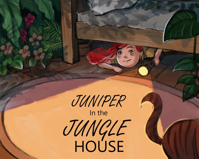
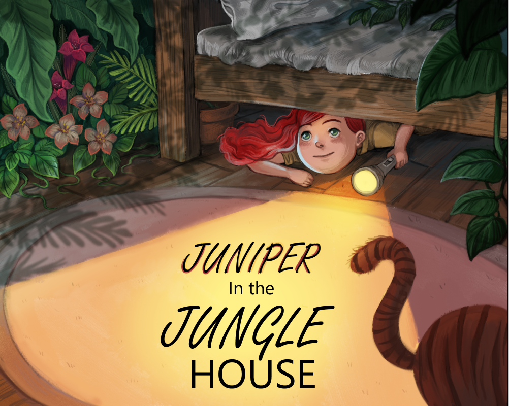
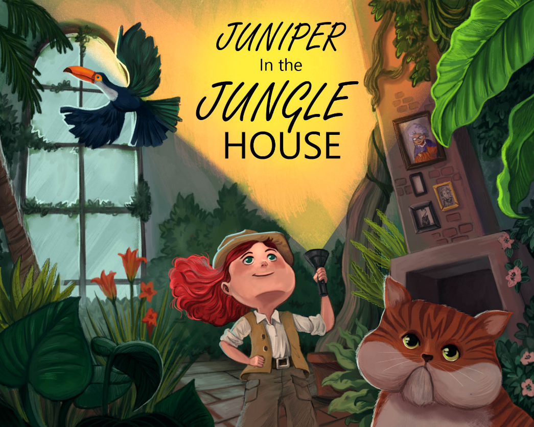
            So for slowvember I want to do visual research and exploration of a vague book idea I can use to make some mock spreads and covers.

            It's gonna be called "Juniper in the Jungle House", about a girl that visits her ex-explorer grandma who lives in a house full of potted jungle plants grown out of control! Throw a tabby tiger cat and a parrot in the mix.

            So today I did some visual dev for the cat!

            af3a5b9c-b8fe-4683-8569-11058ecf68fb-image.png

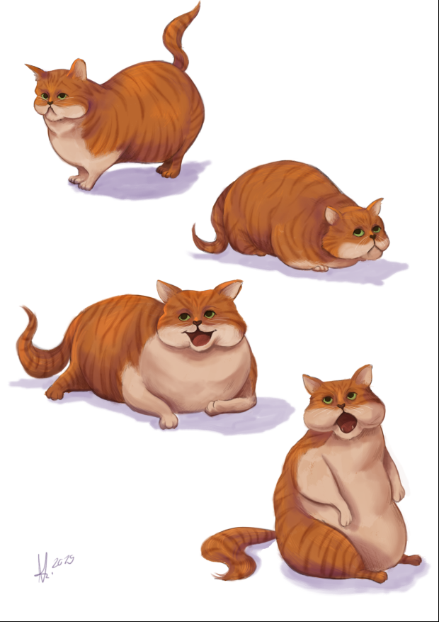
            Even though I've been adding more hatching and pencil textures, I'm still afraid my art is too digital looking for a children's book market...but im struggling with the idea of changing it up too forcefully, because I like it! And this style still comes naturally to me and feels right.

            www.nathaliekranich.com
            https://www.artstation.com/nathaliekranich
            https://www.instagram.com/nathalie.kranich/?hl=en

            1 Reply Last reply Reply Quote 1
            • Nathalie Kranich
              Nathalie Kranich last edited by

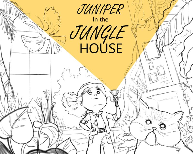
              Progressing on my Slowvember! I've narrowed down thumbnails and fleshed out two sketches that could make a final illustration.

              Sketch1.jpg

              Sketch2.jpg

              www.nathaliekranich.com
              https://www.artstation.com/nathaliekranich
              https://www.instagram.com/nathalie.kranich/?hl=en

              Nyrryl  Cadiz 1 Reply Last reply Reply Quote 3
              • Nyrryl  Cadiz
                Nyrryl Cadiz SVS OG @Nathalie Kranich last edited by

                @Nathalie-Kranich i love the bottom one with more plants.

                Portfolio: nyrrylcadiz.com
                Instagram: https://www.instagram.com/nyrryl_cadiz/
                YouTube: https://www.youtube.com/channel/UCbJCF1Im8ZO7hpGWTKOJMuA

                1 Reply Last reply Reply Quote 1
                • MichaelaH
                  MichaelaH last edited by

                  Wow so lovely, I love both of them, I cannot deside, which one I like more. Maybe the upper one, because I like to see the animals also...

                  https://www.instagram.com/michaelaheimlich/
                  https://www.heimlich-illustration.de/

                  1 Reply Last reply Reply Quote 1
                  • Nathalie Kranich
                    Nathalie Kranich last edited by

                    I'm also having a really hard time deciding! So for the moment I'm still working on both.
                    It's slowvember after all!

                    RoughColours1.jpg

                    RoughColours2.jpg

                    www.nathaliekranich.com
                    https://www.artstation.com/nathaliekranich
                    https://www.instagram.com/nathalie.kranich/?hl=en

                    chrisaakins MichaelaH 2 Replies Last reply Reply Quote 1
                    • chrisaakins
                      chrisaakins @Nathalie Kranich last edited by

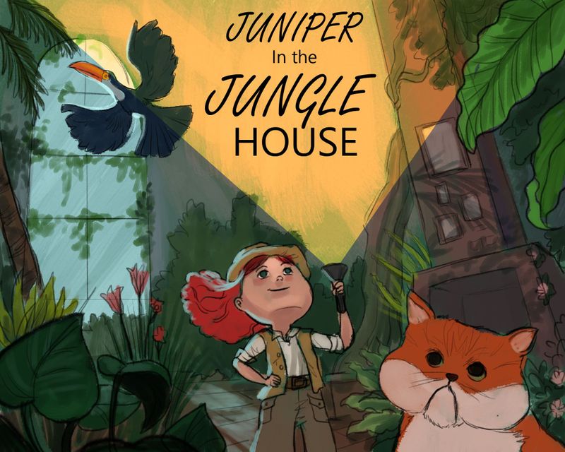
                      @Nathalie-Kranich the top one reads more jungle, the bottom one, house. I think the top one would be the better one, but I read the window as some sort of ruins of a column or something rather than a window. Maybe add some context to it? Curtains, trim? A picture frame next to it?

                      Chris Akins
                      www.chrisakinsart.com
                      www.instagram.com/chrisakinsart/

                      1 Reply Last reply Reply Quote 1
                      • MichaelaH
                        MichaelaH @Nathalie Kranich last edited by MichaelaH

                        @Nathalie-Kranich Both of them are so great, but slowly I am liking the second idea, because the girl is not like Tomb Rider adventure girl but a normal girl having adventure in a house of explorer grandma. Maybe it is the hut in the above picture.
                        What about changing the eyes of the girl on the bottom illustration, that she is looking down to the book title, because now she is looking up.

                        https://www.instagram.com/michaelaheimlich/
                        https://www.heimlich-illustration.de/

                        1 Reply Last reply Reply Quote 0
                        • eriberart
                          eriberart last edited by

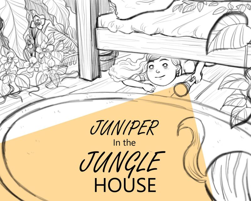
                          I prefer the bottom one. The composition feels more interesting to me and it flows well. The top feels a little more confusing to me as there is a lot going on (although I love the girl's hair flip!:smiling_face_with_open_mouth_closed_eyes:).
                          The bottom might look better if you mirrored it, as then the girl and torch would be facing the direction of the page turn, encouraging the reader to open the book

                          Instagram and Twitter: @eriberart
                          Website: www.erinmcclean.com

                          1 Reply Last reply Reply Quote 2
                          • Nathalie Kranich
                            Nathalie Kranich last edited by

                            Oooh interesting thoughts!
                            @eriberart I'll give that a try and see how it looks! Can't fault that logic.
                            @MichaelaH I see what you mean, but I don't think I want the title to be part of the storytelling.
                            @chrisaakins good call! I'll see what I can include in the render.

                            By now I had anyhow rendered the second one, before reading your feedback.

                            f8c7fb93-d96a-49c1-8925-fc30154bbbf1-image.png

                            Need to think about typography this upcoming week as well!
                            Thanks for all your input! 😃

                            www.nathaliekranich.com
                            https://www.artstation.com/nathaliekranich
                            https://www.instagram.com/nathalie.kranich/?hl=en

                            Heather Boyd 1 Reply Last reply Reply Quote 3
                            • Heather Boyd
                              Heather Boyd @Nathalie Kranich last edited by Heather Boyd

                              @Nathalie-Kranich this is great! I liked both and if you returned to the first I would watch not to cut the toucan (sp check by Braden lols) in half with the light. If someone else said it already sorry.

                              Instagram: www.instagram.com/heatherboyd.illustration/
                              Website: https://heatherboydillustration.ca
                              Shop: https://www.inprnt.com/search/products?q=HeatherBoydIllustration
                              Ko-Fi: https://ko-fi.com/heatherboydillustration

                              Be blessed,

                              braden H 1 Reply Last reply Reply Quote 0
                              • braden H
                                braden H @Heather Boyd last edited by

                                @Heather-Boyd I misread your post and was about to try and research 'tuscan half light' as some kind of obscure art term 🙂

                                1 Reply Last reply Reply Quote 1
                                • Nathalie Kranich
                                  Nathalie Kranich last edited by

                                  Finished both of these now, am running out of time to do more tweaks so I ended up submitting the under the bed cover. I like both of these quite a bit and they've been great to work on.

                                  d6af971e-df47-4407-87ff-36a7c24b7da3-image.png

                                  2d5fc154-7fa9-4490-a3c0-0758a1cc1c06-image.png

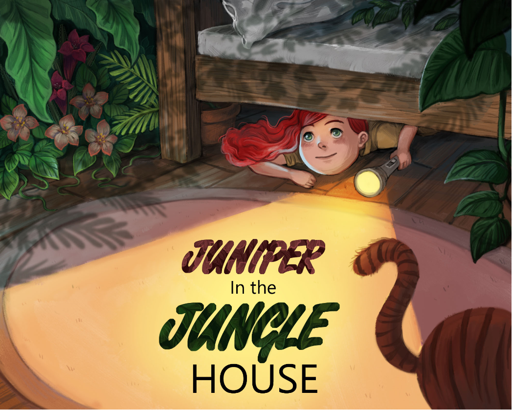
                                  I still see a lot of value in the feedback I haven't addressed in this, flipping makes a lot of sense, just needed to finish this up with something I was pretty confident with before the evening 😃 Can I throw two covers of the same thing on my portfolio I wonder? I like them both...

                                  www.nathaliekranich.com
                                  https://www.artstation.com/nathaliekranich
                                  https://www.instagram.com/nathalie.kranich/?hl=en

                                  Heather Boyd KaraDaniel 2 Replies Last reply Reply Quote 1
                                  • Heather Boyd
                                    Heather Boyd @Nathalie Kranich last edited by Heather Boyd

                                    @Nathalie-Kranich

                                    I love the first one with the addition of the fireplace and the grandmother picture frame. But the shadows are lovely in the second one. I would read and buy this book. I'm not at all jealous lols.

                                    Instagram: www.instagram.com/heatherboyd.illustration/
                                    Website: https://heatherboydillustration.ca
                                    Shop: https://www.inprnt.com/search/products?q=HeatherBoydIllustration
                                    Ko-Fi: https://ko-fi.com/heatherboydillustration

                                    Be blessed,

                                    Nathalie Kranich 1 Reply Last reply Reply Quote 1
                                    • Nathalie Kranich
                                      Nathalie Kranich @Heather Boyd last edited by Nathalie Kranich

                                      @Heather-Boyd Thank you! Envy is exactly what I aim to inspire XD

                                      www.nathaliekranich.com
                                      https://www.artstation.com/nathaliekranich
                                      https://www.instagram.com/nathalie.kranich/?hl=en

                                      1 Reply Last reply Reply Quote 0
                                      • KaraDaniel
                                        KaraDaniel @Nathalie Kranich last edited by

                                        @Nathalie-Kranich love the shadows on the second cover. good work!

                                        instagram.com/sha_kara
                                        karadaniel.net

                                        1 Reply Last reply Reply Quote 0
                                        • First post
                                          Last post