Society of Visual Storytelling

    SVSLearn Forums

    • Register
    • Login
    • Search
    • Recent
    • Tags
    • Popular
    • Users
    • Groups
    • Search

    Urgent feedback on thumbnail

    Artwork
    8
    34
    1521
    Loading More Posts
    • Oldest to Newest
    • Newest to Oldest
    • Most Votes
    Reply
    • Reply as topic
    Log in to reply
    This topic has been deleted. Only users with topic management privileges can see it.
    • Elinore Eaton
      Elinore Eaton last edited by

      What a fun illustration! @NessIllustration I'd love to see the running characters be a bit larger and closer to the audience, maybe have the cat the closest. It will create a stronger dominance structure, as well as bring some stronger layering and perspective. If you make them larger and shift them just slightly so that they overlap the stairs a bit, you're also going to lead the eye from the mummy to them and back again, and the composition won't be divided by that strong line illustrating the corner of the room. I did a quick re-size to show you what I mean. Nice work!

      alt text

      http://www.elinoreeaton.com/
      https://www.instagram.com/elinoreeatonart/

      NessIllustration 1 Reply Last reply Reply Quote 2
      • NessIllustration
        NessIllustration Pro @Elinore Eaton last edited by

        @Elinore-Eaton Elinore, this looks wonderful!! Thank you so much for this!! ❤

        vanessastoilova.com
        instagram.com/vanessa.stoilova/

        Check out my Youtube channel for tips on how to start your career in illustration! www.youtube.com/c/ArtBusinesswithNess

        Elinore Eaton 1 Reply Last reply Reply Quote 1
        • Elinore Eaton
          Elinore Eaton @NessIllustration last edited by

          @NessIllustration Yay! So glad, anytime. I'm kind of a composition junky. 😉
          Looking forward to seeing how this goes!

          http://www.elinoreeaton.com/
          https://www.instagram.com/elinoreeatonart/

          1 Reply Last reply Reply Quote 1
          • Perrij
            Perrij last edited by

            Not sure if anyone else mentioned this yet, but the perspective on big columns the is off. They should be pointing straight up and down. Of course, it could be an artistic choice to skew the perspective, but in this case I feel its more distracting than anything. I did a quick draw over to show you what i mean perspective draw over.png
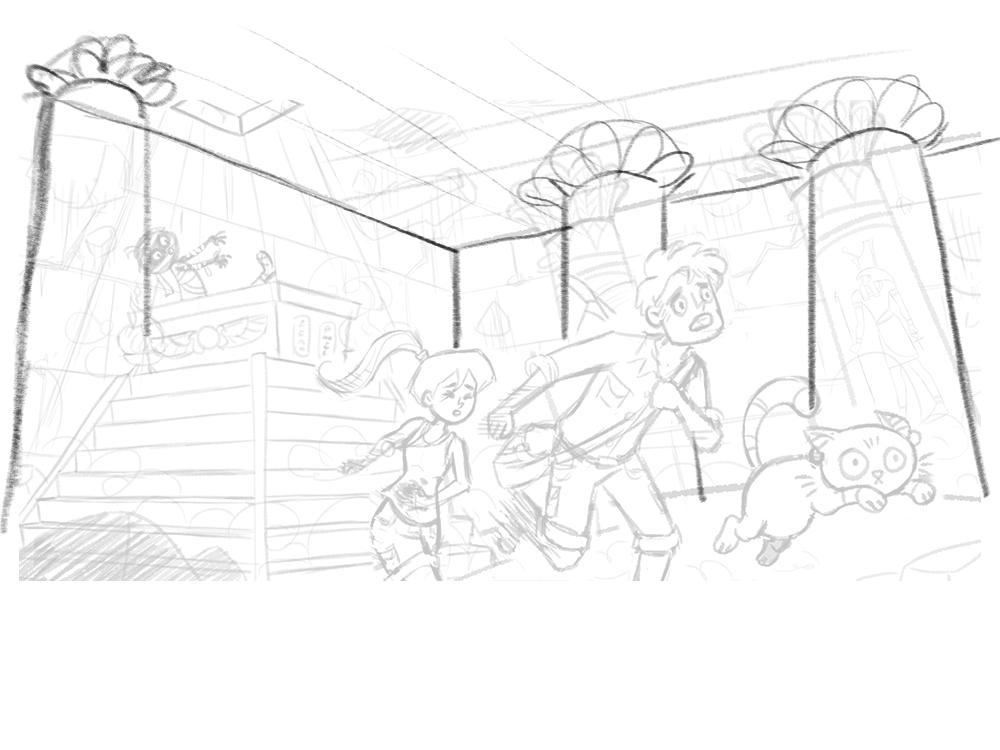
            and I added a third column because the wall behind the mummy was feelin kinda empty.

            https://perrijs.myportfolio.com/

            NessIllustration 1 Reply Last reply Reply Quote 1
            • NessIllustration
              NessIllustration Pro @Perrij last edited by

              @Perrij That's very accurate critique, but in this case I've decided to add a 3rd vanishing point and tilt the scene as well to create more dynamism in the composition 🙂

              vanessastoilova.com
              instagram.com/vanessa.stoilova/

              Check out my Youtube channel for tips on how to start your career in illustration! www.youtube.com/c/ArtBusinesswithNess

              1 Reply Last reply Reply Quote 2
              • Perrij
                Perrij last edited by

                @NessIllustration for sure! well in that case, i think maybe tilting the vertical lines of bricks towards the 3rd vanishing point will help sell it

                https://perrijs.myportfolio.com/

                NessIllustration 1 Reply Last reply Reply Quote 0
                • NessIllustration
                  NessIllustration Pro @Perrij last edited by

                  @Perrij They are, hun. Look at them with a ruler, the brick lines on the right of the screen tilt towards the left, the brick lines on the left tilt towards the right. They all "seem" vertical because they're following the established perspective 🙂

                  vanessastoilova.com
                  instagram.com/vanessa.stoilova/

                  Check out my Youtube channel for tips on how to start your career in illustration! www.youtube.com/c/ArtBusinesswithNess

                  1 Reply Last reply Reply Quote 1
                  • Perrij
                    Perrij last edited by

                    @NessIllustration Ah, okay, you bet. Hope I didn't offend, only meant to be helpful

                    https://perrijs.myportfolio.com/

                    NessIllustration 1 Reply Last reply Reply Quote 1
                    • NessIllustration
                      NessIllustration Pro @Perrij last edited by

                      @Perrij Not offended at all, and thank you so much for taking the time to even do a draw-over, that's really cool! Seeing the scene in another perspective is super interesting!

                      vanessastoilova.com
                      instagram.com/vanessa.stoilova/

                      Check out my Youtube channel for tips on how to start your career in illustration! www.youtube.com/c/ArtBusinesswithNess

                      Perrij 1 Reply Last reply Reply Quote 1
                      • Perrij
                        Perrij @NessIllustration last edited by

                        @NessIllustration Haha yeah everyone has a different perspective! Is that a pun? oh lord..

                        https://perrijs.myportfolio.com/

                        1 Reply Last reply Reply Quote 1
                        • First post
                          Last post