SEPTEMBER WIP Maybe???Prompt Question
-
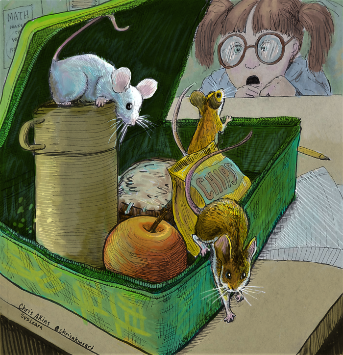
So I already entered the contest but the more I stared at it the more I felt like it looked like a value study rather than a finished piece. I had originally wanted to do a black and white piece but I wasn't completely happy with it. So I watched Will Terry's video again on how to paint in 10 steps and applied a multiply layer over it and colorized it. I think I like it better but I would like your feedback. Would other colors work better? Does the color even work at all? Is it too flat?
-
@chrisaakins Honestly, I loved your black and white piece.
") It could easily go in an early-reader chapter book.
It could easily go in an early-reader chapter book. -
The green lunch box is pulling from the rest. The little girl is a focal point?
instagram and twitter: @artofaleksey
alekseyillustration.com -
@Aleksey the mice are the focal point
-
@KathrynAdebayo thanks. That's good to hear. That's what I was thinking at first.
-
I also like the black and white version best but I tend to have old-fashioned tastes so don’t put too much weight on my opinion!
-
@Aleksey I agree, the green is the first thing that caught my eye. It's also harder to see the individual mice with the chip bag being the same color palette.
-
@Aleksey @jakecrowe ahhh! Mice are hard. Because they are golden brown. I would go neutral with the lunchbox but then it wouldn't contrast with the mice. And what color for the chip bag? Can either of you do a draw over to show me other color choices? I am stuck in my own head.
@demotlj don't sell yourself short. Your opinion is important. -
@chrisaakins I’m very sympathetic to the mouse color problem. I’m doing rabbits next to a fox sitting on chairs with trees behind them. How many shades of brown can one come up with?!
-
@Aleksey @jakecrowe How is this? I blued things up a bit. I also toned down the white mouse a bit. and changed the color of the bag.
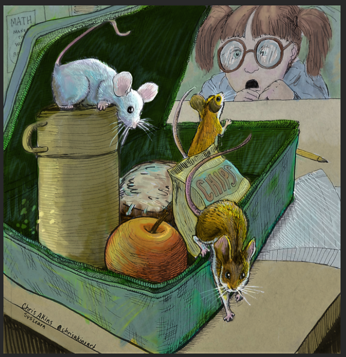
I do think the mice pop out a bit more since they are one of the few warm things on the cool pallet. -
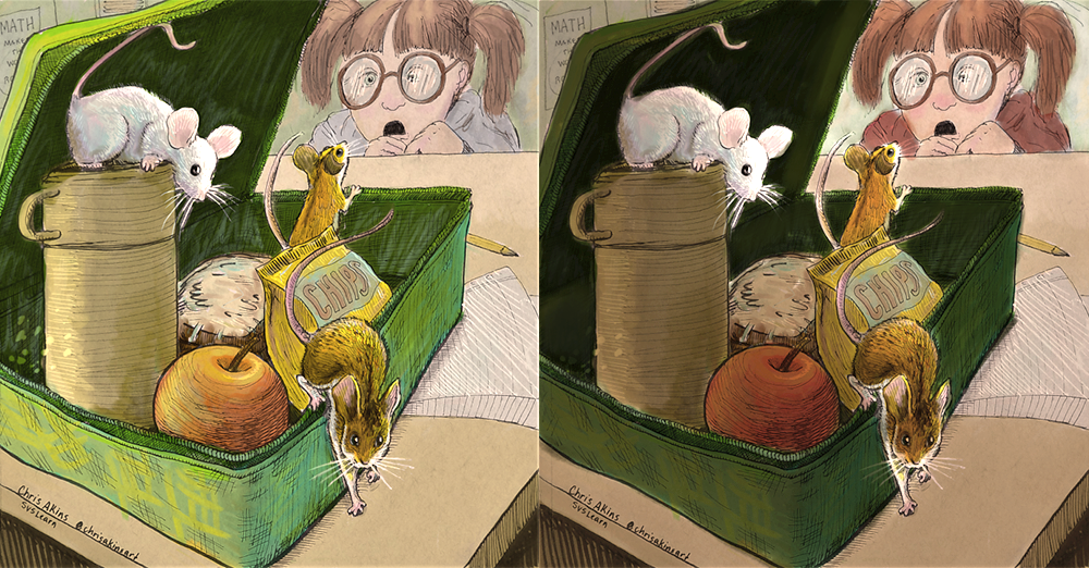
I have to say that I really liked the black and white version too! That being said, one solution might be to handle the values a bit differently. I tried to keep your same color palette, but warmed it up a bit, tweaked the values of the desk and lunch box/food, and brought some red to the girl so our eye would be drawn to her.
Don't know if it's any better, but I thought it was worth exploring a slightly different value structure.
-
Hmm try making the gray rat darker and the other 2 a tiny bit more saturated
-
So far I have three votes to keep the black and white and no votes for a colorized version. Maybe its because I had a clear concept for a black and white and no real clear pallet for the other. @TessaW I do like the warmer pallet, but I actually did not want the girl to be the main emphasis. (I know that is the prompt, but in MY story the mice are the central characters. I am just trying to make it work).
@Aleksey Re: "Hmm try making the gray rat darker and the other 2 a tiny bit more saturated"
If only I knew how to do that. I am a novice at PS. Being able to do a multiply layer is a minor miracle for me. I can work wonders with color pencils, okay at painting with acrylic and am improving daily in ink but ask me to pump up the colors in PS and I am like "Uhhh, which button do I push???" -
Ah, I see! If that's the case- I find the girl to be a super strong focal point. The perspective, the tails, the apple stem, and one of the mice are all pointing to her, and she's facing us. (Plus she's just super cute with an amazing expression). If the focus is supposed to be the mice, I think it would read better if she was rendered with less focus, or if she was bigger in the frame and cropped right above the nose. That puts the viewer more in sympathy with the mice-where humans must look quite large to them.
However, looking back to the black and white version, the focus between the mice and the girl are better balanced. I think once you started messing with your value structure, it threw off the balance quite a bit and brought more contrast to the girl. You did bring more contrast to the mice as well, but for some reason the girl still becomes more prominent than in the original version.
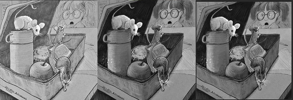
Here is a comparison of your original value structure next to both of your color value structures-
-
I think it works with or without color! The mice look great and i love the green! I thought that when i saw this on instagram...it really stands out! Nice work!


-
@TessaW Wow! I see what you mean. Maybe the girl should be the focal point. Maybe I knew that all along subconsciously, and my instincts guided my hands. I actually like the black and white versions of B and C way better than any other version I created. And I am super impressed with myself for creating this little girl's expression.
Somehow I managed to capture exactly the morbid horror/but they're so cute/and I-might-scream-and-run-away-or-I-might-just-let-it-lick-my-hand feeling I was going for. It was one of those everything went according to plan moments that are so few and far between for me. I am very thankful for being able to capture her expression.@TessaW @Aleksey @demotlj @jakecrowe @KathrynAdebayo @lou Do you think I should stick with the original or go with one of the colored versions? I don't have a lot of time this week but I really want to finally have a competitive piece. I think the composition and story-telling element is there but I am concerned about the rendering. Also EVERYONE does digital and my picture quality is not the best. Even though I am stronger traditionally, I have a hard time getting a good photo of how it looks in life. And... I always manage to have some fatal flaw in my work that puts my work in the middle of the pack rather than making the top ten.
okay...Rant over. I should just be thankful to be learning and growing as an artist and put away my competitive instincts. Here is me eye-rolling at myself. Haha. Thanks for listening!
-
@chrisaakins when you said "Somehow I managed to capture exactly the morbid horror/but they're so cute/and I-might-scream-and-run-away-or-I-might-just-let-it-lick-my-hand feeling I was going for." That made my day! I know little girls just like this. Sooooooo funny! Good luck with your piece!
-
@juliepeelart haha! It probably comes from being the dad to three girls myself.
-
@chrisaakins Did you do what Will does in the class and do several colour studies to find one you like?
-
I think you have a really strong piece for the theme this month- but as you've pointed out the presentation could be slightly better. The color could potentially work, but I would simplify the green on the lunch box. You've added additional textures and are trying to get too tricky with the color variation. It's sticking out from everything else. The textures are competing with the charm of the ink work. Color variation can be a good thing, but I think it needs to be reigned in for this case- especially if you don't have a ton of time to work out the problems. Let the lunch box simplify. Maybe go over it will a solid transparent color, letting the ink do the heavy lifting. I also think you need to brighten up the piece slightly overall, it's feeling a little somber to me.
Just my opinion. I'm looking forward to what others have to say.