Critique needed - WIP "Blustery"
-
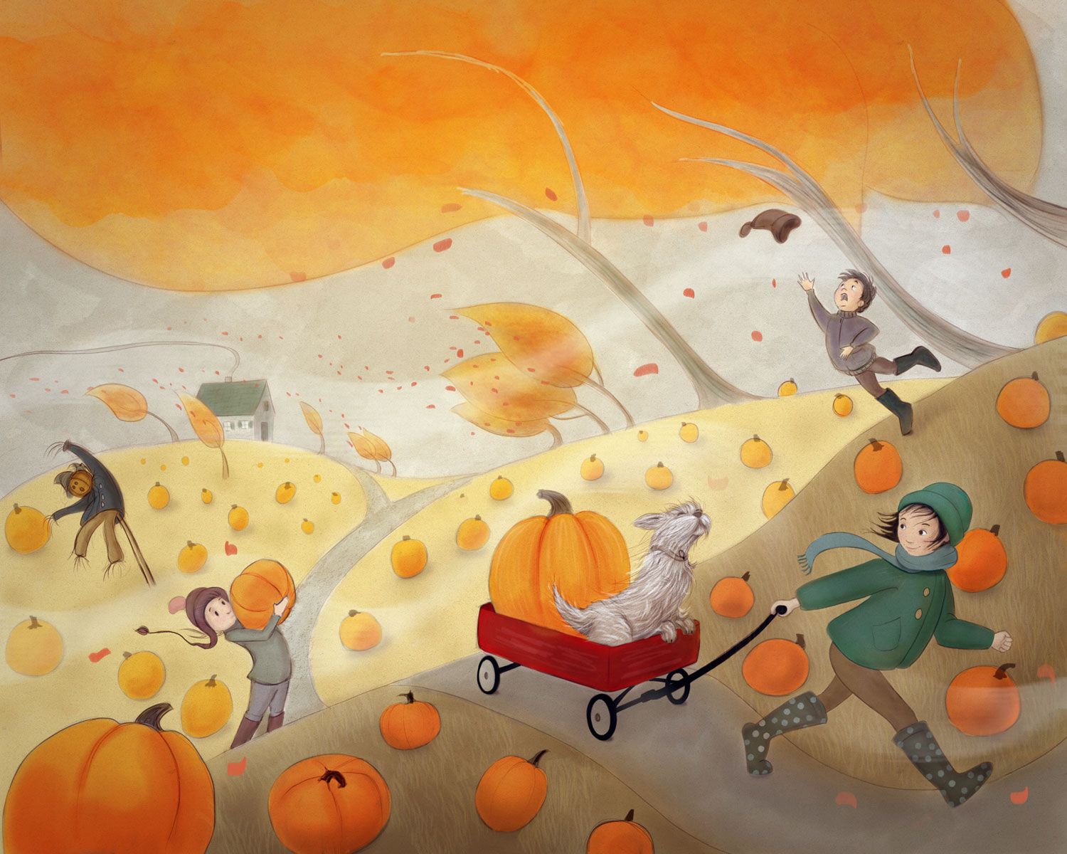
Hi everyone. I'm about to start over with a different concept, but I thought I'd ask for an extra set of eyes on this piece to help out before I do that. I'm submitting to the SCBWI monthly contest (key word is "blustery"). I've struggled with the colors and making it look cohesive. I still have detail work to do, but if someone could give an honest critique that would be awesome. Thanks!
-
@Laurel-Aylesworth Hi Laurel. My initial impression is that I really like it. I like the autumn palette. I like the windy scene too.
When I spend a bit more time looking at your pic, I notice that some of the pumpkins in the foreground are the same size as the pumpkins in the background. There’s also a pumpkin that stands out near and behind the scarecrow that looks huge.
Would it help if their size was considered more as they went off into the distance.
Also would textures add to the feeling of blustery. For example in the trees could leaves or lines be added to show movement.
It reminds me of another artists work I’ll try and find an example for you.
I can’t wait to see your finished piece, it’s looking great. -
@Laurel-Aylesworth
Also I wonder if you could help me out. Is there a link where the SCBWI post their monthly prompt and do they have a set date when they post it.
I think I’ve asked before but with svs it’s great, they have an easy place to find the monthly prompt. SCBWI just seem a bit hit and miss. Usually by the time I’ve found it it’s a bit late.
(I’ve tried messaging them several times but nothing) -
@peteolczyk Thank you for catching the pumpkin size issue. I've been looking at this piece too long - lol. This is why I love this forum.
-
@peteolczyk I agree - I often just google "scbwi Draw This" in order to find it because it's impossible to find it on their website. Here it is:
-
@Laurel-Aylesworth Yep fresh eyes are the best help


I’ve sent you a link on Instagram to another artist. -
@Laurel-Aylesworth cheers Laurel I’ll bookmark that page this time
-
It is beautiful. I love the softness of your rendering, my only comment would be to tweak the color of the wagon; the red is too red (maybe tone it towards an orange red) and doesn't belong in this world- just beautiful
-
I’m really liking this! One thing to do is to make the shadows more present I see little hints of shadow here and there but very soft. Try making the shadow under the wagon and girl the sharpest in comparison to the rest. Maybe towards the greens to make it more lively.
-
@Laurel-Aylesworth Great flow to it. Even with some of the warm orange colors, the piece still feels cool. Almost like I can feel the cold. Maybe cause its fall and cold outside. Besides for the pumpkin sizes that @peteolczyk mentioned, The main girl in the green coat, maybe that can be a different color. Maybe a plaid pattern. In my opinion she looks more ready for winter then fall.
Looking forward to seeing the final piece.
-
I like this a lot. Even though its blustery, it still feels warm and inviting. The only thing for me is I wish there was something up in the sky. Birds or a hot air balloon, something like that. Great piece though, I'm looking forward to seeing it finished.
-
This is such a warm and inspiring piece! I know other people mentioned it, but the scene has warmth and simultaneously feels cold and windy. That’s awesome!
One thing that strikes me is the darkness of the foreground and the character in it (the girl pulling the wagon).... would it help if either she or her background be lightened up a bit?
I love the softness of the shapes and the flow of the wind through the scene. It’s a beautiful piece! -
Not sure if it is too late. I like the piece and the colors. The one thing I see is that you are not using value to your advantage much. All of the foreground is basically one value. The girl and wagon are slightly darker but not significantly.
Also, the background, sky, and trees are really blending together. The pumpkins, scarecrow, and characters pop nicely on the background.
I think this might be why you think everything is getting muddled together. Good luck!
-The Prairie Fox
https://www.instagram.com/theprairiefox
https://www.theprairiefox.com -
@theprairiefox Thank you so much for your comments. This is what I struggle with: how much to rely exclusively on value vs. using color to also create contrast. In my thumbnail, the foreground was a lot darker (as you suggest), but in the end I was worried about the foreground becoming too brown, and I struggled with the shadows overall. Maybe I'll revisit it again once my eyes uncross. lol
-
@Laurel-Aylesworth lovely colour palette and it definitely feels blustery
")
Until I read the comments I was seeing the orange at the top as the sky, the trees as being just bare branches and the grey underneath as distant hills. I think you said you'll be adding more detail so probably some leaves or shading will make it clearer that the orange is actually part of the trees but thought I'd just mention it anyway.