Society of Visual Storytelling

    SVSLearn Forums

    • Register
    • Login
    • Search
    • Recent
    • Tags
    • Popular
    • Users
    • Groups
    • Search

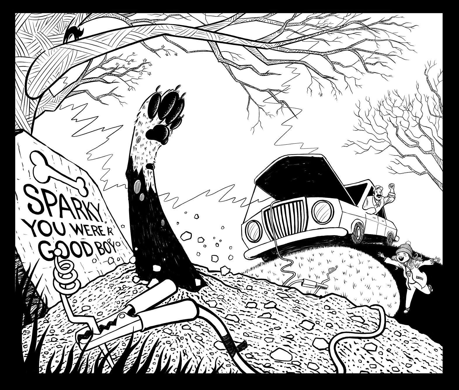
    October prompt sketch, feedback welcome

    Artwork
    10
    24
    1510
    Loading More Posts
    • Oldest to Newest
    • Newest to Oldest
    • Most Votes
    Reply
    • Reply as topic
    Log in to reply
    This topic has been deleted. Only users with topic management privileges can see it.
    • Zachary Drenski
      Zachary Drenski @chrisaakins last edited by

      @chrisaakins thanks. I was thinking about changing it but not anymore 😁

      1 Reply Last reply Reply Quote 0
      • Aaron_T
        Aaron_T @Zachary Drenski last edited by

        @Zachary-Drenski Yeah, dogs (even fat dogs) tend to have thinner legs, so that’s probably why my mind went there. Still so good though.

        https://www.instagram.com/aaron_t/

        1 Reply Last reply Reply Quote 1
        • J
          JennyJones last edited by

          Keep the frogs! They are perfect for the science experiment feel. I don’t have any major criticism. I just wanted to affirm the frogs and say the piece looks pretty fun. Can’t wait to see the finish.

          1 Reply Last reply Reply Quote 1
          • KathrynAdebayo
            KathrynAdebayo last edited by

            This is so good!! I laughed too. 🙂 Perhaps consider the perspective of the cable and either thicken it in the foreground or thin it out in the background. Thanks for sharing! I love your interpretation of the prompt.

            1 Reply Last reply Reply Quote 1
            • Elena Marengoni
              Elena Marengoni last edited by

              I love this concept too!! I agree that the sharp claws can make it look like a cat (especially the 'thumb'). Talking about cats, it could be fun if the cats on the trees look scared or are kind of hiding from the dog, so it could be fun to see their expressions too! I'm curious to see the final piece, great work! 🙂

              Instagram: https://www.instagram.com/elena.marengoni/

              1 Reply Last reply Reply Quote 1
              • J
                Jellen @Zachary Drenski last edited by

                @Zachary-Drenski
                This is so good! I also couldn’t find much to critique, but perhaps the paw could be more dog-like? But Seriously- awesome work!

                1 Reply Last reply Reply Quote 1
                • Heather Boyd
                  Heather Boyd last edited by

                  I agree about the cat paw and I think the idea got stuck in my head because you have three cats in the tree. Other than that I didn’t notice anything else, I think it’s a great piece and welcome in on joining the contests!

                  Instagram: www.instagram.com/heatherboyd.illustration/
                  Website: https://heatherboydillustration.ca
                  Shop: https://www.inprnt.com/search/products?q=HeatherBoydIllustration
                  Ko-Fi: https://ko-fi.com/heatherboydillustration

                  Be blessed,

                  1 Reply Last reply Reply Quote 1
                  • Zachary Drenski
                    Zachary Drenski last edited by

                    0CAE3D66-B32C-4E46-861A-5D0C106794E2.jpeg

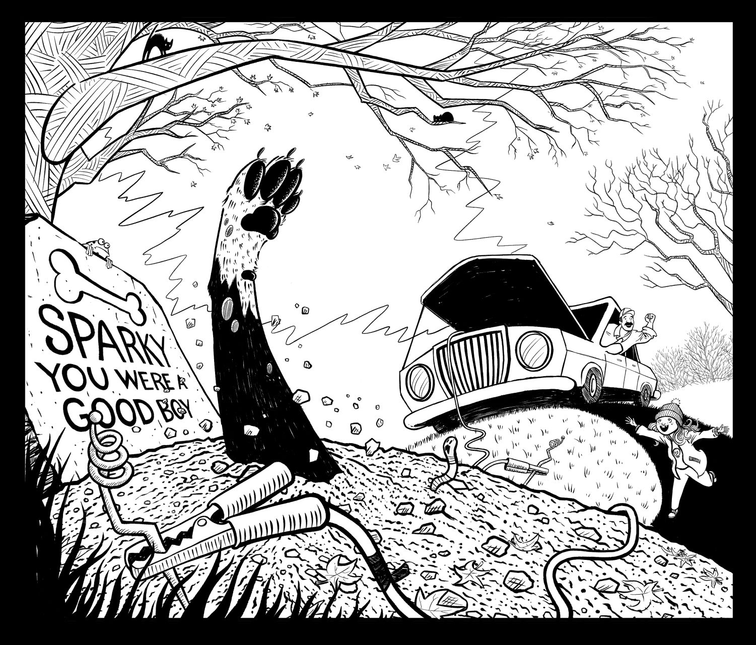
                    Still in progress. Can I have some feedback on the concept and composition? Everyone was really helpful in the sketch phase. Also, does this picture make sense outside of the context of the contest? I want to know if it is worth painting for a portfolio piece.

                    J 1 Reply Last reply Reply Quote 4
                    • Zachary Drenski
                      Zachary Drenski last edited by

                      @Heather-Boyd @Aaron_T @Elena-Marengoni @Jellen thanks so much for the previous feedback. I drew so many paws to get to this one. I hope it looks like a dog now.

                      @KathrynAdebayo thank you for commenting before, I refined the perspective a bit.

                      @JennyJones sorry about the frogs 😭

                      J 1 Reply Last reply Reply Quote 0
                      • RG Spaulding
                        RG Spaulding last edited by

                        @Zachary-Drenski , Very cool concept and art. I miss the frogs though! Having dad behind the wheel makes it more believable. Paw looks more like a dog's now.
                        Definitely a good portfolio piece. Can't wait to see finished.

                        RGSpaulding
                        https://rgspaulding.com/
                        https://twitter.com/rgspaulding

                        1 Reply Last reply Reply Quote 1
                        • J
                          JennyJones @Zachary Drenski last edited by

                          @Zachary-Drenski I did like the frogs...But I really love this composition much better! The dad running the car and girl running to the reanimated dog is much better story telling. I think all the changes are right on. The dog paw is certainly a dog paw and not that of a cat. It’s just a really good piece. I think it is understandable.

                          I would say paint it if it’s a piece that fits what you would like to be doing in the future.

                          1 Reply Last reply Reply Quote 1
                          • Zachary Drenski
                            Zachary Drenski last edited by

                            @JennyJones @RG-Spaulding Thank you for the feedback. In future illustrations, there will be frogs 😁

                            1 Reply Last reply Reply Quote 1
                            • J
                              Jellen @Zachary Drenski last edited by

                              @Zachary-Drenski It looks amazing! I think everything flows well, the textures are awesome, and the paw is definitely recognizable as dog now. 👍🏻👍🏻 Nice work!!

                              1 Reply Last reply Reply Quote 1
                              • chrisaakins
                                chrisaakins last edited by chrisaakins

                                @Zachary-Drenski the background trees look like a lightning bolt at first to me. You might want to gray scale them or texturize them slightly to differentiate them from the car. Just my two cents. You might also want to extend them slightly behind the car.

                                Chris Akins
                                www.chrisakinsart.com
                                www.instagram.com/chrisakinsart/

                                1 Reply Last reply Reply Quote 1
                                • Aaron_T
                                  Aaron_T last edited by

                                  This one is much stronger in my opinion...good job on the leg too. Much more clearly a dog’s foot. I like that the little girl isn’t the one starting the car too...even though it made for a fun composition I did wonder why she was driving. For what it’s worth, the far electrode in the ground may be a little too far off in the distance to be clear about what’s happening...now that the frogs are gone and they’re a little smaller it kind of disappears back there. Not sure if that’s an easy fix or not but it may help drive the point home.

                                  No pun intended.

                                  https://www.instagram.com/aaron_t/

                                  1 Reply Last reply Reply Quote 1
                                  • Zachary Drenski
                                    Zachary Drenski last edited by

                                    @Aaron_T I also thought the electrode thing was too small and was getting lost but for the moment, I’m leaving it as it.

                                    1 Reply Last reply Reply Quote 0
                                    • Zachary Drenski
                                      Zachary Drenski last edited by

                                      Which one should I post to the contest?

                                      01C561F8-5F5E-48BE-8076-C6ECFECA62B3.jpeg
                                      CF032146-4D9E-4B96-AE25-0AEA34B6506A.jpeg

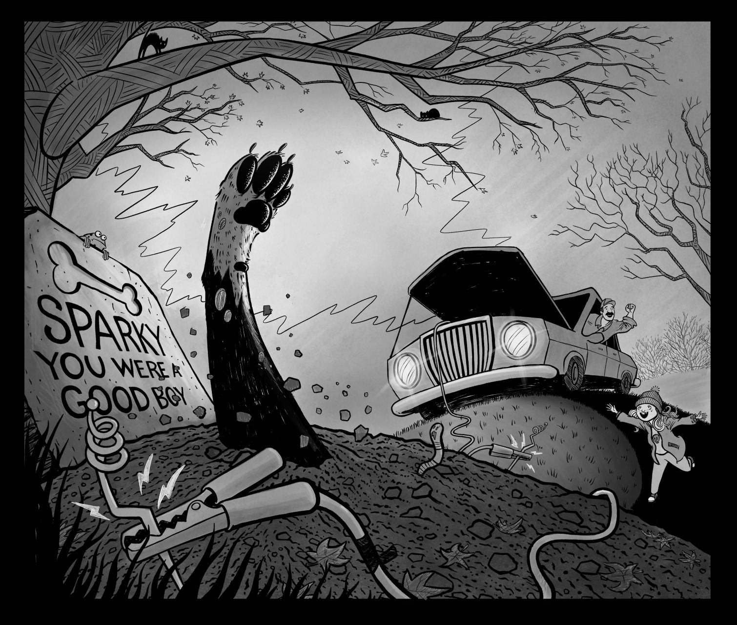
                                      Finished not perfict!

                                      1 Reply Last reply Reply Quote 0
                                      • Aaron_T
                                        Aaron_T last edited by

                                        Love the addition of the worm! I think the black and white one is stronger...I get that you want to highlight the paw in the foreground but feel like the ink wash doesn’t help draw attention to the foreground as much as it hides some of your great details.

                                        https://www.instagram.com/aaron_t/

                                        1 Reply Last reply Reply Quote 1
                                        • First post
                                          Last post