Accountability: using Lee White’s 6-step process to create a Christmas card
-
So I never got to 50 thumbnails, but I learned something trying. The stopping point with every thumbnail was difficulty constructing the shape of the interior using different points of view. An insightful comment on IG by @neschof prompted me to step back and re-evaluate, just as I was about ready to throw in the towel and go back to my character-only format. She talked about using Lee’s process to improve a piece more within my comfort zone. When she mentioned “baby steps”, I had my aha! moment. In a previous career, I helped autistic children learn by breaking tasks into manageable steps and using methods that played to their strengths and set them up for success. (I think that’s one reason I find @Lee-White’s systematic approach so appealing).
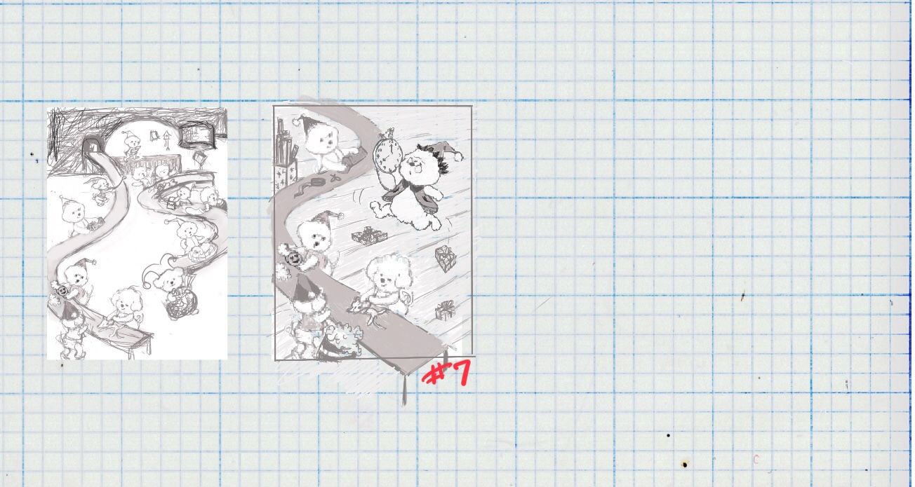
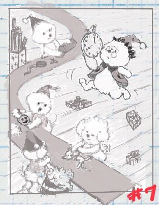
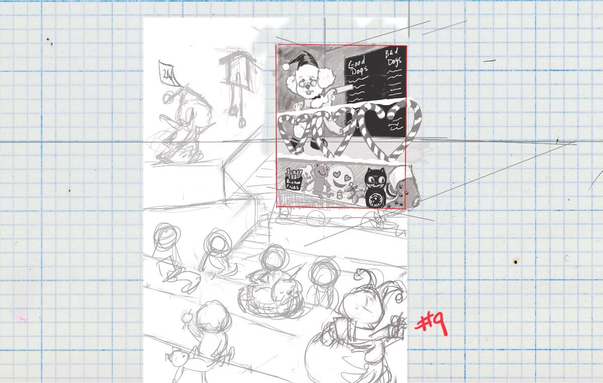
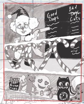
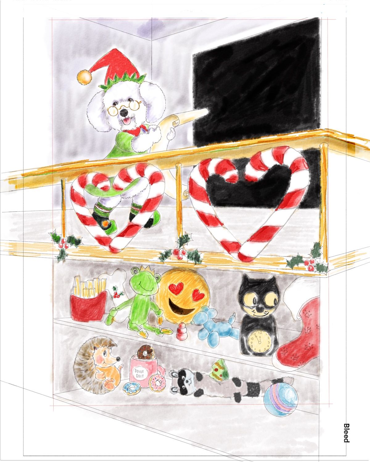
I chose a subject that plays too heavily to my weaknesses (perspective and composition). So I decided to think about how I could set myself up to succeed in working on these skills. I went through my thumbnails, took my proportional 5x7 thumbnail frame and looked for “spots” that would emphasize my strength (Bichon characters), but also require some perspective and composition. I tried “Step 3 Rough Sketches with Values” with 2 thumbnails, #7 and #9.
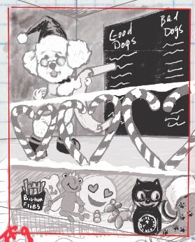
#7 was too frustrating because of the scene falling below the horizon line. #9 was more satisfying because it required me to work out the measurements of the candycane railing using perspective and I could incorporate some of Will’s “50 Things” concepts on the “shelf below the elf”.
So I am leaning toward developing #9. I welcome suggestions about the composition that don’t require a change in perspective (adding or subtracting elements, moving things around, values, etc.)
This is a S-L-O-W-ember piece

-
This is a super cute idea, and I love how you're sharing your thought process - really helpful to see how you're incorporating things you learned from different videos into the whole thing. I just want to say, however, that they're all good dogs. Just all of them. They're good. :smiling_face_with_open_mouth_smiling_eyes:
-
 you're right @Kat!
-
@Kat how’s this

-
@BichonBistro LOL love it!
-
It's great to hear your self reflection and progress. Knowing that perspective and backgrounds have been a challenge for you, I was very impressed with what you produced in your thumbnails. There where a lot of interesting and convincing scenes with different view points.
 It seems like a significant step toward growth.
Website: www.tessawrathall.com
Instagram: www.instagram.com/tessawrathall_art/
-
@TessaW Thanks! I am going to keep working on more complex thumbnails for this concept as I gain confidence with perspective (the Loomis reference you gave me awhile back is in my educational toolbox) and composition. In the meantime, I will back down to very simple scenes to learn perspective for points of view I want to achieve (below the horizon is high on my list). I used some of the photo references I picked out initially (and from your pinterest idea board) to work out horizon lines and vanishing points with draw-overs last week. I realized I need a lot more practice doing that before I can accurately construct my own scenes. You've always provided great resources, thanks so much!
-
@BichonBistro I love it, what a cute idea!
-
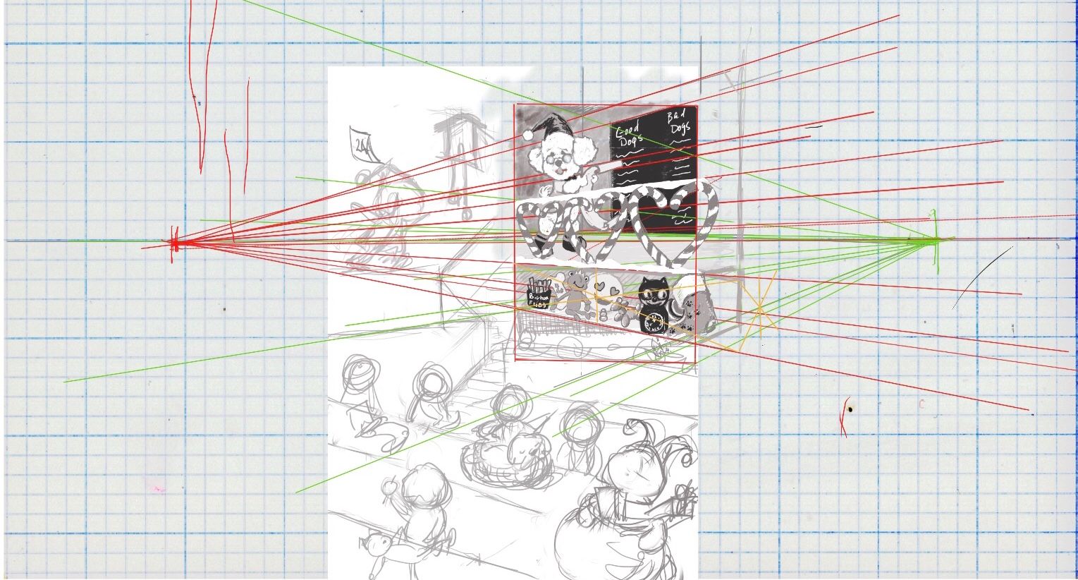
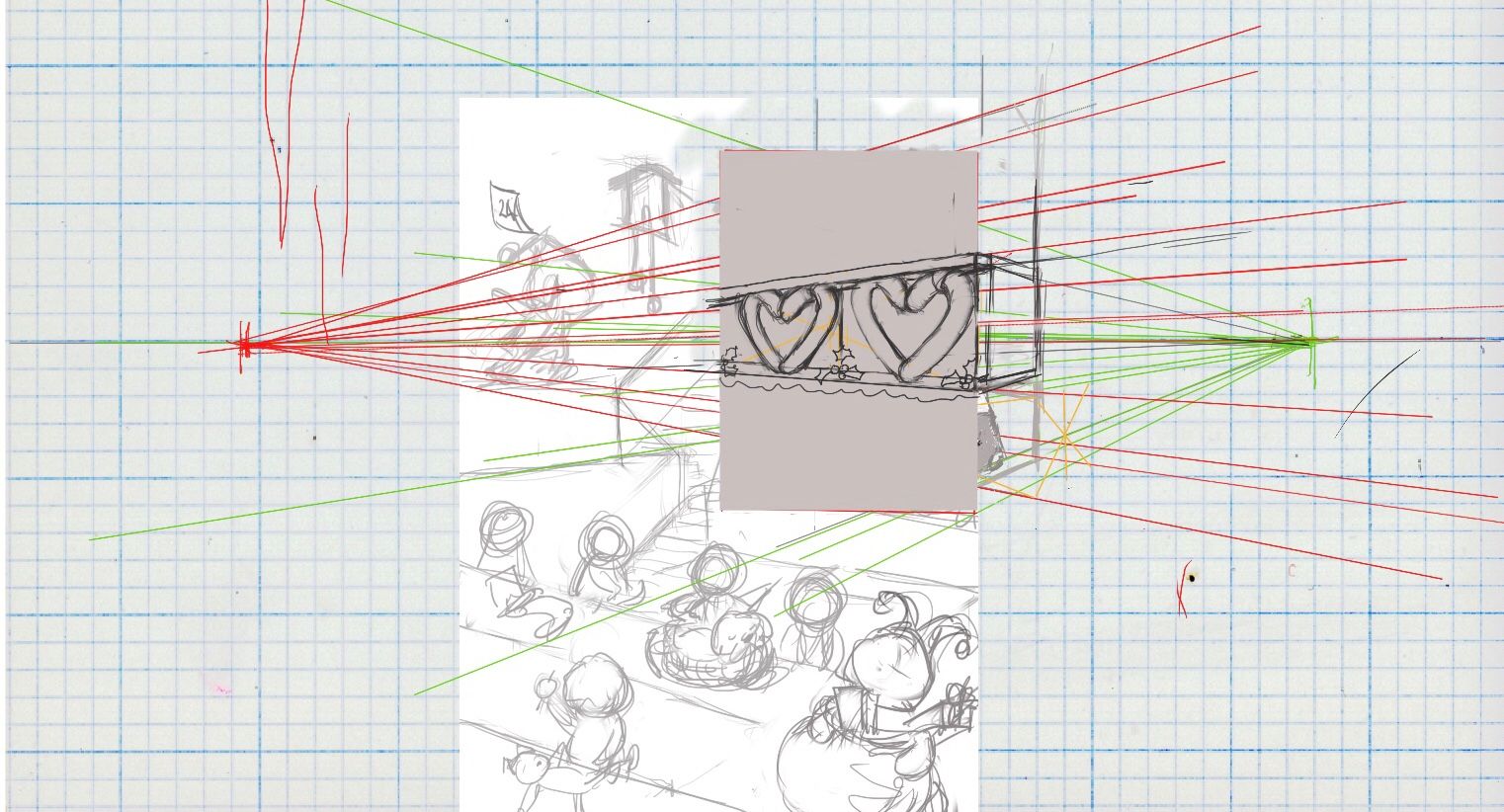
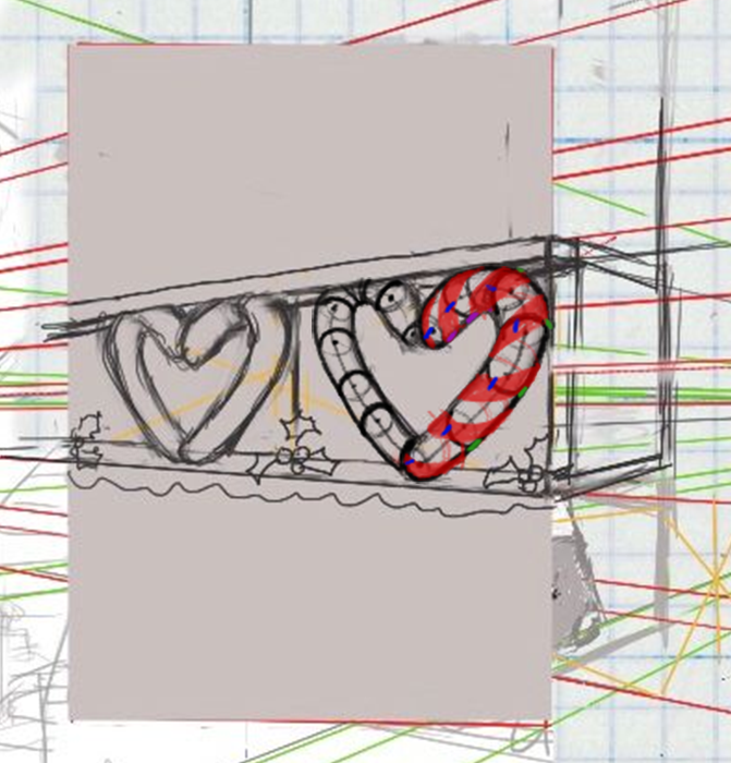
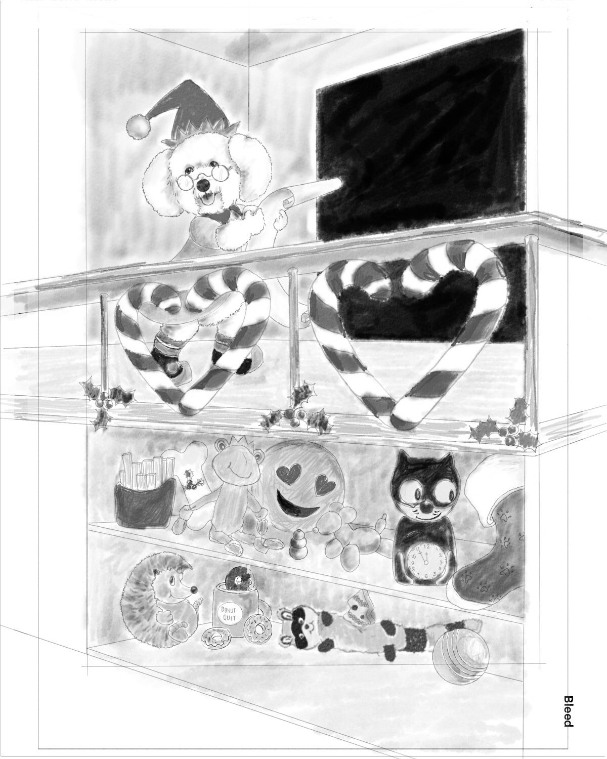
Still at rough thumbnails step 3, so glad I am not at the painting stage because I realize the candy cane railing is not in 3D perspective in the 1st sketch, so I am trying to work that out. 2nd drawing is after making the railing fit into a box.
One reason this is a good challenge for me is that the stripes on the candy canes will be horizontal at the horizon line, curve up when above the horizon line and curve down below the horizon line.
Questions:
- do I have the basic shapes now drawn to look more 3D in proper perspective?
- Is the best way to get stripes drawn correctly to draw ellipses within the candy canes?
- Are there perspective rules I am missing trying to make this railing look more realistic than the first thumb’s flat rendering?
Thanks!
-
-
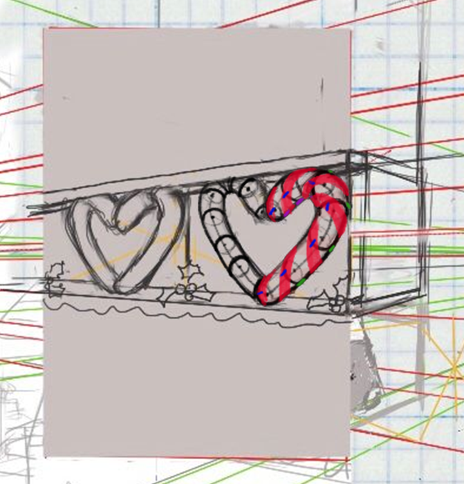
Yes, it does look more 3d in proper perspective.
-
Simple answer- just wing it until it looks good. Use reference, online or buy a candy cane, to help you. It's kind of a complicated thing to achieve correctly in perspective, and I think for this case, it just needs to look good and not be technically correct.
Complicated answer- This is a tricky drawing problem to explain easily. You have the form of the candy cane (a cylinder) coming toward us, and falling away from us at an angle, and you are introducing a spiraling ribbon wrapping around those forms, in either a clockwise or counterclockwise way, and you have to determine the steepness of the angle the spiral will wrap. Identifying the ellipses within the candy cane (cross sections) can certainly help visualize how the spirals might work. Or you could even think of the candy cane as being broken up into several equal cylinders. If you wrap the ribbon around the same way for each cylinder in perspective, that might be a good way to go. It can definitely be plotted out in perspective, but it could get confusing fast and take a lot of time. It could be a valuable exercise, but maybe not worth the trouble, which is why I recommend winging it.
I've tried to plot it out- wrapping one way and then the other, but I'm not sure I got it correct and I'm not convinced it looks any better than if you free handed it until it looked right.
Maybe someone with more perspective experience can chime in.
- It's looking good to me. Adding a bit of shading or linework in the final will go a long way in helping the perspective read.
Website: www.tessawrathall.com
Instagram: www.instagram.com/tessawrathall_art/
-
-
@TessaW said in Accountability: using Lee White’s 6-step process to create a Christmas card:
-
Yes, it does look more 3d in proper perspective.
-
Simple answer- just wing it until it looks good. Use reference, online or buy a candy cane, to help you. It's kind of a complicated thing to achieve correctly in perspective, and I think for this case, it just needs to look good and not be technically correct.
Complicated answer- This is a tricky drawing problem to explain easily. You have the form of the candy cane (a cylinder) coming toward us, and falling away from us at an angle, and you are introducing a spiraling ribbon wrapping around those forms, in either a clockwise or counterclockwise way, and you have to determine the steepness of the angle the spiral will wrap. Identifying the ellipses within the candy cane (cross sections) can certainly help visualize how the spirals might work. Or you could even think of the candy cane as being broken up into several equal cylinders. If you wrap the ribbon around the same way for each cylinder in perspective, that might be a good way to go. It can definitely be plotted out in perspective, but it could get confusing fast and take a lot of time. It could be a valuable exercise, but maybe not worth the trouble, which is why I recommend winging it.
I've tried to plot it out- wrapping one way and then the other, but I'm not sure I got it correct and I'm not convinced it looks any better than if you free handed it until it looked right.
Maybe someone with more perspective experience can chime in.
- It's looking good to me. Adding a bit of shading or linework in the final will go a long way in helping the perspective read.
This is so helpful! Your cylinders within the canes are great guides. I will probably end up winging it to save time, but I want to try to plot out in perspective at least one side of the closest one because I need to learn how to do this. I can work on it again tomorrow night. I did the same candy canes front on view a few years ago when I used Will & Jake’s “Posing Characters” video to try and bring more dimension to my dogs, but that’s my biggest problem: I always do front view without backgrounds because it’s easier
 Thank you so much for your guidance
 ️
️

-
-
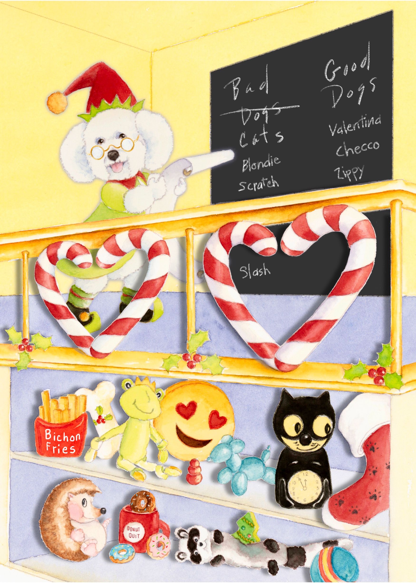
S-L-O-W-cember...value study. Trying to do candy cane ribbons in exact perspective taxed my brain, so I ended up winging it.
Next up is drawing on ipad with a no-pressure brush so that there is no variation in lines when printed, then color tests in watercolor.
-
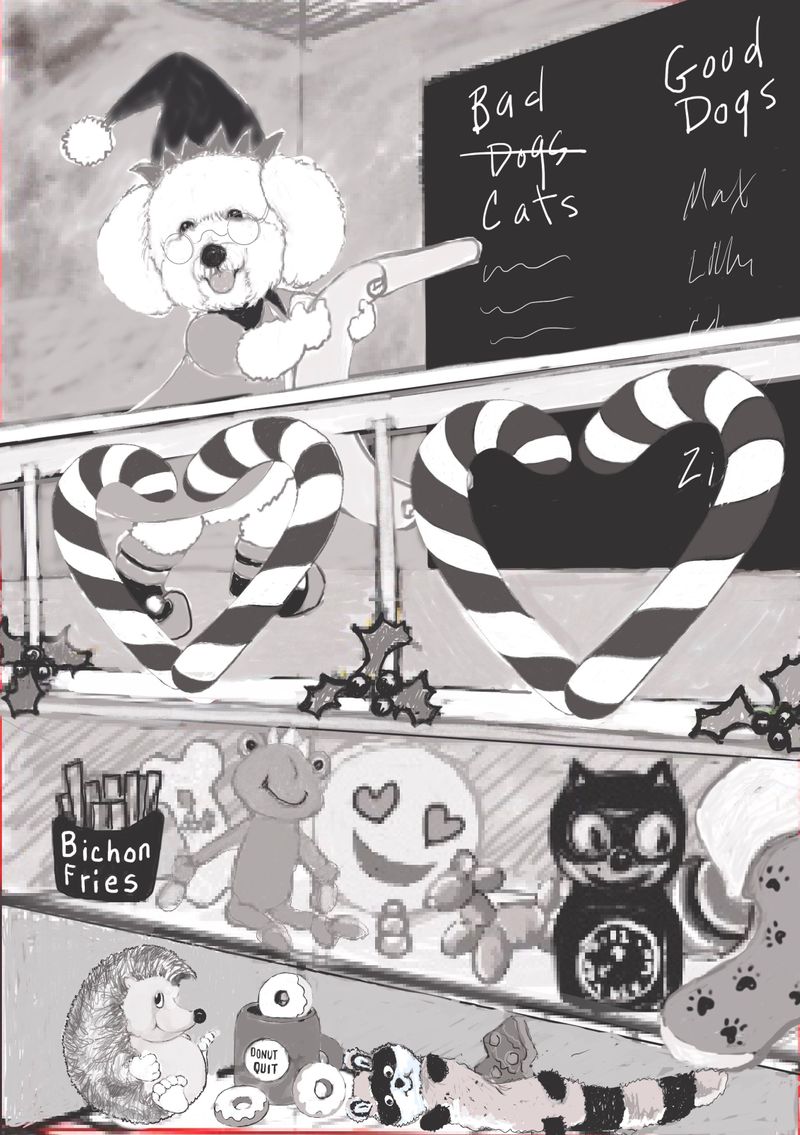
Staying Accountable: donut doggie toy is my “note to self”
I can’t quit and the pressure is on to finish because some loyal customers want this card.
Final drawing ready to print. Not much time for thoughtful color studies, but onward...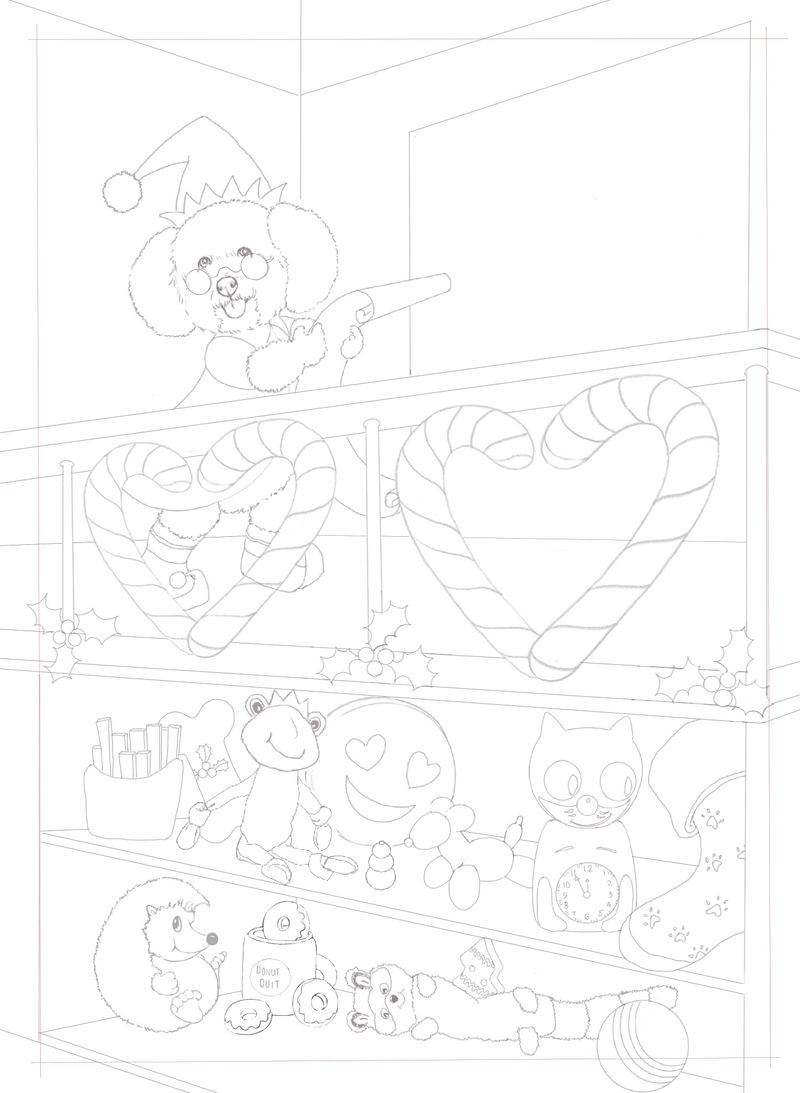
-
Digital color thumbnail, converted to greyscale doesn’t read well. Thought digital color studies would be quicker, but since I don’t know digital...
will try watercolor tomorrow study tomorrow.
-
This post is deleted! -
Slowvember becomes Slowcember
Had to finish for customers, but not finished for myself. Perspective and cast shadows still not right, but at least I got more of a background than my usual character-only approach.
Thanks to @peteolczyk @xin-li @chrisaakins @coley @meta @TessaW, @neschof and @kat for your feedback and of course @Lee-White for the process.
-
@BichonBistro it's looking great! The colours came out great and I love all the stuff on the shelves. You should be proud of this and I think your customers will really like it
")
You mentioned perspective and shadows. Without drawing over it I can't tell exactly but it seems like maybe you can see too much of the upper floor? It seems like that floor is close to eye level and so would be flatter. On the shadows, maybe just play around with different things digitally, if you can. I think, from the direction the light seems to be currently, then the things on the shelves would be mostly in shadow.
Nicola Schofield
Twitter: twitter.com/NSchofieldArt
Instagram: instagram.com/NicolaSchofieldArt/ -
@neschof that sounds right, which would throw off my bottom shelves, no matter how precise I was trying to be in figuring out perspective for those. I am going to do some rough shelf shadows in photoshop or procreate and post them here before I attempt them on the watercolor, but I think I will hold off on the re-draw of the perspective after the new perspective class comes out and I have a chance to go through that.
Thanks so much for your critique!
-
@BichonBistro yeah, the shelves look fine to me.