SLOWVEMBER IS HERE!!
-
@xin-li that sounds like a really great plan! I had been struggling to get things going on this myself but you've gone and made it much easier for me! I think I will follow the same steps that you described and plan on using watercolor also. As a watercolor newbie, can you suggest which SVS course might be the best one to start with? Also I must say that your Inktober submissions are wonderful! You've kept them so bright and lively even without using color. I'd also recommend that you have a look at James Yang's course on Portfolios. A good thing to keep in mind when creating new personal project pieces is how it would compliment your portfolio.
Eoin Cassidy
https://www.instagram.com/e1cassidy/ or @e1cassidy
www.eoincassidy.com -
@Eoin-Cassidy thanks. I will definitely take a look of James Yang's course. I am newbie with watercolor also. I found 3 watercolor classes on SVS and watched them all earlier this year, and they are very inspiring. I think all of them are beginner friendly, especially the last one by Vesper Stamper. Lee's loosening up in watercolor was the course made me really inspired to work with watercolor. Enjoy.
https://courses.svslearn.com/courses/loosening-up-in-watercolor
https://courses.svslearn.com/courses/luminous-lighting-in-mixed-media
https://courses.svslearn.com/courses/reinventing-your-watercolor-palette -
@Inge-Permentier Hi Inge, You are not an idiot at all! This seemingly simple assignment of creating one piece that you care about is actually very difficult! The problem is we have been led down the road of constant "quick" assignments and small projects. Like I said in the video, it's easy to spend a day on some art challenge like Murmay or something because it doesn't ask much of you as an artist.
Don't get me wrong, I love those challenges too, but at some point we have to slow down and ask ourselves "What do I really want to make". Some people may not have ever really considered that simple question before. So if you feel confused, it probably means we are asking questions that you need to figure out, but haven't yet. What should you be working on? Only you can answer that. You may not be perfect at drawing (none of us are!), but it's time to dive in and try to make something that you like that starts to build a portfolio.
So what happens if the end result isn't great? Well, that's ok too! Just do another one. Like I say in the Loosening up in Watercolor video: "The worst case scenario is that I messed up a perfectly good piece of watercolor paper". No one was hurt in my painting except for my ego! haha! So just paint another one and move on! That is how great work is made. It's a series of errors that all lead to getting good. Without the errors, there is nothing to judge yourself against. So dive in and figure out what kind of work you want to be creating and then go for it. : )
Good luck!
-Lee -
@Maureen All the things you noticed are great! Those can definitely be something to pay attention to. When I say "theme" I was more so referring to what they are painting. What kind of subject matter is inspiration using?
Now, one thing to know is that there may not be a common theme that is obvious. That is ok too. But it's important to at least look for it. I'm trying to get you guys to look at your inspiration from different angels. Subject matter, character design, media, format, etc. We need to figure out why we are attracted to certain work. That way we can integrate that one thing into our work without taking everything from the artists we are looking at. Some artists I just love their line work, but don't really like the finished art per se. Mobius would be an example of this. I am not a huge fan of his finished art. I've never been too much of a sci-fi guy. But I LOVE his line work on some pieces (but not all). I love Lizbeth zwergers backgrounds and monocromatic work, but not her color work.
I try to analyze each artist I like and see what it is that really pulls me in. So any of the things you noticed on your inspiration could be what draws you to that work. Or maybe it's something else? You need to look hard and see what it is. : )
SVS Faculty Instructor
www.leewhiteillustration.com -
Thank you, @Lee-White OK, now I think I get it. I liked looking at the artists you referenced so I could "see" what you are talking about. I appreciate the many approaches to communicating something -- being told about, being shown, trying something and getting critiqued, etc. -- and your willingness to go further to help us learn. Back to my research ...
-
@xin-li said in SLOWVEMBER IS HERE!!:
@BichonBistro thank you so much for the references. Hmmm, I have to read up a bit more, I can barely follow your reference about "transparent watercolors". I have a box of Sennelier watercolor (12 colors) for years. I use it occassionally. They are suppose to be artist grade color.
Vesper Stamper has a video tutorial on SVSlearn, which she explains how to use 5 color to paint everyting in watercolor. I thought I might give a try since it is not a very bigI think you will find that the 5 colors Vesper Stamper uses are transparent colors, or at least semi-transparent, which is why the limited palette works so well to create colors that are not muddy. I forget the brand she used, but you can google the brand and color name and will get links to descriptions of the color’s transparency, how lightfast it is and the color number. The color number will show you if you already have the sennelier brand of the yellow she uses, for example.
When I googled “sennelier watercolor yellow”, I got a link that looks like it will tell you which colors in your sennelier box are transparent, semi-opaque and opaque (she uses a square box to identify transparent, a black square for opaque and a black/white square for semi-opaque). Here is the link:
https://janeblundellart.blogspot.com/2017/06/sennelier-watercolours.html
You will see that Sennelier’s Lemon Yellow(PY3) is transparent, Primary Yellow(PY74) is semi-transparent and Cadmium Lemon Yellow(PY35) is opaque.It might turn out that you already have the colors used in Vesper Stamper’s video if you check your Sennelier color numbers against the brand and color names she uses

-
"the best you can do right now" I'm sold!... I am taking part in this challenge.
-
@BichonBistro wow. The info of transparent color is big for me. Thank you so much to take the time explaining this. I will definitely look closely on what I have before purchasing more art supplies.
-
Just a side comment in support of @Lee-White Slowvember concept: After Slowvember of 2017, I started using Lee's process in a number of illustrations I was doing with animal characters and for each one I would spend the first week just reading about the animal's habitat and behavior, doing anatomical studies from skeletons, and even building clay and wire models before I even began to think about compositions. Most of what I did never ended up in the final painting but I learned a lot about animal anatomy etc. during that research phase that came into play in later paintings that I did. I tend to be a slow painter anyway so I have always appreciated Slowvember!
-
@xin-li you always want to use a transparent yellow if possible. Especially when mixing dark tones. If you use an opaque yellow, it will lighten the mix when you are neutralizing a dark violet color. I use Quinacridone gold which is a a wonderful warm transparent yellow. Or indian yellow if that isn't around.
SVS Faculty Instructor
www.leewhiteillustration.com -
@Lee-White @xin-li Quinacridone Gold is a good example of how pigments with the same name can vary considerably across brands. Daniel Smith (and Winsor-Newton) had a single transparent pigment Quinacridone Gold (P049) until it was discontinued. I still have a tube and it’s my favorite for warm, transparent yellows and mixing warm greens.
Daniel Smith replaced it with a combination of a transparent orange (Quinacridone Orange, PO48) and transparent yellow (Nickel Azo Yellow, PY150), which I haven’t tried, but you will see watercolor artists complaining that they don’t like it as much as the original.Winsor-Newton adds 2 transparent pigments to the Nickel Azo Yellow to make their current Quinacridone Gold, both in the red-violet family (Quinacridone Maroon, PR206 and Quinacridone Violet, PV19). I would guess that this brand is going to look duller with the addition of colors that border on being a complement to yellow.
Schminke’s adds a rust-color (Red Iron Oxide, PR101) that can be less transparent to the Nickel Azo Yellow.
Sennelier’s Quinacridone Gold is a cross between Winsor-Newton’s and Schminke’s, adding to the Nickel Azo Yellow the rust (Red Iron Oxide, PR101) and a red-violet (PR206, Quinacridone Violet).
You will find the pigment numbers in very small print on the side of tube watercolors (not sure if pan watercolors include that information). It can be very helpful to reference these numbers in getting to know the characteristics of your watercolors rather than doing so through trial and error. Not just transparency, but whether or not it’s a staining pigment, lightfastness, how granular it is, etc. This knowledge is practical: for example, if you think you want to lift color from an area, don’t use a staining pigment, but if you want to mix a rich intense black, use staining colors like Perylene Maroon (PR179) and Phthalo Green (PG7).
Knowing the formulations can also save you money when you find out that Daniel Smith’s “Opera Pink” that’s calling you is PR122, the same number of the Winsor-Newton tube of Quinacridone Magenta already in your collection of red watercolors

-
@BichonBistro and @Lee-White thank you so much for the info. I did not realize there is a science around the watercolor pigment :-). Definitely worth taking time to understand it.
-
@xin-li I try to keep a very simple palette. I found one that works for 99% of the time for me which is:
Quinacridone yellow
Hansa Yellow
Cadmium Red
Permanent Alizren Crimson
Ultramarine Blue
Indigo BlueThen a few earth tones like Burnt Sienna, Yellow Ochre,
And a white Gouache for correcting mistakes, adding some highlights, etc.I'll add in something every now and then if really need a special color, but that simple pallette covers me most of the time and I rarely leave it. Most of the time I'm only using like 3-4 paints within this palette and don't use them all.
-
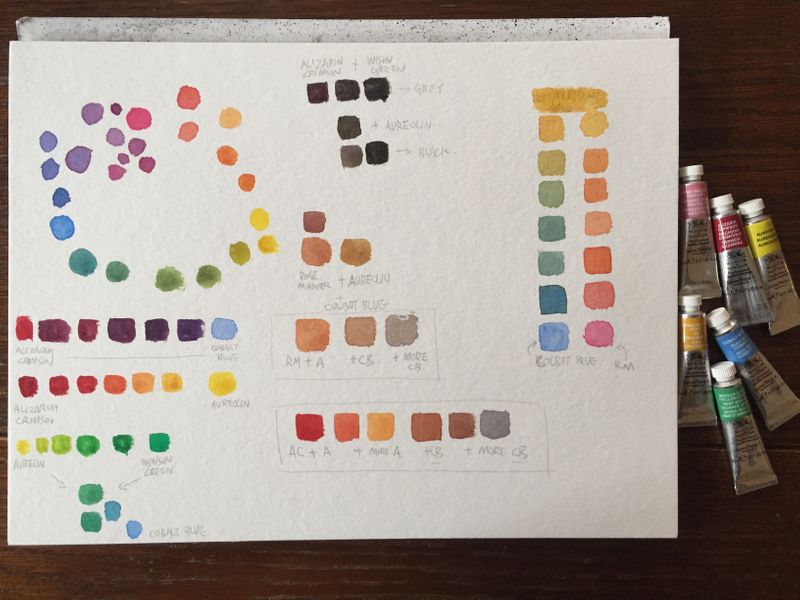
Here is my slowvember kickstart:
I am speechless.
This is magic for me.
After following @Lee-White, @BichonBistro 's recommendation + advices and the svs tutorial on mixing water color with limited palette, I got these colors I never knew it was possible to do with watercolor out of 6 tubes.
Quinacridone yellow is so beautiful.
-
@xin-li looks great! Isn’t it fun? You’ve mixed your own raw sienna
and your blacks and greys will be much richer than those from a tube. Your painting is going to be beautiful 
-
@Lee-White I am at the art questions you've posted, Lee. Maybe it's a language issue, but could you please specify what's meant with this?: "Provide 3 examples of concepts that showcase this theme"
Is a concept something closed like a movie, or book, or channel ... Or can it be sth. like a global movement, a group of interest etc. ...? Could you maybe also give some examples of themes? I am not sure if I got that right ... Thank you for clarifying! -
@Meta The theme I was referring to is the subject matter. For example, are most of the images showing big landscapes and dramatic lighting? Maybe most of the ones you picked are just showing fantasy elements or characters? Really it's just looking for patterns within the subject matter in the airtists that you picked.
Hope that helps some. : )
SVS Faculty Instructor
www.leewhiteillustration.com -
@Lee-White Okay, than it is much simpler then I thought
") Thank you!
Thank you! -
I’m also taking part! ... hit a bit of a road block with it last night which caused serious frustration but will battle through!
-
@Lee-White this step has helped me in my art journey so much! I’ve actually identified the pattern in the work I like and that is also what I want to be creating! So thanks for this project ... really enjoying it! ... even though I find it hard haha