Discovering our style - Who's in?
-
@Meta on here!
-
Was just wondering, because @Inge-Permentier opened one for hers
") A minute, pleeease!
A minute, pleeease! -
Neat I'm totally working on this myself. I work as a designer/illustrator for a large online printer making templates from business cards to greeting cards and everything in between; requiring me to be well versed in a million different styles bouncing around nearly daily. 12 years of this has caused me to have no idea what MY voice and style is. I've gone through the steps of creating a dream portfolio, I'm working on analyzing the portfolio and would love everyones opinions on commonalities they see in the work, or if you agree/disagree with what I find.
What I've worked out:
Folk Art / Sci - Fi (sometimes both at once!)
Abstract or minimal backgrounds
Analogous colors
A lot of detail
Texture - usually with lines
Monoline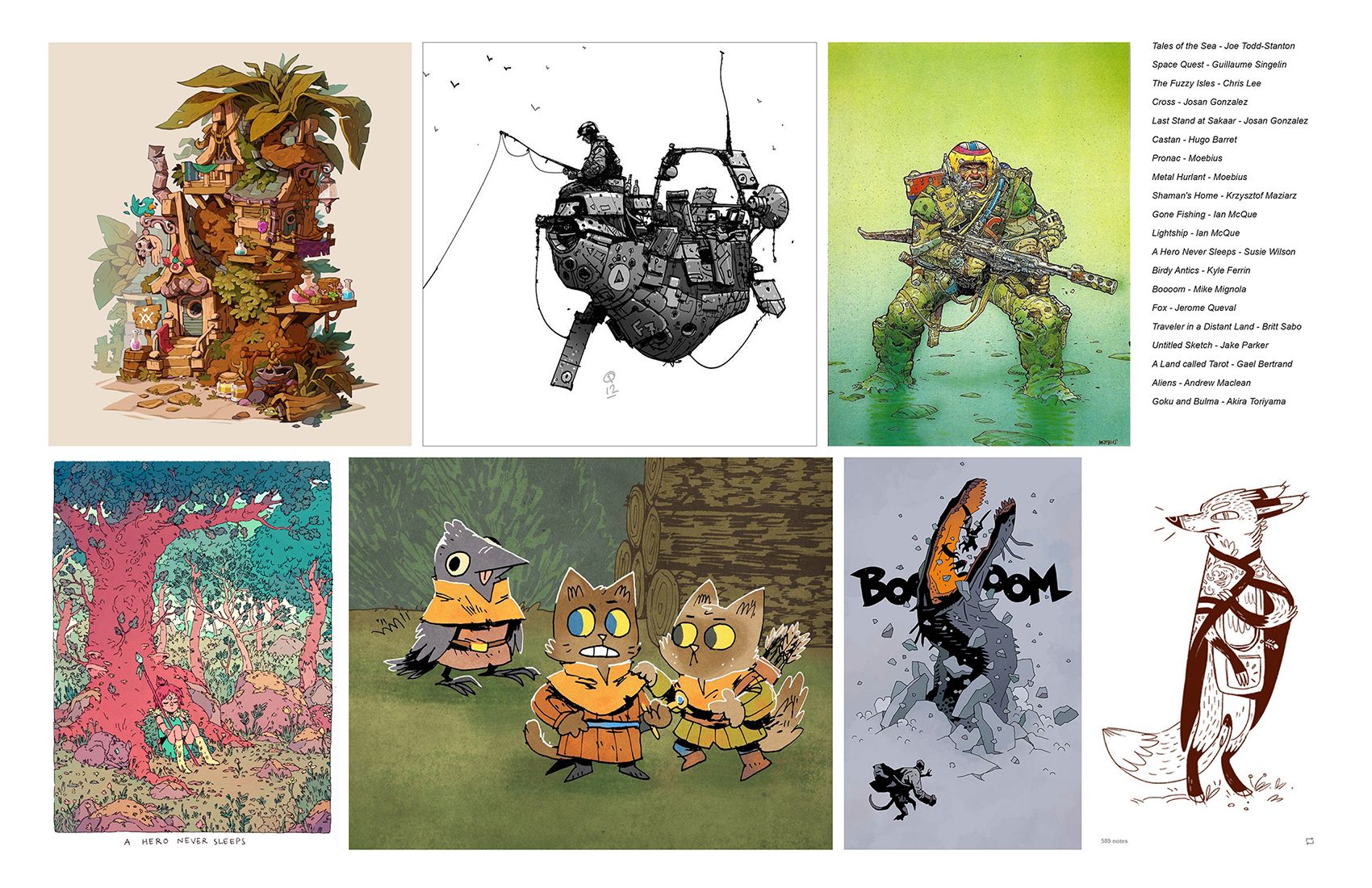
I'm sure there are more things I'm not seeing. I'll reply with some pieces of my own that I like in a few days that hit some of these commonalities. This has already been so helpful in helping to discover my voice.
-
@jakecrowe also say solid block colours (with that detail of line on top - like you said). Unless that’s what you mean by monoline, but I’m not sure what that means so that’s why I ask.
Instagram: www.instagram.com/heatherboyd.illustration/
Website: https://heatherboydillustration.ca
Shop: https://www.inprnt.com/search/products?q=HeatherBoydIllustration
Ko-Fi: https://ko-fi.com/heatherboydillustrationBe blessed,
-
@jakecrowe You already pointed out a lot. I would as well say you like secondary colors and their close neighbours. And, as Heather noticed, lineart filled up with color blocks. Very graphic, not painting-style.
-
@Heather-Boyd @Meta yes I totally see that thank you. By mono line I mean that most of the pieces that have line work don’t tend to vary the line weight very much.
-
Don't know why this is something I'm actively apprehensive about doing. So i'd better do it.
I'm gonna join in with you guys and give some feedback tomorrow. It'll be a good start to slowvember
-
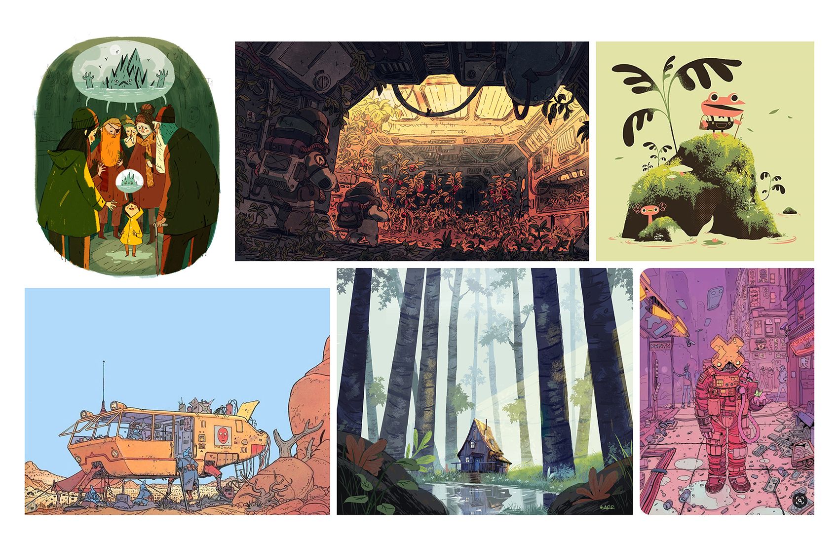
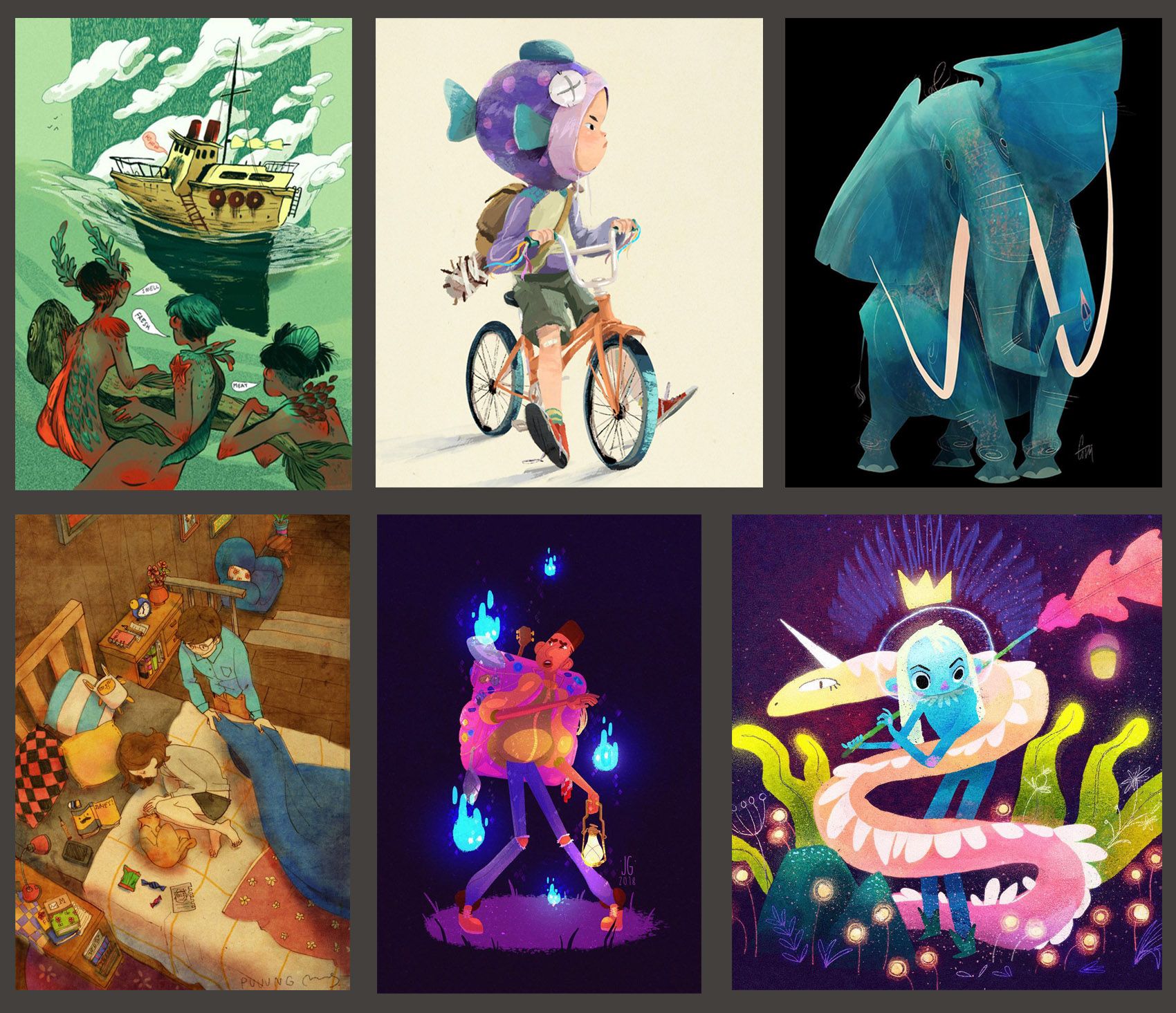
Here's my first Dream Portfolio. (There will be a second one with a rather graphic style due to my next goals.) I've sorted it already a bit.
And I see a lot of green landscape with vibrant lighting. Or strong light/dark composition. Rather realistic approach to landscape and human figure. Lot of paint and line.
Ah, and I like many things from disney people!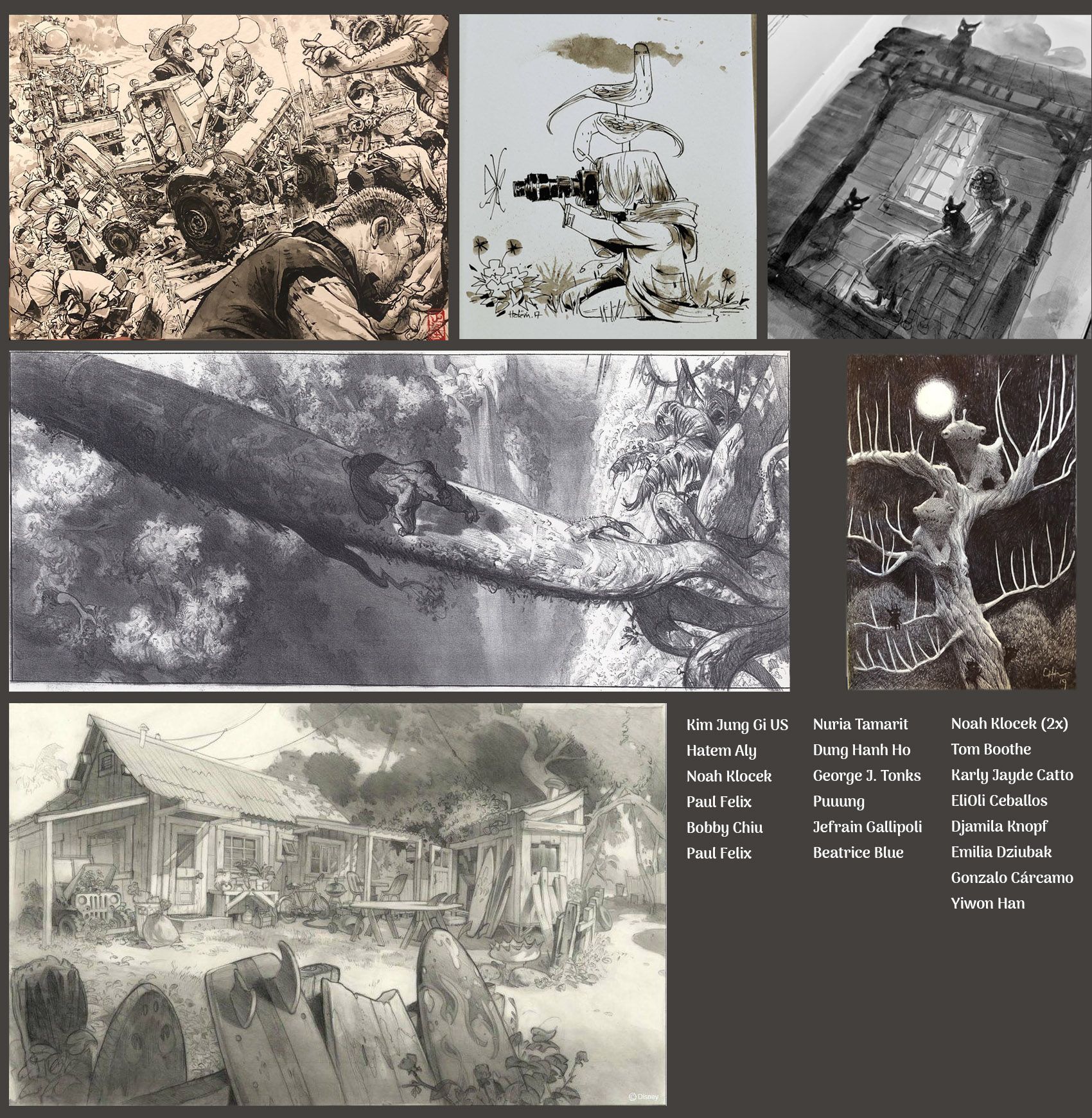
-
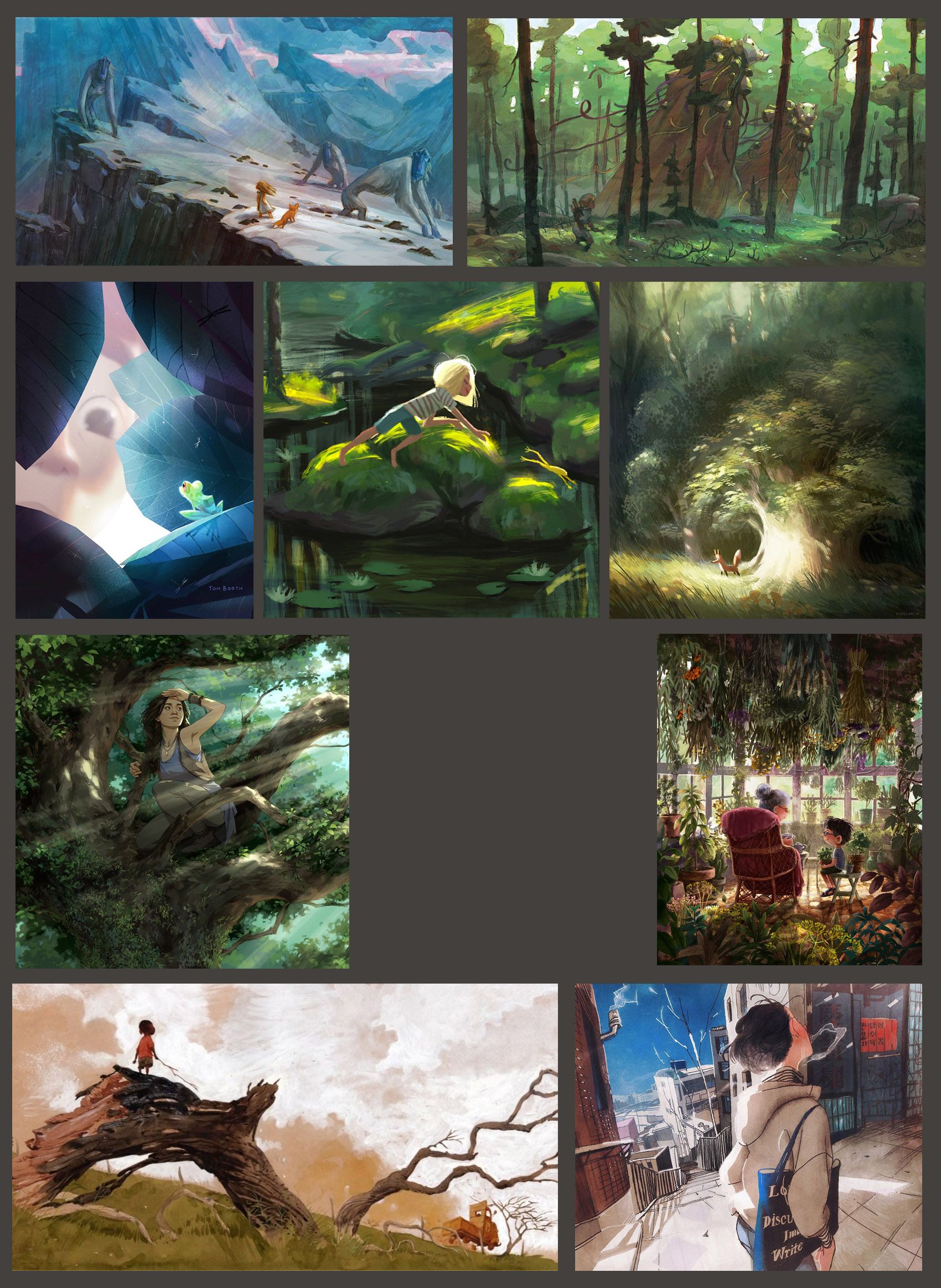
@Meta I notice a lot of strong compositional lines, angular and vertical, being main focus like the tree bridge across, and the angles in characters like the elephant.
-
@Meta I don’t know if I have the language for all of it, but I’m seeing a lot of dramatic lighting.
Also, as far as subject matter goes there’s plant matter in almost every piece! Maybe that’s all coincidence.
-
@jakecrowe I think it isn't! :face_with_stuck-out_tongue_winking_eye: I like that stuff.
-
@Meta Sorry XD i wasn't trying to take away from your thread i just thought this was a thread where people could specify whether they joined or not. That's why i opened a separate one.
instagram: https://www.instagram.com/permentier.inge/
-
@Heather-Boyd @Meta
Me too! Always.
-
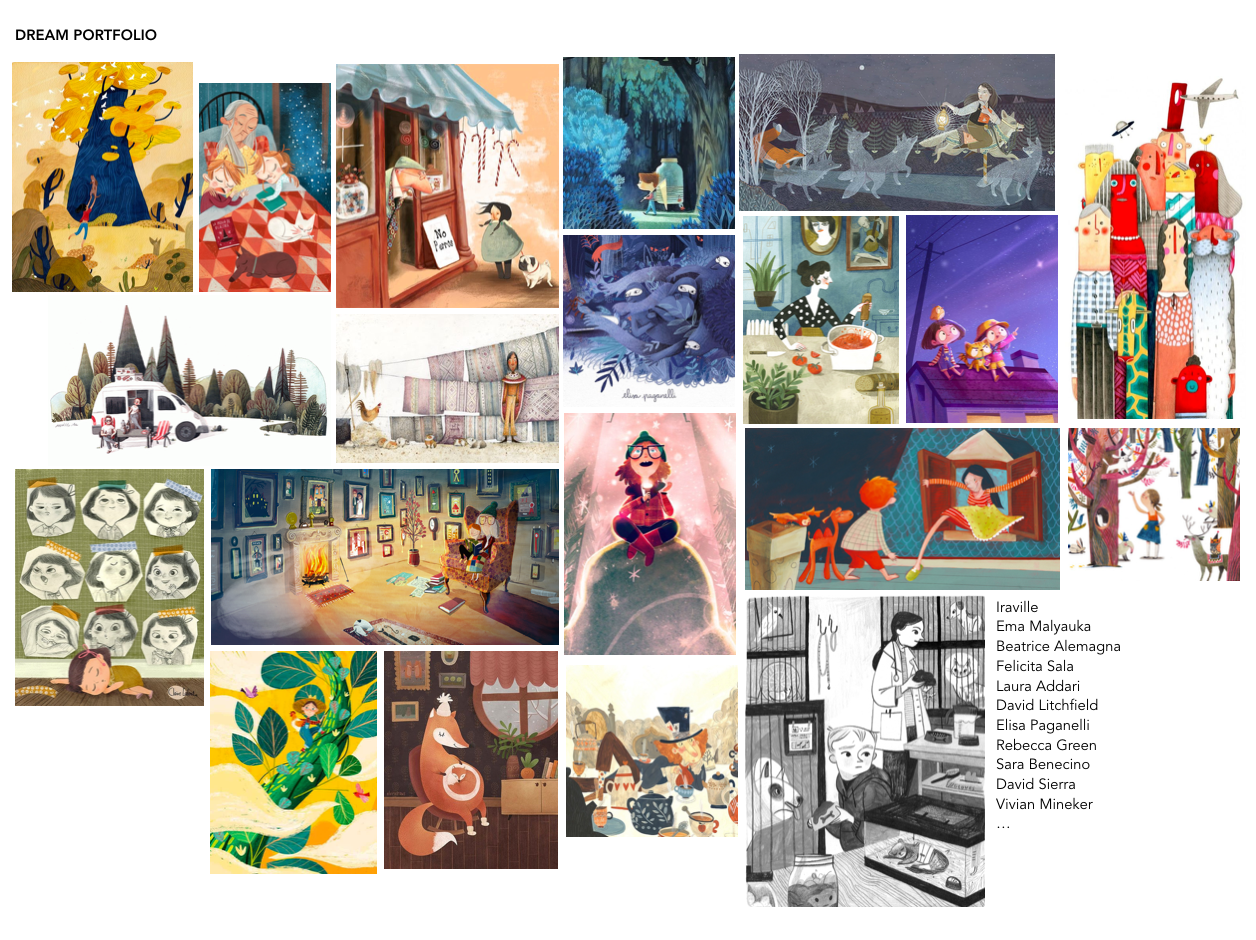
@jakecrowe, Along with the texture you mentioned, I'm also seeing a lot of brown & green, and earthy tones. So I'd say a rugged / nature kind of feel.
You mentioned "Abstract or minimal backgrounds", and most of these have a very simple, centered composition.
-
@Meta, I agree with the other comments. Something else I noticed is the compositions move the eye all around the page--very quickly for me. Some have a lot of details, while others achieve this effect with the strong lines and contrast in lighting. Also, most of the characters are very engaged and alert. I'm seeing a lot of depth in most of the images.
-
@Inge-Permentier no worries!
-
@jakecrowe A lot of this does have an analogous feel, but I see some that lean toward complementary as well. The Hellboy for example is orange on blue. The first thought that came to my head when I saw this grouping of paintings was pyschedelic comic art. I think it is the pinks, purples, teal greens, and the heavy emphasis on linework as well as the subject matter that makes it feel like it fits that genre.
It seems like you are drawn to a certain kind of moment and mood. I would call it quiet action. Sometimes the content is quiet but the rendering gives it a little boost, like in the hero never sleeps image. Quiet scene, loud colors.
Other times the content is action packed, but the rendering tones it down. The Hellboy one for example, a monster is busting the ground open with a boooooom but that blue calms it down (for me). I don't know if any of that makes sense but I'm just trying to throw some ideas at you to explore.
Last thing, you seem to be very attracted to excellent draftsmanship. These all have realistic perspective and the human characters are all drawn with realistic proportions.
-
@Meta A lot of green and blue. It looks like you are really influenced by animation concept art. Your dream portfolio feels painterly, yet happy at home looking digital.
I don't have much to add other than what other you said. I would say these images come from people who can draw and paint really well and who love and are inspired by the natural world.
-
@Inge-Permentier It is perfectly fine to start your own thread for yours. I plan to do the same this week once I get everything together.
I love seeing everyone's dream portfolio. I noticed on the ones here and others I have seen most of the time when you look at them small you can see a color pattern. But the style and technique vary. Has anyone else noticed that? So then the cross roads are with what style you want to work towards?
I have also found that the dream portfolio and what i feel are my 20 best are SO different. I have lots of work to do.
-
Here's my dream portfolio! Nature and everyday life scenes are a red thread for me. Also a little bit of magic here and there.
Other key features for me are: soft shapes, 'unexpected' proportions (of body shapes or landscape elements), asymmetric and dynamic compositions varied (and quite-but-not-too-much accurate) use of perspective, bright (but not overly saturated) colors, contrast, presence of primary colors (although I love black and white too), analog (or analog-looking) media), with a particular interest for gouache, watercolor and pencils, presence of patterns and textures (I LOVE patterns and textures), generally no outline (except for black and white).
I am loving this exercise, it was a good confirmation of things that I consciously like in other people's illustrations, but also a great source of inspiration. I will try to set aside some time to study these visual techniques and create small swatches or samples of the different traits.
Instagram: https://www.instagram.com/elena.marengoni/