Society of Visual Storytelling

    SVSLearn Forums

    • Register
    • Login
    • Search
    • Recent
    • Tags
    • Popular
    • Users
    • Groups
    • Search

    Slowvember progress.

    Slowvember
    17
    72
    7005
    Loading More Posts
    • Oldest to Newest
    • Newest to Oldest
    • Most Votes
    Reply
    • Reply as topic
    Log in to reply
    This topic has been deleted. Only users with topic management privileges can see it.
    • TessaW
      TessaW @braden H last edited by

      @Braden-Hallett Lol, well what you present here seems very organized and delineated. I guess behind the scenes might be a different story? 🙃 Either way, your presentation is therapeutic for my scattered brain. ðŸĪŠ

      Website: www.tessawrathall.com

      Instagram: www.instagram.com/tessawrathall_art/

      1 Reply Last reply Reply Quote 2
      • braden H
        braden H last edited by

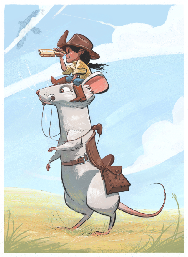
        Simple 5 value breakdown and first colour test. I really, REALLY like it.

        e8c7d38c-f05e-41fa-a371-549b33ee504a-image.png

        xin li 1 Reply Last reply Reply Quote 1
        • xin li
          xin li @braden H last edited by

          @Braden-Hallett I love this color. beautiful early autumn feel.

          Web: www.lixin.no
          IG: www.instagram.com/lixin.illustration/

          1 Reply Last reply Reply Quote 1
          • xin li
            xin li @braden H last edited by

            @Braden-Hallett I looked at your color study closely on this one. Did you paint with color straight on top of the sketched line work? (I mean this does not look at a color layer, or multiply layer on top of a value sketch).

            I struggled to get a way to do color study I liked. Layer properties such as (multiply or color) easily makes the color look muddy. My current method is to use hue/saturation adjustment to give my value sketch a tone, and I paint on top of it with a normal layer. I am curious on what is your process.

            Web: www.lixin.no
            IG: www.instagram.com/lixin.illustration/

            braden H 2 Replies Last reply Reply Quote 1
            • MichaelaH
              MichaelaH @braden H last edited by

              @Braden-Hallett Wow I love this one so much, great illustration for autumn season.

              https://www.instagram.com/michaelaheimlich/
              https://www.heimlich-illustration.de/

              braden H 1 Reply Last reply Reply Quote 1
              • braden H
                braden H @xin li last edited by

                @xin-li I have a really hard time doing colour studies consistently that I like, too. It's infuriating 🙂

                What you see here is a sketch layer set to multiply and a value layer underneath. Overtop of that is a colorize layer (I'm using painter, but I THINK that in photoshop it's a color layer.) A colorize layer only alters hue and saturation, but doesn't change the value.

                xin li 1 Reply Last reply Reply Quote 0
                • braden H
                  braden H @MichaelaH last edited by

                  @MichaelaH I friggin' love autumn 🙂

                  1 Reply Last reply Reply Quote 2
                  • braden H
                    braden H @xin li last edited by

                    @xin-li Sometimes I just paint overtop with whatever colour i want, too 🙂 This one though I like as is.

                    1 Reply Last reply Reply Quote 0
                    • xin li
                      xin li @braden H last edited by

                      @Braden-Hallett thanks for the explaintion. Hmm. Your colorize layer does not look muddy or overly saturated. I do that as well, I often having a hard time with colorizing, because it feels a bit random. I eventually got something I satisfied, but it feels like a guessing game for me. I think I will just do more of paint overtop with whatever color :-).
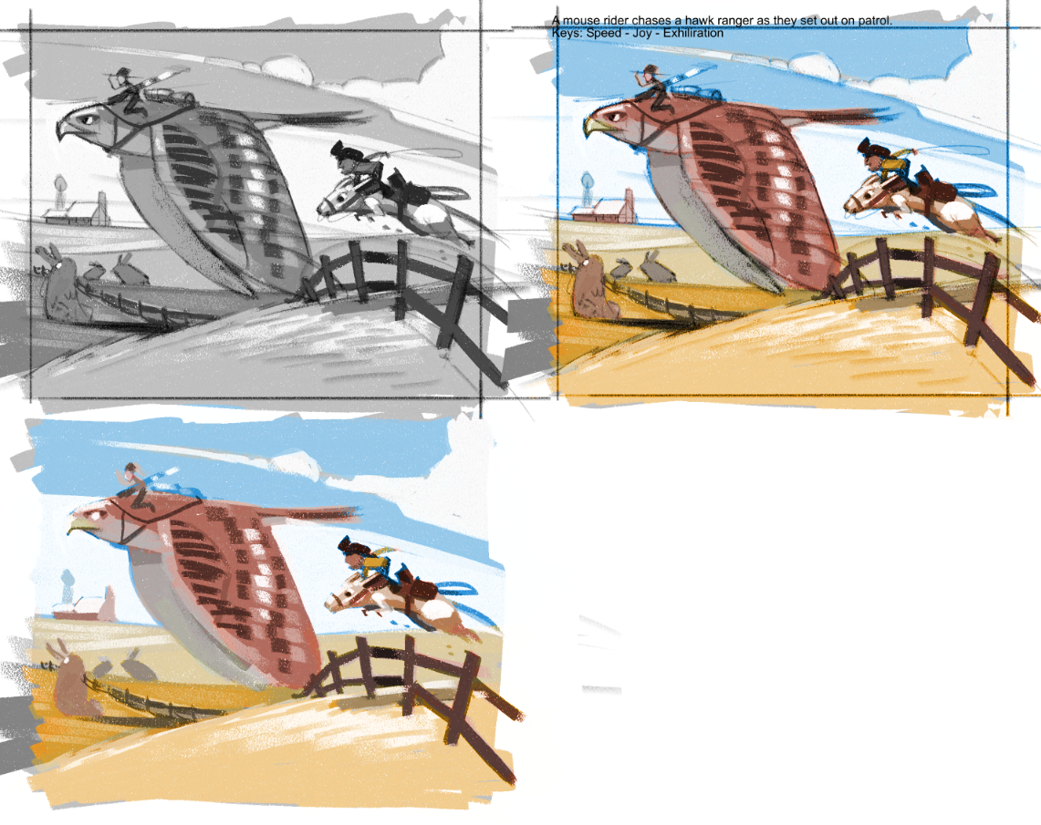
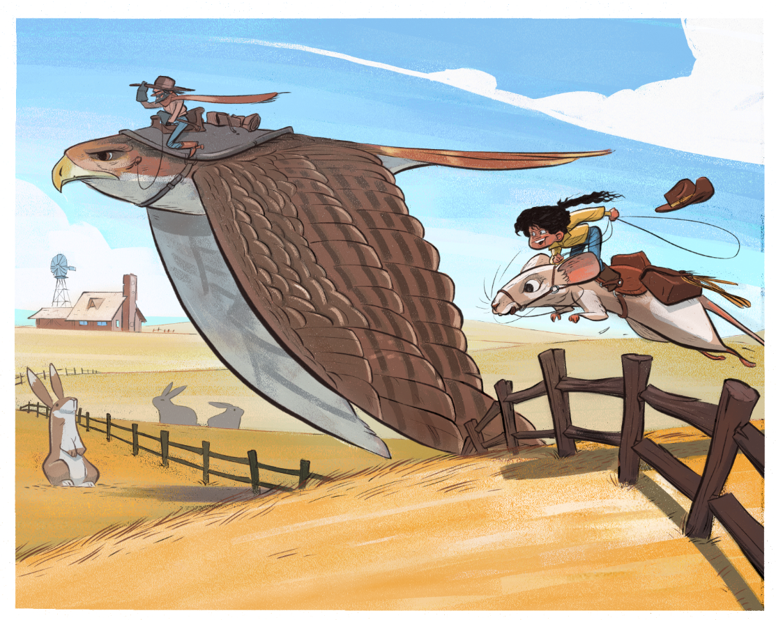
                      Web: www.lixin.no
                      IG: www.instagram.com/lixin.illustration/

                      1 Reply Last reply Reply Quote 1
                      • braden H
                        braden H last edited by

                        Sketch!

                        I think I redrew that friggin' mouse rider at least 12 times.

                        0e4facfd-9d56-4f0a-bcb9-20fe0df659fb-image.png

                        1 Reply Last reply Reply Quote 2
                        • braden H
                          braden H last edited by

                          Hyah!

                          debdbcb5-1870-46a6-a7cf-174b83bb9ca9-image.png

                          1 Reply Last reply Reply Quote 1
                          • J
                            jdubz last edited by jdubz

                            Being 100% honest, I like the silhouette of the mouse rider's head/hat area much better that you had in the color value test. Just looking at them side by side the shapes looks a lot stronger at first glance.

                            Trying to come up with a technical reason for that, maybe the hat is taking my eye too far to the right and out of the image?

                            sample.jpg

                            Curious how others feel about it or if it was just me.

                            Josh White
                            https://www.instagram.com/joshwhiteillustration/

                            braden H 1 Reply Last reply Reply Quote 1
                            • braden H
                              braden H @jdubz last edited by

                              @jdubz I absolutely agree! I much prefer the original silhouette.

                              I spent a good hour drawing and redrawing and redrawing and couldn't get it to look right, so I decided to move forward with an option that worked 'okay'.

                              I'm gonna try redrawing the mouserider so that it more closely follows the original sihl, though.

                              1 Reply Last reply Reply Quote 0
                              • braden H
                                braden H last edited by

                                Redid an idea and used the colours I'm planning on using for the slowvember piece as well as the process that I've worked out.

                                42ec71b3-58ec-4696-94f2-c168250b7a23-image.png

                                1 Reply Last reply Reply Quote 3
                                • xin li
                                  xin li last edited by

                                  Beautiful color. also I started to notice your unique way of paint cloud in the background 🙂

                                  Web: www.lixin.no
                                  IG: www.instagram.com/lixin.illustration/

                                  chrisaakins 1 Reply Last reply Reply Quote 2
                                  • chrisaakins
                                    chrisaakins @xin li last edited by chrisaakins

                                    @Braden-Hallett How are you so prolific at this? Do you have a job/family responsibilities or is this your full time work? I am amazed at your work ethic and passion (as well as your art). I'd be interested in knowing what a typical Braden Hallett day looks like.

                                    Chris Akins
                                    www.chrisakinsart.com
                                    www.instagram.com/chrisakinsart/

                                    1 Reply Last reply Reply Quote 0
                                    • braden H
                                      braden H last edited by

                                      @xin-li I do like drawin' them clouds 🙂

                                      @chrisaakins I saved up some money when I was working as a teacher in the butt-end of nowhere BC. Right now I have no responsibilities, so I'm doing this full time 🙂 I wake up at 5:00, work from 6:30 - 9:30, then 10:00 to 11:30, and then 1:30 to 3:00. So a good 6 hours of drawing minimum. Then I fit in some sketching and whatever I feel like for the rest of the evening.

                                      Chip Valecek 1 Reply Last reply Reply Quote 3
                                      • braden H
                                        braden H last edited by

                                        Second process and colour test.

                                        a8232c97-b62a-4be4-9af5-239c8f63d3ad-image.png

                                        1 Reply Last reply Reply Quote 1
                                        • braden H
                                          braden H last edited by

                                          Rough paint. Throwin' colour around. Pretty much ready to settle in and paaaaaaaaaaint away. Hooray!

                                          @jdubz I resketched and reinked the mouse rider a few more times. For some strange reason this was still the best option of the inked versions both for sense of movement and silh. I still love the original silhouette, though 🙂

                                          1f6cd9e2-6ba9-4573-9be7-7bc7614d7674-image.png

                                          1 Reply Last reply Reply Quote 3
                                          • Chip Valecek
                                            Chip Valecek SVS Team SVS OG @braden H last edited by

                                            @Braden-Hallett said in Slowvember progress.:

                                            I have no responsibilities

                                            Man am I jealous!!! I wish I would have done something like that. I'm lucking to get an hour a day to do art with crazy ass job and crazy ass family LOL.


                                            https://www.instagram.com/chipvalecek/
                                            https://www.facebook.com/cvalecek
                                            http://www.cshellmedia.com/

                                            braden H 1 Reply Last reply Reply Quote 1
                                            • First post
                                              Last post