Slowvember progress
-
@mads Thank you! I just figure that if I want someone to read my posts I had better organize what I say!
 But also, organizing helped me to get more out of the process. I learned a lot from doing the exercises and it was worth every bit of effort! Now to the thumbnails before the month runs out
  .
. -
Hey, I recognize those images of yours!
")
SVS Faculty Instructor
www.leewhiteillustration.com -
@LauraA what an interesting post Laura. Are you on Instagram? I think I tried to find your work on their before. So nice to see your work and your influences.
-
@Lee-White Now you see why I take live classes!
Somehow it gets me ramped up a notch. Or at least makes me finish things? -
This post is deleted! -
@peteolczyk Here's a link: https://www.instagram.com/lauraintorino/ And thank you!
-
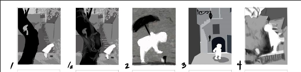
And finally...thumbnails! I am most fond of 1, 2, and 3, but 2 has a different feeling from the others, with the figure silhouetted against a flat wall. In each case the child is looking at something she has discovered (leaf, small animal, puddle). I hope to choose one of these and get on to color and figure studies today. Votes, anyone? I would be most grateful because I need to get going! Thank you!!
-
@LauraA first off, WOW you are super organized. Now I am scared to post my process since yours is so well done

As for your thumbnails, I like 1 and 2 the most. 1 gives more of the environment where 2 focuses on the character.
-
@Chip-Valecek Thank you!!!
I have to be organized, because I am behind!
Right now I am taking photos of myself in a raincoat, holding an umbrella, in poses similar to all three of the ones I liked most, because I have a lot of catching up to do. It might even help me decide! -
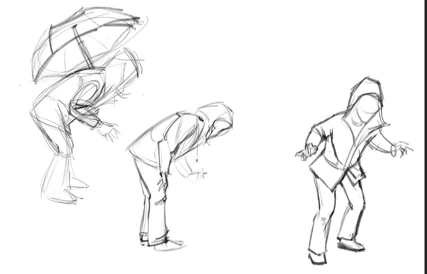
Figure studies. Still have to make them look younger and stylize them, but I know the basic poses are doable.
-
First of all, I love your facial expressions! Regarding your thumbnails, my choice is 4. I like the figure being closer up and that staircase in the background.
-
@deborah-Haagenson Thank you, Deborah!
-
@LauraA I really like them Laura
-
@LauraA Really great studies Laura
-
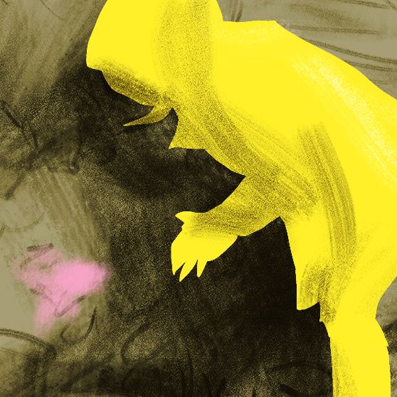
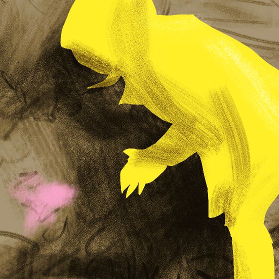
Um, however did I wind up with this?!
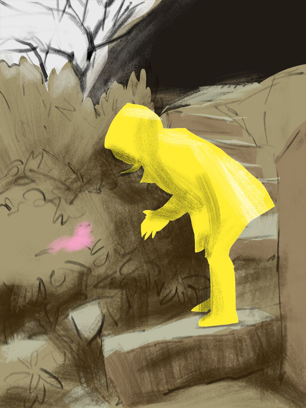
I don't know, but I kind of like it where it is! And I like the square, close up version. Luckily I still have time to mess with it. I may do a bunch of different versions and choose on on November 30.
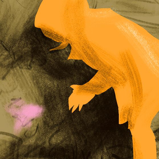
Color favorites anyone? Anything sticking out as a problem?
-
@LauraA Hi Laura! very interesting observations! I am also trying to use traditional media and digital, I work with gouache and coloured pencils and then import the art in photoshop and fix things.. What I noticed, is that I can more easily start something if I use the materials I like, and then photoshop can help me, specially with value, with which I struggle, as it is more difficult to control paints with tones and shades. But the challenge is fun!
I love you work, and I also prefer n.2 thumbnail, as I like the proportion scale between the tree and the character, big/small.
Good luck! -
@Lucelfo Thank you! I looked at your style exercise and thought it was both consistent and that your work resembled what you chose. Very nice!
And thank you for your thumbnail vote. I went with 4 because I wanted the figure to be bigger but wanted to work on plants, and then I ended up cropping it all out--go figure!
Will keep trying variations but having to do lesson plans this afternoon. Thanks again!
-
@LauraA said in Slowvember progress:
Color favorites anyone?
I like the yellow one. It pops more then the orange.
-
So here's the experiment as it now stands. I'm trying to do something looser, but every time I start messing with style, chaos happens. At least we've still got eight days!
Anything stand out here, for better or for worse? Does it get at nature, wonder, and intimacy? Thank you for any comments!
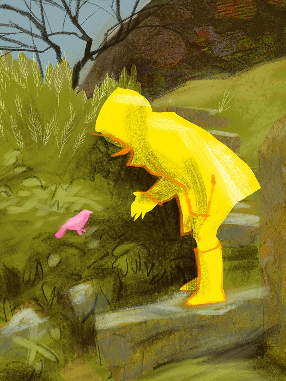
P.S. I'm probably going to work on that line at the top of the wall to soften it in some way.
-
Yay, you went with my favorite comp. I think you're hitting your theme well and I'm really loving where this looks like it's going. I'd perhaps play with pulling in a few patches of darker values on the right hand side. It looks a little unbalanced to me and is calling attention to that side with it's simplicity- almost mimicking the more graphic nature of the raincoat.
Looking good!