Slowvember progress
-
As might be imagined, it's going slowly! Last week I wasn't able to work actively, but I was thinking about the project and in fact, my idea (a child exploring in the rain) is based on the place where I was staying. I took some reference photos.
I thank anyone who has the patience to read and comment on this thread. Main points are in bold. Areas where I have questions are in italics:
During the last two days I did the dream portfolio, which went faster than it might have because I've been thinking about it for a while. I still wound up with four different themes, though:
-
This morning I did the art questionnaire. It was very helpful and I recommend it to everyone! I have a couple of questions, though:
- When it says, "concepts that showcase this theme," what does that mean?
- What is local tone? It's listed under light. How is it different from value or color? Does it just mean that the local color and value give it a certain overall lighting effect?
I also learned some interesting things from the survey. Following Braden's example, I'll list some of them:
-
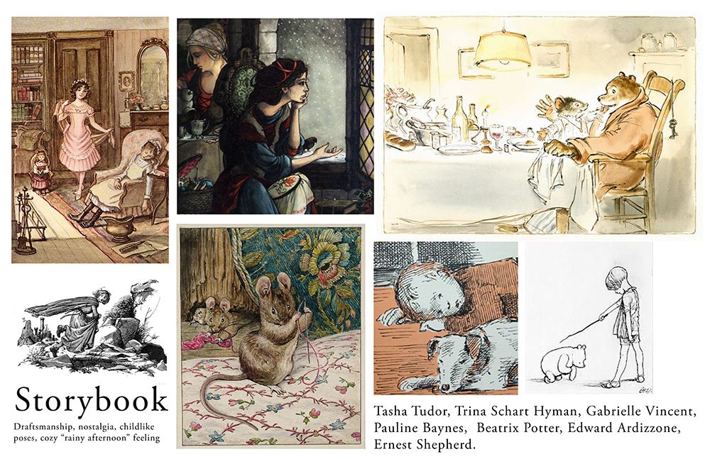
I really like to pay attention to characters and relationships between characters. I like to portray specific childlike qualities and so I tend to draw realistically enough to capture individual gestures and expressions. I don't exaggerate as much as many people do. This has to do with mood, not the desire to be realistic per se.
-
Themes are wonder, intimacy, sometimes with a touch of dark emotions like poignancy or black humor, but not always. Sometimes I just like enthusiasm and mischief.
-
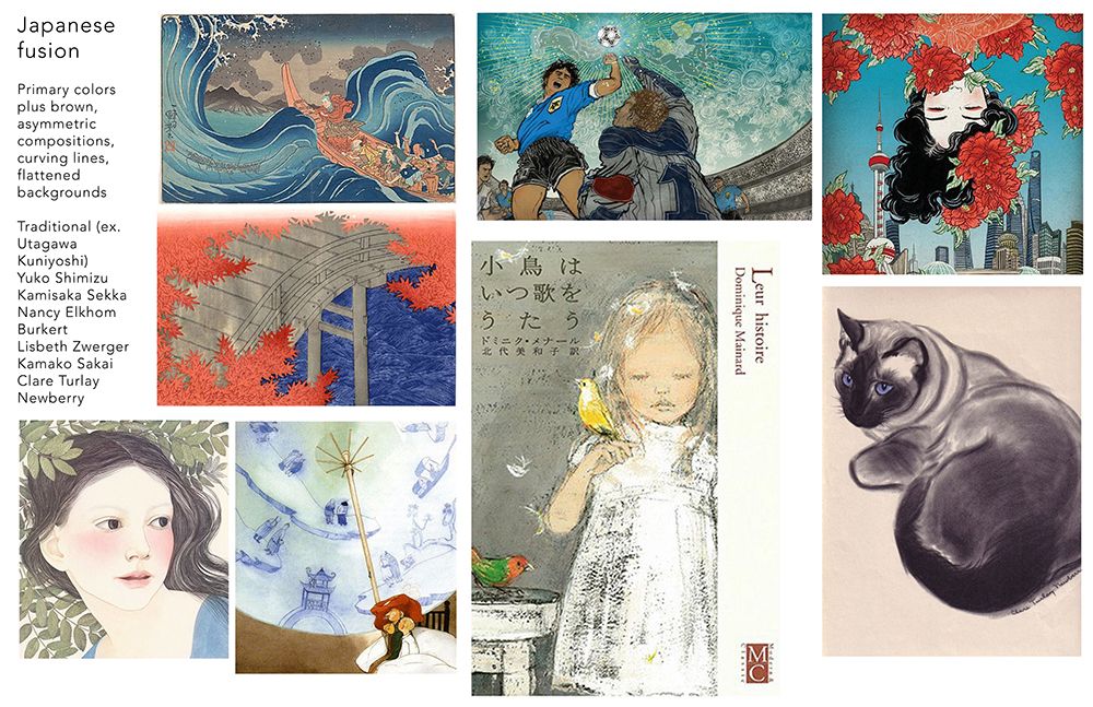
My sense of composition is influenced by modern and Japanese art. I like asymmetry and simple compositions, often with a shallow background and with some aspect parallel to the picture plane. I'm torn about perspective. I also like some amount of historical or cultural detail.
-
I really like spontaneous lines, and curved lines, with varying width. I like to see the stroke.
-
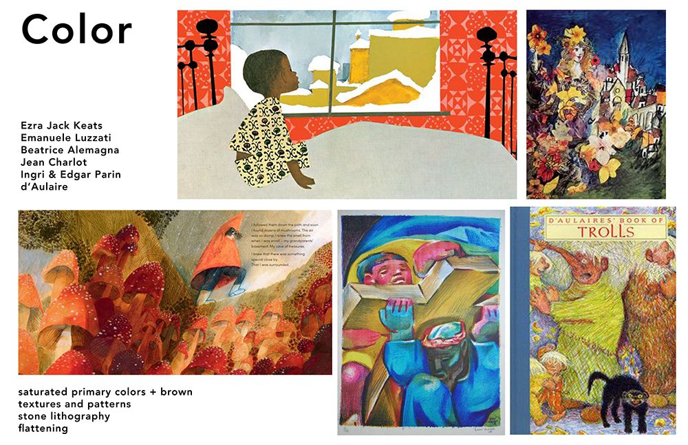
I am confused about color. I think I like large swaths of neutral with bright accents. But I may just like both black and white pencil drawings and bright painting. I don't know! I like saturated complementary (blue and orange-red) combinations, and sometimes blue and yellow, along with brown.
-
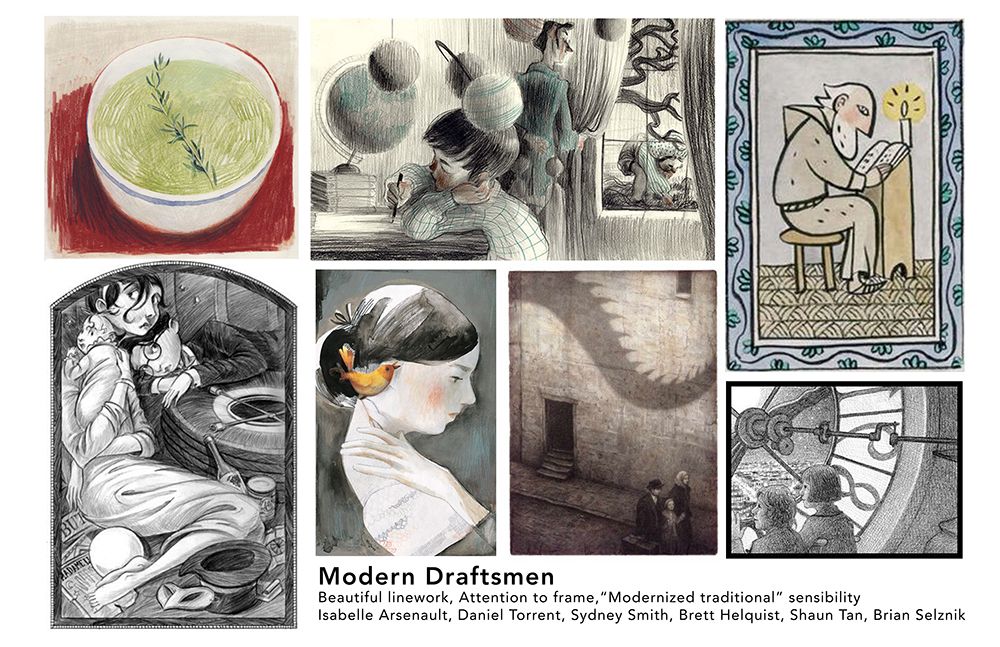
I have been using digital media, but realized that all my favorite artists use traditional media at least in part, including some media I don't have access to, like stone lithography. A lot are watercolorists, which scares me because you often have to start over and I'm already slow enough! I think the reason for traditional media is that they are more responsive to spontaneous line quality, even with all the risks. I also like the idea of texture and collage, but am not sure how it's going to get worked in yet.
-
I like the idea of light coming through color, or at least some intimate source of light within a room, like a fire. This may be why I picked so many watercolorists. I'm not that interested in super dramatic animation light or special effects.
-
All this makes me think I should try some combination of traditional and digital media, but I may not be ready to do this yet because I'd have to really think it out and get the right materials. So for this month maybe I'll just try to incorporate as much of this survey as possible using Photoshop.
Again, thank you to anyone who has had the patience to read through all this, and even more so if you have time to comment! I'm going to be working on thumbnails for the rest of the day, so we'll see how that goes. It doesn't leave much time, so it may run into next week.
-
And finally, here are four examples of my work. They have a certain consistency, but I'm not sure how much that is purposeful and how much it is due to my own limitations. At least, my goal is to produce enough work to find out!
Also, they aren't in chronological order, but every time I tried to change the order, I lost a photo, so I left them as they were.
-
@LauraA oh wow, your whole process has been so organised! Thanks for posting this! Very inspiring
-
@mads Thank you! I just figure that if I want someone to read my posts I had better organize what I say!
 But also, organizing helped me to get more out of the process. I learned a lot from doing the exercises and it was worth every bit of effort! Now to the thumbnails before the month runs out
  .
. -
Hey, I recognize those images of yours!
")
SVS Faculty Instructor
www.leewhiteillustration.com -
@LauraA what an interesting post Laura. Are you on Instagram? I think I tried to find your work on their before. So nice to see your work and your influences.
-
@Lee-White Now you see why I take live classes!
Somehow it gets me ramped up a notch. Or at least makes me finish things? -
This post is deleted! -
@peteolczyk Here's a link: https://www.instagram.com/lauraintorino/ And thank you!
-
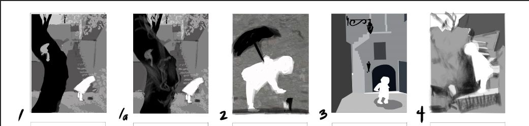
And finally...thumbnails! I am most fond of 1, 2, and 3, but 2 has a different feeling from the others, with the figure silhouetted against a flat wall. In each case the child is looking at something she has discovered (leaf, small animal, puddle). I hope to choose one of these and get on to color and figure studies today. Votes, anyone? I would be most grateful because I need to get going! Thank you!!
-
@LauraA first off, WOW you are super organized. Now I am scared to post my process since yours is so well done

As for your thumbnails, I like 1 and 2 the most. 1 gives more of the environment where 2 focuses on the character.
-
@Chip-Valecek Thank you!!!
I have to be organized, because I am behind!
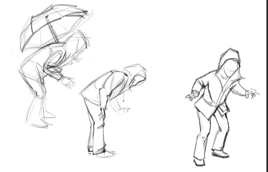
Right now I am taking photos of myself in a raincoat, holding an umbrella, in poses similar to all three of the ones I liked most, because I have a lot of catching up to do. It might even help me decide! -
Figure studies. Still have to make them look younger and stylize them, but I know the basic poses are doable.
-
First of all, I love your facial expressions! Regarding your thumbnails, my choice is 4. I like the figure being closer up and that staircase in the background.
-
@deborah-Haagenson Thank you, Deborah!
-
@LauraA I really like them Laura
-
@LauraA Really great studies Laura
-
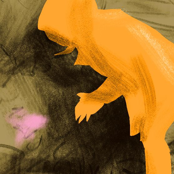
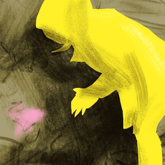
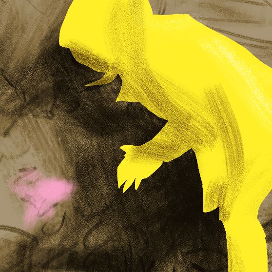
Um, however did I wind up with this?!
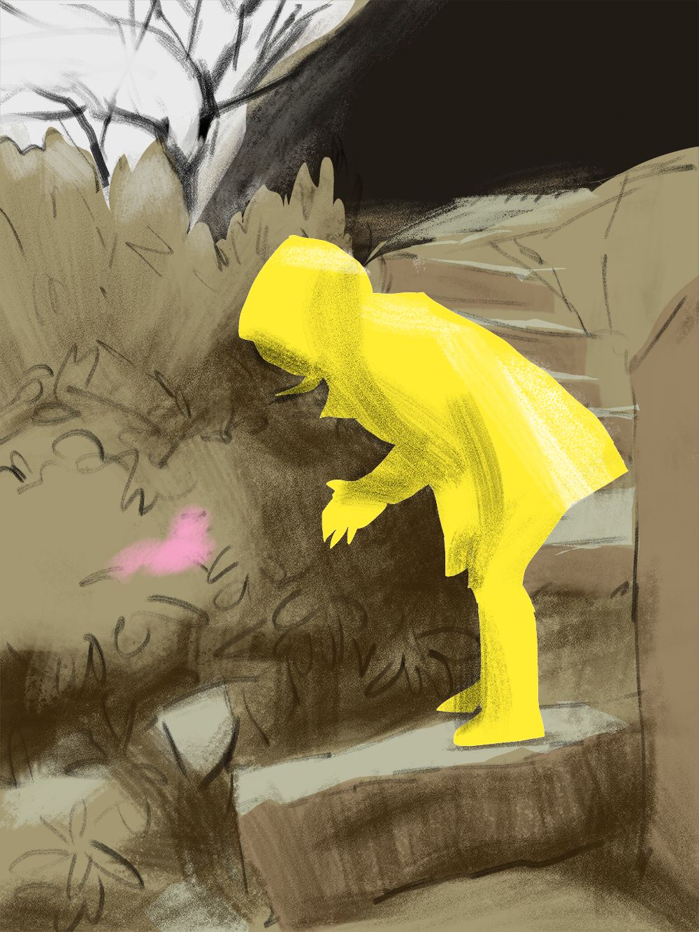
I don't know, but I kind of like it where it is! And I like the square, close up version. Luckily I still have time to mess with it. I may do a bunch of different versions and choose on on November 30.
Color favorites anyone? Anything sticking out as a problem?
-
@LauraA Hi Laura! very interesting observations! I am also trying to use traditional media and digital, I work with gouache and coloured pencils and then import the art in photoshop and fix things.. What I noticed, is that I can more easily start something if I use the materials I like, and then photoshop can help me, specially with value, with which I struggle, as it is more difficult to control paints with tones and shades. But the challenge is fun!
I love you work, and I also prefer n.2 thumbnail, as I like the proportion scale between the tree and the character, big/small.
Good luck!