Value and composition feedback
-
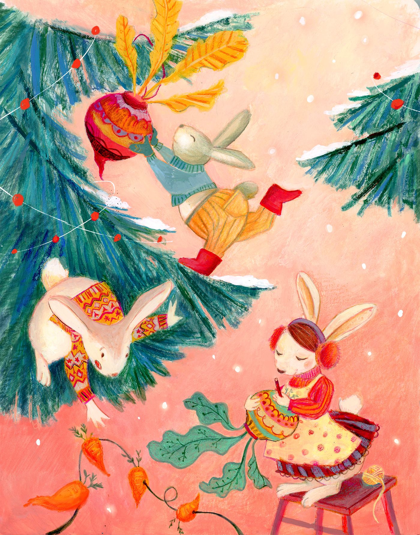
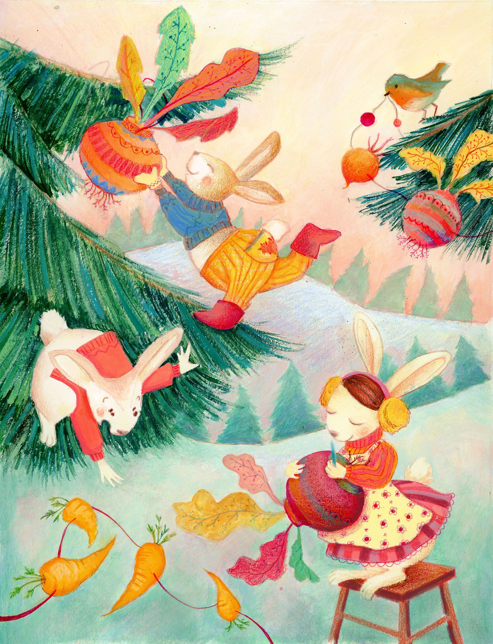
Hi everyone, following some of your advices, I made some changes to my previous illustration... any feedback would be really appreciated, in my point the first version, although maybe less thoughtful, was better in the sense that feels less calculated.
Ps: more carrots would be added on the tree in the last version...still wip.Thanks for the help!
-
This is really cute, I love how it tells a story from the bunny creating the ornaments through the bunny handing them to the bunny hanging them up. The composition is really nice as my eye goes right through and around, following the top bunny's foot back to the bottom bunny.
The only issue I have is with the carrots. They aren't critical, as my eye follows the green leaves of the ornament next to them. But they do distract and might lead the eye off the bottom left corner. If it were me, I'd move them to the right, or remove them, or move them elsewhere. They're really cute so I wouldn't want to take them out! -
Hi Anni, thank you for your point, I agree need to fix the carrot exit problem!
-
If you are using photoshop and you take your image and desaturate it, take a look at the levels. You will see that your levels are all on the high side. There is really no dark values in your piece. You might want to try and adjust your levels a little.
-
@Chip-Valecek Thanks for this! I am not sure I understand, though. I tried putting a black and white adjustment to check and I thought the tree part is dark, maybe I don't understand this all value thing, then...
-
Super cute image! But I agree on the values comment. Yes the tree has a darker value, but everything else is pretty much equal in value and tends to blend in together a bit. I’m guessing the bunnies are the focal point, but they don’t stand out much. Maybe the colorful background is a little too colorful, and maybe the bunnies can have more light/dark contrasts in value to help them stand out.
I’m no expert, so feel free to disregard my thoughts
 except the comment that the bunnies are cute, cuz they are!
 -
So cute! I love how they look like oil pastel (are they done in pastel?) I'm curious to see what it would look like if it had a cool background...maybe giving a more wintery feel and making your warm characters pop. It might be nice to see more of the carrot garland somewhere else in the image as well...overall i love your style and the bunnies are super cute.
-
Thank you so much guys for the super helpful comments! I will do further tests, it is true that after working on an image a bit, I stop seeing things...
-
@KaraDaniel thanks for the helpful comment! they are done in gouache...I will try working on the background, thanks for the suggestion!