Lee White 6 step process steps 3 & 4
-
I’m getting pressure to produce something, so I finished step 5 and printed the final drawing and thumbnails on watercolor paper, so ready to do some underpainting in watercolor for color studies before moving to step 6, final painting.
Question: I know these are fudging light and shadow, but if one assumes light coming from about a 45 degree angle from horizon on right side, are these believable shadows/highlights?
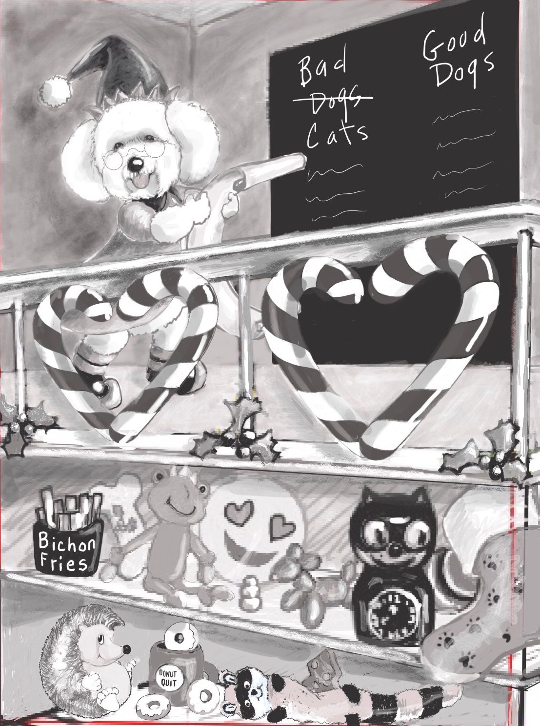
Thanks! -
@BichonBistro this is looking good, great work on the stripes!
I think the shadows on the hearts wouldn’t both be on the inside? Maybe more like?:
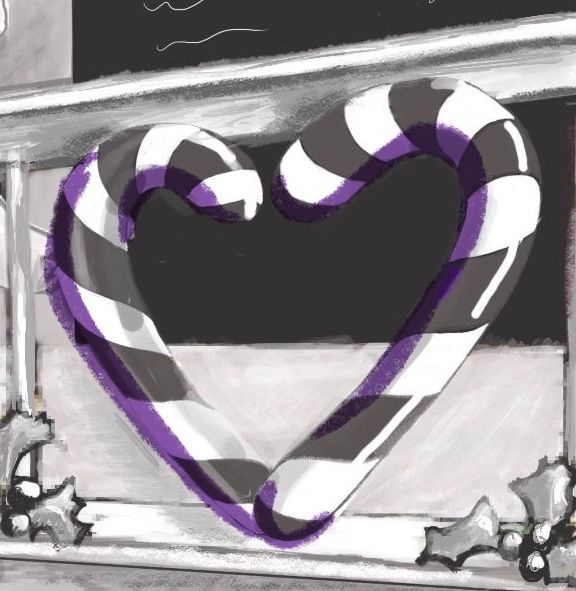
-
@neschof said in Lee White 6 step process steps 3 & 4:
@BichonBistro this is looking good, great work on the stripes!
I think the shadows on the hearts wouldn’t both be on the inside? Maybe more like?:

Thanks Nicola! I was thinking that the right side would cast its shadow onto the left side of the heart, but it looks better the way you drew it.
I love the way Christopher Denise illustrates cast shadows in the book "Groundhug Day", but figuring them out for imaginary scenes is a mystery to me. Lee White's upcoming "Light and Shadow" course is one I definitely need to take!
-
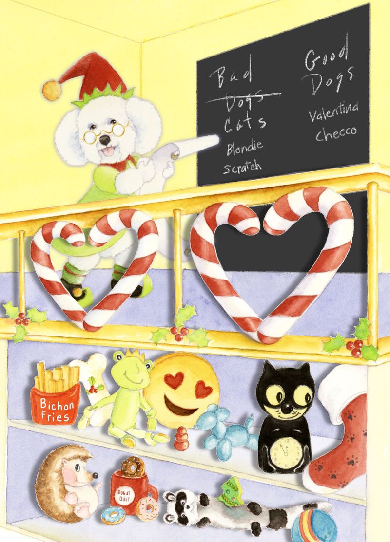
Slow-cember step 6: I had to fake in photoshop cast shadows of the main objects to get cards out to loyal customers, but I would like to paint them onto the watercolor and do some digital edits and additions before calling this finished.
I hope the method to determine cast shadows in perspective will be covered in the new light and shadows course.
One thing that did not hit me until the painting stage is that something about the perspective is off on the built-in toy shelves. I thought I had it right drawing boxes for the shelves, finding converging lines, drawing the ellipse curves above and below the horizon line (back of wall on second floor where dog stands), etc. but something about the shelves doesn't look right.
I painted enough of a bleed to allow some flexibility in cropping to fit a 5x7 vertical greeting card, but am wondering if there are glaring mistakes in the positioning I have chosen?
Tips on painting realistic cast shadows will be appreciated.
At this pace, I might be able to put all the vignettes from my original "santa's workshop" concept together by December 2020
 .
.
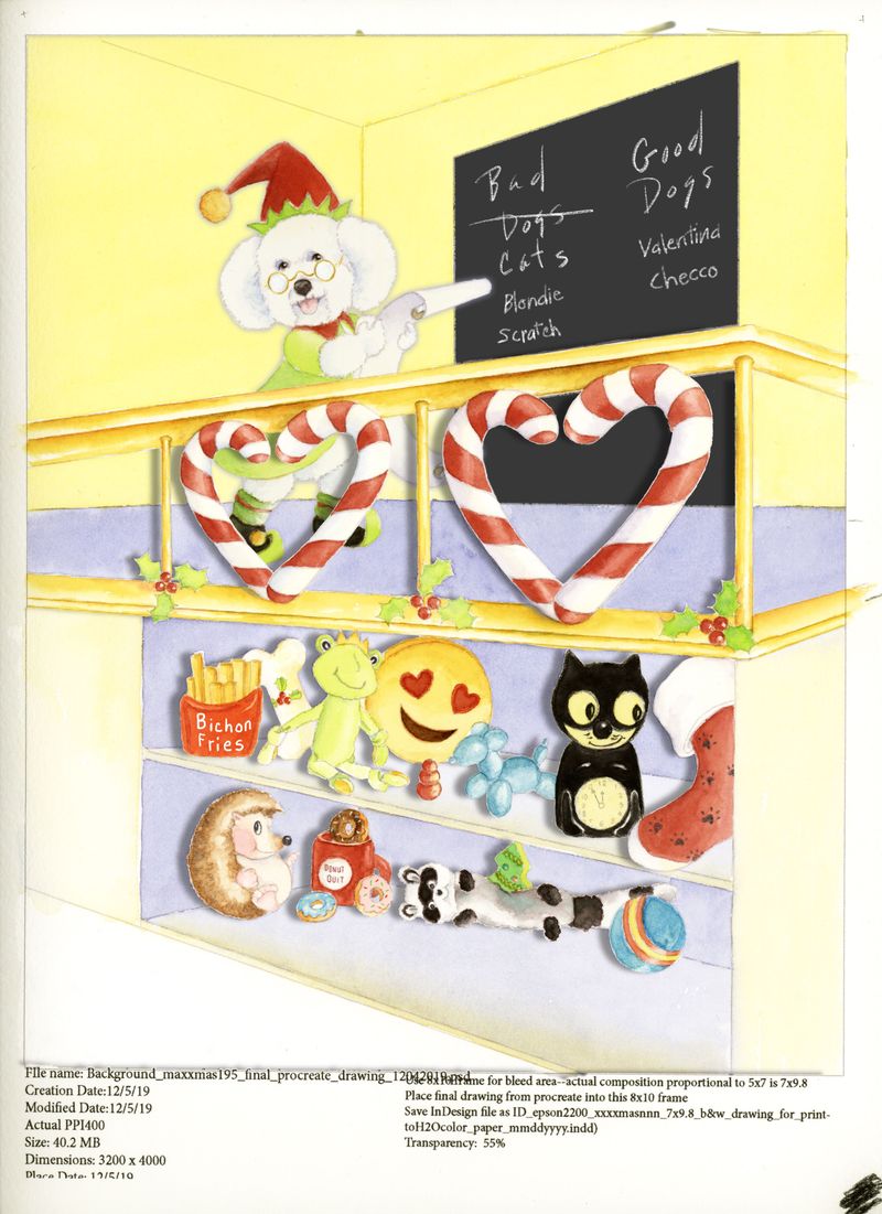
Preliminary 5x7 card:
-
@BichonBistro omg it is so cute!!!! so happy! I love it :
-
@Coley aw thanks Nicole! Happy is exactly what I was going for
 The background actually prints out better than the yellow wash I chose. The advantage of doing color thumbnails is that I can scan them in and test printing before painting the final. I am looking forward to @Davidhohn perspective and @Lee-White light and shadow classes before I call this finished. I think working those issues out in this piece will help me FINALLY achieve what I hope will be next year’s #slowvember piece, the full Santa’s Workshop
-
@BichonBistro what's the new class they're doing? Is it live or a subscription thing?
-
@Coley It's in the subscription on the splash page of the new curriculum, a new perspective class by @davidhohn and a new light & shadow by @Lee-White, coming in December

-
@BichonBistro ooooh I missed that announcement. Exciting!
-
@Coley I've been clicking on that page daily
