Dec WIP
-
@Zachary-Drenski Ahhh interesting I see what you mean. What I ended up doing is create a hue/saturation adjustment layer at the top and set it to grayscale and then I just turn it off and on. It sounds like it's doing the exact same thing.
I think I'm going to try some more of painting on the grayscale. It seems like the final result has a specific look I'd like to try and master, but it's really counterintuitive to how I want to work hah.
-
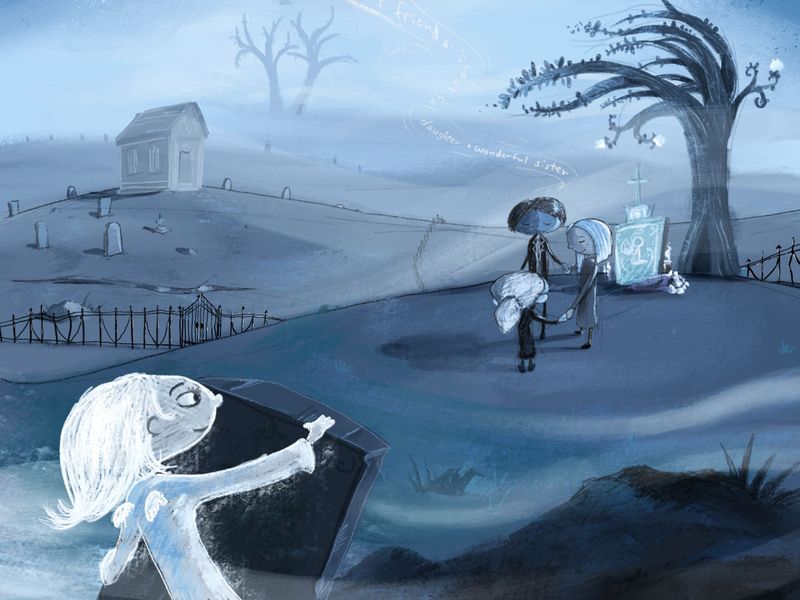
Cleaned up the cat and the girl and then added several more layers of glows to her, and then made her transparent in the middle to point @carlianne made which was it should be transparent in the middle. I think that worked a lot better!
-
@jdubz this reads clearly to me now! Great job!
-
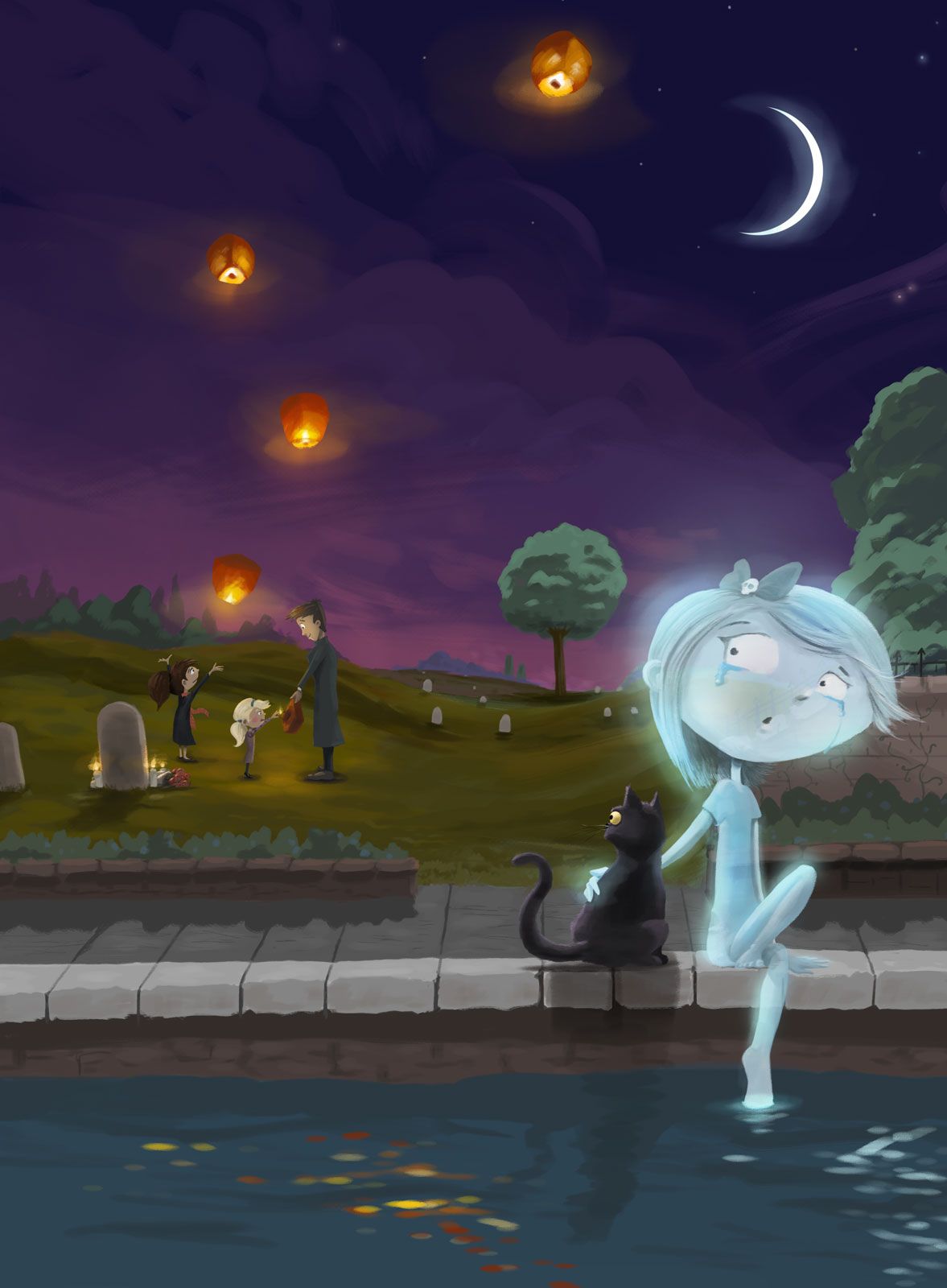
Hey everyone, can I ask a favor?
In the last few months I've been working on my iPad in a way that's just totally different than my desktop tablet. The drawing tools just end up being more rough and stylized versus more painterly which I've been doing the kind of work above. So instead of trying to make them match, I've tried to embrace the difference and just make that totally different style of art.
Over Christmas break I had been doing a lot of different pieces and one of them I thought I might do this same prompt with the same subject matter/characters but see what the results would be. What I'm trying to do is get better at communicating the scene and what's going on.
So I was hoping to get some feedback on how I'm communicating the subject matter. Does this more clearly communicate what's going on? Or did the first one do a better job of that?