December prompt wip - feedback welcome!
-
@neschof @JoannaH @chrisaakins @KaraDaniel Thank you for the feedback! I will play around a bit in terms of trying to show a phone call, but in the end I might have to scrap it as I guess the image doesn't need it to work. I just remember when I was a kid and wouldn't finish my dinner my mum would pretend to phone Santa and tell him

-
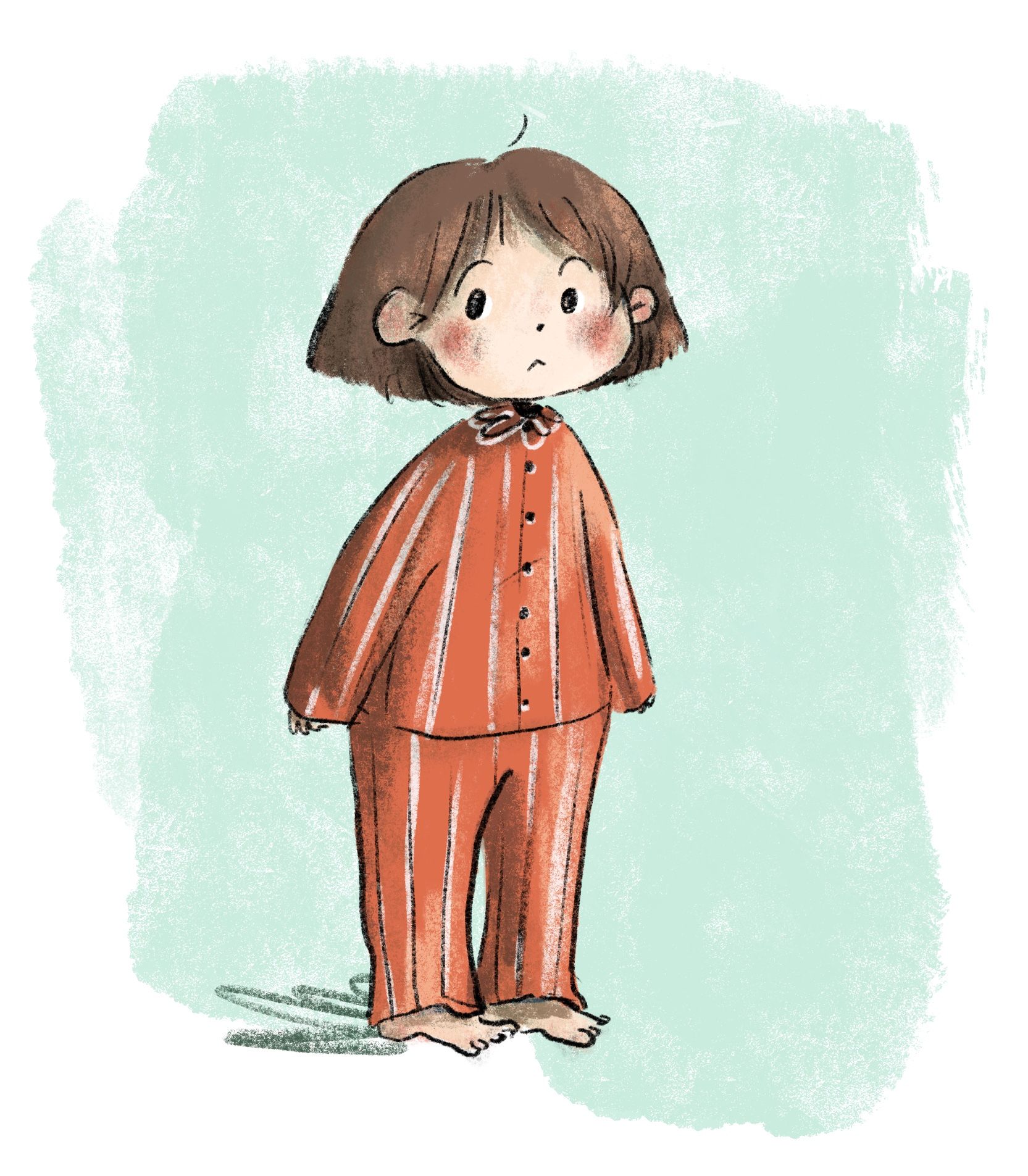
An initial character design
-
neat idea! I really like it
")
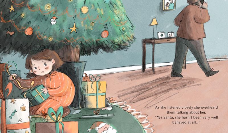
Is it obvious that she is hiding under the tree, trying to sneakily open a Christmas present early?
It's definitely a possible read! I may have her little hands yanking on the ribbon, or quietly shredding the paper with a mischievous look on her face, maybe
Is it obvious who her parent is talking to? I wanted to add a phone cord so show he was on the phone, but then realised that kids these days would not understand that haha!
As long as you read the text, then yes, though not so obvious there's a phone involved. It's really hard to show that with this perspective without skewing things, though.
Should I add more context of the living room to the background or will that become too cluttered?
I suppose it would be easy enough to have some chair legs and a throw rug or something. A baseboard running along where the floor meets the walls might be all you need, though
You might be able to have both the living room furniture AND show the phone if you have a whole couch in the background with the parent sitting on it talking on the phone. Perhaps sneaking a sideglance over the top of the couch in the direction of the present thief
-
@chrisaakins said in December prompt wip - feedback welcome!:
@eriberart You could have a silhouette of the dad a little farther away or you could have him sitting on a couch with his back to the girl.
I had the same idea of moving the silhouette further into the background so you see the parent with the phone to their head. I also think it’s very obvious she’s hiding under the tree, but seeing her pulling a ribbon or unwrapping the gift would make her intentions more obvious. I used to hide under the tree all the time as a child, but only to stare up in wonder at the lights!
-
@eriberart the character is so cute, love her innocent looking. I agree with Braden that maybe adding a bit more elements showing that she has been misbehaving will make the story reads even better. (e.g. half-opened gift box, messy floor with toys).
To show the parent talking to Santa:
Maybe there is an opened phonebook on the floor, Santa's phone number is written on it. Or maybe you can see the adult's hand, holding a Santa's business card. -
@neschof I love how this looks and the idea is really fun and cute. I think you're going to need to put a phone in there though, especially since you are only entering a single illustration into the contest.
-
@eriberart said in December prompt wip - feedback welcome!:
Is it obvious who her parent is talking to? I wanted to add a phone cord so show he was on the phone, but then realised that kids these days would not understand that
You could totally add a phone cord in. While kids today probably would not have used a corded phone, slightly older kids (6 and up) would still recognize corded phones from seeing them on TV, in books, or playing around with an old one in grandma's basement. This is something that has been brought up recently on a couple of podcasts I listen to. People read their kids a book with some obsolete device in it (cassette tapes, old phones, TV antennas) and are surprised when their kids can identify it. It's probably similar to how when I was a kid no one was using these old phones any more but I still knew what it was.
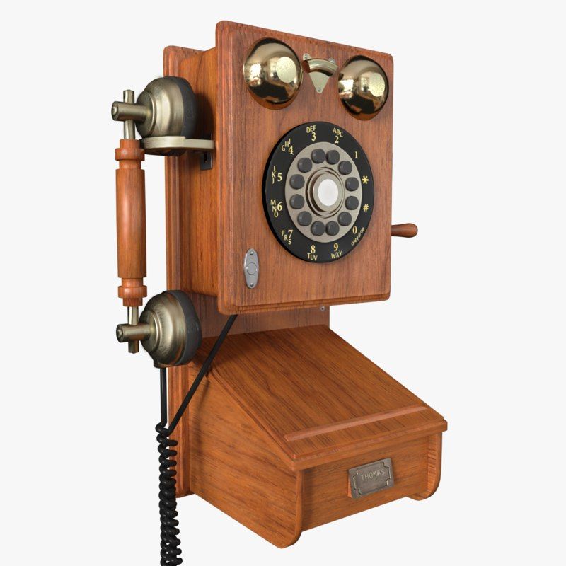
I guess it depends on your story a little too. If you are wanting it to take place in 2019/2020 I like the option of adding the dad's shadow on the back wall so you can sneak in the silhouette of him talking on the phone without it getting too distracting but if you want a more 80s/90s (or earlier) setting, you could go with the corded phone.
-
Thanks for the feedback everyone! I’ve tried playing about with having the father’s silhouette farther away but I’m not completely happy with it. I think the room looks oddly empty when I place him further away, but I don’t want to clutter the image by filling it with furnishings. I think in the image with the dad on the armchair, it feels a bit weird as it is an unusual placement in relation to the armchairs distance from the tree with nothing in between.If this were an actual picture book I would show the phone ringing/the dad ending the call in another spread but that doesn’t work for this stand alone image! I think Im Over complicating things

Instagram and Twitter: @eriberart
Website: www.erinmcclean.com -
@eriberart maybe a little end table and lamp by the chair? That would fill in and hopefully not distract. I really like that thimbnail
-
@eriberart I like the chair but feel like the placement is leading my eye off the page. Maybe see what it looks like rotated, perhaps 180 degrees so we see the back of his head & left ear to phone?
-
I like the walking away one. I read the whole thread, agreed that the girl was effective, and was pleased to see the solutions that showed the dad on the phone. Somehow it gives the idea of him pacing, as in, "What am I going to do with this child?" You could put in a doorway so that it wouldn't look too blank, but you don't want to clutter it, either.
-
Your character designing is so cute!
The mischievousness of the girl is pretty evident but can still be emphasised a little based on the comments shared.
As for the placement of the father, how about changing the layout of the illustration from a landscape to a portrait/square layout. Keep the eye level closer to ground like you have, but now you can show more of the beautiful decorated tree and the father sitting on a chair next to the tree. No need to show his face since the girl is the focal point. You could also show one of his hands hanging off the arm chair holding a piece of paper or an address book with Santa's phone number on it. (Also, the chorded phone and the address book sort of imply an earlier time so it would go well together.)
Best of luck! Looking forward to the final illustration! -
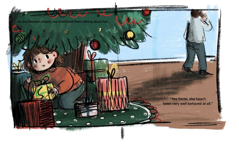
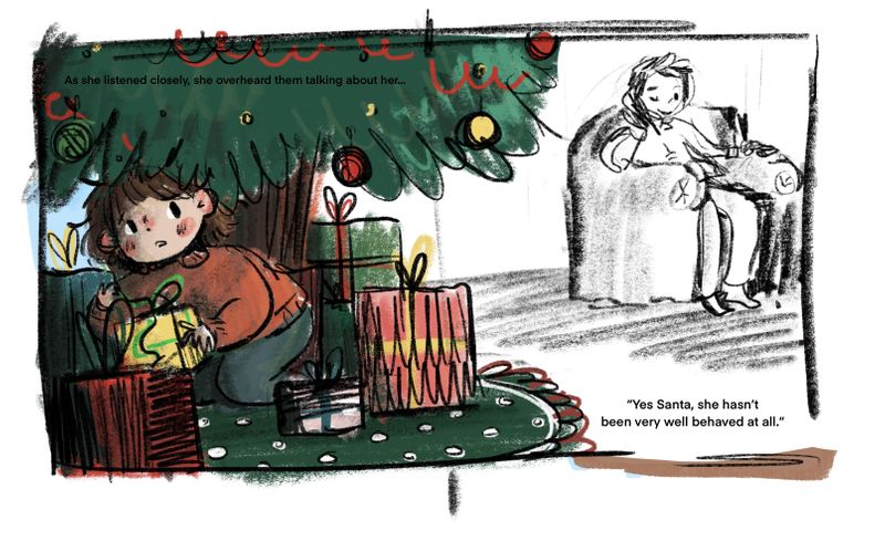
Hi everyone, thanks for all the feedback! I've taken what everyone has said onboard and this is what I've come up with
I'm not completely happy with it, but I don't know if I'll continue to work on this piece (unless I'm feeling particularly inspired) but feedback is still always welcome.
-
Great expression. I think this is the best angle on the dad from a composition standpoint in my opinion.
I think the words in the tree are detracting from it through - I'm thinking the impression you're getting is establishing that part of the story, and the words are a bit tough to read so you're drawn up there for no reason. I'd pull that out and then bump up the size of the text that's in the lower right. Maybe even add some space on the right so you can get his foot off the edge of the page to make some more room. I'm just remembering the times Will has said in the critiques that if you are going to put text in there, it has to be considered in the whole piece, so you want to make sure that's intentional, easy to read and looks like it belongs if you printed it.
-
Over all I’m getting the message but there are a few things to focus on to streamline it a bit. The first thing that I noticed is that the image could be a bit cleaner not in regards to style but more so value. Try pushing the values darker or making the girl a bit lighter to make her a bit more clear to the viewer, not that she isn’t clear now but it could be a bit tidier. I would also recommend lightening the tree around the text because I didn’t notice it at all at first. Maybe make a sort of light green speech bubble sort of thing around the text there. Hope some of this helps!
-
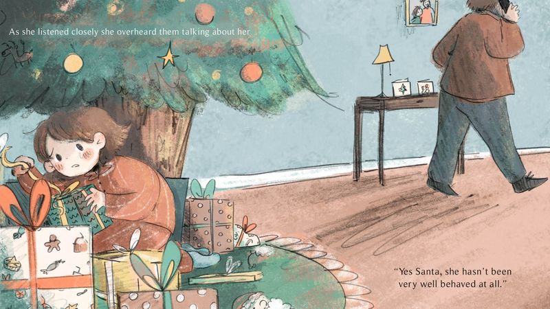
Hi guys, I have reworked the image, redoing in the lineart in places and redoing the colouring. I didn't like how stiff and rendered the first image was as I like to try and keep my lineart really loose. I also thought the brush texture was a bit too much at points. I pushed the values a bit more and moved the text in the new image. Not sure which version I like more... Probably somewhere in between the two would be ideal haha!