December contest WIP as is tradition. Feedback always appreciated :)
-
@Jonas-Zavacky Thanks! The look on the lady's face is definitely gonna change. Right now this is more of a colour study (I'll really figure out expression and design in the clean sketch phase)
")
-
@Heather-Boyd said in December contest WIP as is tradition. Feedback always appreciated
:her hand and other features are strangely large or more masculine a shape. My only last doozy is that she and her bed look like they are floating or have been lifted off the ground.
Oh, her design's definitely gonna change
Right now I'm more trying to figure out colour and value. As for the bed floating I'm trying to super exaggerate a cartoonish perspective. I think exaggerating more with maybe her hand holding the knife REALLY near the camera might help to distract people from the floating bed phenomena @Heather-Boyd said in December contest WIP as is tradition. Feedback always appreciated
:I know your still doing colour (class). Is the pink outside the door bringing in light -that would my assumption - not sure how I feel about that much pink
I'm not sure how I feel about it either. I was thinking another colour of cool light would be better to highlight the rat traps on the floor so went with the warmer cool if you get what I mean. Maybe a slightly greener blue (cerulean I think it is?)
@Heather-Boyd said in December contest WIP as is tradition. Feedback always appreciated
:could be slits in the floor board, ah in that case if you could convey that more in the wood floor that would have helped me out personally as well as maybe sparse up the light coming down (looks fierce).
Yup, that's what I'm goin' for
 You're right though, it needs a tone down. I'll have to find reference. If only we were taking a class for that sole purpose
@Heather-Boyd said in December contest WIP as is tradition. Feedback always appreciated
:For me for your story,
at this point the only story I'm goin' for is rats hate lady, lady hates mice, lady uses traps, rats are goin' for poison :smiling_face_with_open_mouth_smiling_eyes: It's super neat that you picked up that much story from the colour study though.
@Heather-Boyd said in December contest WIP as is tradition. Feedback always appreciated
:I read the light bulb is their way in
I hadn't thought of that, though it makes a lot of sense! My big reason for having the light bulb below with its electrical stuff stretching into the ceiling was to connect the two different areas somehow.
@Heather-Boyd said in December contest WIP as is tradition. Feedback always appreciated
:but I don't like the light bulb being right in the centre
I'm thinkin' the light bulb may need a new home as well
Maybe further left so that it helps to lead the eye back up from the doorway to the rat realm@Heather-Boyd said in December contest WIP as is tradition. Feedback always appreciated
:I still love your idea and I hope these observations are not too hard on you
You are not being harsh at all! I love this kind of feedback and it is always most appreciated
These observations can take something from 'okay' to portfolio piece! -
@peteolczyk said in December contest WIP as is tradition. Feedback always appreciated
:If I was being really annoying And picky which I guess I am, I’d tone down the saturated yellow Light streaks.
I do love the colours though it’s working brillAbsolutely
I'm plannin' on doing a few more colour studies and toning down those streaks of light is high on my list -
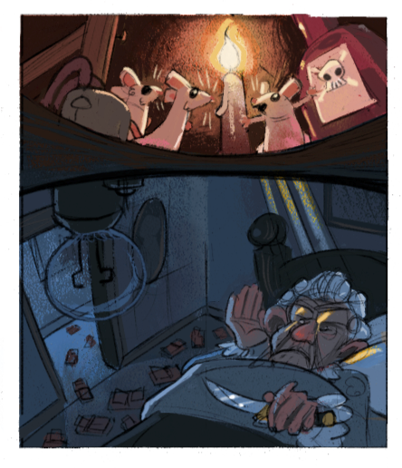
I love this so much! There are so many things screaming awesome with this piece. The plan to off the ol' lady, the trail of mousetraps showing that this is a continuous problem, the 'perspective' choice and how the top/bottom warp through the ceiling, down to the colors and color scheme. This is a great start and I cannot wait to see where this goes.
Feedback is minimal really:
-
I love the heavy lines and jowls that emphasizes how old the lady is. Someone mentioned they didn't notice she was a 'she' at first. I think the lips could use a little more punch but I feel like you have the right plan with the curlers. They are a great way to show that its a woman and will show after cleanup.
-
The light-bulb is vital to showing that the warped part is a ceiling and meshing the two areas, however I don't like the center placement. My eye wants to go to the mice but I keep getting drawn to the strong silhouette of the light socket.
-
I think that the warping of the ceiling is a little too wide on both ends. I want to see those mice feet.
-
-
@Braden-Hallett I love your idea and the story. Love the details in this piece: the rat traps on the floor, and the drawing behind the rats. It helps to communicate the story so much.
I also felt the light bulb does not add much to the story, and being a bit too prominent on this image.
I would also try the idea of adding a few pictures on the wall to show the personality of this old lady.
-
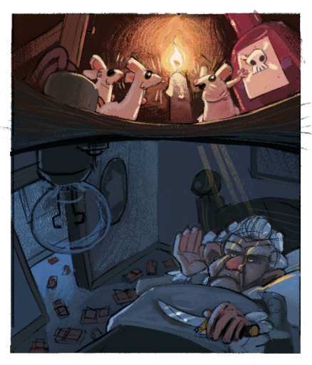
@BradAYoo said in December contest WIP as is tradition. Feedback always appreciated
:I want to see those mice feet
Mice feet are indeed essential
I'll see what I can do! Thanks for the feedback -
@xin-li said in December contest WIP as is tradition. Feedback always appreciated
:I also felt the light bulb does not add much to the story, and being a bit too prominent on this image.
I think I may try moving it over to one side or another
Out of the centre line but still in the picture -
@Braden-Hallett I claim to be a pretty fast drawer, but when it comes to perspective ... I just take looong. Maybe this is due to my perfectionism ...? You have the same problem?
-
@Meta said in December contest WIP as is tradition. Feedback always appreciated
:@Braden-Hallett I claim to be a pretty fast drawer, but when it comes to perspective ... I just take looong. Maybe this is due to my perfectionism ...? You have the same problem?
It doesn't take me long at all, actually. I'm pretty good at putting things into perspective and having it 'pretty good' (good enough for no one to notice or care unless lookin' real close). My problem is that my innate need to have things follow perspective rules means I miss out on a lot of compositions that look really cool but don't make sense with literal perspective
So this time I'm kinda trying to ignore them. -
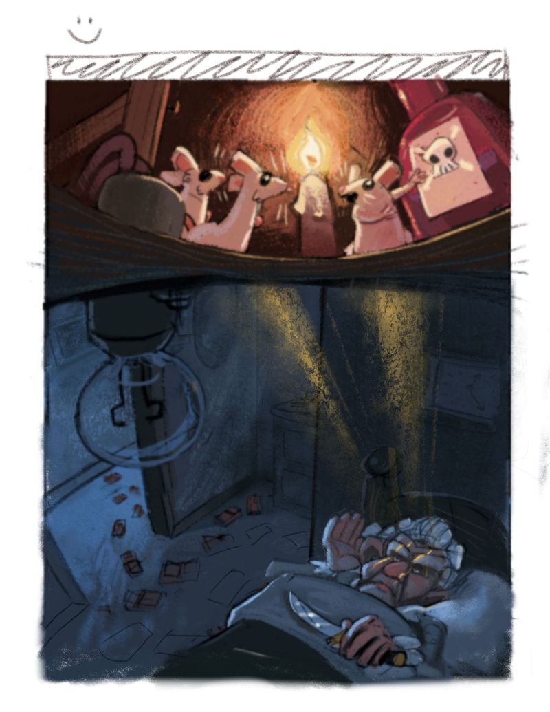
I'm much happier with this one so far. I'm gonna make a few more tweaks with the colour and value (and I'll be doing some design exploration on the granny) but I much prefer the candlelight and the lightbulb off to the side
-
@Braden-Hallett only one tangent I see Braden is where her ladyships knuckle matches with the crown moulding on the floor.
Instagram: www.instagram.com/heatherboyd.illustration/
Website: https://heatherboydillustration.ca
Shop: https://www.inprnt.com/search/products?q=HeatherBoydIllustration
Ko-Fi: https://ko-fi.com/heatherboydillustrationBe blessed,
-
@Heather-Boyd It absolutely does! Her ladyship must rectify the situation
Thank you for the catch!
-
@Braden-Hallett that and the picture frame corner hitting the light ray - I was rushing to get to the live critique.
-
I think I'm almost ready to start painting. Thanks everyone for the feedback so far!
I'd love some specific feedback at this point if anyone cares to do me a solid
-Do the colours feel harmonious?
-Is the purple poison bottle too overpowering and does it look like a half full translucent bottle?
-Does the bottom scene look like a dark room and is granny's skin colour too warm (I like the super red nose, but understand if it's too much)Thanks again for the feedback! I can't imagine doin' something like this without help
-
@Braden-Hallett I love where you're going with this one. The super red nose is a bit nuch, it almost looks like it's glowing by itself . . . but I wouldn't get red of that color altogether, since it helps to connect the room below with the attic above (my two cents)
-
Hi Braden! As usual, I love this piece. Your creativity is really at a whole other level, and to me it’s phenomenal.
As I’ve been admiring your work in progress, it came to mind that the bed looked really close to the ceiling, like she was on a top bunk, but this dear old lady doesn’t strike me as the youthful type who would climb up a ladder to get to bed every night. I’ve never done a paint over before because I suppose I never thought myself in the tier of artists professional enough for that sort of thing, but then I remembered my first ever SVS forum thread where someone did a draw over of my WIP, and it meant a lot that they took the time to do that. So, here is an attempt to pay it forward and to share some ideas that came to mind for perhaps making your composition look a little more natural. Also, it occurred to me that the light rays might be coming through the floor boards if they’re making stripes on dear lady’s face like that, and that they would probably come down in perspective from an approximate-floor-board distance apart.
All the best, and thanks for sharing your process.
-
@KathrynAdebayo This brings a lot more of the warmth down along with the addition of the light reflected off of the lightbulb.
-
@JoannaH I'll tone it down a tad! Thanks for the feedback
-
@KathrynAdebayo said in December contest WIP as is tradition. Feedback always appreciated
:but this dear old lady doesn’t strike me as the youthful type
m'lady was once a well-renowned olympic gymnast. Vaulting into a bed 6 feet off the ground every night keeps her spry (and away from the murderous mice) :smiling_face_with_open_mouth_closed_eyes: joking
I like a lot of what you did with the drawover! Thanks so much for that (I know they take time). The lady looks much more at home in your drawover and gives more room for bedroom props (dressers, more traps, etc) I'll totally incorporate that. I'm not sure why I was stuck on a larger lady compositionally, but this does look better
Those rays of light may get axed overall. With the flashlight they made a lot of sense, but less so with the canlde. Though your drawover's given me some ideas on how to keep them
Thanks so much again! All this feedback is gonna make one heck of a portfolio piece (I hope, lol)!
-
@Braden-Hallett I love seeing your process, Braden! Thank you for sharing it with us because it helps me learn, too. I love that you changed the flashlight to a candle and that the lightbulb was moved to the side, and that the master plan drawing was changed to a simple bottle of poison. It makes the story clear and easy to read!
I thought it would be a fun detail to add like a cup of water next to her on a nightstand to show where they would put the poison. Or somehow show that they've already put poison in her cup.
Amazing work as always!