SCBWI Snow Day WIP - Critiques Welcome
-
@theprairiefox I like the last two. If you played with the warmth of the purple, right now I feel it's on the cool side. Like a more purple burgundy maybe. The yellow hair in that one is warmer than in the last one but still like the paler but maybe the yellow clothes could be a warmer yellow (with that combo I feel it's more on the cool side).
The cool/cold is the wall and window/outside portion, so I don't want the cold to bleed into the foreground anymore than the boys pale skin. Also feel cold maybe because the book is white.
Keep it up.

-
I would slick 15 because the composition is feeling strongest for that one. However I think you should try to stagger the composition a bit. Right now it’s all very centered, shifting things around to create a flow for the viewers eye will make it much more balanced and relaxed which is especially important for a scene that should feel comfortable like this one. As for the dragon sketches I really both of the ones on the left.
-
@Griff thanks for the advice.
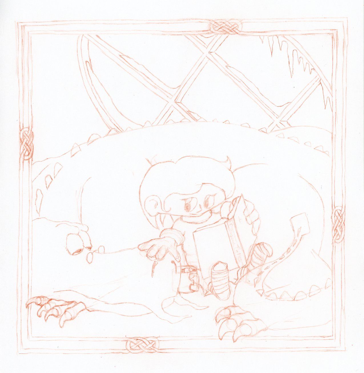
I was thinking I was not moving the viewer around the composition very well either. As I did my final sketch, I changed the dynamic by moving the eyes of the characters.
I think it is working better to move the viewer around. The girl looking at the dragon and the dragon facing back at the book which brings you back to the girl. Let me know your thoughts.
With the dragon falling asleep it adds more story to the image as well. It feels to me that the girl is reading a story and her dragon is falling asleep because of it.

-
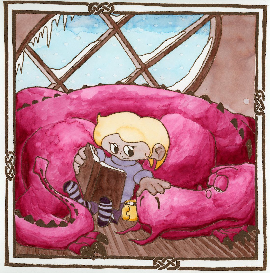
@Heather-Boyd , @Griff , @Sara-Vecchi , @Coley Thank you all for the input. I decided to take the plunge and attempt the watercolor over a woodcut print I have been pondering!
Not perfect, but done! And I learned a lot in the process about my watercoloring!

-
@theprairiefox just realized that this isn't due until Jan 20th! They don't do a December DRAW THIS!
So, I will be reprinting and repainting this... so any comments are welcome.
I plan on doing the following for sure.
- Reverse the plate (forgot and that is why it is backwards.)
- Print the sepia much darker. The watercolors came out much darker than I expected so the lines should have been darker as well.
- Switch which side of the book is darker.
- Use a slightly different technic for coloring the dragon.
- See if I can develop a better technic for the snowflakes.
Anything else you guys can see or think might improve it would be welcome.
-
@theprairiefox You did a great job! I think the changes you listed out for yourself are all good ideas. As for the snowflakes, I have seen some people use salt on watercolor for some interesting effects. It may be worth trying the technique and seeing if you like the results.

https://www.liveabout.com/using-salt-to-create-snowflakes-in-watercolor-2573986
-
@Sara-Vecchi I have seen this too! Thanks for reminding me. I am definitely going to give it a try now that I have some more time to experiment.
-
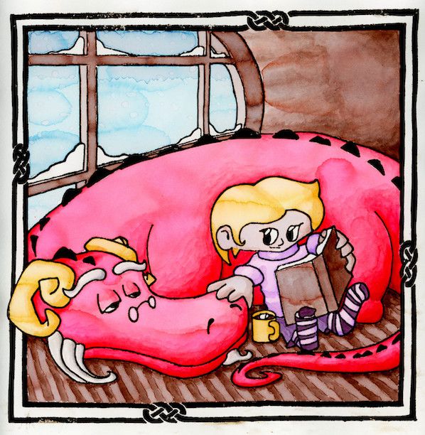
Well, I did all the things:
- Updated sketch to provide a better composition (focal points on 1/3s better eye movement between girl/dragon)
- Updated dragon's anatomy to work better
- Attempted different technique for snow, did not look how I wanted so I went back to droplets.
- Fixed shadows extensively using what I learned in the shadows class by @Lee-White that I have been working through with watercolor
- Reversed the plate.
- Darker sepia print.
- Changed color of dragon slightly.
I ended up darkening the scan as the colors did not seem rich enough for me.
I am pretty happy with the overall. But let me know what you think. Any feedback would be welcome. I will be submitting it on Sunday.

-
I like it -it's warmer and cosier
 . I haven't been on much so I apologise if this was already in your work but I like seeing the depth of the window intersecting vertical and horizontal panels (holds the glass) ahh you understand I hope - gives a nice depth.
I just thought of an addition of the dragon's tongue coming up and over to take some hot chocolate but leave that for another time, I like this one as it is. -
@Heather-Boyd the tongue would have been fun! Oh well, next time...
I understand the intersecting of the windows. I also needed to pay attention to the snow not filling the whole depth as it would only be on the outside of the pane of glass. I hope that made sense as well...