December contest WIP
-
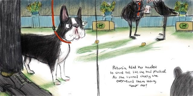
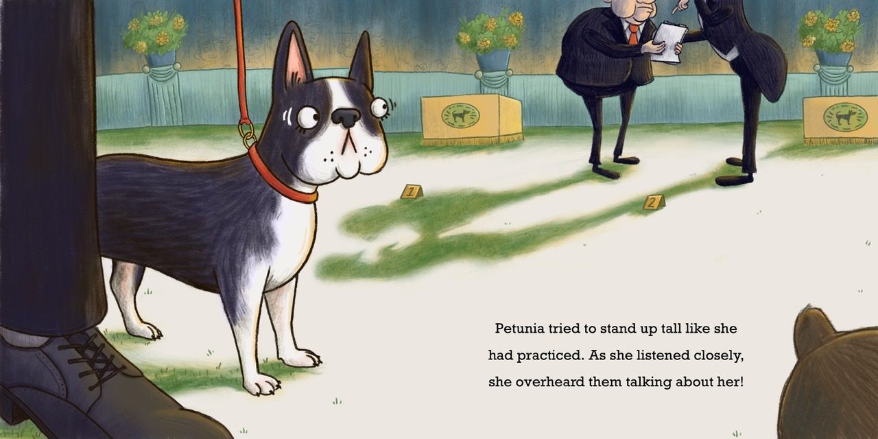
Haha! I like this take on the prompt! I like how the judges' heads are cut off, I like their long shadows, and I like how she's in the foreground looking worried. The fact that there are no other faces in the spread puts the focus on her expression and makes it look like it's a dog's world. My only thought for change is, Is there a particular reason you put the other dog at the same level, with the same straight back? It looks slightly stiff that way. And of course she will have a shadow too, but that's a minor point. It's good a good, slightly humorous vibe and I think it's a nice start!
-
I love this! The dog's expression is perfect. I actually find the other dog's bum a little distracting, but I understand you're putting it there for the context of the dogs in a line at a dog show. Another possibility is showing a slight glimpse of dog bum and tail curving out from the bottom right corner, as if the line of dogs is curving to the right. Hope that makes sense- I'm terrible at explaining things!
-
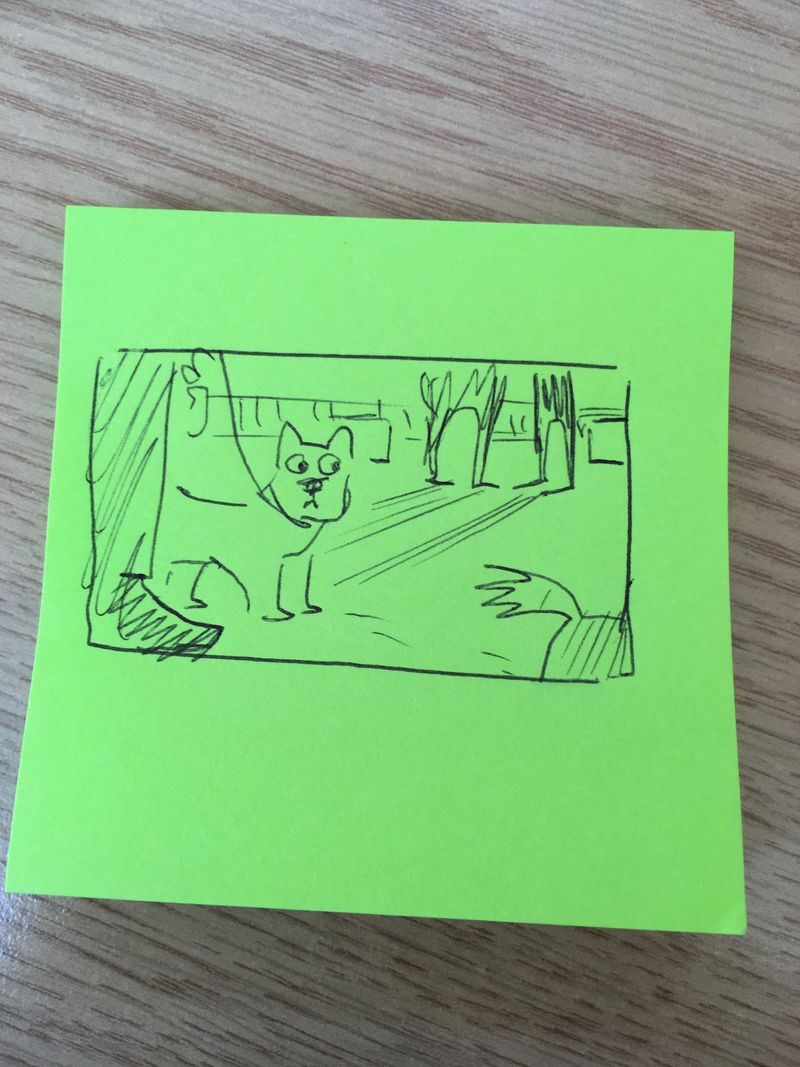
I’m at work but here is a little post it scribble of what I mean!
Instagram and Twitter: @eriberart
Website: www.erinmcclean.com -
@eriberart hey thanks, I like that idea!
-
@LauraA I wanted to imply other dogs in the ring, as for the actual shape and placement of the puppy butt I drew, this sketch is still pretty rough and I hadn’t worked out the actual anatomy of a Boston terrier yet (its more of a placeholder) I do like the idea to move it down so you just see a bit of the tail though.
-
I refined the sketch a little and threw some rough color in, I think this is getting close to ready for me to take it to final, still have a bit of working out to do with the judges.
-
I really like what you’ve done with your piece! That doggie face is great. And the new version of the other dog looks like a much better fit. It is less distracting, but still very clearly giving more information to the viewer.
-
Haha! I love the concept! And I love the worried little doggo!
 the composition is great. I’m trying to think if it needs anything else but this is totally working for me. I love the sparing details and the clear story. Looking forward to the final piece!
 -
Do you think the shadows are working here? In terms of the color, I have them that grassy green color to imply the fake grass floor of the ring without making the illustration too dark. I’m not sure if I have the shapes and angles just right though...
Taylor Woolley
(Formerly Taylor Ackerman / StudioLooong)
Website: www.woolleystories.com
Instagram: https://www.instagram.com/woolleystories/ -
@StudioLooong turned out great. I think the shapes work.
-
@StudioLooong I love the colour of the shadows. And the whole thing generally.
I'm not sure about the little number cards on the floor though. I don't really know what they're for and my eye is constantly drawn to them because they're disrupting the silhouette shadow outlines. Because each is attached to a man's shadow it's like the shadows are being labelled for some reason. Maybe try pulling one away from the main shadow so it's separate and push the other totally inside the shadow?
Nicola Schofield
Twitter: twitter.com/NSchofieldArt
Instagram: instagram.com/NicolaSchofieldArt/ -
@neschof that was bugging me too, I moved them
Taylor Woolley
(Formerly Taylor Ackerman / StudioLooong)
Website: www.woolleystories.com
Instagram: https://www.instagram.com/woolleystories/ -
@StudioLooong looks great!