Society of Visual Storytelling

    SVSLearn Forums

    • Register
    • Login
    • Search
    • Recent
    • Tags
    • Popular
    • Users
    • Groups
    • Search

    3rd Thursday Naughty Children FINAL

    General Discussion
    21
    56
    17133
    Loading More Posts
    • Oldest to Newest
    • Newest to Oldest
    • Most Votes
    Reply
    • Reply as topic
    Log in to reply
    This topic has been deleted. Only users with topic management privileges can see it.
    • Dulcie
      Dulcie SVS OG last edited by Dulcie

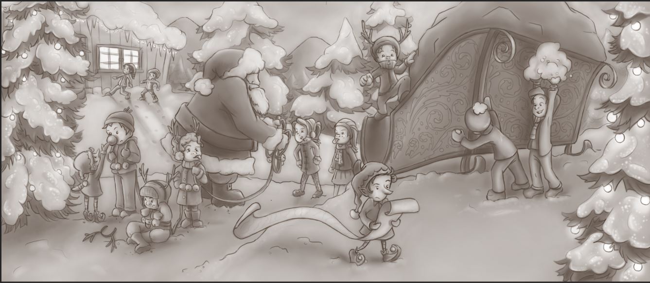
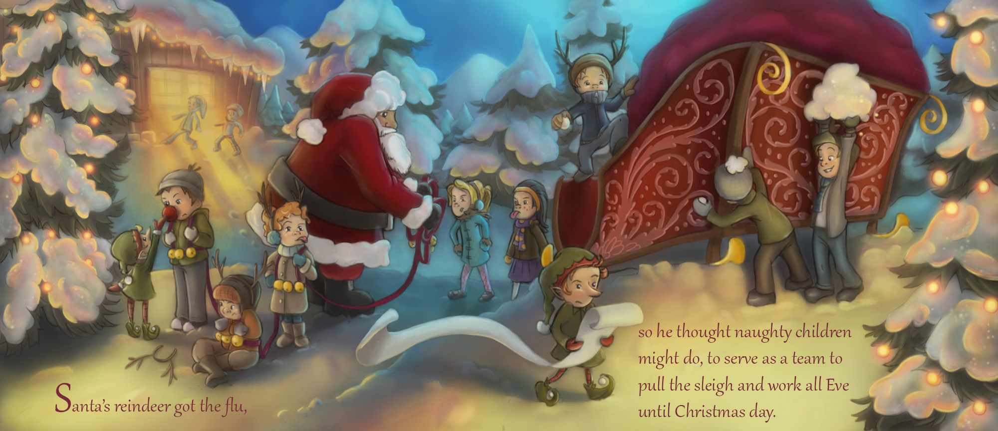
      I agree with @Rob-Smith ...both about the wonderful drawing (it is really so nice to look at just as it is!) and suggestions to improve it. I wonder if the rear end of the sledge could be darker....you could push that a bit more.. Also the area in the background with the house, and the distant trees, if those areas are lighter in value it will heighten the sense of it being further away. Santa is a really important figure so you want to make the contrast between light & dark on him quite strong, though not OTT of course, so he will stand out more. Your piece has a really beautiful sense of distant ground, middle ground and foreground in the way you draw it, so if you can make the values match that, it will be even more amazing!

      Sorry hope that's not too long-winded & that it makes sense....finally wanted to say I love that you have given some of the children reindeer antlers too! 🙂 Can't wait to see the next version!

      www.dulciemascord.com
      https://www.instagram.com/dulciemascord
      https://twitter.com/dulciemascord
      https://www.facebook.com/dulciemascord

      1 Reply Last reply Reply Quote 1
      • bharris
        bharris last edited by

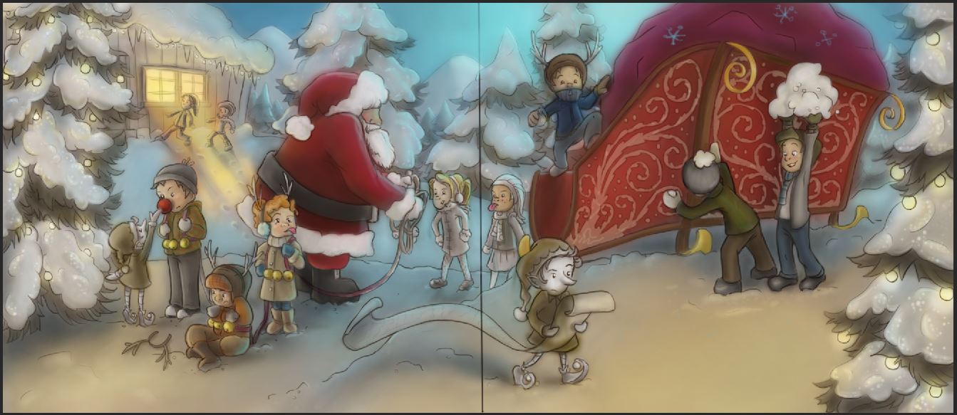
        @Dulcie Thank you very much! Yeah I am playing with those values now. The hard part is just having it be a night drawing and trying to figure how soft to make things and trying to envision what I can do with the color to heighten it.

        No you're not long winded! I always appreciate your feed back, you're spot on!

        www.brittanyharrisillustration.com/
        www.instagram.com/britillustration/

        1 Reply Last reply Reply Quote 1
        • bharris
          bharris last edited by

          Any better?

          naughty children sketch 6.JPG

          www.brittanyharrisillustration.com/
          www.instagram.com/britillustration/

          Stephanie Hider 1 Reply Last reply Reply Quote 4
          • Stephanie Hider
            Stephanie Hider @bharris last edited by

            @bharris Great illustration, so much fun can' wait to see it in color.

            http://stephisdoodling.com
            http://stephaniehider.com
            https://www.instagram.com/stephhider/

            1 Reply Last reply Reply Quote 0
            • bharris
              bharris last edited by

              How is this lighting and color scheme working? I'm struggling with the back two girls and the one in front of Santa; their clothes need to contrast but not take up a whole lot of attention...

              naughty christmas 7.JPG

              www.brittanyharrisillustration.com/
              www.instagram.com/britillustration/

              Bobby Aquitania 1 Reply Last reply Reply Quote 1
              • Bobby Aquitania
                Bobby Aquitania @bharris last edited by Bobby Aquitania

                @bharris maybe " cool " them out like the tree on the corner of the house?

                Edit: I did this real fast, and left their faces shining, which maybe good be a tad brighter, I'll leave that up to you.
                1450110046516-naughty-christmas-7.jpg

                1 Reply Last reply Reply Quote 1
                • bharris
                  bharris last edited by

                  @Bobby-Aquitania I'll try it. I've been shying away from it because I didn't want to lose them completely, but no other warm colors worked for me here.

                  www.brittanyharrisillustration.com/
                  www.instagram.com/britillustration/

                  1 Reply Last reply Reply Quote 1
                  • Lydia M
                    Lydia M last edited by

                    You can go a lot bolder with this. I just duplicated the image and changed the top to a vivid light blending mode. It darkened and brightened the areas. I'm not say that's the technique you should use to change it, because you'd have to flatten the whole image but it's just to show that it needs more contrast. And watch out for the airbrush. Your shadows are very blurry and kind of "fuzzing off" the edges of your subjects. It's making it all murky. Lee told me that cast shadows are 2 shades darker than the local color and they have harder edges. Form shadows are soft.

                    Capture_bh.JPG

                    www.lydiamueller.com
                    Twitter @lydesigns

                    1 Reply Last reply Reply Quote 1
                    • bharris
                      bharris last edited by

                      @gimmehummus I figured that once I started really laying on the color it would saturate it and I'd play with the brightness, but you're so right. I'll deepen those cast shadows. It a little hard with all the light sources to know how dark to go.

                      www.brittanyharrisillustration.com/
                      www.instagram.com/britillustration/

                      Kevin Longueil 1 Reply Last reply Reply Quote 0
                      • Bobby Aquitania
                        Bobby Aquitania last edited by Bobby Aquitania

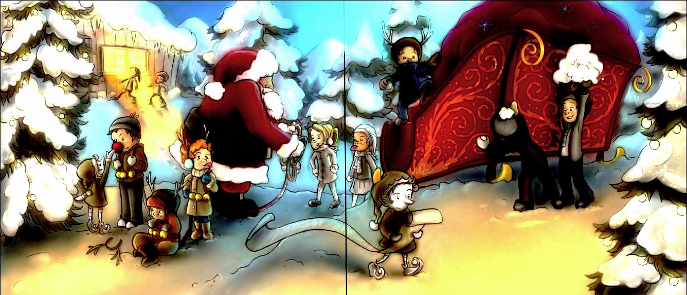
                        That window is so bright now, the kids look like they're about to be War of the Worlds vaporized! BWWWAAANGGHHH!!!
                        Just kidding... the jewel tones in the sleigh are nice though, I would keep that for sure.

                        1 Reply Last reply Reply Quote 1
                        • Lydia M
                          Lydia M last edited by

                          Naughty kids get vaporized in the presence of Christmas magic. Lol.

                          www.lydiamueller.com
                          Twitter @lydesigns

                          1 Reply Last reply Reply Quote 2
                          • Kevin Longueil
                            Kevin Longueil SVS OG @bharris last edited by

                            @bharris This is such a nice piece! - one thing that I would say critique wise is that the focal point is going to be in the gutter of the book - I think too that it may be a little crowded in the space between Santa and the sleigh - would it be worth looking at to move Santa's side of the composition to the left a bit? - possibly bringing the little girl that is sticking her tongue out to the left also - the other thing I was wondering is about Santa's eye - will he get an eye?.....I think not having the eye leaves the image too open to projections - if you can define Santa's attitude for us it would remove the tension I feel there - for me I want him to be good natured and twinkly eyed in his attitude...but this may not be your intent ....he may be upbraiding the children...not sure though - anyways I really like your piece and it does look good the way it is 🙂

                            Portfolio: kevinlongueil.com
                            https://www.instagram.com/kevinlongueil/

                            1 Reply Last reply Reply Quote 1
                            • bharris
                              bharris last edited by

                              @Kevin-Longueil I will add an eye on Santa!Thank you! I realize now that those areas were too close, and it'd be easy to make larger if it was going into a book, but I really don't want to try to move those layers this late in the game.... laziness...

                              www.brittanyharrisillustration.com/
                              www.instagram.com/britillustration/

                              1 Reply Last reply Reply Quote 0
                              • bharris
                                bharris last edited by

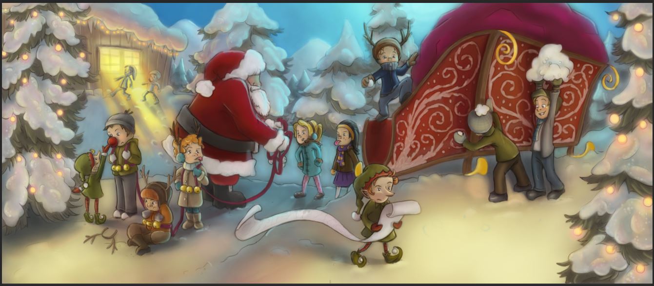
                                I've brightened the colors a lot and tried to warm up the lights. I still have to go over the details and highlights to really paint and define things. Is this working alright? I'm trying not to wash things out with color (I'm a color person anyway) and have a few good focal points across the page.

                                naughty children 5.JPG

                                www.brittanyharrisillustration.com/
                                www.instagram.com/britillustration/

                                1 Reply Last reply Reply Quote 5
                                • ?
                                  A Former User last edited by

                                  This post is deleted!
                                  1 Reply Last reply Reply Quote 1
                                  • Cali Ward
                                    Cali Ward last edited by

                                    Best idea ever!!!

                                    caliward.com * instagram.com/caliwardart

                                    1 Reply Last reply Reply Quote 1
                                    • bharris
                                      bharris last edited by

                                      brittanyharris.jpg

                                      All done and sent!

                                      www.brittanyharrisillustration.com/
                                      www.instagram.com/britillustration/

                                      Chip Valecek Rich Green 2 Replies Last reply Reply Quote 10
                                      • Stephanie Hider
                                        Stephanie Hider last edited by

                                        Love your lighting! All of it is so wonderful 🙂

                                        http://stephisdoodling.com
                                        http://stephaniehider.com
                                        https://www.instagram.com/stephhider/

                                        1 Reply Last reply Reply Quote 2
                                        • Chip Valecek
                                          Chip Valecek SVS Team SVS OG @bharris last edited by

                                          @bharris Looks fantastic!


                                          https://www.instagram.com/chipvalecek/
                                          https://www.facebook.com/cvalecek
                                          http://www.cshellmedia.com/

                                          1 Reply Last reply Reply Quote 1
                                          • Rich Green
                                            Rich Green SVS OG @bharris last edited by

                                            @bharris Really nice work! Your concept was so clever from the start and to now see it completed with the nice cool and warms tones and lighting - really nicely done! Best of luck tonight and congrats on such a great piece!

                                            www.richgreenart.com instagram.com/richgreenart/

                                            1 Reply Last reply Reply Quote 2
                                            • First post
                                              Last post