Society of Visual Storytelling

    SVSLearn Forums

    • Register
    • Login
    • Search
    • Recent
    • Tags
    • Popular
    • Users
    • Groups
    • Search

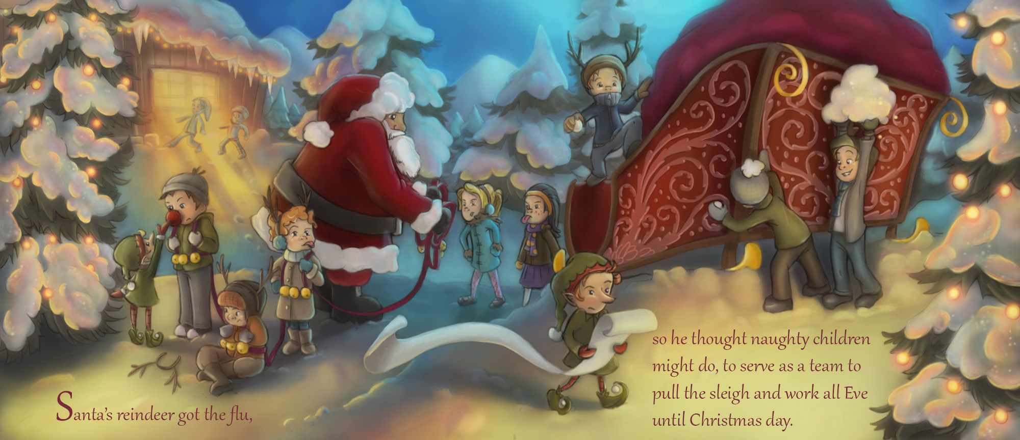
    3rd Thursday Naughty Children FINAL

    General Discussion
    21
    56
    17133
    Loading More Posts
    • Oldest to Newest
    • Newest to Oldest
    • Most Votes
    Reply
    • Reply as topic
    Log in to reply
    This topic has been deleted. Only users with topic management privileges can see it.
    • bharris
      bharris last edited by

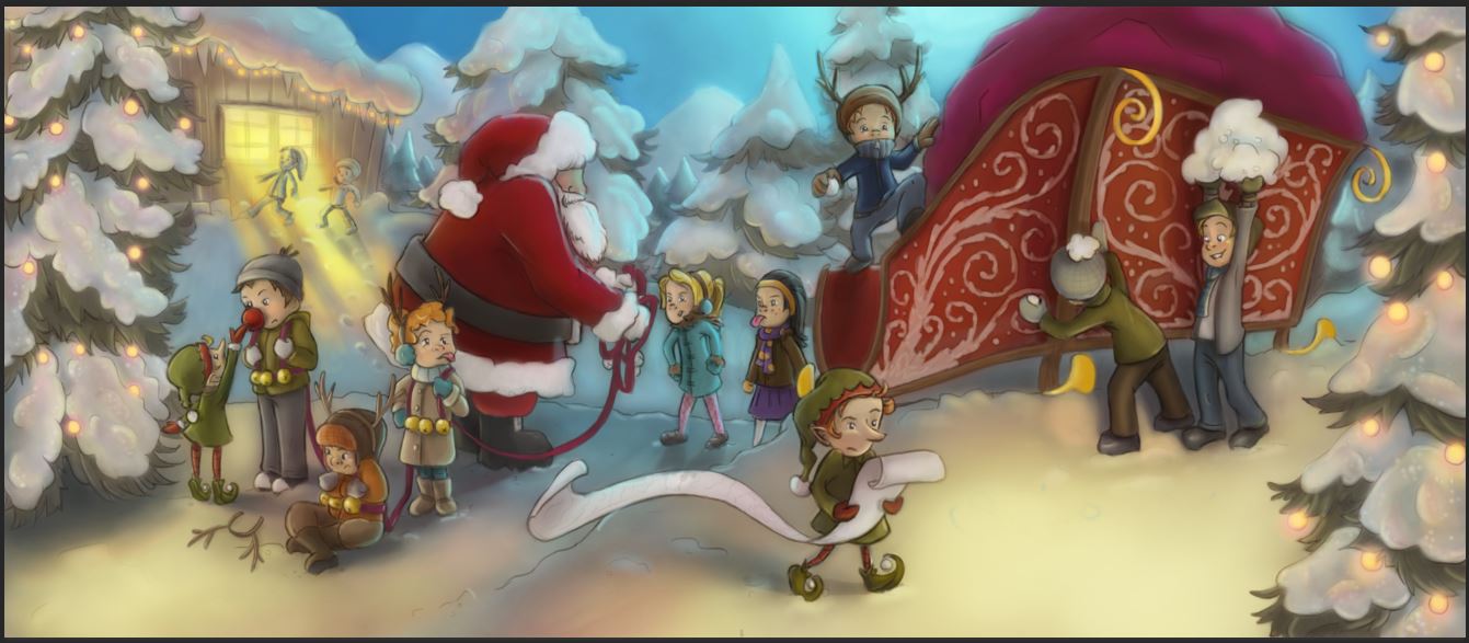
      I've brightened the colors a lot and tried to warm up the lights. I still have to go over the details and highlights to really paint and define things. Is this working alright? I'm trying not to wash things out with color (I'm a color person anyway) and have a few good focal points across the page.

      naughty children 5.JPG

      www.brittanyharrisillustration.com/
      www.instagram.com/britillustration/

      1 Reply Last reply Reply Quote 5
      • ?
        A Former User last edited by

        This post is deleted!
        1 Reply Last reply Reply Quote 1
        • Cali Ward
          Cali Ward last edited by

          Best idea ever!!!

          caliward.com * instagram.com/caliwardart

          1 Reply Last reply Reply Quote 1
          • bharris
            bharris last edited by

            brittanyharris.jpg

            All done and sent!

            www.brittanyharrisillustration.com/
            www.instagram.com/britillustration/

            Chip Valecek Rich Green 2 Replies Last reply Reply Quote 10
            • Stephanie Hider
              Stephanie Hider last edited by

              Love your lighting! All of it is so wonderful 🙂

              http://stephisdoodling.com
              http://stephaniehider.com
              https://www.instagram.com/stephhider/

              1 Reply Last reply Reply Quote 2
              • Chip Valecek
                Chip Valecek SVS Team SVS OG @bharris last edited by

                @bharris Looks fantastic!


                https://www.instagram.com/chipvalecek/
                https://www.facebook.com/cvalecek
                http://www.cshellmedia.com/

                1 Reply Last reply Reply Quote 1
                • Rich Green
                  Rich Green SVS OG @bharris last edited by

                  @bharris Really nice work! Your concept was so clever from the start and to now see it completed with the nice cool and warms tones and lighting - really nicely done! Best of luck tonight and congrats on such a great piece!

                  www.richgreenart.com instagram.com/richgreenart/

                  1 Reply Last reply Reply Quote 2
                  • bharris
                    bharris last edited by

                    @Stephanie-Hider @Chip-Valecek and @Rich-Green Thank you for your comments! It was a struggle, but worth it!

                    www.brittanyharrisillustration.com/
                    www.instagram.com/britillustration/

                    1 Reply Last reply Reply Quote 1
                    • Rob Smith
                      Rob Smith last edited by

                      @bharris Really nice. I was super excited to see the finished image. I'm sure they will have a few suggestions for you tonight but I'm hoping your one of the winners!

                      1 Reply Last reply Reply Quote 1
                      • bharris
                        bharris last edited by

                        @Rob-Smith I hope they do! It was my first time using this method and I'd like to improve on it.

                        www.brittanyharrisillustration.com/
                        www.instagram.com/britillustration/

                        1 Reply Last reply Reply Quote 1
                        • Dulcie
                          Dulcie SVS OG last edited by

                          @bharris I agree with the other comments - a really beautiful piece. There are so many great works entered this month but I wouldn't be surprised at all to see this one critiqued tonight!

                          www.dulciemascord.com
                          https://www.instagram.com/dulciemascord
                          https://twitter.com/dulciemascord
                          https://www.facebook.com/dulciemascord

                          1 Reply Last reply Reply Quote 0
                          • bharris
                            bharris last edited by

                            It was fun to watch and participate! This piece didn't get a critique, so I'd love to hear some thoughts. I already see things that could have used more time.

                            www.brittanyharrisillustration.com/
                            www.instagram.com/britillustration/

                            1 Reply Last reply Reply Quote 1
                            • DanetteDraws
                              DanetteDraws last edited by DanetteDraws

                              @bharris I haven't watched last night's critique yet to know who won and how they stack up to yours, but I can offer some feedback 🙂

                              What I think you're strong in:

                              • concept
                              • composition
                              • line drawing/sketch (the only thing I think is "off" is Santa's face - I feel like he's missing a round cheek rather than having a flat face that immediately goes into a big nose. His eye might be too high/inset too much too.)

                              What I think you can work on:

                              • Colour
                              • Rendering

                              To expand on these... you have some nice vibrant colours in there, but mostly I think it's quite muddy. I think it's the snow in particular that's off to me - for one, it should be more white than yellow (the snow on the ground in the foreground), and in the shadows not so grey/slush-like. I think it would be helpful for you to refer to some reference imagery of snow in a nighttime scene. I also think the overall colour harmony is off - the deep red feels out of place against the blue you chose for the sky.

                              In terms of rendering - do you use the airbrush at all? For me, it looks a bit "mushy". I'd work on adding some nice textures and maybe using brushes with texture right in them.

                              Anyway, hope this helps! I think you're off to a good start though and perhaps next month you'll get a critique 🙂

                              https://danettebyatt.com
                              Twitter @DanetteDraws
                              Instagram @DanetteDraws

                              1 Reply Last reply Reply Quote 2
                              • bharris
                                bharris last edited by

                                @DanetteDraws Thank you for that. I really don't like Santa's face much either... And I agree the sky color is defiantly off. This was my first time doing a night-time and snow and this particular rendering style. Thank you for your suggestions and I appreciate your feedback!

                                www.brittanyharrisillustration.com/
                                www.instagram.com/britillustration/

                                1 Reply Last reply Reply Quote 1
                                • MOO
                                  MOO SVS OG last edited by

                                  It looks really great. I'm so impressed with your skills.

                                  Marsha Ottum Owen

                                  1 Reply Last reply Reply Quote 0
                                  • First post
                                    Last post