Feedback on children’s book illustration please
-
It's a really nice illustration with a lot going for it! The style is very consistent, the animals look genuinely playful and the composition is nicely balanced around the text. I also like how you faded out the landscape in the background.
You might want to look at two small things: First, and most importantly, I had to look hard for her hands, and only one is visible. Maybe take a look at that to make sure she looks like she could really balance while doing a handstand.
Secondly, there was something with color/value that wasn't quite hitting me right. I took it into PS to look at it in black and white. One definitely sees the boots and tire swing and otter as the darks. Is that where you want your value punch? In B & W I want to make the dress darker, but perhaps the fact that it's red gives it enough emphasis (I always wonder about that!). I see that the blue is a unifying tone in the background, but I do wonder if perhaps it's a bit saturated or dark.
Then again, the business of the color and value are so slight that they are only a, "What do you think?" Mainly I'd just look at the hands.
Good job! It's simple, but artfully done!
-
This is so lovely. The consistent style throughout is really beautiful to my eye, and all the characters are so expressive but not over the top. Though I’m no expert at values, and I think there is flexibility within this style, it comes to mind that adjusting the values of certain elements might help draw they eye to your desired focal point and secondary points of interest. One example might be desaturating the dark animal on the far side of the pond to make him fade into the background and not draw quite so much attention to himself.
") Thanks for sharing, this is really really nice...
Thanks for sharing, this is really really nice... -
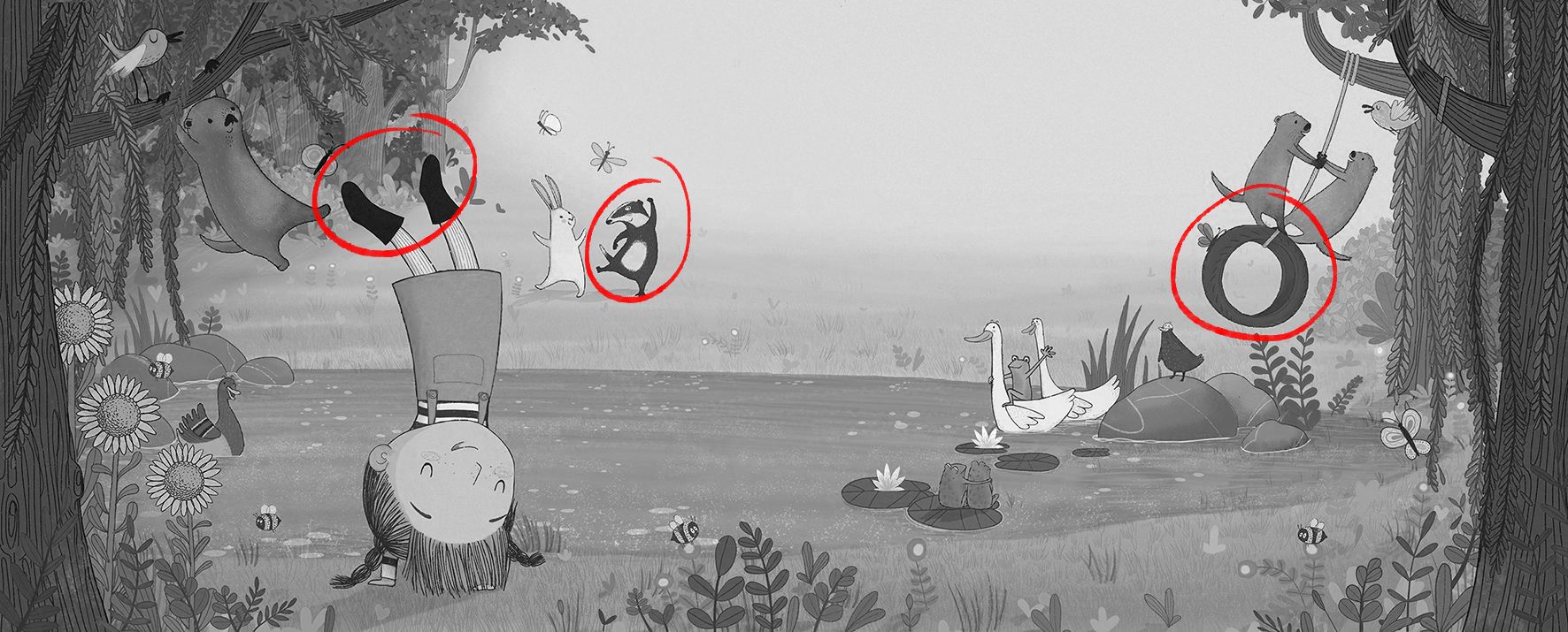
@Carol-del-Angel As @LauraA and @KathrynAdebayo have pointed out, this lovely illustration could be improved by tweaking the values. If we put the image in greyscale, we can see that everything is very similar in value, in the middle range. I've circled the areas of contrast, which will bring in the reader's eye. Not sure this is quite what's most important in this illustration:
What I'd do here is:
- Darken the trees on the forefront on either side to create depth and frame the composition
- Darken all the water in the pond
- Add an additional shadow layer on the left side of the pond, in an attempt to make the girl stand out
- Slightly brighten the girl's skin to increase contrast and bring the eye to her face
- Whiten the sky background to create a lighter point in the composition, avoid the "muddy" look of too many middle range values
I've quickly demonstrated those changes in Photoshop to show you what I mean and what it could do to the image:
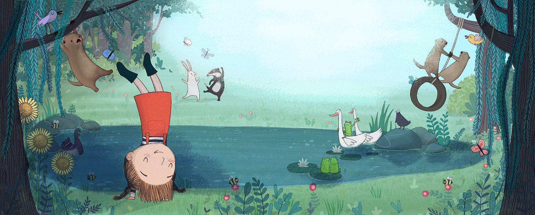
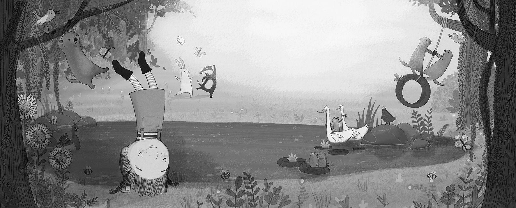
What do you think? If we turn this image to greyscale, we can see that now there's a much broader range of values:
I hope that helped!
vanessastoilova.com
instagram.com/vanessa.stoilova/Check out my Youtube channel for tips on how to start your career in illustration! www.youtube.com/c/ArtBusinesswithNess
-
@Carol-del-Angel Nice design, and color palette. Love your environment. Apart from the value issue the others have pointed out, I might play around with the design of her dress. I might try patterns, or something that will tell me more about the character. I just thought the dress is an opportunity to communicate the character's personality a bit more.
@NessIllustration really nice draw over. -
!nice Very
-
@Carol-del-Angel Your art is very playful and pleasant. I am just a beginner so not much to add from what others with more experience have explained already. I just love how it looks.
-
@LauraA This is really helpful, thank you for taking the time to reply.
I forgot that svs had recommended changing an image to grey scale to look at the values, and it is one thing that. I really needed to do.
I will post my illustration agian once I’ve made those changes.
Many thanks -
@KathrynAdebayo thank you so much. I was feeling very unsure about it before posting but all the response has really boosted my confidence in it.
-
@xin-li Thant’s a great idea xin-li, thank you. I have been trying different patterns but it’s difficult not to make the whole image too complicated by adding that. I do agree that it would add more personality though.
-
@RG-Spaulding thank you