Society of Visual Storytelling

    SVSLearn Forums

    • Register
    • Login
    • Search
    • Recent
    • Tags
    • Popular
    • Users
    • Groups
    • Search

    January WIP Thumbs

    Artwork
    8
    16
    688
    Loading More Posts
    • Oldest to Newest
    • Newest to Oldest
    • Most Votes
    Reply
    • Reply as topic
    Log in to reply
    This topic has been deleted. Only users with topic management privileges can see it.
    • J
      jdubz last edited by

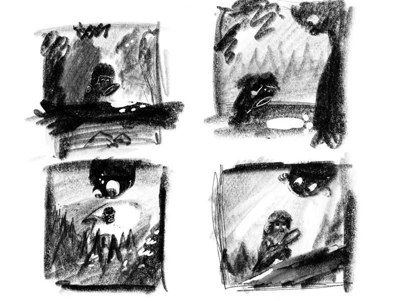
      Starting to do some rough comp thumbs. Lots of similar concepts coming out so I'm kind of leaning towards the dinosaur bottom left. Settling on the idea of a kid with a magnifying glass so intent on following the trail he's missing something right on top of him. Thoughts on how these read?

      Untitled_Artwork.jpg

      Josh White
      https://www.instagram.com/joshwhiteillustration/

      phoenix yip 1 Reply Last reply Reply Quote 1
      • Nathalie Kranich
        Nathalie Kranich last edited by

        I really like the fourth, the story comes together well and I think it's the strongest composition.

        www.nathaliekranich.com
        https://www.artstation.com/nathaliekranich
        https://www.instagram.com/nathalie.kranich/?hl=en

        1 Reply Last reply Reply Quote 0
        • eriberart
          eriberart last edited by

          I agree, I really like the fourth (bottom right). I love how they're making eye contact and I think it's the strongest composition.
          Also I love how energetic your thumbnails are!

          Instagram and Twitter: @eriberart
          Website: www.erinmcclean.com

          1 Reply Last reply Reply Quote 0
          • J
            jdubz last edited by

            Thanks for the feedback! I'll work on some further versions and see where I end up.

            Josh White
            https://www.instagram.com/joshwhiteillustration/

            1 Reply Last reply Reply Quote 0
            • J
              jdubz last edited by

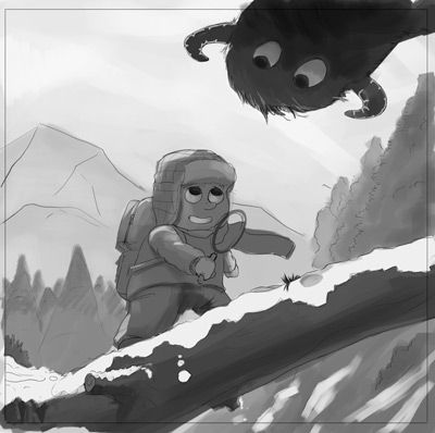
              Had some time to block in a bit more detail and then some basic values to see how it feels. I did both the bottom right, and I also did the dinosaur one just so I explored some options.

              Does that bottom right one still communicate more effectively and feel more cohesive?

              jan-blocked.jpg

              jan-blocked2.jpg

              Josh White
              https://www.instagram.com/joshwhiteillustration/

              KaraDaniel 1 Reply Last reply Reply Quote 2
              • KaraDaniel
                KaraDaniel @jdubz last edited by

                @jdubz of these two I prefer the one on top. I do like the animal hiding in the tree on the bottom though, cute idea.

                instagram.com/sha_kara
                karadaniel.net

                1 Reply Last reply Reply Quote 0
                • LauraA
                  LauraA SVS OG last edited by

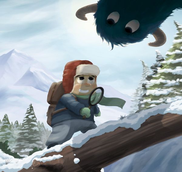
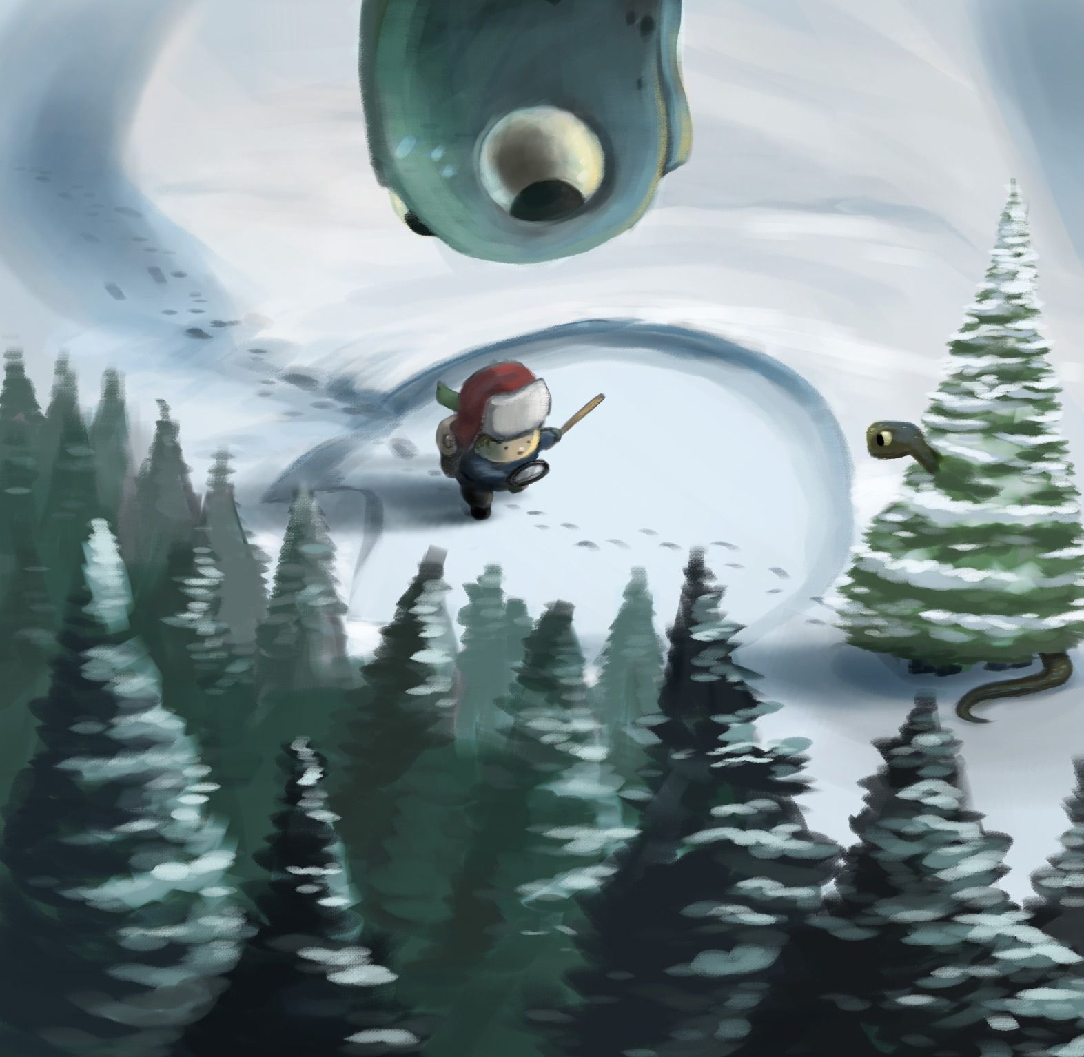
                  I like the one on bottom! I like how Will is clueless (perhaps even to the big print) and I like how the shadow defines the dinosaur's body without showing it all. But would there really be such a huge difference in the size of the dinosaurs and tracks? I take them to be a mother and baby.

                  Instagram: https://www.instagram.com/lauraintorino/
                  http://lauraaldersonart.com/

                  1 Reply Last reply Reply Quote 0
                  • J
                    jdubz last edited by

                    @KaraDaniel @LauraA Thanks both for the feedback! Ugh it's tough. I looked at them again this morning and I want to take both further lol.

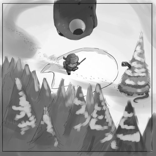
                    I did rough paint-through to see how far off I was and I still think it's a bit workable. I'd likely need to reduce the size of the footprint but not by a ton and work the shadows slightly different.

                    overpaint.png

                    Josh White
                    https://www.instagram.com/joshwhiteillustration/

                    LauraA demotlj 2 Replies Last reply Reply Quote 3
                    • LauraA
                      LauraA SVS OG @jdubz last edited by

                      @jdubz Wow, now THAT'S a draw through! 😂

                      Instagram: https://www.instagram.com/lauraintorino/
                      http://lauraaldersonart.com/

                      1 Reply Last reply Reply Quote 1
                      • demotlj
                        demotlj SVS OG @jdubz last edited by

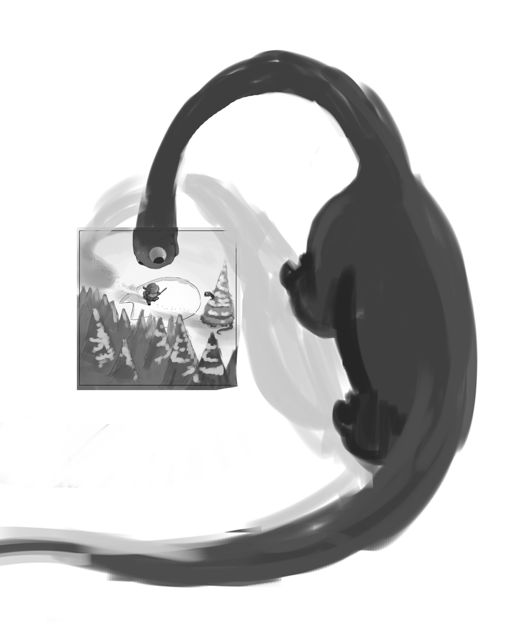
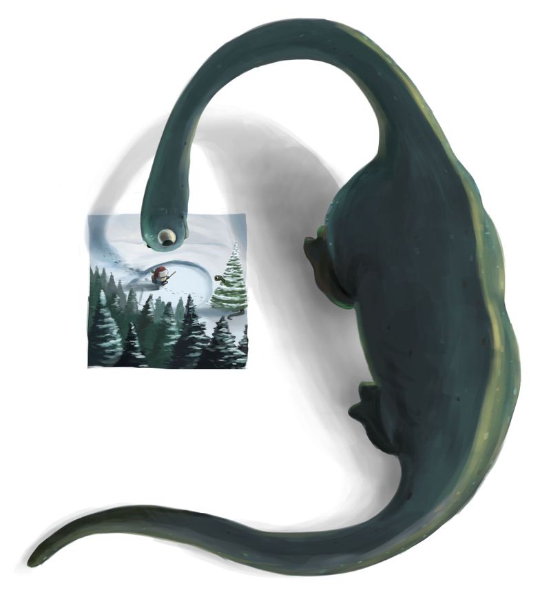
                        @jdubz Even if you just did this as a draw-through, I actually like it with the whole dinosaur standing on the outside of the frame like that. It's very creative.

                        Laurie DeMott
                        instagram.com/demotlj

                        1 Reply Last reply Reply Quote 1
                        • J
                          jdubz last edited by

                          @LauraA Lol yeah I didn't know of a better way to make sure I had an idea of where all the forms would fall 😛

                          @demotlj interesting... maybe I'll keep it that way for a portfolio piece? One problem is that as it's that zoomed out it's hard to tell what's going on in the actual frame.

                          Josh White
                          https://www.instagram.com/joshwhiteillustration/

                          aska 1 Reply Last reply Reply Quote 0
                          • aska
                            aska @jdubz last edited by

                            @jdubz i also think its awesome when you can see the whole dinosaur. It made me smile 🙂

                            Aska
                            www.mugaska.com
                            https://www.instagram.com/mugaska/
                            https://www.etsy.com/uk/shop/mugaska

                            1 Reply Last reply Reply Quote 0
                            • J
                              jdubz last edited by

                              Had a chance to work on the first one - still working on the dino. I'm trying some stylistic things on that specifically in how I'm coloring it, so we'll see how it turns out. But this is where the first is so far:

                              jan1-v1.jpg

                              Josh White
                              https://www.instagram.com/joshwhiteillustration/

                              1 Reply Last reply Reply Quote 2
                              • phoenix yip
                                phoenix yip @jdubz last edited by

                                @jdubz those look amazing!

                                1 Reply Last reply Reply Quote 0
                                • J
                                  jdubz last edited by

                                  Had some time to flesh these out a bit. I'm getting a far looser look and feel than the first one and decided not to try and "fully render" it out. I'm wondering if maybe I'm over illustrating a bit on the first one above?? I just wanted to keep a bit less refined to see how that felt.

                                  The bottom one is along the lines of what some of you had said where the dino is like looking "into" the frame. The real problem is that the scene ends up being REALLY small you'd have to zoom way in to see anything.

                                  Untitled-2.jpg

                                  dino-full.jpg

                                  Josh White
                                  https://www.instagram.com/joshwhiteillustration/

                                  1 Reply Last reply Reply Quote 1
                                  • J
                                    jdubz last edited by

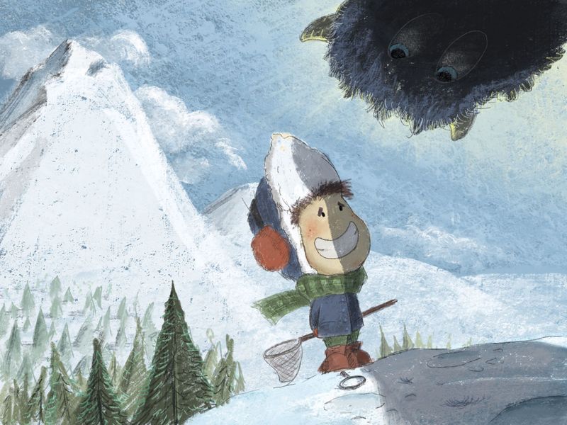
                                    I'd like to ask some feedback on what I'm doing stylistically. I'm kind of wondering if maybe I'm over illustrating some of my work a bit.

                                    I tried to do less on the dino than I did with the boy and the yeti.

                                    But I thought maybe I should try pulling WAY back and do some planning then start the first idea with that in mind and see what happened. What I ended up with is spending far less time rendering all the details out and then chose a really limited color palette. I probably started this 4-5 times because I kept changing details on where he was on the mountain.

                                    Does a more simplified approach seem to help it or take away from it?

                                    Yeti.jpg

                                    Josh White
                                    https://www.instagram.com/joshwhiteillustration/

                                    1 Reply Last reply Reply Quote 0
                                    • First post
                                      Last post