Critique request
-
@CLCanadyArts It’s the work of @yuriqart but you nailed the type of change I was suggesting, rounding things off to make it more childlike!
-
@mamadraw oops, sorry. I hit the wrong reply button.
 I definitely agreed with your critique.
All my links: https://APHOTICMOTH.carrd.co/
-
@CLCanadyArts thank you so much , now I can see where the mistake is, thank you soooo much man
-
@yuriqart You're welcome! Can't wait to see more from you.
")
-
@mamadraw thank you man
-
I really love your monster character with it's "I love humans" shirt lol! Would love to see a whole book about it!
-
@yuriqart! Hi, man!
This is pretty cool! What makes an artwork stick is often times the idea, not the technical side of things, so while it could use a bit of work, the idea is there and it is fun and memorable.I've taken some time to do a quick overpaint with a few suggestions. Just a couple of little ideas and changes that popped into my head when I saw this image.
Let's go!
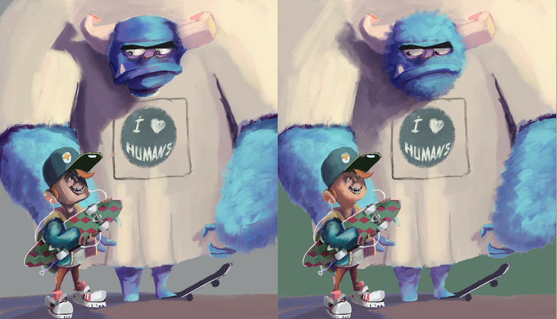
So the first thing that I see is that your light direction seems to be a little inconsistent. Looking at the shadow on the creature and the boys head, the lightsource is somewhere on the right, in front of the scene. Yet you painted the monster's left hand like it's being lit from a different direction. I fixed that.
Also, I adjusted the light on monster's head to match it with the boy and the arm behing him. In the original, it looks like monster's head is being lit at a slightly different angle.Speaking of his head...
I just looove the furry texture you used on monster's arms. I realy think that something like this should happend on his head as well! Adding this furr texture there not only makes it look a bit more interesting, but also adds some unity to the design. Also, by making the creature's head more round I echoed the change that you did to the boy's head. You can achieve some great harmony through shape repetition like that!Watch out for the boy's skin! Skin is actually a bit translcent, that is why we can see a LOT of warms in it. Those cool, desaturated colors you have used make the skin look very...dead? I guess that's a good word.
So as long as you don't want your kid to be a zombie, throw some warms in there!I also adjusted the shadow that is being cast by creature's head. It works AMAZING as a compositon tool, since it leads our eye straight for the boy. However, with such a hard edge, this shadow calls A LOT of unwanted attention. You can push it back by allowing it to melt away. Make a grad in there, soften the edge the further away from the head it goes... Shadows do that in real life, you know? The further away they go from the object, the softer they get.
Here! I took a photo for you!
This is not a thing that is set in stone since the strength of this effect depends on the strength of the light source, but this image is a perfect opportunity to use it!Last but not least, I made a color change to the background.
It is VERY subjective so treat it with a grain of salt, but I because the local color of the monster's shirt was sooo similar to the color of the background, I couldn't figure out the character's silhouette at first. Making a change like that will help the picture to read better. The green I used there is random. You can use any color you want
That is all I could think of at the moment.
This is a good picture though! It has some nice composition, a fun idea and I REALLY like how you've painted the boy's clothes. Good luck with your artwork!Spreading art and positive vibes!
-
@IgorWoznicki Has some AWESOME points! I agree with his input. The only change I would make to his overpaint is the background color. I wouldn't do that pale green. Maybe try the same color shadow that the Monster's head is casting. Or a warm tone like the pink on the tips of the monster's horns. In fact I would ditch the pale green color all together. Don't use it on the skateboard. Again, maybe try the purple or another shade of pink.
2 other things come to mind..
1- You've got this awesome cast shadow coming from the monsters head, you might want to try the same thing for his arm on the right. I feel like it gets a little flat with all that tan. Think about where the light source is coming from and cast another nice deep purple shadow.
2- The guys from 3 pt Perspective podcast have mentioned the 2/3rds or 3/4ths rule (I can't remember which) with layout and space when it comes to design. To me it looks like you're right at 50/50. Half clear/negative space and half busy. Might want to consider adjusting the composition a bit to make it a little more interesting.
Super interesting concept though. I love the expression on the monster's face and the blue fuzz
-
@IgorWoznicki I really wanted to thank you for your patience I will redo the art and create the same character Playing video game I will post here I hope I make fewer mistakes.
-
@NicholeMarie thank you so much