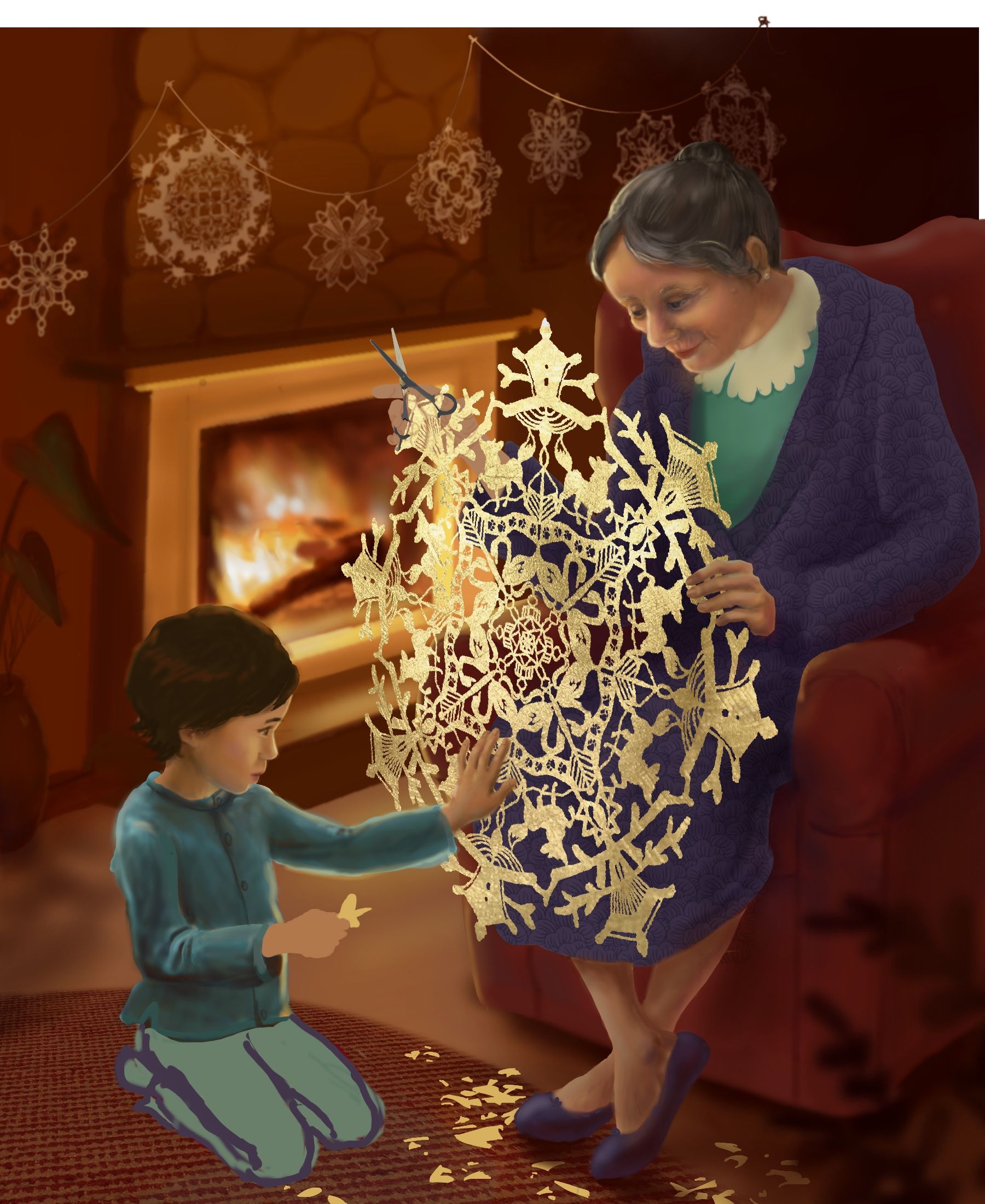
Critique appreciated - tracks in the snowflake
-
@Kalimostlypaints Thank you for your comment. You’re absolutely right that the chair is in a weird place. Hmm... I wonder what other details could make it feel more grounded and less randomly situated. Any ideas?
-
This is really fun... I can hardly stop even though I should
") I’d appreciate critique, especially about where I could adjust values.
I’d appreciate critique, especially about where I could adjust values. -
@KathrynAdebayo This is lovely!
I have noticed two things, which you might want to correct or not. I am not sure about kid's left arm (looks a bit longish). Second thing is more a question. How did you intend to draw grandma? Is she supposed to look at the child? At this moment she looks a bit melancholic and lost in her world, like she is deep in her thoughts about something else than the child. Anyway looks lovely. On the thumbnail I wasn't sure what the thing was as it looked like a piece of clothing to me. I didn't expect such a beautiful piece of art -
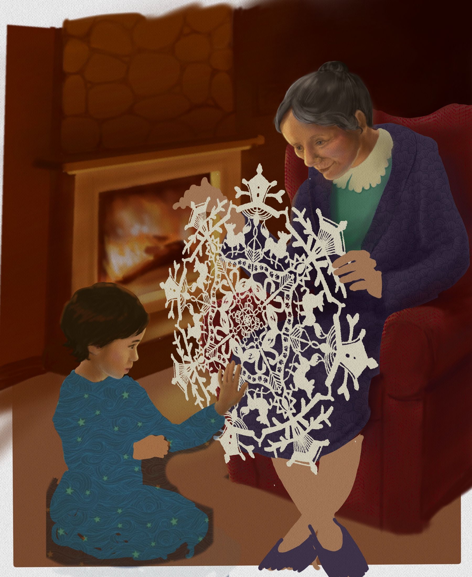
@aska Wow, thank you for the super helpful suggestions! I would like the grandma to look at the boy, but I’m still not convinced that it looks like she is... Is this better? And great catch with the arm length...
-
@KathrynAdebayo no problem. I think it's better
Grandma stil seems a bit absent and melancholic, but maybe thats what you want? However if you are not convinced if you achieved planned effect, you should explore a bit more. Take one day break and look again. -
@aska Thank you, great advice!
-
More details... this is still way too fun.
-
@KathrynAdebayo I love the idea, love the warmth of the colors (you really researched this piece well!) and I do like the constrasting cool colors in the clothes. I love the boy's tender profile and gesture. I also really like the pattern you added to the pajamas!
I don't know if this advice will be too out of the blue or whether it will be right for your style (I've seen some of your work but don't have a good feeling for the whole yet), but I noticed that the boy's profile, especially, lost something when you started to paint in the details. If I had to say, it's that there is a lot of contrast in the values in the figures' faces and limbs, especially in the reflected light. The result is that they lack some the unity that they would have otherwise.
An easy way to try out a change would be to put in some kind of fill layer over all the skin and then take town the opacity or change the layer mode to see if you like the effect. (Or if you still have the underpainting, you could make the layers of paint on top more transparent so you can see the underpainting.)
Also, the snowflake is gorgeous (I just now noticed the track motif!), and it is the center of the painting and therefore some sharpness and contrast are warranted. And I suspect that you're still going to take down the value a lot. But there is something of the gorgeous softness of the snowflake in the 3rd color study that it would be a pity to loose. Also, I really suspect that a paper snowflake that large would bend a bit more. Not as much as a lace tablecloth, but it wouldn't be flat either.
I hope it doesn't feel like I'm picking your illustration apart. In fact, I really relate to it, and the former portrait painter in me especially relates to the warm realism of it. I think for that reason I can hear my former portraiture teachers' voices in my head and am passing on the same advice they used to give me, especially about subordinating the details to the whole. Portraiture has some specific rules that don't apply to all illustration styles, so if you like that kind of painting, it's worth a Google search! (And yes, Sargent is one of the great masters!)
-
@KathrynAdebayo grandma expresion is perfect
However boys left arm looks a bit too thin in the upper part. I i think t's a small repair. Good job -
@KathrynAdebayo looks like a precious memory, I love it.
-
Awesome painting so far. The boys left arm looks like it’s bent at a weird angle to me. I think in this pose the elbow should be pointing down and toward the fireplace. Other than that it looks great!
-
@LauraA Oh Laura! I’m so happy to get your feedback! Thank you so much for your very valuable advice. Actually, of all the people who I see regularly on this forum, your work is probably closest to the style of this piece, so I am honored to receive your critique. I usually take each monthly contest as an opportunity to try a new style, so this is a whole new ballgame for me this month.
I really want to understand what you were saying about values of skin tones. I looked up some portraits by Sargent and started to perhaps notice the unity in skin tones that you were mentioning. I put another layer over my characters’ faces and tried some new colors... is it an improvement? I feel happier about it for sure.
I appreciate your comments about the center snowflake. I’m still mystified by how to color it and have yet to look up good reference photos. I did warp it a bit more to help it look less stiff. I hope it turns out looking natural! A challenge for sure! I did look back at my color studies again as a reminder of the effects suggested there.
Thanks again for the help.
@aska & @Zachary-Drenski Hi! Thank you both for the encouragement and the input about the arm. You definitely brought something important to my attention! I tried a new position for the boy’s arm and hand. Any better? Thank you again for taking the time to comment.
@KaraDaniel
Happy to hear you enjoy it so far.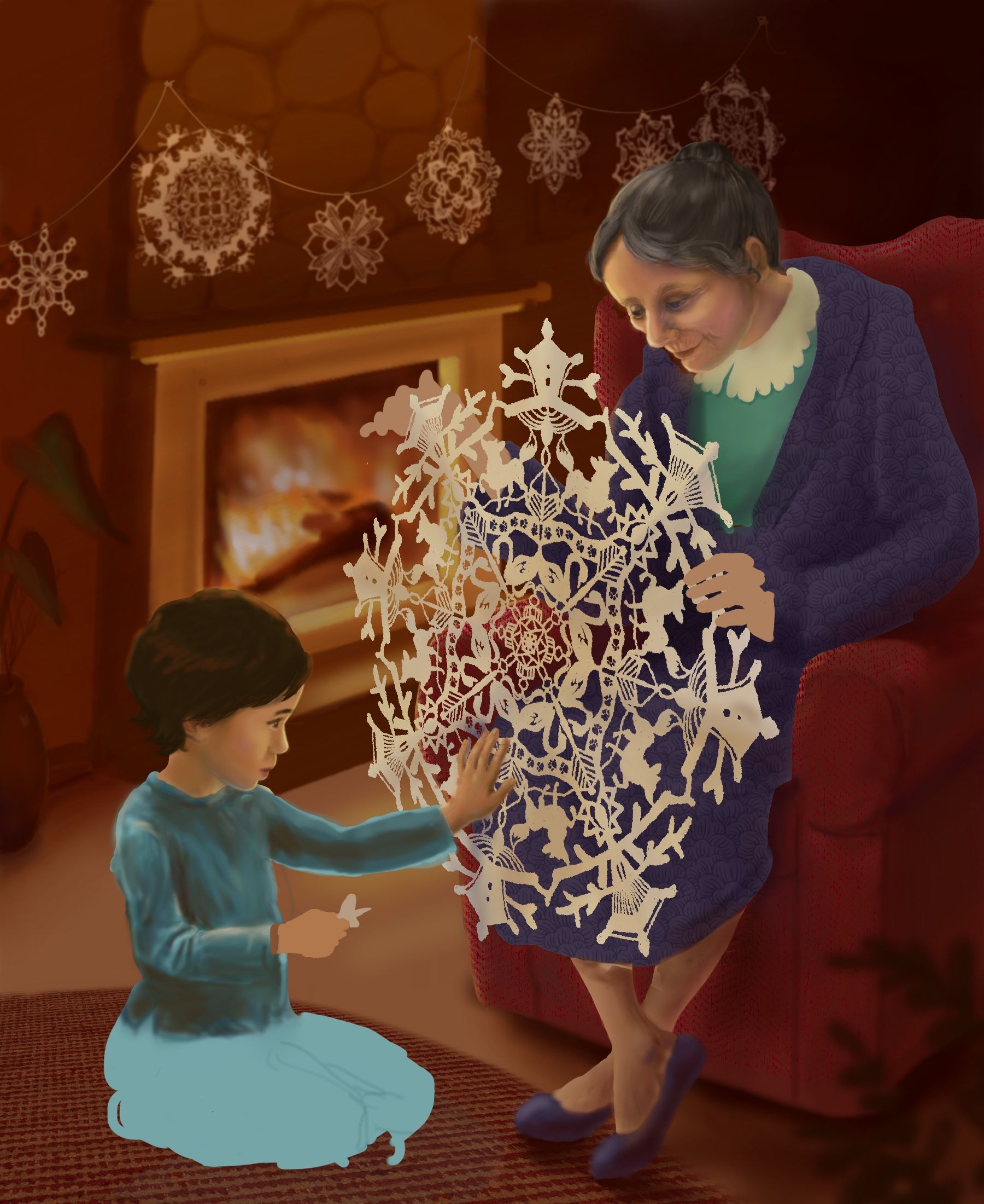
-
@KathrynAdebayo I wish I had time to just paint what I am talking about, but I've got some distractions at home. Instead, I'll post this video here that I hope will explain it well enough. I think you could simplify even more! Also, forcing yourself to use a larger (and more definite) brush in the beginning stages helps. That's what they always told us to do in portrait painting classes. It forces you to define the shapes within the larger shape. Again, Sargent is a master of this.
As for the snowflake, I think you could take it even further both with the deepening of the color and with the bending! After all, the light source is coming from behind!
And I understand what you said about style, because I am still trying out a lot of styles and media as well, and at times it makes each piece feel like reinventing the wheel!
-
The arm looks much more natural
looking forward to seeing the end product -
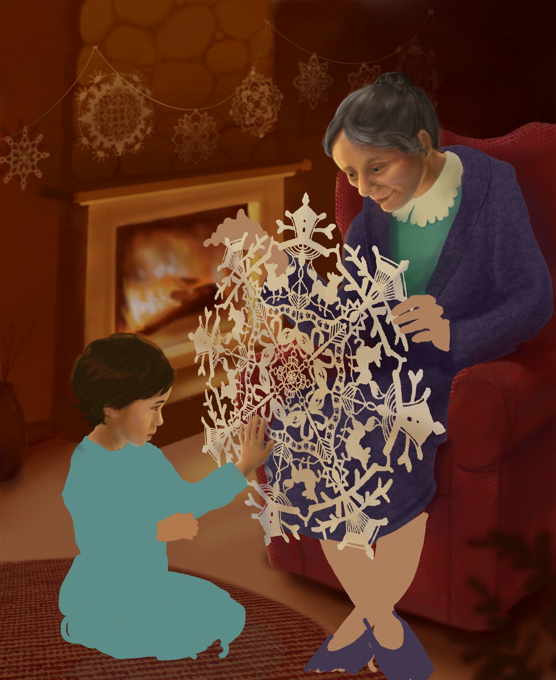
@KathrynAdebayo I think this is looking good. All the changes look good. For me the fire looks a little airbrushy. Your other characters have that nice mixed media quilt cut out effect that is super in right now with clean edges and the fire looks more soft and blurred compared to the crisp edges. I think its placement right behind the snowflake causes a little distraction too. Maybe move it left just a little? But take this with a grain of salt. You have a great piece and your digital painting skills far exceed mine.
-
@LauraA Hi again, Laura, thanks so much for the link to the video. That was very helpful and I can see how defining large areas with value earlier would help the forms and skin look more natural. Right now my figures are very blendy with less defined values and perhaps values that don’t correspond well with the shapes of the faces and hands. I worked on them a little more, but I feel like I would really need to start over to get the best effect. I’m also not the best at imagining forms and lighting in my head, and with the fire in the background, I don’t have good reference pictures for this image. Maybe better reference images would help too for next time.
If anyone wants to paint over my piece if you understand better what Laura is trying to explain to me, feel free.
@chrisaakins Thanks for the note about the fire. I tried to give it a bit more definition and darken the area behind the snowflake. Any better? It’s still pretty airbrushy, but my hope is that it won’t get too much attention... leave the focus on the other busy elements. Do you think that’s working? Thanks again for your help.
I’m also hoping to experiment with some texture at the end so that the piece looks less airbrushed overall.
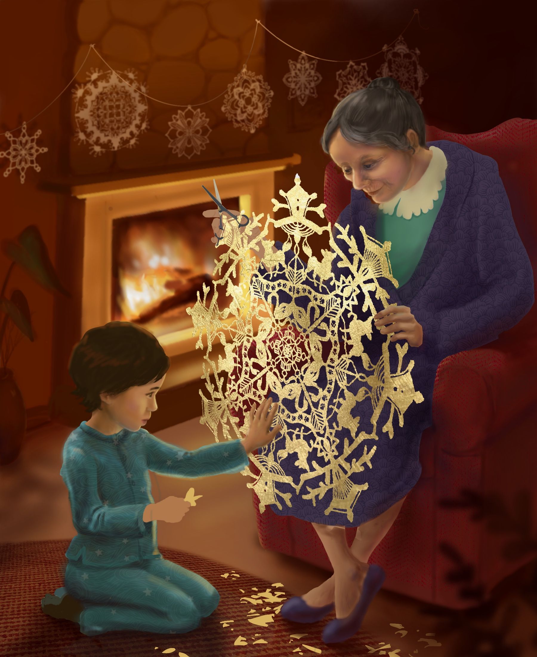
More critique is always appreciated from anyone who notices things that look off. I’m still working on the snowflake and don’t know if I like the shimmery effect vs. a normal paper look. I haven’t added any shadows to it yet.
-
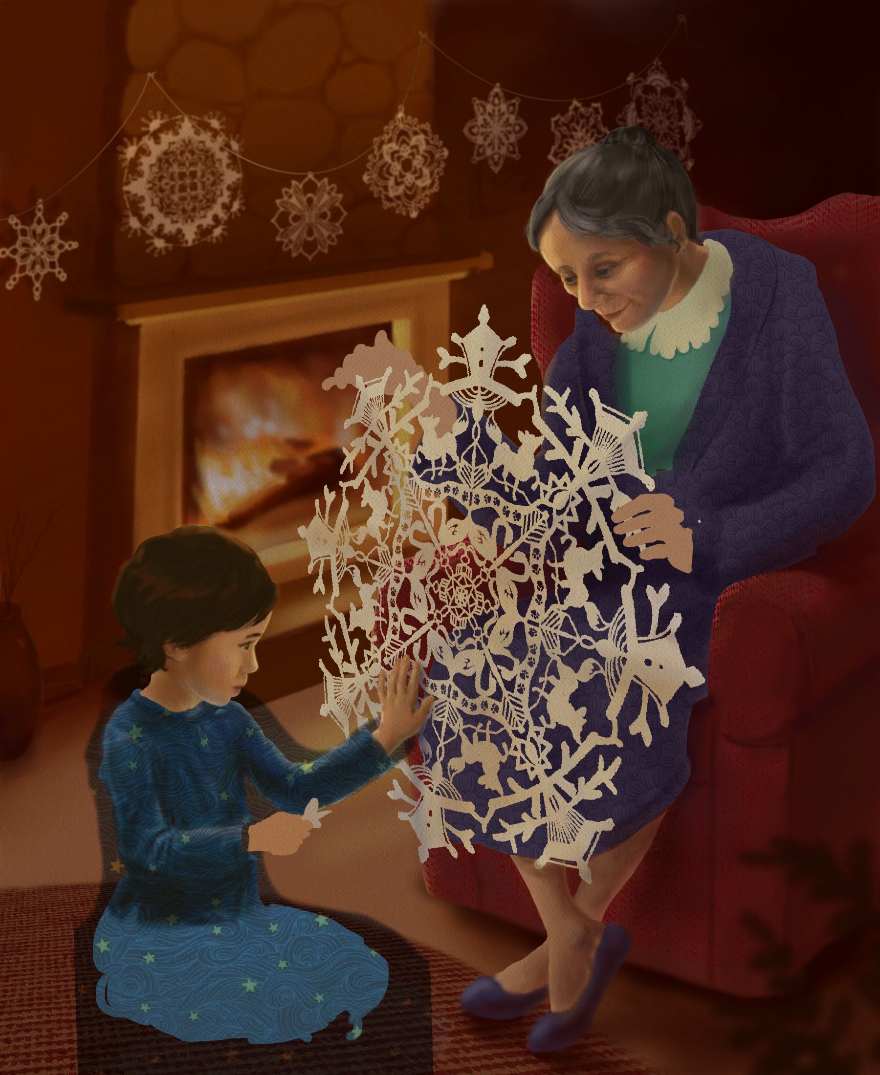
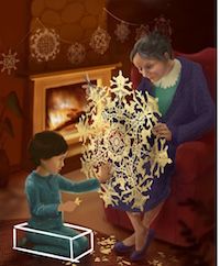
@KathrynAdebayo This is looking really nice - i do like the new texture on the paper too. I could be wrong on this but i feel like the background does not match the perspective of the foreground - that the background is too high - i feel like the fireplace should actually tilt down and away from us to the right? I put a quick little box around the folded legs of the child to see if it helped me to see and i think it did - our point of view seems much lower for the child than the background - it feel like the point where the floor hits the wall should be just below the child's shoulder - i am not too sure of this but i though i would share it anyways
-
@Kevin-Longueil WOW, thank you so much for mentioning this and for taking the time to draw that box. I see now the discrepancy and will have to adjust things. Thanks again. I love how your January piece is turning out.
-
Hi! I do think it has gotten a lot better, especially the boy's face! And the sparkly texture on the snowflake is very nice, too.
I think maybe I'm partly describing what @chrisaakins called airbrushiness. Airbrushiness is usually not caused only by the brush used but also by not being sure where the shadow delineations should fall. Like you said, good reference or a model would probably help a lot. I know it's getting late in the month to start over (I have a cold now and am staring at my own piece ineffectively), but it's all a learning process. And I still think the piece has such a nice theme and atmosphere!
-
@LauraA Thanks again for your help! I keep tweaking grandma’s face... I suppose it’ll turn out as well as current capacities allow, and there’s always room for more practice later.
Here’s the current stage of things... Thanks to @Kevin-Longueil ‘s suggestions. Do the legs look any more natural?