Society of Visual Storytelling

    SVSLearn Forums

    • Register
    • Login
    • Search
    • Recent
    • Tags
    • Popular
    • Users
    • Groups
    • Search

    Critique request-animals in coffee shop

    Projects
    16
    28
    1869
    Loading More Posts
    • Oldest to Newest
    • Newest to Oldest
    • Most Votes
    Reply
    • Reply as topic
    Log in to reply
    This topic has been deleted. Only users with topic management privileges can see it.
    • chrisaakins
      chrisaakins last edited by

      @Daniel-Grissom I would check out the composition 2.0 class and the draw 50 things exercise. You could definitely use light and color to emphasize your focal point. I think making your focal point large and in charge of the middle bottom third might be a better way. Especially with a steaming cup of coffee in its paw.

      Chris Akins
      www.chrisakinsart.com
      www.instagram.com/chrisakinsart/

      1 Reply Last reply Reply Quote 0
      • Daniel Grissom
        Daniel Grissom last edited by

        Excellent feedback from all of you! Really helpful. I’m going through it, processing it, and will play with the composition this week. Thanks!

        1 Reply Last reply Reply Quote 1
        • Daniel Grissom
          Daniel Grissom last edited by

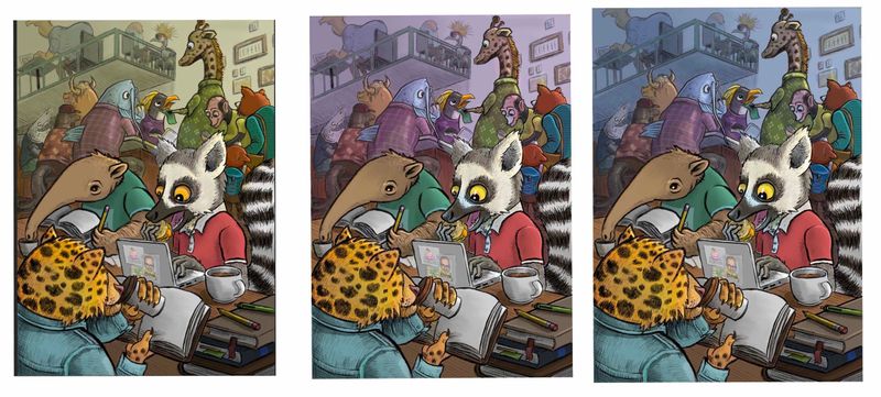
          So I put a lot of work into this. There's a lot I like, but I'm not sure how the colors work. I took a couple of the color courses. Whew, overload! Hopefully I applied some of it well.

          Which "haze" in the background looks best?

          I think the anteater needs more detail along his face, since the lemur and jaguar have so much. And I think I need to put something on the pages of the open books. No idea what. Or how. Any references y'all could recommend for that? Any other critiques?

          Thanks!

          IMG_0829.jpg

          Amanda Bancroft aska 2 Replies Last reply Reply Quote 7
          • Amanda Bancroft
            Amanda Bancroft @Daniel Grissom last edited by

            @Daniel-Grissom This is a really neat scene! Love all the animals. In my opinion to answer your question about the best "haze" I think the one at far left looks best, everything seems to pop better than the other two.

            1 Reply Last reply Reply Quote 0
            • aska
              aska @Daniel Grissom last edited by

              @Daniel-Grissom awesome, love it!

              Aska
              www.mugaska.com
              https://www.instagram.com/mugaska/
              https://www.etsy.com/uk/shop/mugaska

              1 Reply Last reply Reply Quote 0
              • LauraA
                LauraA SVS OG last edited by

                @Daniel-Grissom I really like your color schemes! I think the first one is somehow more unifying, though, and it does need unity with all those animals. When you squint at it, the lemur still reads as the central focus. But if you're wanting to simplify it a little more, I think you could still take down the saturation in the background, and darken the leopard's head a bit.

                As for the book, this is going to take a bit of brainstorming! It's going to have to be a second read, but those are really worth it sometimes (think of all the great inside jokes in Zootopia!). I'd think of some classic novel and then adapt it to leopards, or a work about diversity and adapt it to the animals in the bar. But those are just two quick thoughts. I'm sure there are many things that would work.

                Instagram: https://www.instagram.com/lauraintorino/
                http://lauraaldersonart.com/

                1 Reply Last reply Reply Quote 0
                • Daniel Grissom
                  Daniel Grissom last edited by

                  Sweet. Yea I think you’re right...I’ll take down the saturation of the haze and stick with the yellow background as it seems to unify it more. I’ll try darkening the Jaguar too. I like the book suggestions! Thanks!

                  1 Reply Last reply Reply Quote 0
                  • chrisaakins
                    chrisaakins last edited by chrisaakins

                    @Daniel-Grissom I definitely like the first best. It unifies it nicely with more of an analogous color scheme. I think you could grey the lemur up a little bit to tone down the white. It would still read white, but wouldn't blast it so much. The colors look great. I am loving how they really created a central focus.

                    Chris Akins
                    www.chrisakinsart.com
                    www.instagram.com/chrisakinsart/

                    1 Reply Last reply Reply Quote 0
                    • Phil Cullen
                      Phil Cullen last edited by

                      First one would be my fav, nice work it's coming along nicely.

                      To help add depth you could literally add a layer behind the lemur and others in the foreground, on that layer fill with a neutral earth tone colour and drop the opacity so its barely visable, essential knocking back the black and unifying everything in the Background and helping the foreground characters pop just bit more. Nice piece well done.

                      www.instagram.com/phillip.cullen/
                      www.facebook.com/phillipcullenillustration/

                      chrisaakins 1 Reply Last reply Reply Quote 0
                      • chrisaakins
                        chrisaakins @Phil Cullen last edited by

                        @Phil-Cullen Great advice. I wish I could think of these things when I am doing my work.

                        Chris Akins
                        www.chrisakinsart.com
                        www.instagram.com/chrisakinsart/

                        Phil Cullen 1 Reply Last reply Reply Quote 0
                        • Phil Cullen
                          Phil Cullen @chrisaakins last edited by

                          @chrisaakins It's a nice trick to add depth. Further away stuff gets the less contrast there is, so I find digitally it's very handy to knock stuff back into the distance and add depth with layers of low opacity colour, also helps unify the elements in the background.

                          www.instagram.com/phillip.cullen/
                          www.facebook.com/phillipcullenillustration/

                          1 Reply Last reply Reply Quote 1
                          • Daniel Grissom
                            Daniel Grissom last edited by

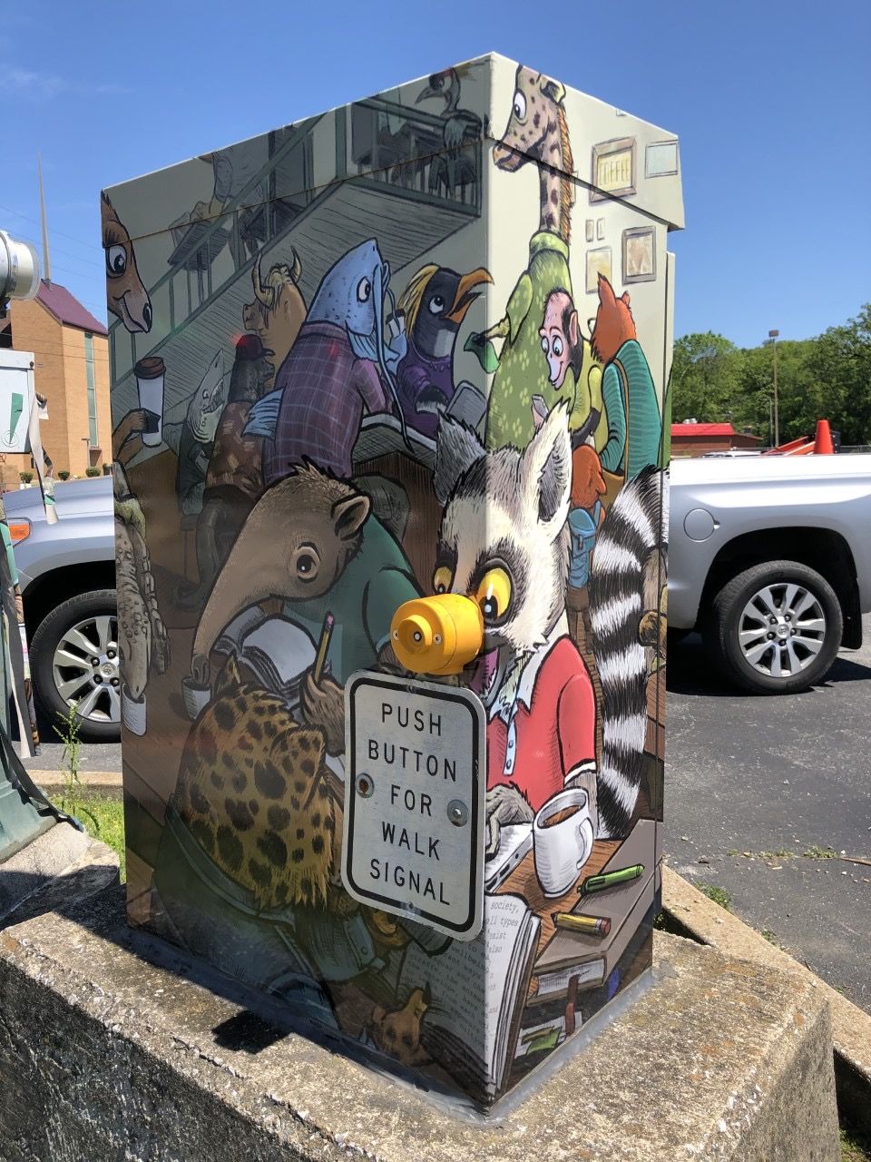
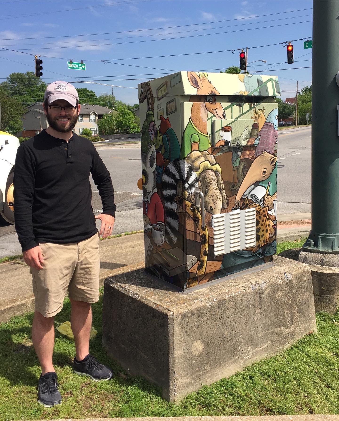
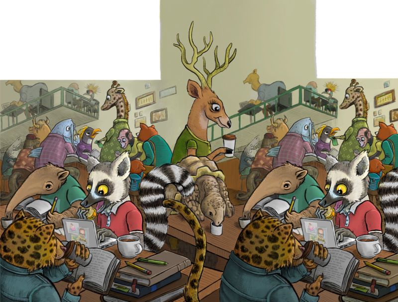
                            I thought I should post the end result. I was selected as one of the finalists for this local competition, won a cash prize, and got my art put up in the city. (It got complicated when they sent me the final template, but I learned some important lessons along the way.) Thanks very much to all of you for your input!

                            0FA69075-CE29-421E-ACAD-4FA9B37A6139.jpeg
                            AD7BC5DC-7F01-446A-AF99-C5A28EF4BF82.jpeg
                            43664FCE-81BF-4F26-BE95-4F4FA080E692.jpeg

                            ? Kevin Longueil K.Flagg Nyrryl  Cadiz Johanna Kim 6 Replies Last reply Reply Quote 6
                            • ?
                              A Former User @Daniel Grissom last edited by A Former User

                              @Daniel-Grissom wow! Thanks for showing us such an interesting application of your work, and fantastic job! Congrats on the win.

                              1 Reply Last reply Reply Quote 0
                              • Kevin Longueil
                                Kevin Longueil SVS OG @Daniel Grissom last edited by

                                @Daniel-Grissom That is very cool!!!

                                Portfolio: kevinlongueil.com
                                https://www.instagram.com/kevinlongueil/

                                1 Reply Last reply Reply Quote 0
                                • Coreyartus
                                  Coreyartus Moderator last edited by

                                  Wow. Just WOW. Very very cool!!! I love how it's a wrap-around repeat. So much fun happening here!! Well done!!!

                                  Children's Illustration Portfolio: https://www.coreyartusillustration.com
                                  Art Portfolio: https://www.coreyartusimagery.com
                                  Mastodon: https://mindly.social/@Coreyartus
                                  Pixelfed: https://pixelfed.social/Coreyartus

                                  1 Reply Last reply Reply Quote 0
                                  • K.Flagg
                                    K.Flagg @Daniel Grissom last edited by

                                    @Daniel-Grissom well done! It looks great 😀

                                    K.Flagg

                                    1 Reply Last reply Reply Quote 0
                                    • Neha Rawat
                                      Neha Rawat last edited by

                                      @Daniel-Grissom This looks super! Congratulations! The template does look very tricky but you did a great job! 😃

                                      https://www.nrbstudio.in/
                                      https://www.instagram.com/nrbstudio.in

                                      1 Reply Last reply Reply Quote 0
                                      • Nyrryl  Cadiz
                                        Nyrryl Cadiz SVS OG @Daniel Grissom last edited by

                                        @Daniel-Grissom congratulations! Which city is this?

                                        Portfolio: nyrrylcadiz.com
                                        Instagram: https://www.instagram.com/nyrryl_cadiz/
                                        YouTube: https://www.youtube.com/channel/UCbJCF1Im8ZO7hpGWTKOJMuA

                                        1 Reply Last reply Reply Quote 0
                                        • Daniel Grissom
                                          Daniel Grissom last edited by

                                          Thanks a lot, folks. @Nyrryl-Cadiz this is Chattanooga, Tennessee.

                                          1 Reply Last reply Reply Quote 1
                                          • Johanna Kim
                                            Johanna Kim SVS OG @Daniel Grissom last edited by

                                            @Daniel-Grissom This turned out so awesome! I love all the different animal characters, the relaxed community vibe, and the palette you chose. The button on the raccoon's nose is a really funny touch. Well done!

                                            http://www.johannakim.com
                                            http://instagram.com/johannahkim/

                                            1 Reply Last reply Reply Quote 0
                                            • First post
                                              Last post