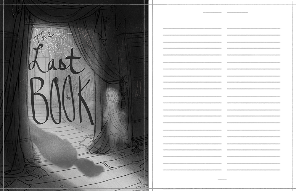
WIP- Nightfall (Previously: Is the perspective convincing enough?)
-
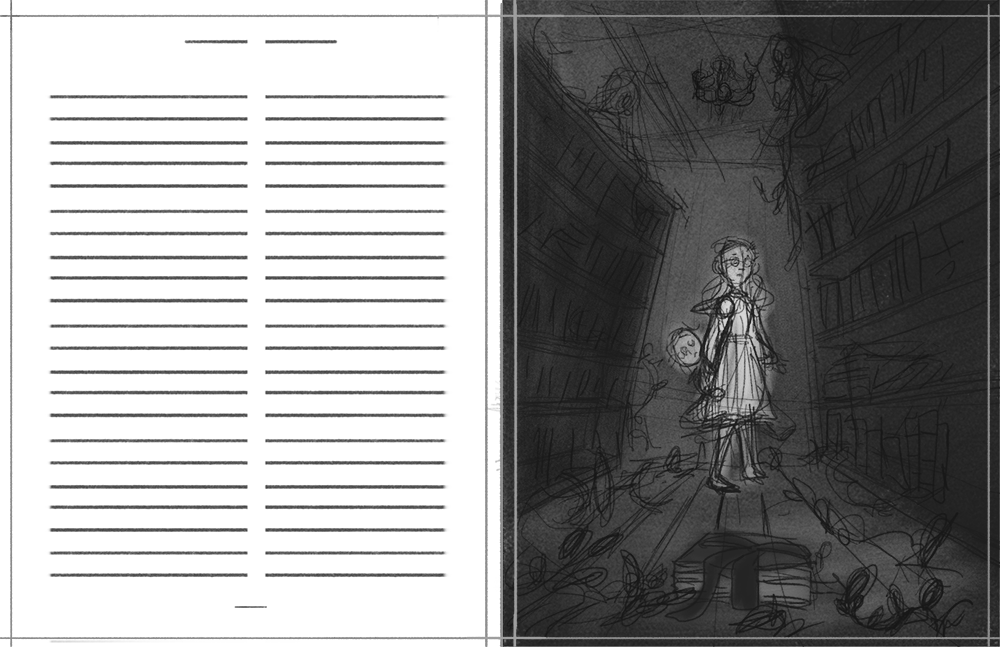
@Chip-Valecek She's supposed to be sitting on the ground with an oval rug, and her back up against the bookshelf with pillows propped behind her back. I'll update the original post to show line-work without values.
Thanks guys! The shelf is definitely not in correct perspective with the rest of the scene. When I had it in correct perspective, I felt that the shelf side was closing off the foreground character too much. When I attempted to then match the rest of the scene to the new shelf perspective, I wasn't quite liking what the new diagonals were doing with the overall flow of the composition.
I've been trying to find a good balance between correct perspective, and more expressive perspective, so I've been attempting to be more free- making verticals not so vertical, tilting things forward slightly more than what is technically correct, etc if I feel it helps nudge the comp in a certain way. The bookshelf rotation and the vertical lean was an attempt to tweak the feel of the comp so she's separate, but still leads us into the rest of the scene.
I'm still not confident in getting that balance to be playful and still feel pleasing and appropriate to the scene- but I'm trying.

Thanks for the input! I'll play around and try to wrangle it into working a little better (hopefully).
-
@TessaW I think your perspective seems fine but the girl didn't seem settled comfortably, so i drew what i thought would make her more comfortable
 I have not taken the perspective class yet...
I also put arrows to things that didn't feel fully on the floor and moved the two kids in the tree closer to the center. Then I flipped it horizontally to check if I had drawn it ok. I'm not sure I did, but at least it will give you a sense of why it didn't feel like she was leaning with both shoulders before.
-
@carolinedrawing That looks really great, thank you! :smiling_face_with_open_mouth: It leads into the scene much better, and her pose does look a lot more natural. I love it.
-
@TessaW Lovely! The work you do always amazes me. I actually have no critiques for this piece. If I were to be nit-picky, i would point out the crooked shelf and whatnot but I understand that these are artistic liberties you’re intentionally making and I think they’re beautiful. They give your work more character. I say go with your gut. I hope this helps!
-
@TessaW I second @carolinedrawing with the girl and bookshelf. Other than that, great drawing!
-
@Zachary-Drenski and @Nyrryl-Cadiz Thank you so much.

Ok, I played around a little based on the feedback. Some things are still rough and not 100% settled, but what do you guys think overall. Which one feels best- most intriguing?
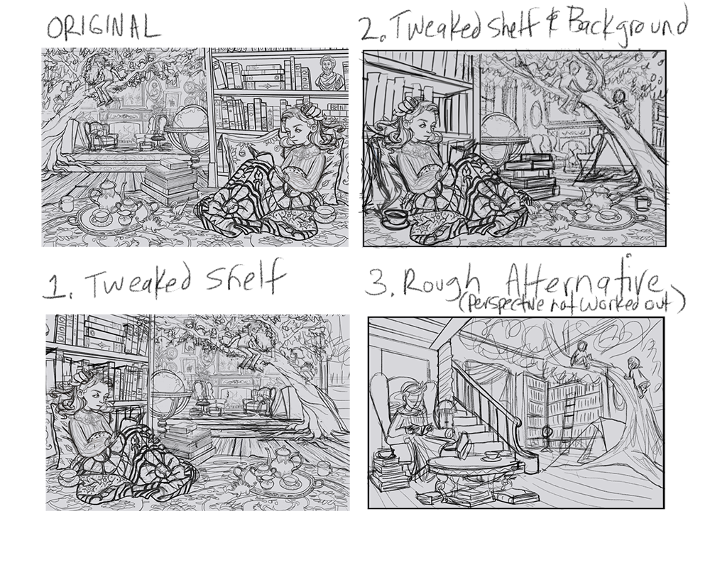
Here are a couple more sketches that lead up to this illustration, for context.
Thank you guys so much for your help.

Website: www.tessawrathall.com
Instagram: www.instagram.com/tessawrathall_art/
-
These are amazing! Super envious right now. Great work.
-
@TessaW said in WIP- Is the perspective convincing enough?:
@Zachary-Drenski and @Nyrryl-Cadiz Thank you so much.
Ok, I played around a little based on the feedback. Some things are still rough and not 100% settled, but what do you guys think overall. Which one feels best- most intriguing?
Thank you guys so much for your help.
I am the last person in the world able to comment on perspective, so I can only say #2 appeals to me because the background room seems farther away so the read for me is girl, kids in tree and background room. I love #3 too!
The illustrations make me want to know more about the story
-
@TessaW 1, 2, and 3 nailed it on the shelf. Looks great!
My gut says go with 2.
Number 1 is my favorite background but I feel like the empty chairs and space are arranged like a stage in need of action. Without anything going on there it could be a distraction that leads the viewers eye away from the focal points. (If, however, the living room/fireplace play an important role in the story and you want to allude to that number 1 might work.)Number 3 is a nice drawing but paints a completely different picture. I like the cluttered mood of the first design, it has energy and give me the impression that the girl is really lost in the book.
That's my take on these. Really cool work!
-
@TessaW these all look great together! I think #1 really works because it makes the room feel so big that a tree is part of the clutter, yet really cozy and lived in. #3 is fun because of the way it shows the tree against the ceiling, but I agree with @Zachary-Drenski in that it has a completely different feeling. #1 has a wonderfully cozy, cluttered look that keeps the expansive space of the original (the reason i like that it's bigger is because it feels like more of a playground) and contrasts really well with the other context sketches of an empty haunted house. Depending on which feeling you're going for i'm sure you can make either one work.
-
@TessaW i’d still go with the original
-
@TessaW In ORIGINAL the stack of books on the floor is going to a super high horizon compared to the rest of the picture. In #1, there is the same issue. They’re working a bit better in #2, as it looks like you aimed for a lower horizon line.
If you’re going for a warped perspective look, you could push that further probably. Right now, you’ve got realistic, solid drawings of individual objects, but they aren’t going to the same horizon line, so I think it might look more intentional if you warped the objects themselves more maybe? Considering how spooky the story is (love your compositions for the rest of the illustrations, btw
 ), you could emphasize that with spooky perspective.
Exercise idea: Analyze a few Brett Hellquist illustrations (or whatever spookier style inspires you—does anyone have suggestions? I’d like to try this myself) by doing a perspective draw over (find the Vanishing Points for the objects, and see where the Horizon Line is, look for what visual cues or angle repeats). It might give you some inspiration as far as how to approach it.
Take or leave it perspective tip: If you don’t use a perspective grid under your sketch, I would suggest trying it and seeing how it goes, because it saves a lot of time—you don’t have to plot each object’s vanishing points individually necessarily, and you can warp stuff while still having that visual guide to refer to (I’m still a student, but this is what my instructors at college encourage us to do when drawing backgrounds).
Even if you didn’t change anything, your illustration would still turn out great. I really like it! The girl reading cozily, and the little dinosaurs by the tea set—it’s got a great mood and so many interesting details.
Love the cozy vibe of your first concept, and that your main character is in the foreground. Lots of depth to the scene. My fav is #2, because you’ve added more overlap to the objects (you pushed the books behind the blanket a bit), and my eye goes to the characters in the tree (in the others I tend to look at the fireplace first).
-
Thank you guys for your thoughtful feed back! It gave me a lot to think about. It was hard deciding, but I ended up going with #2. I used a perspective grid, but tilted the angles of different elements slightly afterwards to get it to feel right to me. I liked how closer vanishing points felt for the foreground, but wasn't liking what the closer vanishing points were doing to the background, so I made it a little flatter back there.
@K.W. Thanks for the recommendations! I had never heard of Brett Helquist. Love his work!
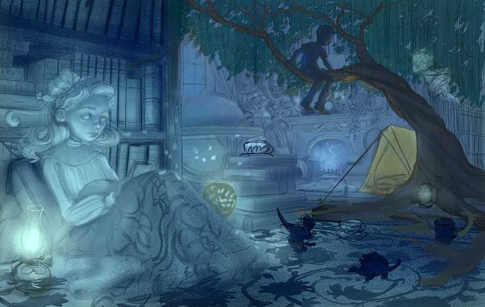
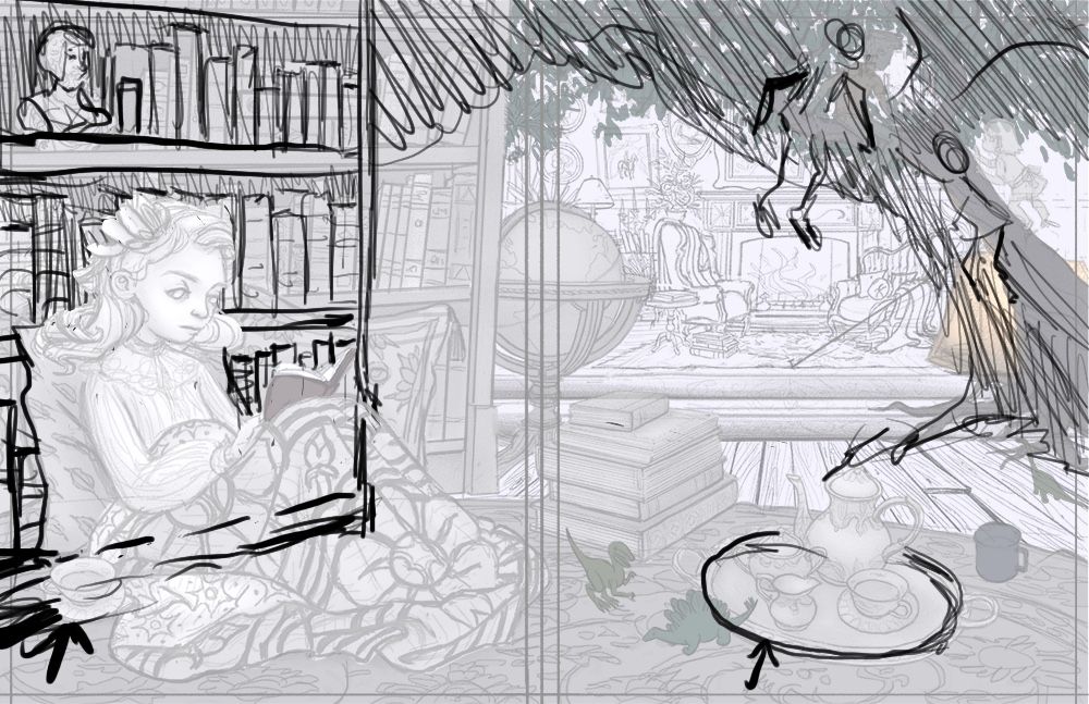
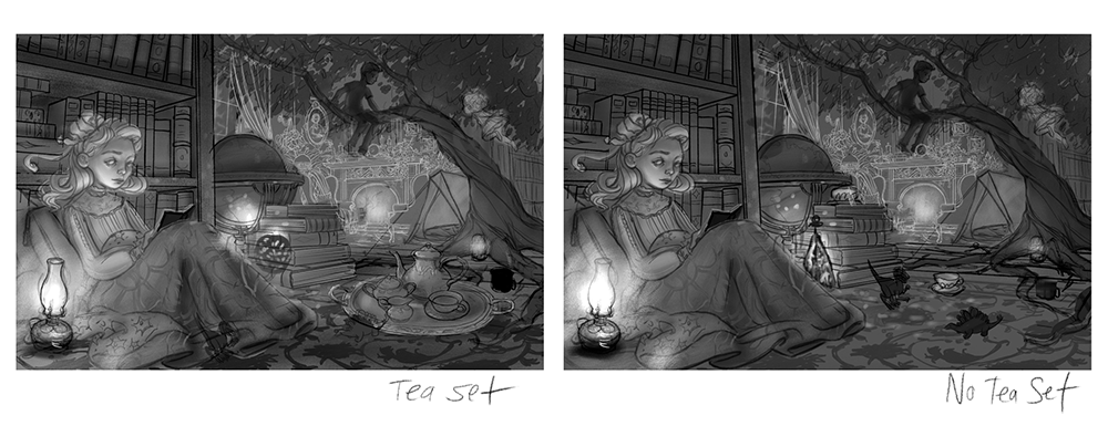
I'm still tweaking things with the sketch (I need to tweak the teaset and figure out a pose for the ghost in the background) and am just beginning to build up the values (this is not the final value and lighting).
I was just wondering if anyone had an opinion on if I should keep the tea tray or leave it out? On one hand I like how it closes in the foreground, on the other hand I like how taking it out helps lead the eye up toward the tree.
Thoughts?
Website: www.tessawrathall.com
Instagram: www.instagram.com/tessawrathall_art/
-
@TessaW STUNNING.
And the lamps are gorgeous. I like it both with the tea set and without it. -
@TessaW looks great!
-
I like it with the tea set. For me, the empty space draws my eye away from the girl. Overall, it's a beautiful drawing.
Laurie DeMott
instagram.com/demotlj -
I agree with @demotlj - the tea set is beautiful but it takes my eye away from the girl.
-
Wow! looks great! I would choose no tea set unless it is pertinent to the story to be in the image. I love the pattern on the blanket and how the light hits her face and the interesting way you've sketched in the background using a white line. Can't wait to see more.
-
Thanks for the feedback everyone! It's helping with motivation. I've always been more of a painter than a draw-er and the drawing part has been difficult!
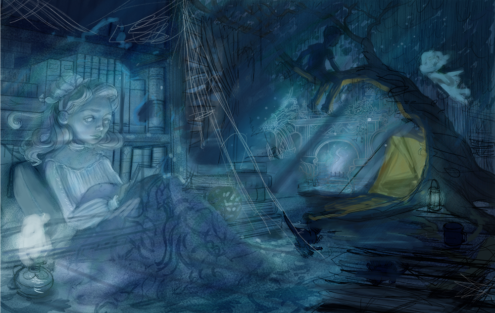
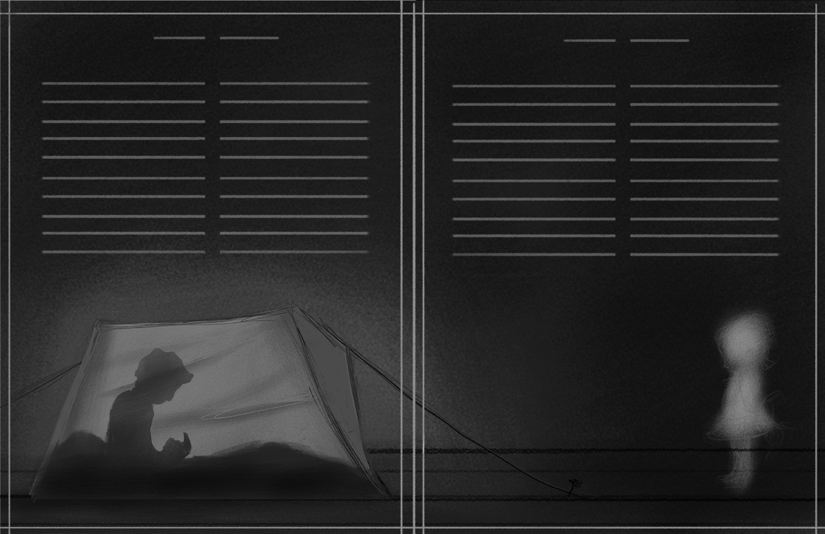
Right now I'm trying to decide between showing more of the ghostly atmosphere with just a tad bit of decay (tree and floorboards around it). Or pushing more of the ghostly element by making things feel more transparent and show even more decay. Not sure which to choose. These are kinda rough and not completely worked out, but hopefully you can sort of see what I'm going for. Thoughts?