Society of Visual Storytelling

    SVSLearn Forums

    • Register
    • Login
    • Search
    • Recent
    • Tags
    • Popular
    • Users
    • Groups
    • Search

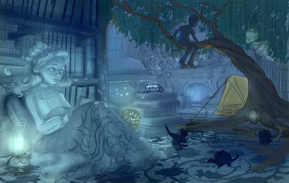
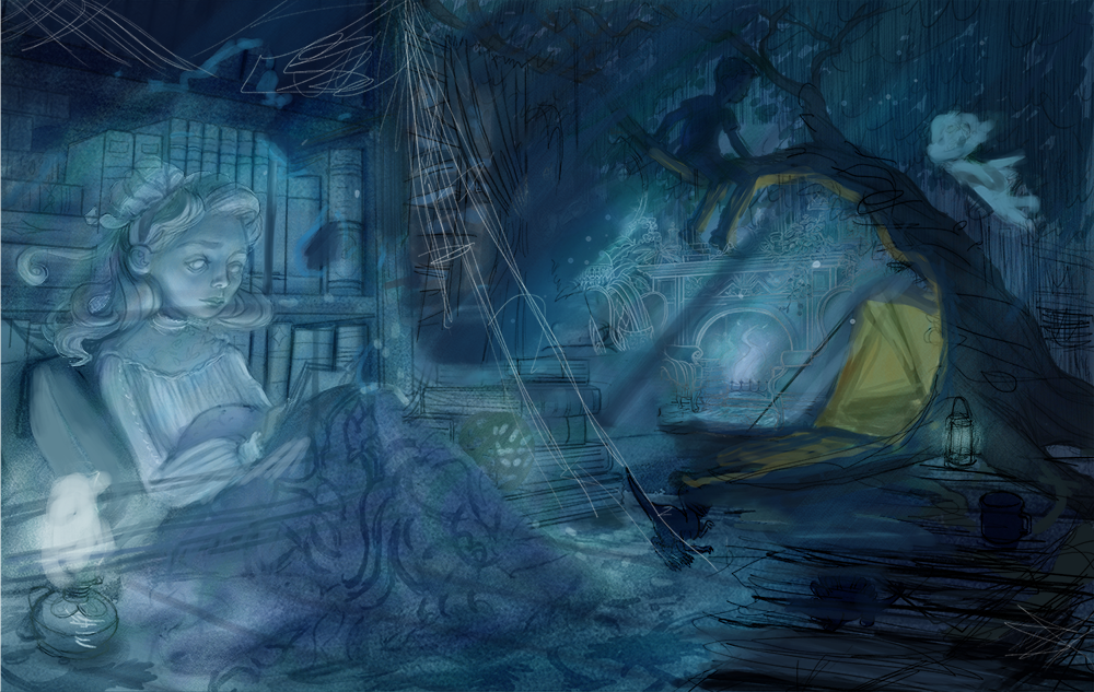
    WIP- Nightfall (Previously: Is the perspective convincing enough?)

    Artwork
    15
    25
    1382
    Loading More Posts
    • Oldest to Newest
    • Newest to Oldest
    • Most Votes
    Reply
    • Reply as topic
    Log in to reply
    This topic has been deleted. Only users with topic management privileges can see it.
    • Jeremy Ross
      Jeremy Ross @TessaW last edited by

      @TessaW looks great!

      https://www.instagram.com/jeremyrayross
      https://www.jeremyrayross.com/
      https://twitter.com/jeremyrayross
      https://jeremyrayross.substack.com/

      1 Reply Last reply Reply Quote 2
      • demotlj
        demotlj SVS OG last edited by

        I like it with the tea set. For me, the empty space draws my eye away from the girl. Overall, it's a beautiful drawing.

        Laurie DeMott
        instagram.com/demotlj

        Laurel Aylesworth 1 Reply Last reply Reply Quote 1
        • Laurel Aylesworth
          Laurel Aylesworth @demotlj last edited by

          I agree with @demotlj - the tea set is beautiful but it takes my eye away from the girl.

          www.laurelaylesworth.com
          instagram.com/laurelaylesworth

          1 Reply Last reply Reply Quote 1
          • KaraDaniel
            KaraDaniel last edited by

            Wow! looks great! I would choose no tea set unless it is pertinent to the story to be in the image. I love the pattern on the blanket and how the light hits her face and the interesting way you've sketched in the background using a white line. Can't wait to see more.

            instagram.com/sha_kara
            karadaniel.net

            1 Reply Last reply Reply Quote 1
            • TessaW
              TessaW last edited by

              Thanks for the feedback everyone! It's helping with motivation. I've always been more of a painter than a draw-er and the drawing part has been difficult!

              Right now I'm trying to decide between showing more of the ghostly atmosphere with just a tad bit of decay (tree and floorboards around it). Or pushing more of the ghostly element by making things feel more transparent and show even more decay. Not sure which to choose. These are kinda rough and not completely worked out, but hopefully you can sort of see what I'm going for. Thoughts?

              Library Color Sketch.png

              Library Color Sketch 2.png

              Website: www.tessawrathall.com

              Instagram: www.instagram.com/tessawrathall_art/

              1 Reply Last reply Reply Quote 5
              • First post
                Last post