Society of Visual Storytelling

    SVSLearn Forums

    • Register
    • Login
    • Search
    • Recent
    • Tags
    • Popular
    • Users
    • Groups
    • Search

    February contest WIP

    Artwork
    15
    79
    5815
    Loading More Posts
    • Oldest to Newest
    • Newest to Oldest
    • Most Votes
    Reply
    • Reply as topic
    Log in to reply
    This topic has been deleted. Only users with topic management privileges can see it.
    • L
      Lisa Pickard @ArtofAleksey last edited by

      @Aleksey I think too much background is a bit distracting - your eyes wouldn't know where to look. There are a lot of elements to your character and by making it a lot smaller you might loose all the detail? Maybe just a subtle/knocked back background would work ok - I liked it within the shape of the swirly design.

      1 Reply Last reply Reply Quote 0
      • Heather Boyd
        Heather Boyd last edited by Heather Boyd

        I’d say the same. Unless your story needs the background or you thought about the background ongoing as you made the character, or if the character interacted more with the background or additional characters include it. But the character with your props and the addition of the sky stars coming out of the prop is enough on its own.
        Right now the golden sun being warm is stealing us away from your bird character.

        Instagram: www.instagram.com/heatherboyd.illustration/
        Website: https://heatherboydillustration.ca
        Shop: https://www.inprnt.com/search/products?q=HeatherBoydIllustration
        Ko-Fi: https://ko-fi.com/heatherboydillustration

        Be blessed,

        1 Reply Last reply Reply Quote 1
        • TessaW
          TessaW last edited by TessaW

          While leaving it without a background is an option, I'd encourage you to play with the values and colors like so:

          Aleksey.png

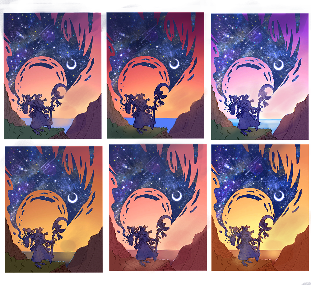
          Use the color balance, levels, hue and saturation in your photo editing program to play around. Look at sunset pictures for color ideas.

          Another couple of suggestions to play with:

          1. Either remove the sun, or move the moon to be at a more diagonal relationship to the sun, to help with balance and focus.
          2. Maybe add a little more of the night sky in the upper portion of the comp to help balance the scene.

          I don't know if those changes would be effective, but it's worth playing with.

          This is such a fun piece! Love it.

          Website: www.tessawrathall.com

          Instagram: www.instagram.com/tessawrathall_art/

          1 Reply Last reply Reply Quote 1
          • ArtofAleksey
            ArtofAleksey last edited by

            This is very helpful thank you!

            instagram and twitter: @artofaleksey
            alekseyillustration.com

            1 Reply Last reply Reply Quote 0
            • chrisaakins
              chrisaakins last edited by

              @Aleksey I think you are missing the opportunity to let the night sky be more bird shaped in keeping your theme. Think of wings of the night kind of thing. I would think about adding some highlights on your figure to show the glint of the sun on its features and to emphasize its importance.

              Chris Akins
              www.chrisakinsart.com
              www.instagram.com/chrisakinsart/

              ArtofAleksey 1 Reply Last reply Reply Quote 0
              • ArtofAleksey
                ArtofAleksey @chrisaakins last edited by

                @chrisaakins im not sure i follow with the first part, you mean the dark blob silhouette to be more birdshaped?
                Also i havnt started on the highlights but I’ll keep that in mind for when i do. Thanks chris.

                instagram and twitter: @artofaleksey
                alekseyillustration.com

                1 Reply Last reply Reply Quote 0
                • ArtofAleksey
                  ArtofAleksey last edited by

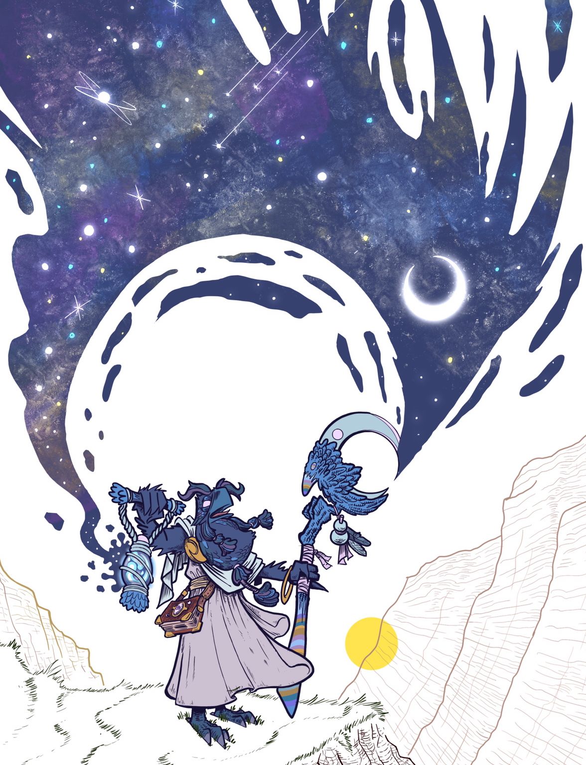
                  So im gonna play around with the background colors but so far i did the local colors of the birdhero and i like the shape of the night blob.
                  The sun ill have disappearing Behind the cliffs rather than water. I think taking out the water is gonna make it easier. But i also dont mind removing the sun completely.

                  I like how the moon kinda looks like an eye
                  8C3708E1-AD52-4079-B88D-73AECFC27969.jpeg

                  instagram and twitter: @artofaleksey
                  alekseyillustration.com

                  KaraDaniel 1 Reply Last reply Reply Quote 2
                  • KaraDaniel
                    KaraDaniel @ArtofAleksey last edited by

                    @Aleksey I really love how the sky looks like a bird and yes the moon does look like an eye!

                    instagram.com/sha_kara
                    karadaniel.net

                    ArtofAleksey 1 Reply Last reply Reply Quote 1
                    • ArtofAleksey
                      ArtofAleksey @KaraDaniel last edited by ArtofAleksey

                      @KaraDaniel thanks kara!

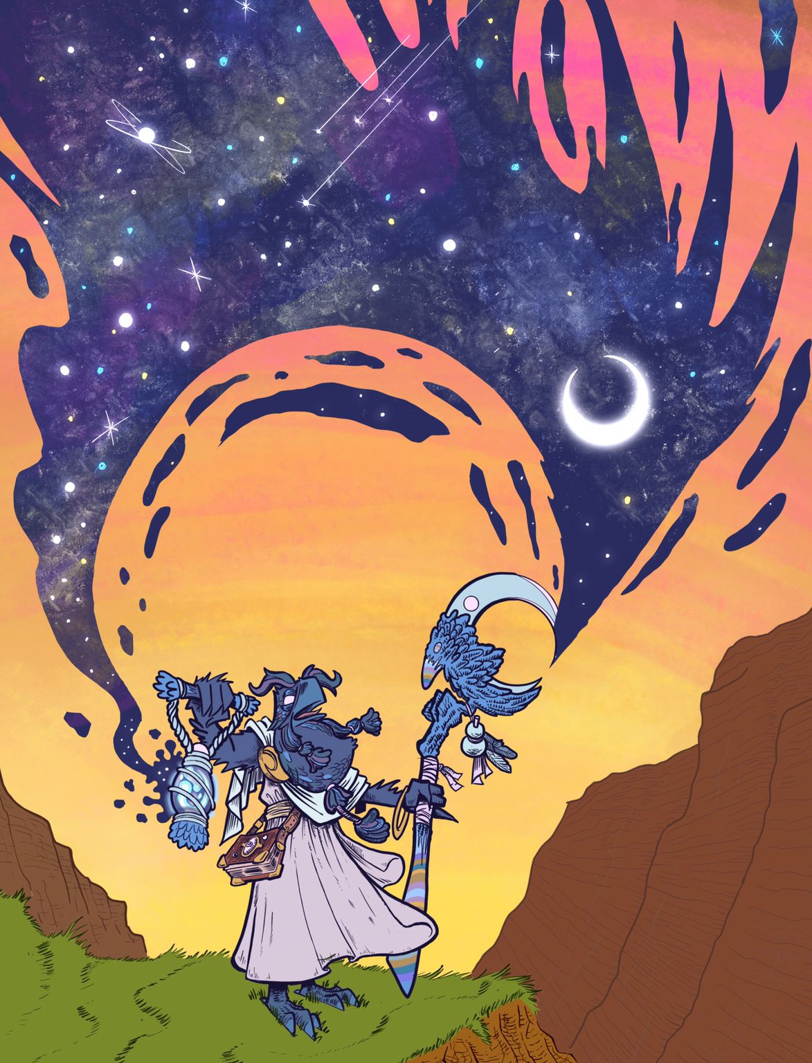
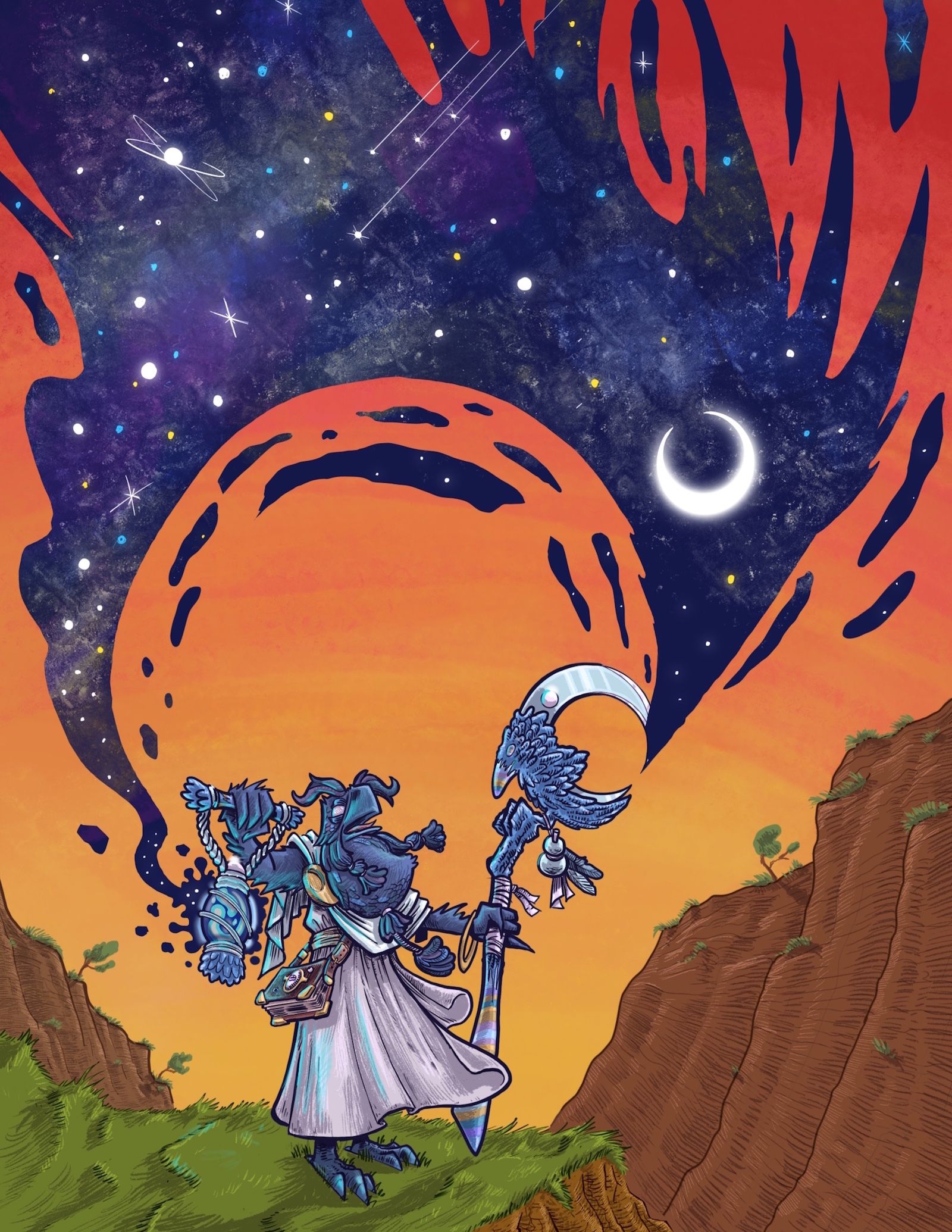
                      Ok so i think these colors are working way better ty @TessaW for that color feedback it helpedme with picking colors i like. Im struggling a tiny bit with a concept of night being created, so how would the sky look? Shouldi do a dark red at the top of that sky? Should i leave it?
                      Do you think im done with local colors at this point?
                      (I noticed that Night blob is too close to the right side Of the image i gotta fix that.
                      7ED565AE-8BF3-4881-A9EF-89682D8A32AB.jpeg

                      instagram and twitter: @artofaleksey
                      alekseyillustration.com

                      1 Reply Last reply Reply Quote 1
                      • ArtofAleksey
                        ArtofAleksey last edited by

                        ok I think win or lose I'm very happy with the outcome.
                        The NIGHT BIRB
                        February Submission.JPG

                        instagram and twitter: @artofaleksey
                        alekseyillustration.com

                        1 Reply Last reply Reply Quote 0
                        • ArtofAleksey
                          ArtofAleksey last edited by

                          Forgot to add the blue light
                          February Submission.jpg

                          instagram and twitter: @artofaleksey
                          alekseyillustration.com

                          StudioLooong 1 Reply Last reply Reply Quote 2
                          • StudioLooong
                            StudioLooong @ArtofAleksey last edited by

                            @Aleksey LOVE this, the colors and rendering are amazing and the concept is cool but I think that your night magic is cutting off the tip of the moon staff.

                            Taylor Woolley
                            (Formerly Taylor Ackerman / StudioLooong)


                            Website: www.woolleystories.com
                            Instagram: https://www.instagram.com/woolleystories/

                            ArtofAleksey 1 Reply Last reply Reply Quote 0
                            • ArtofAleksey
                              ArtofAleksey @StudioLooong last edited by

                              @StudioLooong i tried to make it look like the moon staff is cutting the day sky to create the night sorta? i dont know i should have played with the concept more before i jumped into it haha

                              instagram and twitter: @artofaleksey
                              alekseyillustration.com

                              1 Reply Last reply Reply Quote 0
                              • First post
                                Last post