Feedback needed on this illustration !!
-
Hello I’m a new member and I just made this account! I usually do realism / surrealism art but I really enjoy illustrations / concept art and that it is what I’m trying to get into. I would really like for your critiques to be as harsh as possible ~
DRAWING INFO:
I am just now naming it and I decided to name it “found”
That is because what I aim to show is that a girl went through a journey to try to find herself. She didn’t know that while she was on the journey though. But then she does and it is the Fox, they are both very similar, both hav fox ears and similar features . Sorry if the explanation is corny haha.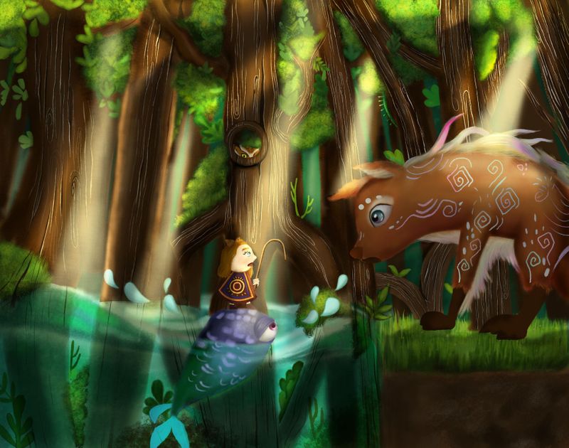
-
The first thing that stands out is your value structure. It is always good to check it from time to time. Yours is really messy at this point.
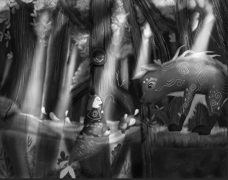
It is really hard to see whats going on at first glance. I think this one would be the first thing I fix
") Maybe make the forest a bit darker and only let the sunrays hit on the girls face and the fox's face. You can also use more sunrays but I would suggest to make them a bit duller than the other sunrays. Also your composition could be improved I feel!
Maybe make the forest a bit darker and only let the sunrays hit on the girls face and the fox's face. You can also use more sunrays but I would suggest to make them a bit duller than the other sunrays. Also your composition could be improved I feel!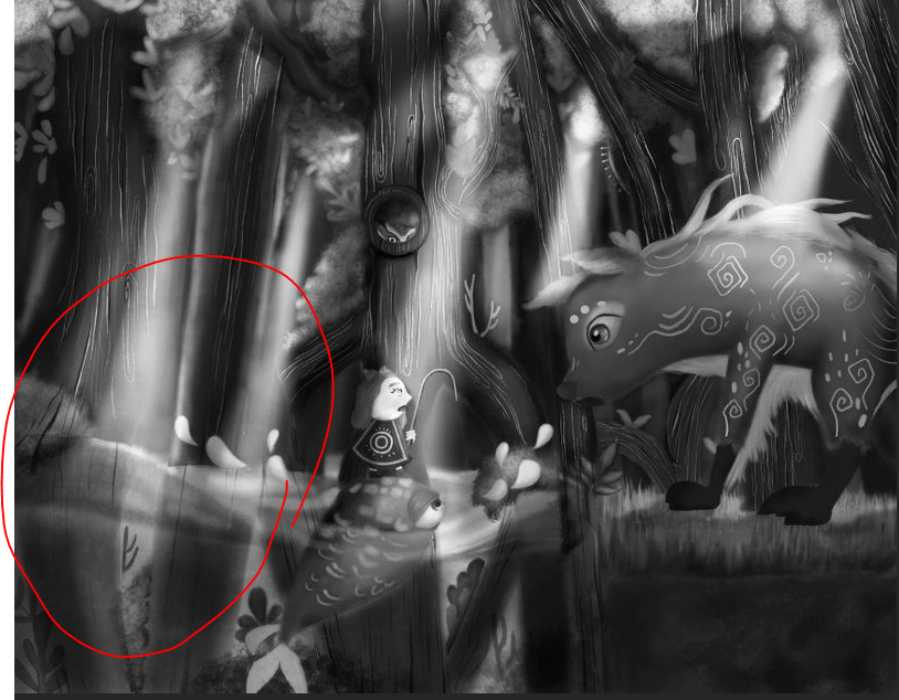
This space is very empty. And why put the fish in front of the girl if the girl should be the focal point?
These are just some ideas how to improve this one. Maybe the others have some other tips