Feedback on Traditional Style (Owl)
-
I am working on a second book dummy and this story needs a different style than my traditional printmaking style with large graphic objects.
I am looking for a higher energy style as the emotions of the characters or vibrant and out in front of the reader.
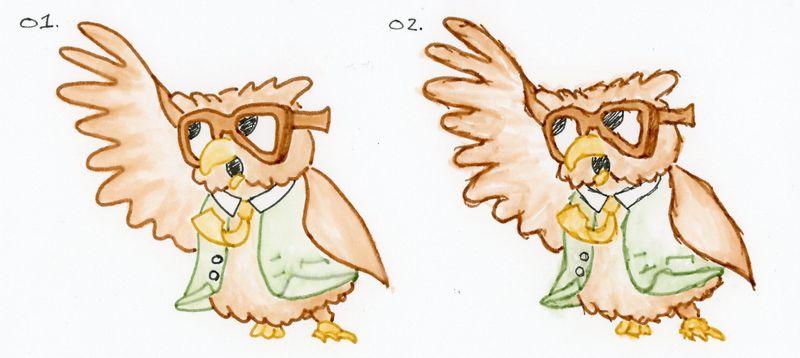
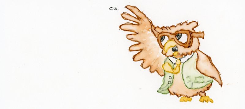
So, I have been playing with my TomBow watercolor markers and trying a few things out (did 7 versions of the is guy today.)
Here are the top 3 from today. Please let me know which style you prefer and why.
Thanks for your feedback.
-
This is a pleasant character to look at. I prefer the cleanliness of number 1 but also think combining some of the texture work of 3 with the clean line work of 1 would look good, too. The lines on 2 and 3 come across as sketchy and unfinished instead of determined and purposeful to the texture of the design. Hope that helps!
-
To me, number 3 has the most energy. I agree with @Jon-Anderson that it is sketchy, but that’s where I can feel the energy. A lot of my sketches capture that kind of energy and then when I try to clean them up it loses some of that energy.
Perhaps its the sharper lines and edges in 2 and 3 that lend to that movement. 1 is very smooth, almost formal.
Great work! Keep it up!
-
@Jon-Anderson & @Justin-Moss thanks for the feedback. I got very similar feedback from my local feedback group (my boys 9,11, & 13) It is good to hear it from others as well.
I will keep playing and see what I can do. I will keep you posted.