Hi! Feedback please!
-
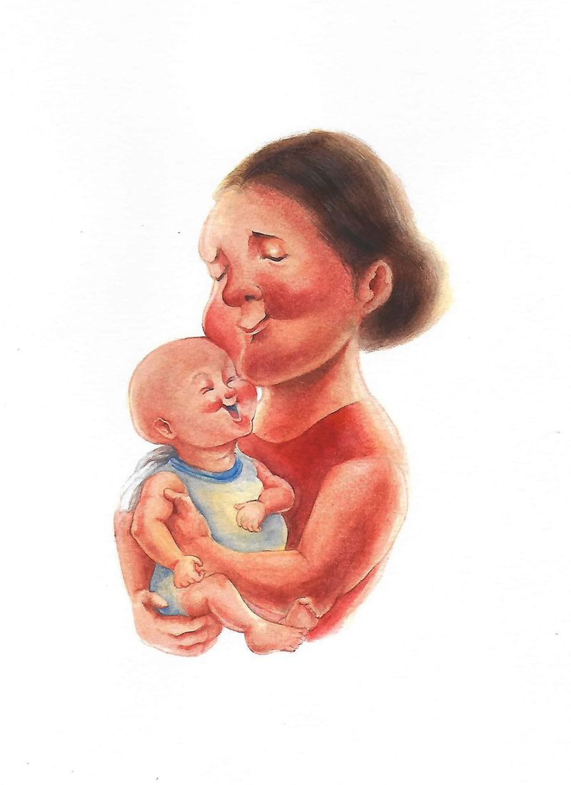
Hello! It's my first time posting here and I just recently joined, I wanted to be part of a critique group and here's my latest work entitled, "To Not Forget"
I'm still trying to figure out a lot of things and I would be very grateful if you gave a critique about this!
-
Sorry! I just learned how to upload the image in a proper way, here's my work:
-
@Beau this is a very sweet image, I really enjoy it. I think since you are able to render all these details so well, you've over-rendered the baby. That might not be a phrase people use... but I think baby proportions cannot be anywhere near a scaled down version of adults, they have to be overly rounded and so soft that you don't see specific shapes except roundness. I might be able to do a draw over some time later today, but if you would soften the baby's features - perfectly rounded head, no specific chub in the arms, no wrinkle in the neck, no distinct tummy, no detail on the ears, and spread the eyes far apart, in other words, none of those things that I have noticed in babies - this would be a more successful image. I think the concept is this feeling of holding a soft baby, so if you have that contrast between the baby rendering and the adult, and if you feel free to be inaccurate with the cloth and the position, it would really strengthen it.
The main thing that would help is putting the eyes far apart to distinguish the proportions from that of the adult and giving less detail with the smile... i think. I think from this drawing you know what feeling you're conveying, so don't be afraid to abstract it.
") Also don't be swayed by this, if that's not the feeling you're going for. You can let us know what you're working on in this image, or the feeling you're trying to convey, or its intended us, and we can change our feedback based on that.
Also don't be swayed by this, if that's not the feeling you're going for. You can let us know what you're working on in this image, or the feeling you're trying to convey, or its intended us, and we can change our feedback based on that. -
@carolinebautista Thank you so much! I feel very happy right now and grateful for your honest critique about this work hehe you even specified the parts that I need to improve on! I will work hard on studying&practicing the proportions! I think my desire for the baby's face to be very cute by smiling, created a tendency for I unknowingly ignored the other features just as you have mentioned!
 I will study more faces of an adult and baby more! hehehe
Actually, you're almost correct! I wanted to convey how lovingly the mother holds her own baby, I'm not really sure if I successfully projected that feeling through the mood in this illustration though.... I wanted the viewers to let them be pulled back and reminisce how their mothers really loved them ever since in their childhood. Thank you so much btw!!!

-
I agree with @carolinebautista- I do think that the emotion comes across well (and I love the rendering of the mother's face- as a mom of two young children I can relate
) but the baby's face doesn't look as realistic/proportioned right for it's age. I think you can fix it by doing some face studies though. In general it's a really sweet illustration! -
@CaroStoltz I'm very happy that it has left an impression on you! Thank you so much for your feedback, I will work hard on studying proportions!!!
-
@Beau I don't think you have to study much, tbh. I think the eyes do probably need to be farther apart, but you clearly know your proportions really well already. I think it's a matter of what is emphasized, and in that case it's a matter of deciding IF you want to change things. Your illustration does communicate that feeling, but I think the way I took it was a little more universal in its concept - like no matter who you are, if you're close to a baby there is pleasure in just holding that baby. I got that from the expression on her face, and it's what led me to comment
So then when I looked at it more closely, i noticed all the details about holding a baby that were so familiar, i just love those little things. I love the way newborns have things about them that aren't that perfect rounded chub of a four month old! But the accuracy of the baby emphasizes the baby in a way that you might not have intended. And it's not quite consistent with some of the choices you have made with the mother. Although she has strong looking arms, her head is a bit bigger than normal proportions, so it felt like the main concept was her feeling of holding the baby.
So I guess what I'm trying to say is that I think you know your proportions pretty well (to check what you would like to do, maybe scale down the mother's features to the size of the baby's head and see if they are similar with eye placement) and you know how to render things accurately, but it's a matter of deciding your emphasis (I personally think it should be on the feeling of the mother holding the baby, not on the baby, because most of us don't remember that as babies) and then adding detail or taking away detail to communicate your concept.Will Terry has mentioned having had this very same problem at first! I don't know exactly when he mentioned it in the 3 point perspective podcast, but it amazed me because I know he has always known how to draw! So basically, there is an element of illustrating that is purposely taking away detail and leaving things un-rendered, and that does seem to apply to babies. Especially with artists that know how to precisely render things.
I keep getting pulled away, so if my distinction between studying proportions and deciding on emphasis doesn't make any sense, please let me know!