First Post here. I would appreciate some feedback.
-
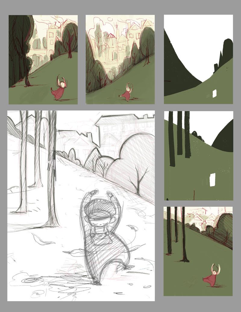
Hello! This is my first post here. I am working on my portfolio for children's book and I would love to see your opinion on this work in progress. I am open for suggestions and criticism.
Here are some of the questions that I have in my mind:
How effective is the composition? is it balanced? Which one is the most pleasant to the eye?
Do you prefer the girl being smaller or bigger on the page?
Do you think the colors are boring or are they okay?
Should I change the gesture of the girl so that her arms aren't mirroring or it's fine just as she is?
Is it too flat? do you think the illustration would look better if I apply more linear perspective?
Thank you!
Julia
@julialiberali_art.
julialiberali.com -
All the compositions look interesting and balanced. However, what is the purpose of the illustration. Do you want the focus to be on the girl? The sketch does a great job of that. Immediately that is where my eye goes. The pose of the girl is great in the sketch has well. Good shape language.
The second color thumbnail, where the city is largest, would work well if the focus isn’t on the girl. I could see that has the last page in a children’s book. The lesson has been learned and the girls is happy.
Whatever composition you choose, I think the colors could use a pop. Perhaps this could be in highlights of the girls clothing. However, this would put more focus on the girl. I like the complimentary colors of the green park and her red clothes.
Hope this helps!
Justin Moss
JMossCreations
https://cara.app/jmosscreations
www.instagram.com/jmosscreations -
@Justin-Moss Thank you Justin! This is very helpful. My primary idea was to illustrate a girl dancing in a park, it doesn't have a written story or anything. I had drawn a cat right beside her but I removed it--maybe I can put it back to improve the storytelling?
I definitely want her to be the focal point. I will go with your suggestion to pop some of the colors in the girl's clothing.
Thank you so much for taking the time to look at it
-
@Julia-Liberali said in [First Post here]
Here are some of the questions that I have in my mind:
How effective is the composition? is it balanced? Which one is the most pleasant to the eye?
I like the first top two but agree ad prefer the closer up sketch. I like the city compositions but if the girl is dancing perhaps so is the city, or people in the city so that the background could connect with the foreground character more.Do you prefer the girl being smaller or bigger on the page?
The sketch one.Do you think the colours are boring or are they okay?
I would experiment more with the colours.Should I change the gesture of the girl so that her arms aren't mirroring or it's fine just as she is?
I like her dance pose in the sketch. It is adorable!Is it too flat? do you think the illustration would look better if I apply more linear perspective?
No I like the overlapping perspective -so keep it.Thank you!
Your welcome
-
I like it! I wonder if having her face upward would be more like a joyous dancing pose.