My take on the Grimm Brothers - Looking for Feedback
-
Hello everyone! I wanted to share with all of you what I've been working on these pasts five months. I had the luck to talk a little with an art director and he gave me several pointers and revisions, and I feel my work has improved a lot thanks to him. There's still a long way to go but we are getting there!
Also, I'm about to start a 6 month trial with David Lewis's Agency and I'm really nervous, not sure what to expect but hoping for the best.Critiques and Commentary are very welcome!
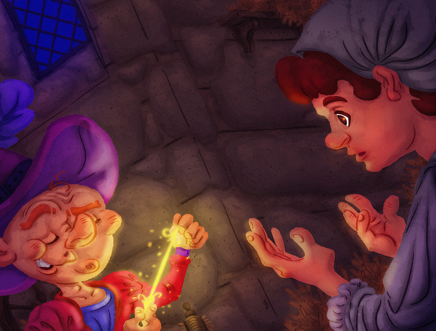
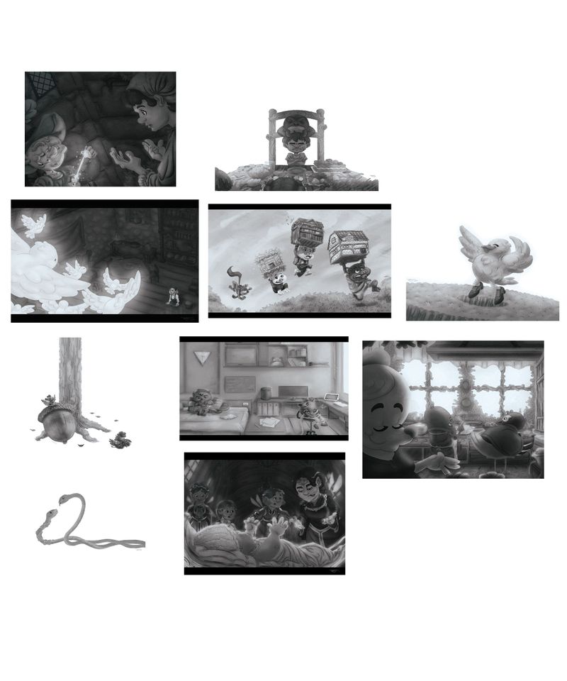
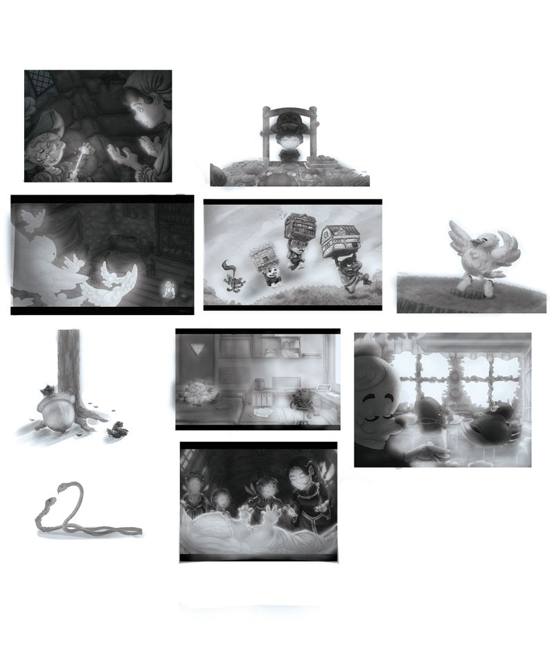
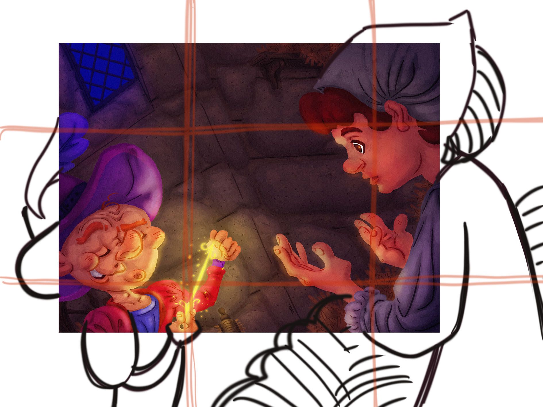
Rumpelstilskin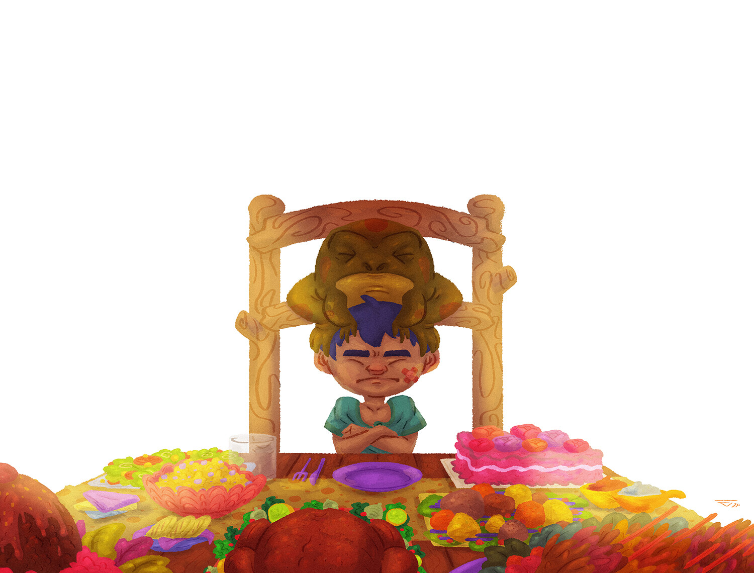
The Ungrateful Son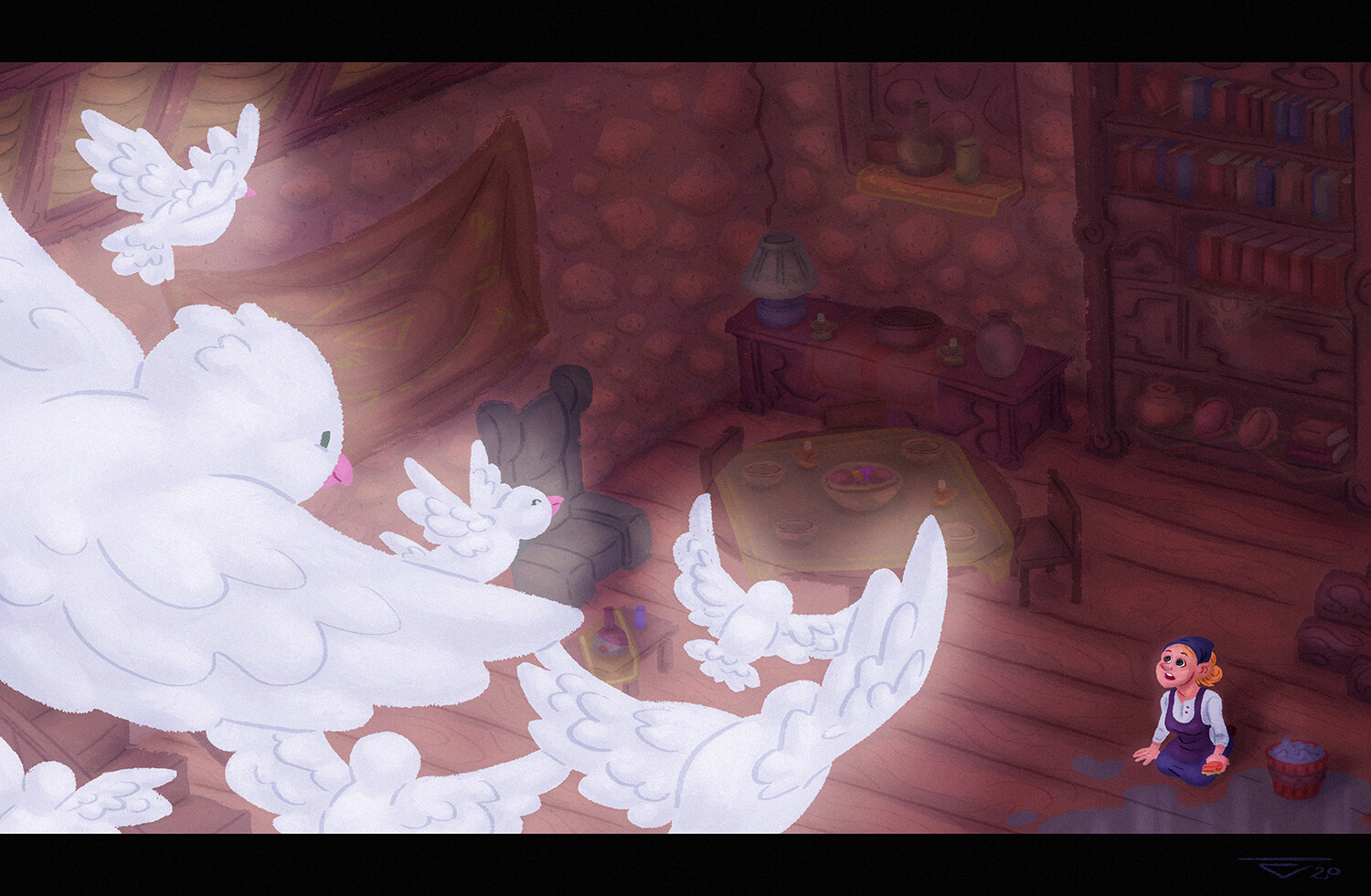
Cinderella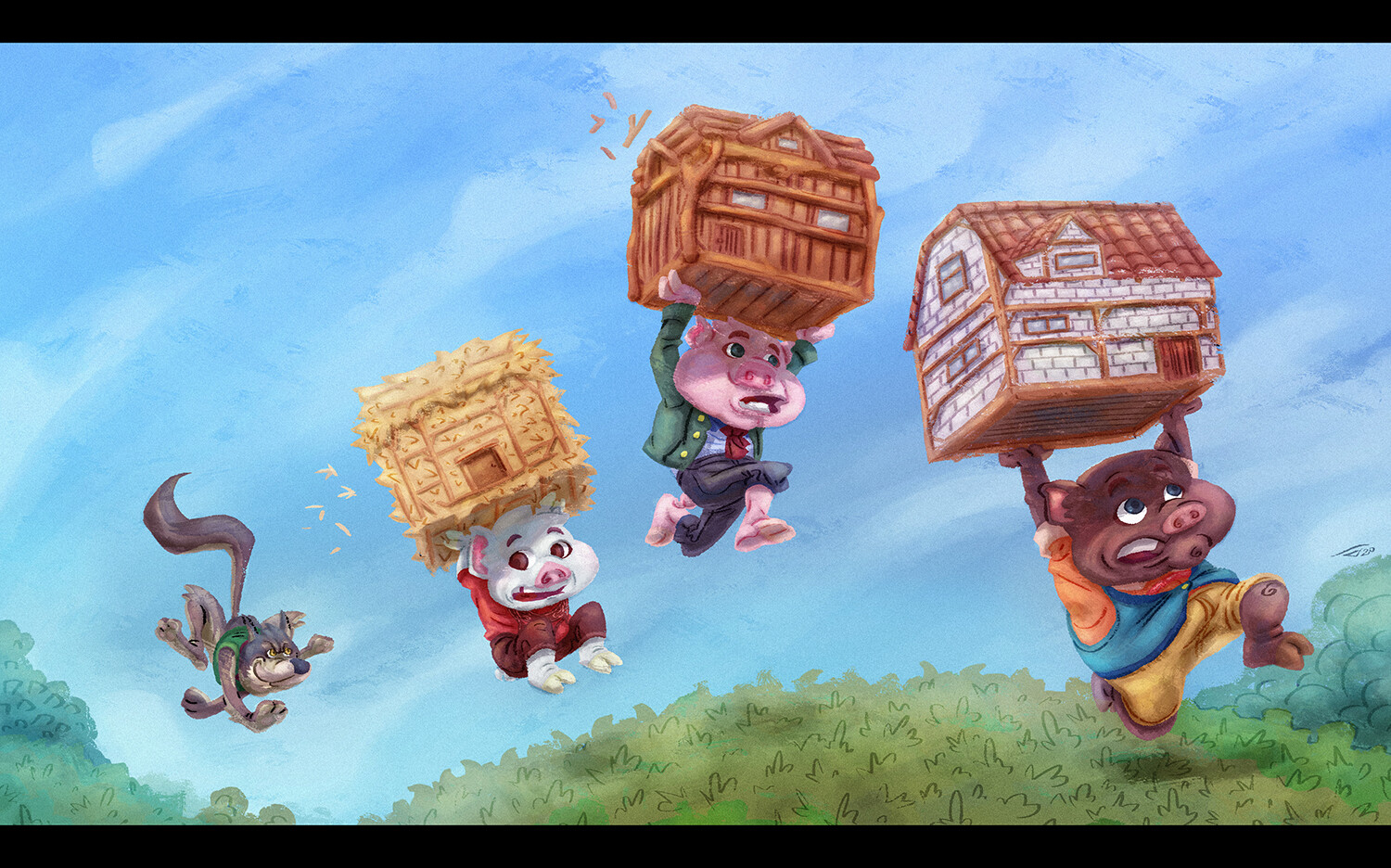
The Three Little Pigs (This one was my favorite)
The Death Of The Little Hen
Cat and Mouse In Partnership
The Three Snake Leaves
Sleeping Beauty
The Juniper Tree
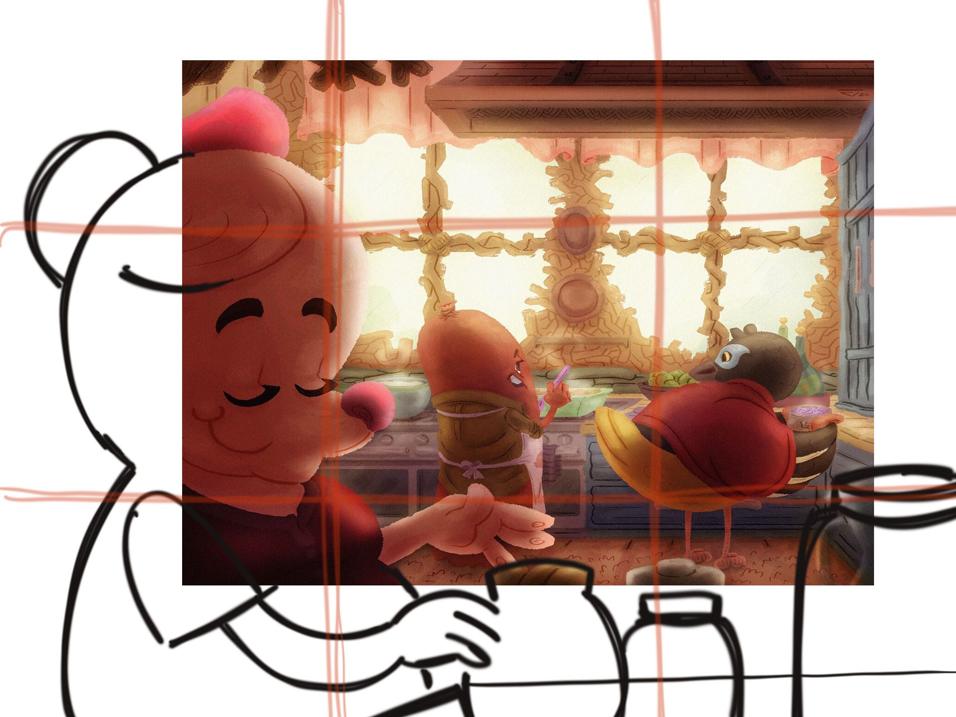
The Mouse, the Bird and he Sausage -
Looking at all the work across the board, the only thing I'd pick out that is something you could look at globally is the soft brush (like an airbrush) feels to me that it's overused. A lot of these I feel are begging for some harder edges. Maybe on the next couple of pieces you do, intentionally use harder brushes and compare them and I think you'll pick out some areas where you see the benefits and it'll tighten things up.
-
@jdubz Thanks mate. Yeah I see what you mean, the "Juniper Tree" one I think is the one that suffers the most from this. I'll have it in mind next time, cheers
-
What amazing work and how awesome that you grabbed the opportunity to get great advice from an art director AND get to work with an agency! Kudos to all you've accomplished so far! If you feel comfortable, would you mind sharing some of the advice the art director gave you?
As for feedback, one thing I would suggest is to think about putting more contrast in your values. It's something I'm trying to improve on right now. SVS has taught me that your image should make sense even at a small thumbnail view. And your main focal point should have the most contrast. I added some more white/black (maybe too much?) to show you what I mean. Also, an artist friend of mine told me to always include shadows to ground my figures, so I just added a couple of them.
You are lightyears ahead of me, so please take my suggestions with a grain of salt!
 I hope this is helpful! Best of luck to you on your trial run! And congrats again!
 Original
More contrast
-
Thank you for taking the time to do this @aprilshin ! Yes I've been struggling with values for a long time and you got the idea I was going for in almost all of the pieces.
Basically what he told me was to work on contrast because I tend to end up with a very dull looking piece, and I did fixed that a little, you can see how they looked before on my site where I uploaded the process for some of the pieces (artstation.com/joseanieto). He also pointed out that the eyes were waay too big and it affected the "cuteness" factor, so I reviewed that as well. Finally another mistake he didn't pointed out but I have noticed is that one has to take the time to analyse the piece, it's story and characters (Will just said something similar happening to him when he was beginning), beyond making a ton of sketches or thumbnails, That's why I feel that Red Riding Hood and Three Little Pigs work so nicely, those two took the most time pre-sketch wise
Cheers!
-
@Jose-A-Nieto Thank you so much for sharing your experience! I definitely see more contrast from the previous versions of your work and it makes a difference! Your work has a great style and I really admire your environment designs. I’ll be looking for more of your process videos on YT!

-
Thanks again @aprilshin ! I was checking out your IG and it is one of the sweetest galleries out there, loved every picture. Keep up the good work
-
Hi!I Great Works! I think @aprilshin has made good point with the values. As for me, I'd like to point out the composition of some your pieces. I think your pieces will benefit if you use the rule of thirds more and place your most important elements at the intersections ( ex: the focal point, the characters faces, etc).
there is also awkward cropping such as on this one. You need to shoew more of the jars at the edge instead of just showing their lids. they could actually make as great framing devices for your pieces.
overall, these are the most pressing issues I'm seeing. I love that you spent your time to create this collection. I can see potential. Keep it up
Portfolio: nyrrylcadiz.com
Instagram: https://www.instagram.com/nyrryl_cadiz/
YouTube: https://www.youtube.com/channel/UCbJCF1Im8ZO7hpGWTKOJMuA -
Thank you @Nyrryl-Cadiz , I will take this into account. Love your work by the way. Cheers!