“Flying” Penguins thumbs
-
Hi Kori!
Such a cute and funny concept! Love all the changes you’ve made to the original! There are two things that I think could make this image a little more clear. The ostrich’s neck is such an iconic feature, but its silhouette gets lost against the basket. I would love to see it’s silhouette more clearly against the sky or even the balloon. Secondly, the background colors seem too dark and since the birds are all dark as well, there’s not enough contrast between the birds and the background. I would make the background colors way lighter and less saturated so that the birds really stand out and shine (as they should!). Hopefully this helps! Good luck on your campaign!
 ️️️
️️️ -
@handdrawnviolist I really like the changes you made. When I first saw your top three images I thought that it might be good to have a combination of the 2nd and 3rd images. I like the viewpoint on the 3rd image but maybe there could be more landscape, like they're a little higher? The changes you've made work well though, I'd agree with the above comment that you need more contrast in your colours and I would definitely change the orange balloon to something more traditional like a red and white stripey one? Look forward to seeing it finished!
-
@Rachel-Horne Red and White!!! THATS the answer I needed! Like moving the kiwi action out of the basket, I'm not sure how that answer wasn't more obvious in the first place, thank you SO MUCH for suggesting it!!
Digital color is really hard for me, everything's always too dark and always too saturated! It's hard to keep to a "quick" mockup when I'm still learning my way around the tablet but also try and communicate what I really mean - I know roughly what it'll look like in watercolor but it's such a stark difference and I know y'all can't possibly be in my head to know how things will translate. I know how valuable (and quick! wow this is much better than doing printouts and coloring with pencils for mockups!) implementing the tablet into my process is, but boy has it been a rocky transition! I'll definitely keep working on it so I can better communicate these early/mid steps!
instagram: instagram.com/korilynneillo
Twitter: @korilynneillo
Portfolio/shop: korilynneillo.art -
@aprilshin I think you're right about the ostrich - I made the decision I did originally because I wanted the balloon to be more of the star of the show but then my characters got a little lost and I think they're by far the more important piece! I've removed the ice from the bottom, which freed up some space to play and I think it's much better with the ostrich sticking his lil (big!) neck up there over the penguin!


I'm still iffy on scarf colors, but I think it's working a lot better now.
-
Do most people instantly know that Kiwi birds can't fly?
Cuz I didn't. And I didn't put the piece together of 'flightless birds finally fly' until I read the text.
if it was just penguiins, and the ostrich I probably would have got it.
Overall it's pretty awesome though!
My Drawing Show: https://www.youtube.com/ArtParlor
Instagram: https://www.instagram.com/frostdrive/ -
@Frost-Drive Oh really? Oops! I thought that was super common knowledge. I remember being taught in school about them, and I thiiiiiiiiink I had an illustrated book that talked about "the flightless birds" and mentioned penguins, kiwi, and ostriches. When I was doing research for the original piece, I found a TON more birds that I had never even heard of! Apparently there's this neat green parrot type bird from Australia (the kakapo) that can't fly either, as well as variations on the ostrich like emus!
Looking at the piece on a different screen made me realize that our kiwi friend was getting lost again, so I brought some more ice down.


-
@handdrawnviolist Oh great, I'm so glad it helped and it looks great now! Sometimes I think we look at our work for so long it's hard to see stuff that just jumps out to others, that's why it's such a good idea to share.
I use the ipad to work on sometimes and I don't know what kind of pens you're using on your tablet but maybe try playing around with different ones. I personally don't like the pens or some of the paints but prefer using the watercolours or gouache?")
rachel-horne.com
@rachel_horne_art -
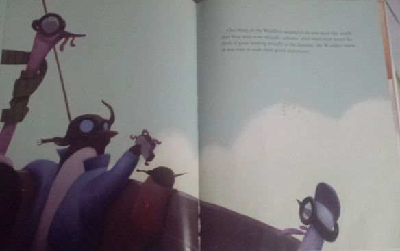
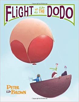
I love this thread and think the work looks great. However, before you dive too deep into postcards, etc. I thought I would mention that Peter Brown has a very well known book with birds that can't fly (and these exact characters) traveling in a hot air balloon. It is an extremely well known book within the industry and so I thought I should mention it. People who see your postcard might reference the concept back to this book. Not saying that you shouldn't send it out, but just to be aware.
SVS Faculty Instructor
www.leewhiteillustration.com -
@Lee-White Thank you so much for bringing this up, it's super good to know!
I'll probably sit on the decision of whether or not to send it until I finish the illustration (I'm really excited to finally paint this thing!) - I've been working on a couple of concepts alongside this one ("pigeon professor" who definitely needs to be workshopped a bit, classrooms are hard! and "superhero service dog" (as a book dummy, but there's probably an illustration or two that I could pull and use)) that might be a better option.
As much as I love these guys, they may be better as a portfolio piece than something I want to use as a "first impression." Looking at what I can find from the book (It looks amazing, I should pick it up!), it's both very, very different but very, very similar (I love the cassowary! It's definitely a bird I considered!). I've been working on a story with the flying penguins for a book dummy, but knowing this I think it's a good idea to steer away from that and pick another concept. Peter's book is so creative and lovely, and I'm not confident I could bring something different enough to the table yet!
-
I know it's been awhile (I fell off the illustration train for a little bit due to health reasons) but I wanted to pop back in and thank everyone for the feedback!
And share the final, since I finally got it scanned in!
