MAY WIP: critique appreciated for Akins
-
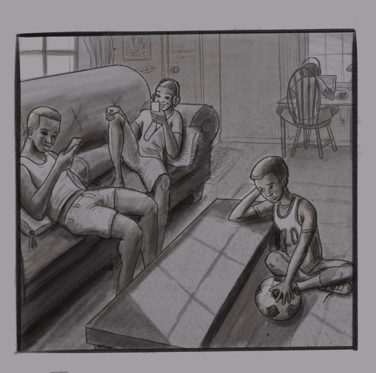
Here are my values and lines. I am going to lighten some other areas with a layer to get brighter highlights. I think I am going to keep the pencil.
-
Workin’ on painting it...
-
I think what was bugging me is the implied negative space between the left character's spine and the back of the couch.
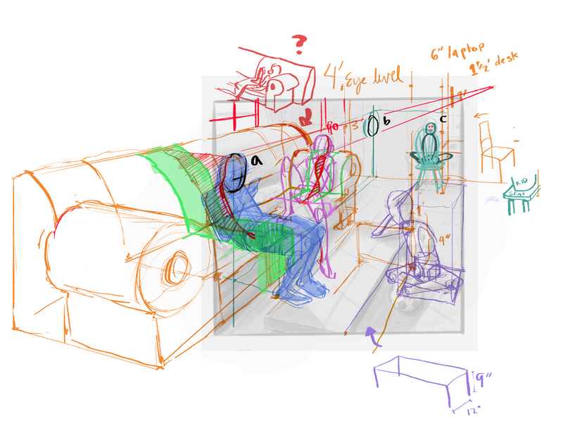
There's also some inconsistencies with scale, I think. I think it's the main issue right now. Judging by your couch (usually 3' at the back), you've placed the "camera" at 4' off the ground. Doorknobs are also usually this height, but you've got one lower than that right next to the couch. The desk in the background is about 18" off the ground, half the height of most desks. I don't shop for furniture very often, so you'd have to tell me if coffee tables are usually 9" tall and 12" wide.
a, b, and c are head sizes, which seem to vary a lot. Kids of different ages make it hard to judge, though.
I think I misread the couch in your drawing; so ignore that draw-over. However, it seems super shallow to me.
Window panes should follow the perspective lines, too, and I'd expect a gap between the seat's edge and the shorts of the child sitting. Make sure the legs of the chair fit the perspective, too.
Observation: All the characters' heads are equally spaced.
I hope this wasn't too messy or confusing. Let me know if I can make anything more clear.
-
@William-Meany wow. That is a lot of input. Did you do this before or after my latest updates? I know the perspective is still a little wonky but at this point I am going to have to go for believable rather than for perfect. I should have started with a horizon line and gone from there. Oh well. I did add a cushion to fix the negative space behind his back.
As far as head size, I was picturing various ages and body types. A big football player type for the oldest. A gangly 15 year old for the other kid on the couch and two skinny 11-12 year olds for the other two. I teach public school and see all kinds of kids. I feel like they look right, but I am probably biased.
I checked out your witch picture and it did inspire me to throw in some details that I would have not put in otherwise.
Thank you for taking the time to give such a detailed critique. -
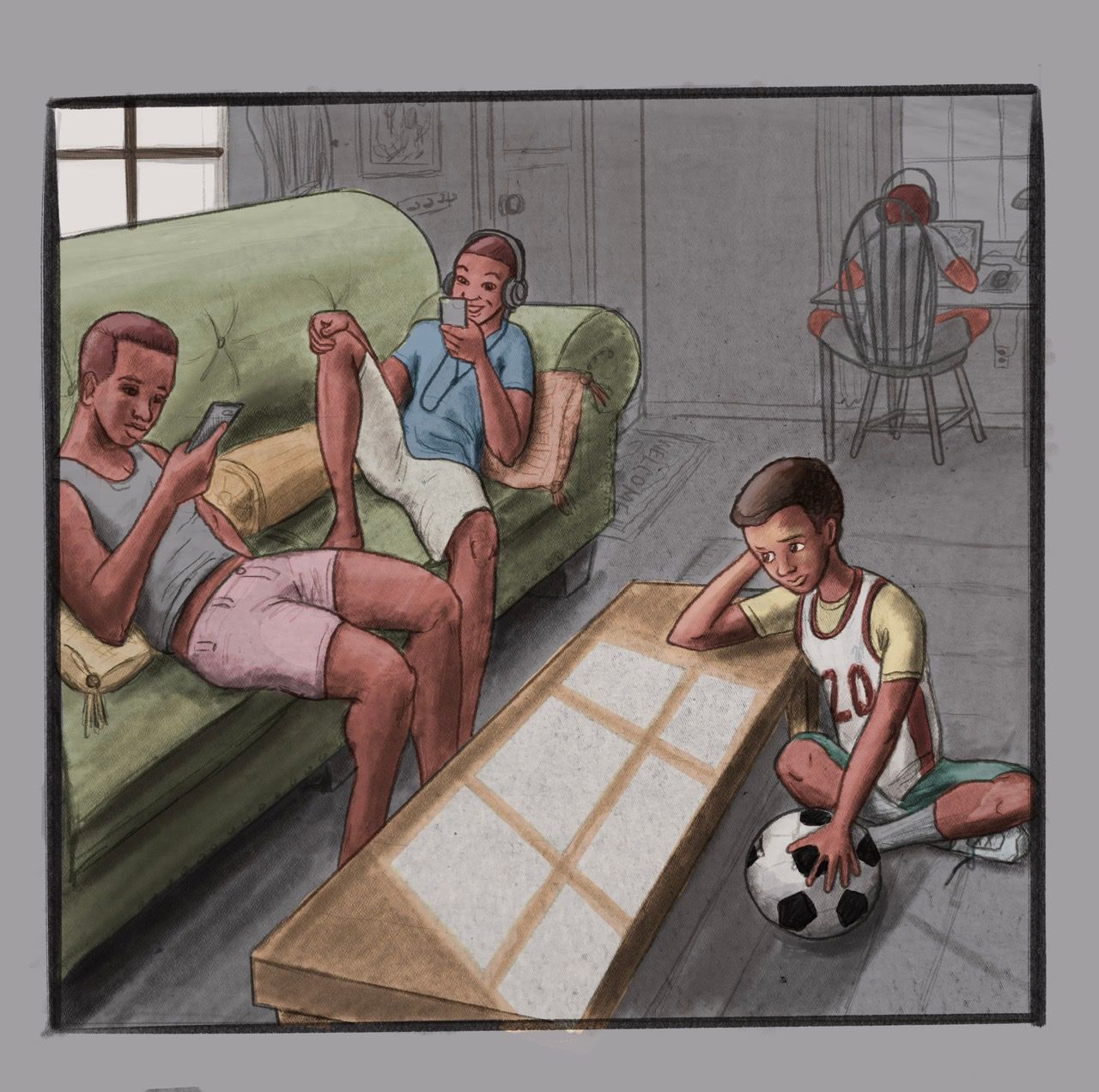
@chrisaakins This was based on the toned drawing. Your perspective lines up really well for the couch and table; the horizon is a little above the border right now, which is fine. The scale kinda went weird in the background. Anyway, thanks! I hope it was helpful
-
@William-Meany haha no worries. Thanks for taking the time to care. I will pay much more attention to scale in the future.
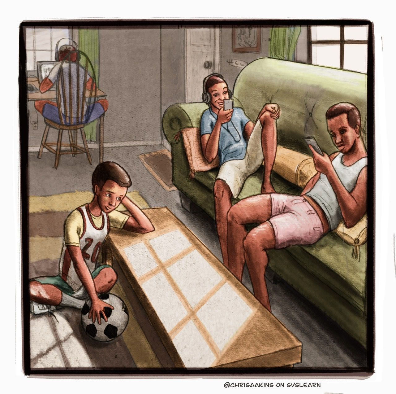
Here is the final I think. If you see something unforgivable let me know. I would also like some affirmation. I think this is definitely approaching the style I could see me doing. Something similar to Pascal Campion combined with Rivulet paper combined with Steven Kellogg.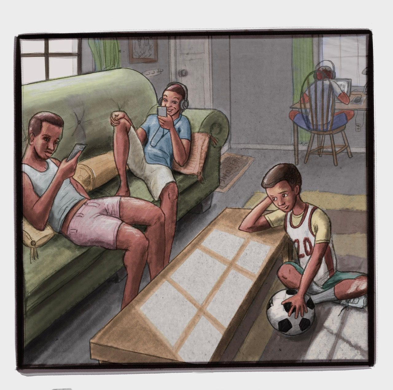
-
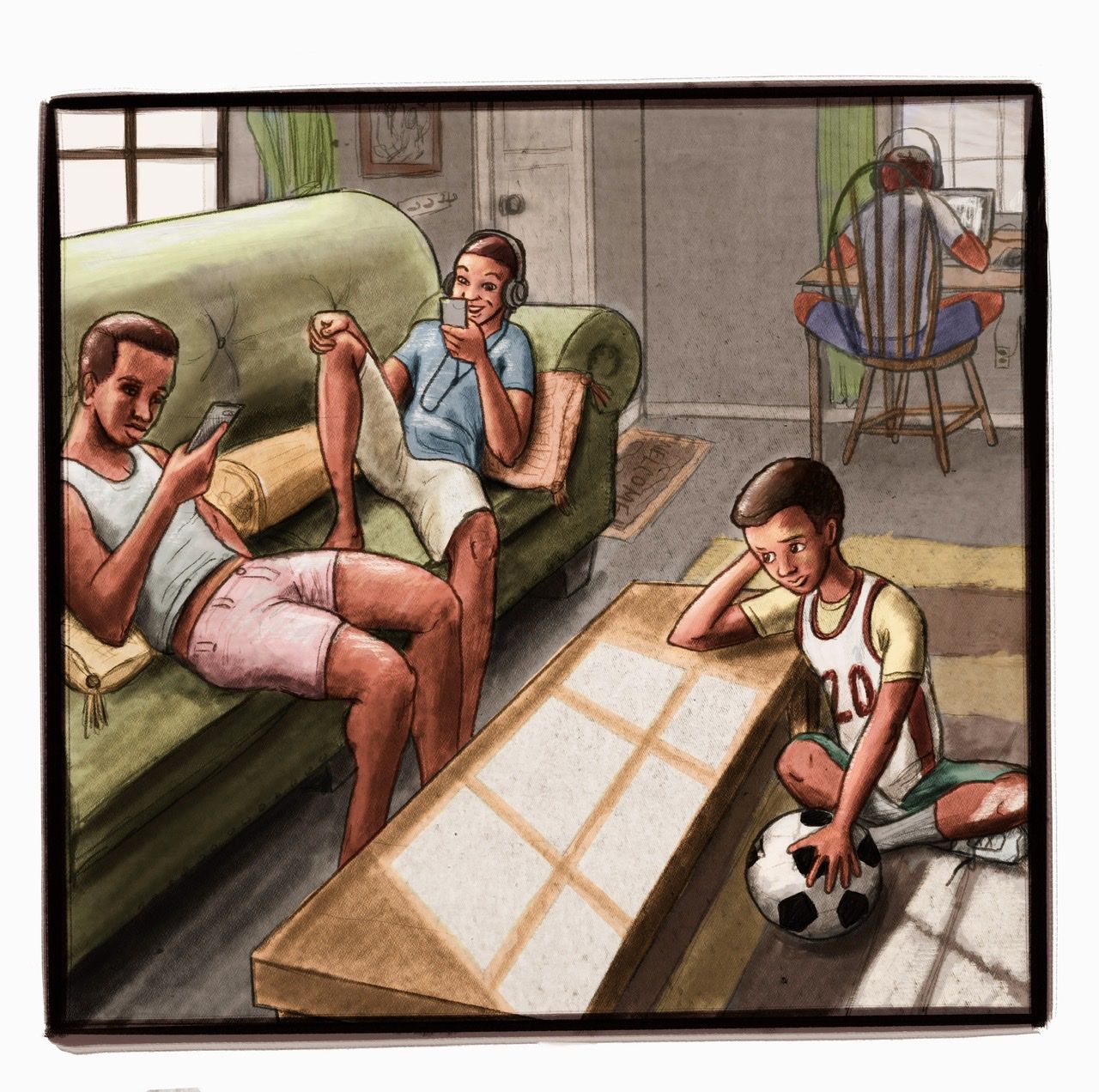
@William-Meany I couldn’t unsee the scale issue. I resized the little brother. I think it reads much better. I also added some filters with the lighting.
-
One last edit before I let it marinate. The lighting was too hot on the soccer ball and his shirt.
-
I think you are really onto something with the style, and I am liking your color choices! I think your characters are appealing here as well. A good balance between realism/stylization.
I would say for future pieces, beware of tangents. End of the couch, corner of the coffee table, foot of the boy with the soccer ball are all uncomfortably touching the edges of the format. I kind of also looks like you are purposely avoiding showing the feet. I think it would have been less distracting if you showed at least one foot from one of the big bros. Maybe a foot propped up on the coffee table or something. This also might be a nitpicky thing- but are welcome mats ever put on the inside of the doorway? I know a matt might be put there, but one that says "welcome" I only really see on the outside of a door. It could be something that varies by region. It was a little distracting, so I thought I'd point it out.
Anyway, really like the concept and overall execution! I'm interested to see your evolution in terms of style. It's looking good.
Website: www.tessawrathall.com
Instagram: www.instagram.com/tessawrathall_art/
-
@TessaW thanks so much!!! I always appreciate your thoughtful critiques. I am glad you like this style. I get insecure about it. It's not very similar to anyone else's in the forum.
I will fix the mat. Its a fair point. As far as feet...I didn't even think about it. I actually drew the whole foot for the side slouched and his brother just happened to be in front of him. Its a point to think about.
Tangents: ahhhh!! I kept running into them. I literally placed the doorknob higher than I should have to avoid it hitting his head. Most of them would have been solved had I gone with my gut and went full on landscape. -
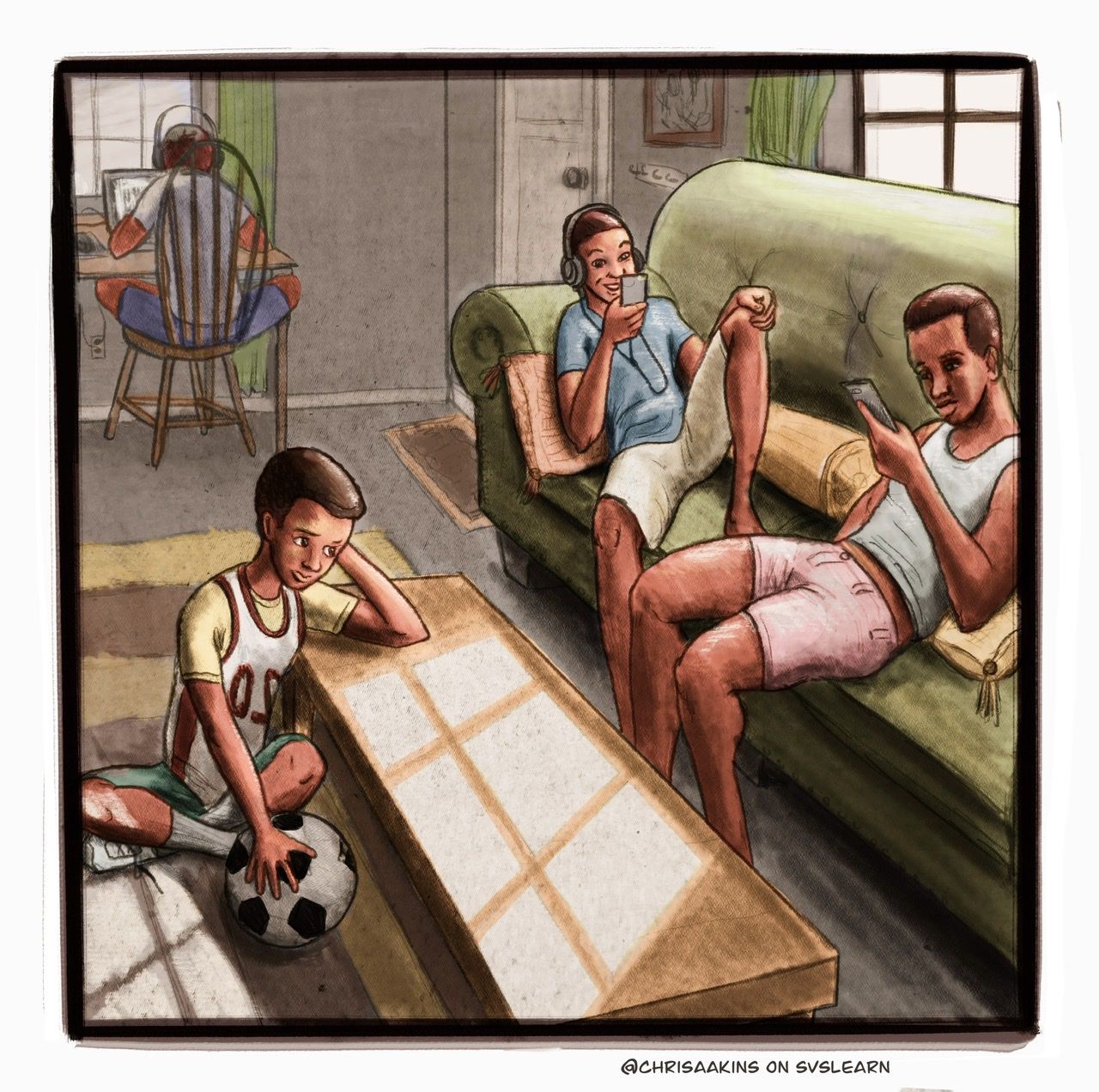
I'm going to "steal" one of Jake's ideas from critique session today.
") I'm wondering what it would look if you flipped it vertically? So the kid on floor is to the left of picture? The first couple of posts I noticed my eyes were drawn more at the two kids on the couch so took me a second to see the kid sitting on the floor. But that's my Western bias when viewing things I've now learned - ha!
I'm wondering what it would look if you flipped it vertically? So the kid on floor is to the left of picture? The first couple of posts I noticed my eyes were drawn more at the two kids on the couch so took me a second to see the kid sitting on the floor. But that's my Western bias when viewing things I've now learned - ha!Other than that, I like the colors and style very much. Feels like I'm in the living room, hanging out.
-
@Sarah-F-Cruz Wow! You were right!!! It somehow even makes my wonky perspective at the door look better.
-
Nice! Kudos go to Jake! Love those critique sessions, I learn so much.
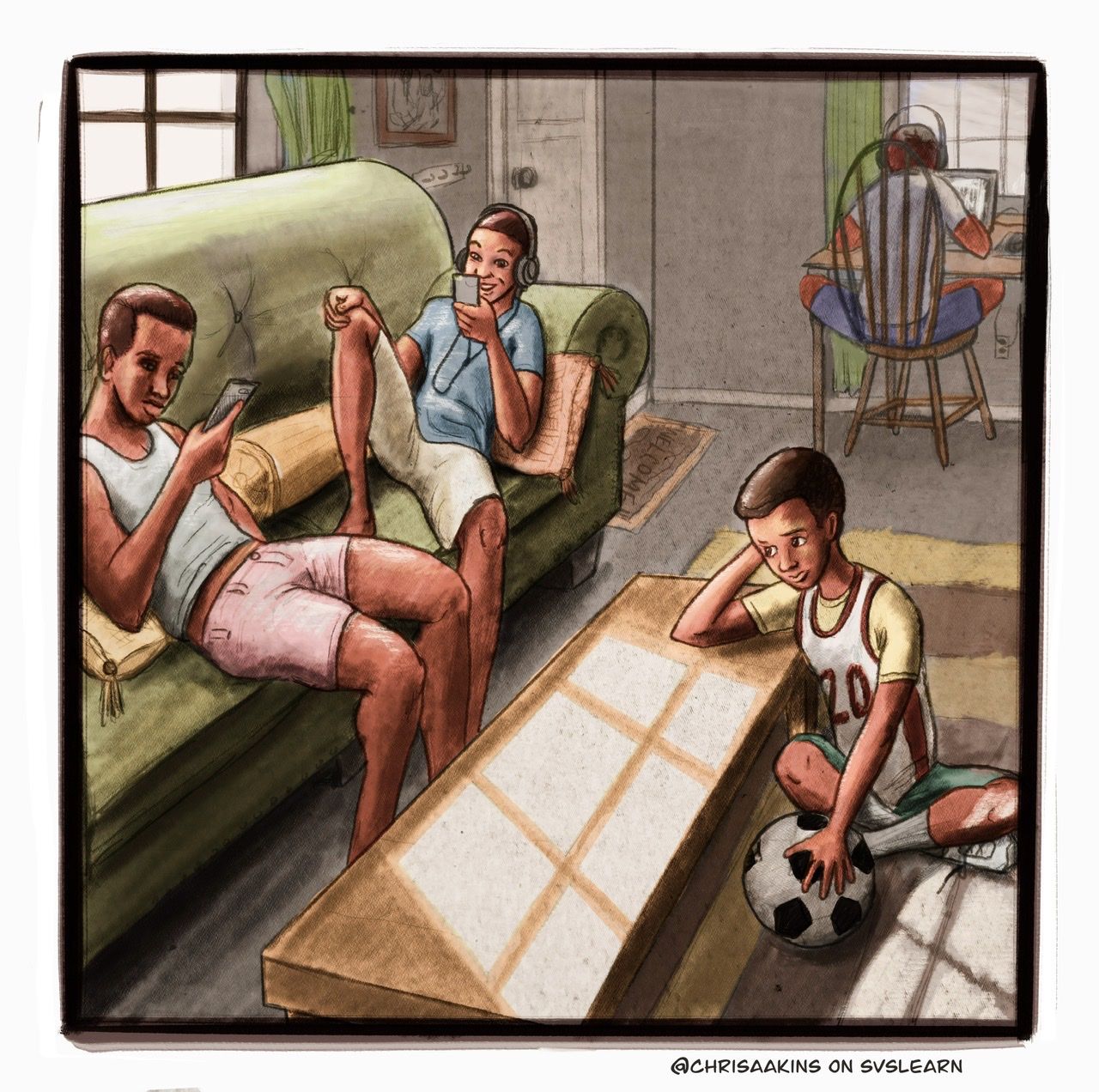
Oh, I guess the numbers on kid's shirt need to be fixed now, lol.
-
@Sarah-F-Cruz except his 20 is backwards! Hahaha! I was able to fix it. I resized the door, too. I think I am going to have to be done at least for now.