Frustration - Help with way of working, please
-
@Lucky-Platt Thank you
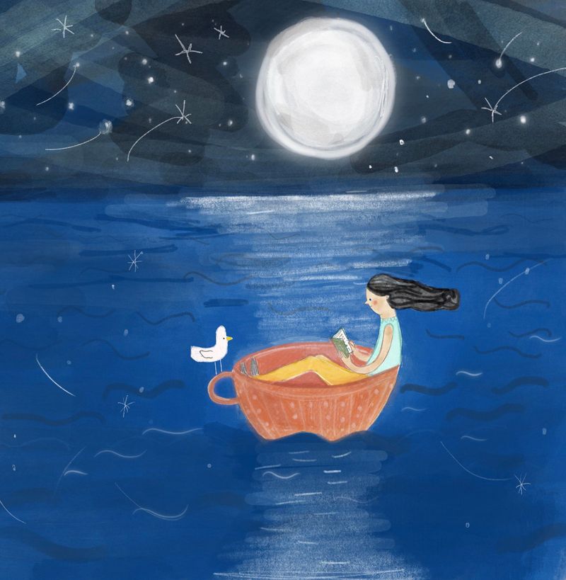
 I like the balance that you talked about, it's a lovely, interesting thought that I hadn't really considered. I love this about art and illustration, the way people see and interpret things differently!
I suppose it is a good thing. I'm wondering if it's because my sketches are really loose in comparison to the final piece, maybe that should be really loose too! -
@Johanna-Kim Thanks for your suggestions, I like them a lot - I hadn't thought about the bird...I actually added him at the last minute because I thought the picture seemed like it was missing something, I hadn't thought of him flying off but I think that could look good too.
-
@carolinebautista Thanks so much for the feedback, I really like the idea of asking questions about the environment. I think the reason the sea is so high is because I wanted it to feel like she was on the sea and not a little lake but I'm wondering now if maybe the layout should have been landscape? Anyway, all of these suggestions are very helpful

-
Hi everyone,
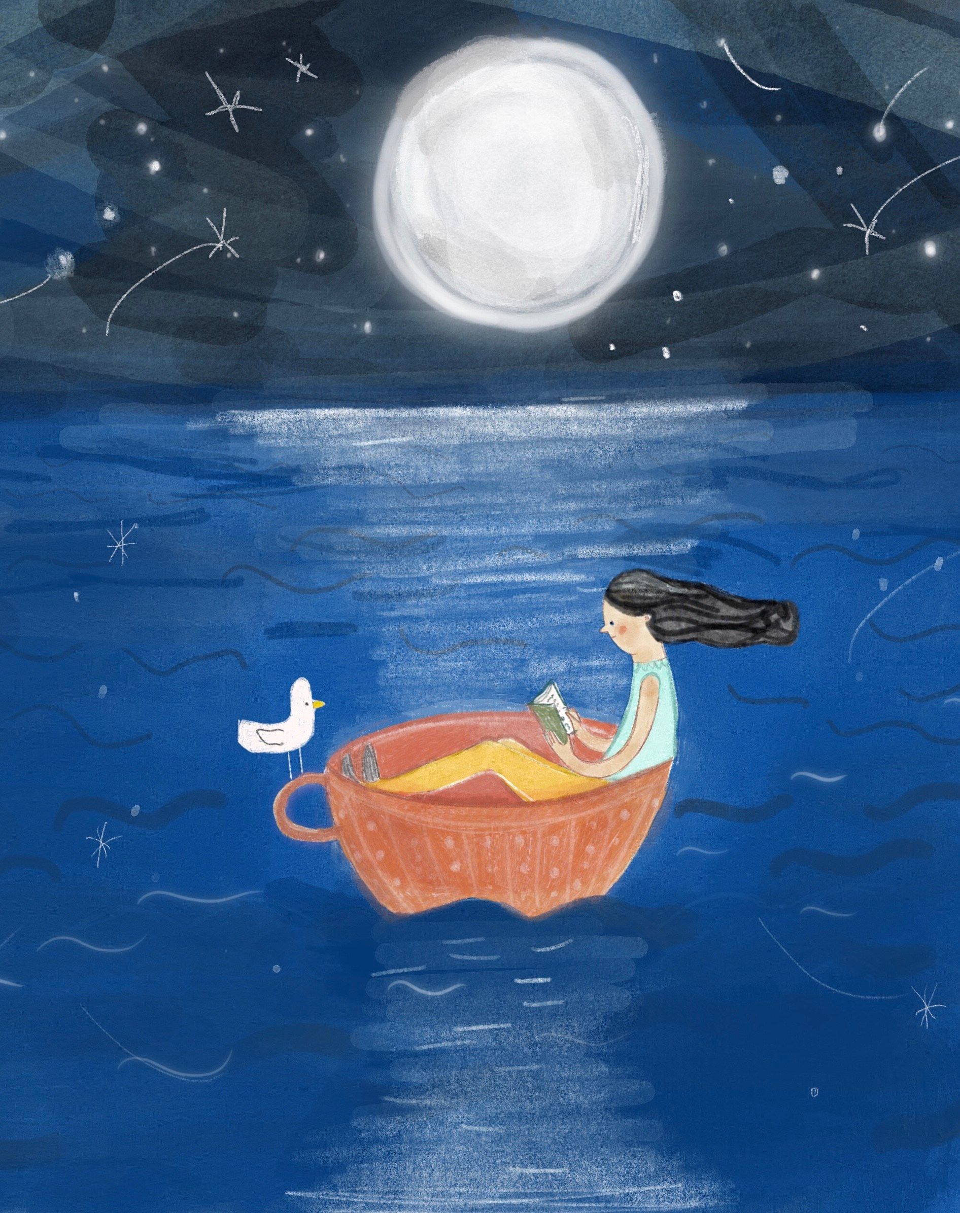
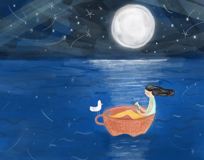
I re-worked my piece according to some of the suggestions above: I changed her legs which looked a bit odd, I re-did the sea and sky and emphasised the moonlight on the water. I also changed the view to landscape so that we can see she's on a vast sea although I'm not too sure about this now. I decided not to take away the bird or change her hair in the end because I liked the balance of the two and I came to the conclusion that we don't have to be alone to be in isolation. I'm not sure this was the best of my thumbnail ideas for the prompt now but I guess next time I'll check in here and ask for advice earlier on!Which of these layouts do you think works best?


-
@Rachel-Horne the last one for sure!
-
@chrisaakins thanks - this was my favourite too!
-
@gavpartridge hi there - not at all, that’s great and actually I have been working on the shadow thing a little though looking at your example above I see that I need emphasise it more, really appreciate the feedback, I struggle with light and shade so thanks!
-
@Rachel-Horne I am a big fan of your mixed media work. They are very playful, and just the right amount of texture, and intriging.
I am guessing the piece you are working now is done digitally. I love the theme, the color choice, and the over all design. I do not think you are missing any steps in the process. The main issue I have with this image is it felt like a very well done color-comp, not a finished piece (I felt your later iterations also have the same issue).
Play with the brush settings, and the way you apply textures, and to see if you can find ways to avoid the obvious digital brush look. For example, It looks like you are using a standard round brush, with a bit of transparency to paint the sky (in the first version you posted), even though the color is beautiful, and the value is great with the image, it looked bit mechanic, and artificial because of the visible photoshop brushes.
I run into to the same issue all the time in my process. Sometimes, I try to paint something in photoshop, and I just could not get away from the "photoshop" look. So I would print out the image, and trace the part I could not get it right, and pull out whatever traditional media I think would work, and paint it traditionally, and scan back & added to the piece in photoshop. Hope my explaination make some sense - I felt like I lack vocabulary to explain this as I am learning about the same thing myself currently.
I wish I know a better way to explain this. Anyone know what I mean, and can articulate this better?
-
@xin-li no that's excellent, thank you so much...it all makes perfect sense. I can't get the recent version of Photoshop on my computer so when I do digital stuff it's on my ipad. Since my painted stuff is often quite loose I try and recreate the same kind of effect in Procreate but it's not as effective and like you said often ends up looking obviously digital. It's a tricky one and I think you've probably hit the nail on the head in that this is most likely what feels wrong to me when I look at it so I'm super grateful...thank you!
 Back to the drawing board!
-
@Rachel-Horne I am glad my explaintion is understandable.
I uses Procreate a lot, often I use procrate to do 80% of the painting, and do last 20% in photoshop. I sometimes do paintings all the way in Procreate as well. I have not got the make my own brushes yet, I stick with pretty basicl stuff. My favorite brushes are the default ones that comes with procreate. I uses 6b pencil, and artist crayon for most of the stuff. Recently I started to explore the Artistic brushes that comes with Procreate.
Depending what traditonal media you want to mimic, you can probably find a set of digital brush that does pretty good job, or ask around on the forum. I think there are many Procreate Ninjas in this forum :-). -
@xin-li thank you - I'll do that.

-
There are a few things that stand out to me right away.
The balance of the composition here is a bit off because we have two main subjects, the moon and the boat. They are both very similar in size which which doesn’t make for a very dynamic image. They are also not quite centered and not quite within the rule of thirds either. They moon and boat should either be on opposite sides of the image or one should be centered while the other lays within a third.
The other main thing that stands out is that there is too much information in the texture of the brush strokes. We are seeing a lot of brush strokes with different values and opacities which end up being distracting for the viewer. Notice on the boat you have more solid colors and values. Tryin incorporating what you did in the boat with the sky
-
@Griff Hi there, thanks so much for your feedback - to be honest my initial idea was to have the moon on the left and the girl off-centre to the right but then I thought this would be a shame as the girl would be practically in the dark.
I see what you mean about the brush strokes. I normally work traditionally in mixed media so I like to use different textures but I can see how this could be a problem digitally... -
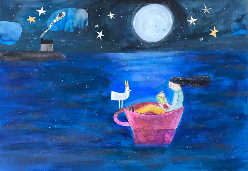
Thanks for everyone who gave me feedback on this piece. I eventually decided to rework it in traditional media (which is how I mostly work) after reading what Xin Li wrote and think it works much better this way. I thought about all the advice and in terms of lighting, I decided to keep it quite subtle. I also thought about the moon/girl balance and decided to combat this by adding the house in the background and feel like this evens things out. Thanks again for all the help.

-
@Rachel-Horne big improvement from the original I would say!
-
@Rachel-Horne It's really wonderful.
 I think you listened to all the right advice because you were able to listen to yourself. It's everything I most enjoy about your work. The composition is so serene.
 -
@Griff thanks! I normally work in mixed media and the digital thing is just a bit hard to translate for me.
-
@carolinebautista ah thanks so much; such a nice thing to hear - it’s true that it was overwhelming to get so much great advice and quite difficult to know what to take or leave

-
@Rachel-Horne I think I might start waiting a day before giving feedback; it would be more thoughtful that way. I have been trying to build up the skill of talking about others' work, and it has been a challenge...
-
Hi, Rachel. First is first. I LOVE YOUR DRAWING! ...Ok, look...Many times, we´re our worst, wrong/bad critic. That´s true!. So, I don´t believe you´re doing your artworks in a wrong way. It´s more a matter of "Am I´m having fun with this?", because you will always have the chance to improve your art. Always. But also is important to ENJOY what are you doing. Did I mention that I love your drawing?.