Frustration - Help with way of working, please
-
Hi everyone,
I feel like I'm getting into a better way of working recently. I religiously do my 50 thumbnails and this definitely helps a lot! That said, sometimes I'll have a thumbnail I like, I'll do a sketch from that that I also feel happy with, I check with people around me that there's nothing too weird-looking and then get to do the final piece and something just feels wrong with it.I'd be really interested to know if this happens to anyone else? Is there something I'm missing, a step I should spend more time on? Maybe I should work the sketch a lot more?
Here's the image I came up with for the Isolation prompt and I think it's okay, I can't really see anything too wrong (or maybe I've just been looking at it for too long) yet it just doesn't seem right...I'd be grateful for thoughts/advice on this, thanks.
www.rachel-horne.com
@rachel_horne_art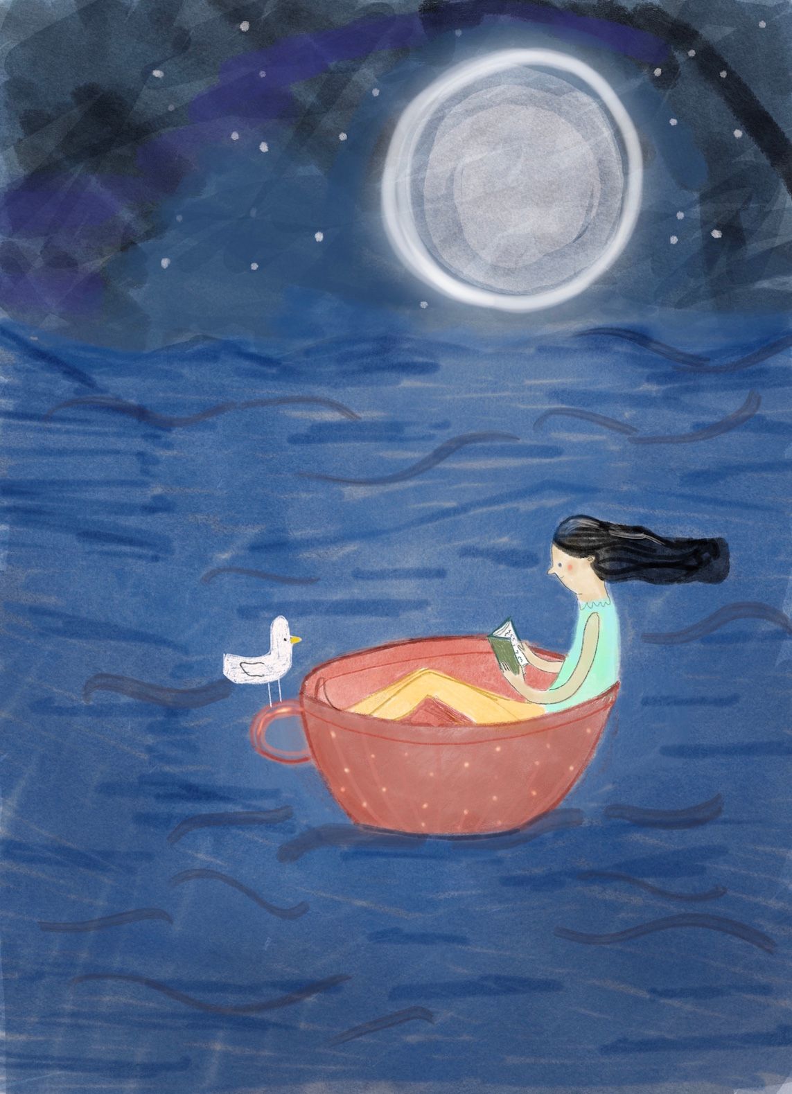
-
@gavpartridge Well I suppose to me 'weird' would mean an arm in a strange position, or a problem with perspective for example. By 'right' I mean, there's nothing that immediately jumps out as technically incorrect. Also, often when I look at paintings or drawings, sometimes I have a feeling that something's not right without knowing exactly what it is, like here for example. Sorry, I thought I'd made myself clear, I'll try and be more specific next time.
-
@Rachel-Horne I agree with @gavpartridge, I think you're missing an opportunity for a more dramatic lighting here. I think the water could be darker with a stark white light in the middle of the lake. There should also be a stark shadow under the cup. This may be why the sketch looked fine, but once put into color it feels wrong that the lighting is unnatural. After your thumbnails, do you do color tests and value/lighting tests? You don't mention it in your post. If you don't, this could be the step you're missing
")
vanessastoilova.com
instagram.com/vanessa.stoilova/Check out my Youtube channel for tips on how to start your career in illustration! www.youtube.com/c/ArtBusinesswithNess
-
@Rachel-Horne One thing that sticks out to me is her hair. It is sticking straight out. Is the wind blowing that hard? If so, I would give some other indications, Maybe some sea spray or ruffled feathers on the bird. If not, I would let it fall straight down her back.
-
@gavpartridge brilliant - thanks so much. Yeah I totally see the knee thing now. I agree too that the lighting could probably be exaggerated, I tend to struggle with light and shade. I'll work on it some more...
-
@NessIllustration thanks, I agree - I tend to be a bit nervous with shading and light etc. I think you've also got a point about the colour tests - I do add value to the thumbnails but tend to skip over the colour part...thanks a lot for the feedback, I'll be addressing these issues!
-
@chrisaakins thanks Chris, to be honest, it was kind of deliberate. I thought it was fun for her to have strange hair - it's not meant to be blowing in the wind but this idea obviously doesn't work at all. I'll change it...I see how it looks odd. Thanks for the feedback
-
@gavpartridge nah, that's fine - I think we're all struggling with that one, this confinement thing is hard! Hope you're allowed out soon
-
We are answering this on the podcast today
-
@Rachel-Horne I have to admit, I totally love the hair! For me it sets up a relationship with the lower half of the bird's body that is really silly and fun. Also that the two characters are balanced - that her weight isn't tilting the cup - for me seems to be a way to read the piece, finding balance in an unlikely setting.
I can definitely relate to that feeling about final art not living up to expectations. I feel like I always have at least a tinge of disappointment with 'finished' work that I never have in the thumbnail and sketches stages, which feel so free and full of potential...but I wonder if that feeling could actually be a good thing?http://luckyplatt.com/
@imluckyplatt -
@Rachel-Horne Looks like you're going to get some invaluable feedback later today from the SVS Podcast. But just to put in my two cents. It's a really sweet image--a woman reading a book in a teacup on the ocean at night. The only thing that makes me pause is the bird. With its presence, the woman no longer is isolated. But if the bird where to fly away, maybe joining some other birds, and the woman were to look up from her book to see this happening, then she would be isolated. OR, if there were other people sitting in teacups clustered together in the distance. I love your style, and the movement of her hair which implies a strong breeze. I guess that breeze idea also poses question. Where else might we see evidence of that (e.g., the ruffling of the birds feathers?).
-
ok, if this is going to be addressed on a podcast, i'll probably regret this post, but here goes. The magic in this image, for me, is the sky and the girl. The contented look on her face and that she doesn't have a chin, it's just so charming, I love her. I enjoy the characters you create (i'm pretty familiar with your work).
I enjoy the way you rendered the sky and moon, but the water feels too digital for me. I can't even be sure it's digital.I do any number of thumbnails that I think are appropriate (so I'm not as disciplined as you are), but when it comes down the final drawing (even after I have done a value sketch) I do make changes. I'm not at the point where I can always render things with a style that justifies emphasis. So with this piece, I would suggest trying different things to figure out how you want the water to feel. She is not concerned about the water, but what is she up against? Water can be aggressive, peaceful, playful, etc. The way the water is rendered is a little distracting. If the water is taking up more space than the sky, why is that? They can each add a dimension of feeling and right now the black smudges mimic her hair in a way that makes her feel like she's in tune. The water doesn't really say anything to me. Another thing I would consider is lowering the horizon line and seeing how that changes the feel and whether you like it.
I think I will get better at not making huge changes all the time eventually, but I think there is something to be said for accommodating surprises during the process.
The last thing is the way you're playing with scale with the large moon and the teacup. It's such a fun idea that I wonder what would happen if you applied it to the bird. I think the bird is cute, but it makes me think the teacup is huge, rather than that the girl is suddenly small. Either one is fun, but as it is now, the composition of your piece is very calm and secure because of the horizontals of the bird, the girl's hair, and the horizon. So it has a balance that I really like.
-
@Lucky-Platt Thank you
I like the balance that you talked about, it's a lovely, interesting thought that I hadn't really considered. I love this about art and illustration, the way people see and interpret things differently!
I suppose it is a good thing. I'm wondering if it's because my sketches are really loose in comparison to the final piece, maybe that should be really loose too! -
@Johanna-Kim Thanks for your suggestions, I like them a lot - I hadn't thought about the bird...I actually added him at the last minute because I thought the picture seemed like it was missing something, I hadn't thought of him flying off but I think that could look good too.
-
@carolinebautista Thanks so much for the feedback, I really like the idea of asking questions about the environment. I think the reason the sea is so high is because I wanted it to feel like she was on the sea and not a little lake but I'm wondering now if maybe the layout should have been landscape? Anyway, all of these suggestions are very helpful
-
Hi everyone,
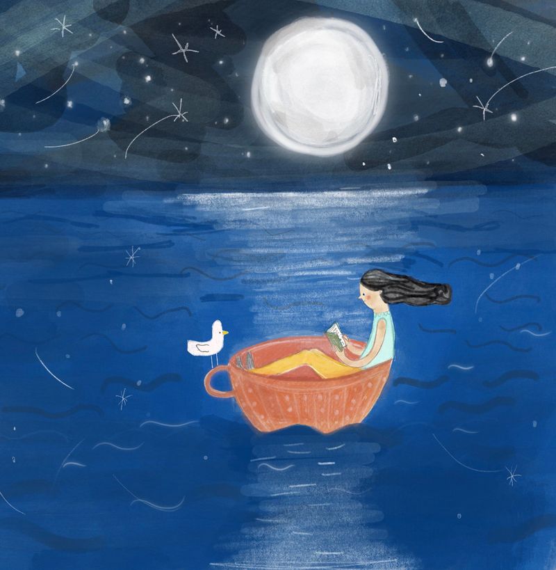
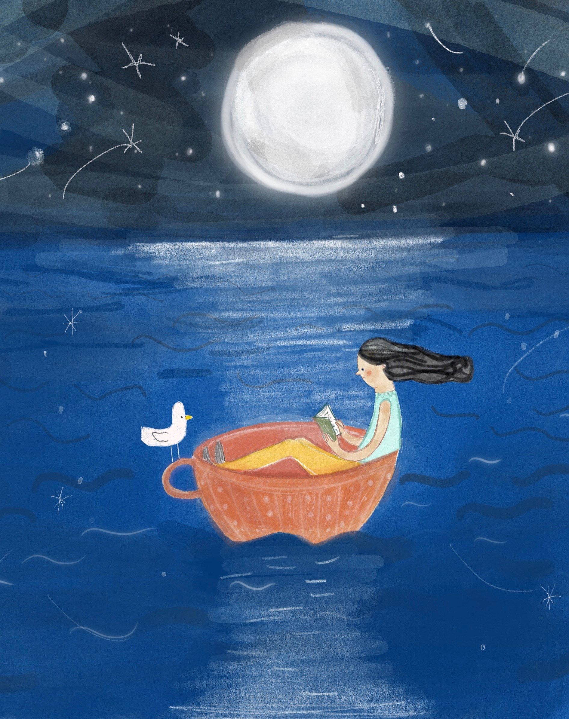
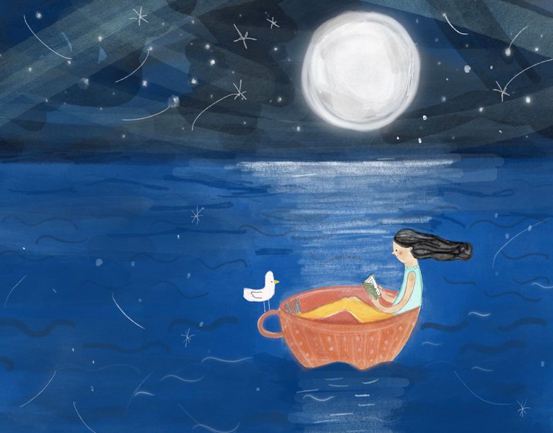
I re-worked my piece according to some of the suggestions above: I changed her legs which looked a bit odd, I re-did the sea and sky and emphasised the moonlight on the water. I also changed the view to landscape so that we can see she's on a vast sea although I'm not too sure about this now. I decided not to take away the bird or change her hair in the end because I liked the balance of the two and I came to the conclusion that we don't have to be alone to be in isolation. I'm not sure this was the best of my thumbnail ideas for the prompt now but I guess next time I'll check in here and ask for advice earlier on!Which of these layouts do you think works best?
-
@Rachel-Horne the last one for sure!
-
@chrisaakins thanks - this was my favourite too!
-
@gavpartridge hi there - not at all, that’s great and actually I have been working on the shadow thing a little though looking at your example above I see that I need emphasise it more, really appreciate the feedback, I struggle with light and shade so thanks!
-
@Rachel-Horne I am a big fan of your mixed media work. They are very playful, and just the right amount of texture, and intriging.
I am guessing the piece you are working now is done digitally. I love the theme, the color choice, and the over all design. I do not think you are missing any steps in the process. The main issue I have with this image is it felt like a very well done color-comp, not a finished piece (I felt your later iterations also have the same issue).
Play with the brush settings, and the way you apply textures, and to see if you can find ways to avoid the obvious digital brush look. For example, It looks like you are using a standard round brush, with a bit of transparency to paint the sky (in the first version you posted), even though the color is beautiful, and the value is great with the image, it looked bit mechanic, and artificial because of the visible photoshop brushes.
I run into to the same issue all the time in my process. Sometimes, I try to paint something in photoshop, and I just could not get away from the "photoshop" look. So I would print out the image, and trace the part I could not get it right, and pull out whatever traditional media I think would work, and paint it traditionally, and scan back & added to the piece in photoshop. Hope my explaination make some sense - I felt like I lack vocabulary to explain this as I am learning about the same thing myself currently.
I wish I know a better way to explain this. Anyone know what I mean, and can articulate this better?