Isolation Landscape WIP - critiques welcome
-
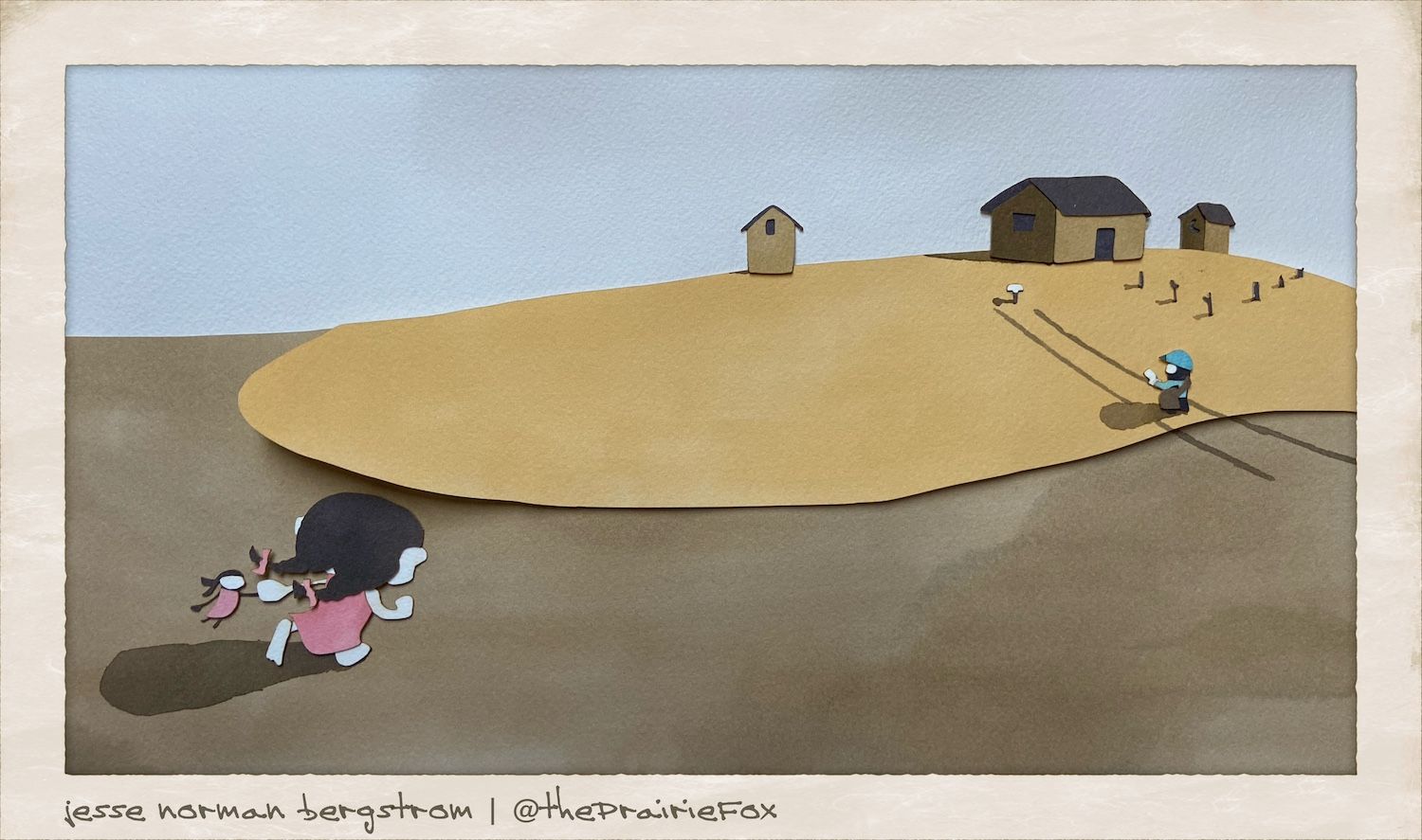
@theprairiefox looking good! To me the first one (with the little girl small) fits the prompt better, as her scale and distance from the viewer makes her feel more isolated. I do like the greater degree of contrast in the second image though.
-
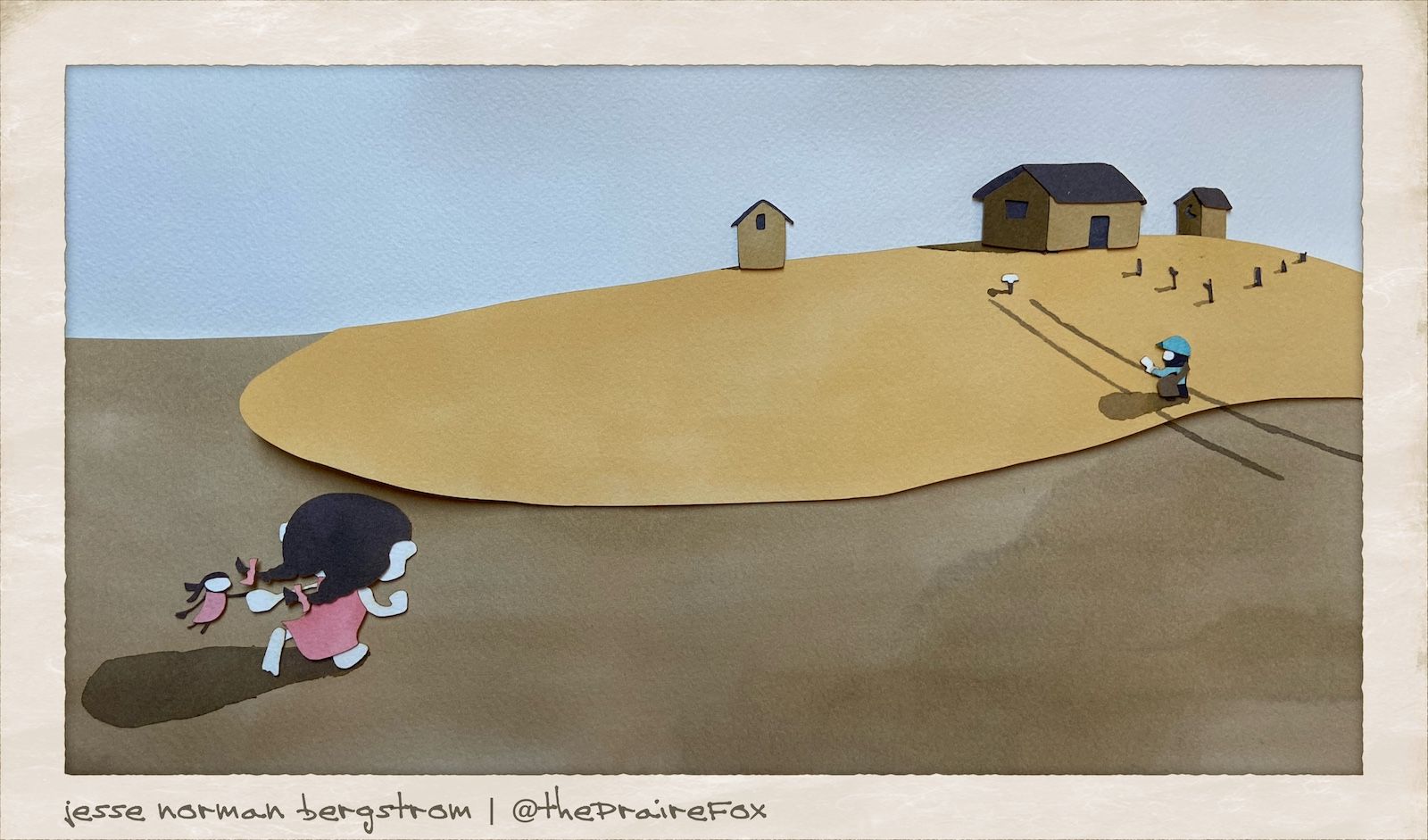
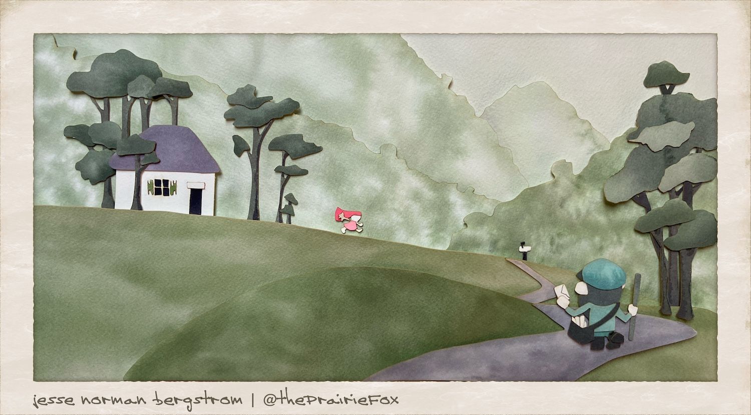
I think the second is a better image, but the first fits the prompt better. I agree that the mountains are too busy - the postman is also getting lost a little bit, it took me a second to find him. What if you made the postman a similar color to the little girl?
-
Okay, I cleaned up the mountains. Did a little repositioning. Straightened the house in the prairie scene. And retook the pictures for each.
These are final...
Let me know which you think is better for the contest this month. I am having a hard time deciding. I will post it up to the main thread tomorrow.
-
I would go with the prairie scene for the contest, currently it's more striking because of the values and color combo and out of the two it feels more like "isolation"- though that could be a subjective read on my part. The mountain scene, I love it overall, but I think it is too contrasted in the textures of the mountains and therefore not quite as striking.
That being said, this technique is gorgeous. I'd love to see more of this from you.
Website: www.tessawrathall.com
Instagram: www.instagram.com/tessawrathall_art/
-
@TessaW thanks. I really love the depth and texture I was able to do with these. Once past the learning curve it is a pretty simple process as well.
I think I will try this for one of my book dummies.
I may try mixing the paper cutting with printmaking as well. I love to experiment.
-The Prairie Fox
https://www.instagram.com/theprairiefox
https://www.theprairiefox.com -
@theprairiefox I agree with everything @TessaW said. Really cool to follow the process!
-