Society of Visual Storytelling

    SVSLearn Forums

    • Register
    • Login
    • Search
    • Recent
    • Tags
    • Popular
    • Users
    • Groups
    • Search

    Isolation Landscape WIP - critiques welcome
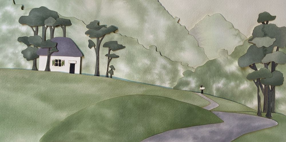
    Artwork
    10
    27
    1377
    Loading More Posts
    • Oldest to Newest
    • Newest to Oldest
    • Most Votes
    Reply
    • Reply as topic
    Log in to reply
    This topic has been deleted. Only users with topic management privileges can see it.
    • theprairiefox
      theprairiefox last edited by

      Another WIP update.

      I am not convinced that I like the amount of color texture with the washes. I almost find it too distracting.

      Let me know what you think. Everything is still editable, very little is glued yet.

      On to the characters...

      Photo May 28, 9 06 48 AM (1).jpg

      -The Prairie Fox
      https://www.instagram.com/theprairiefox
      https://www.theprairiefox.com

      M 1 Reply Last reply Reply Quote 1
      • theprairiefox
        theprairiefox last edited by

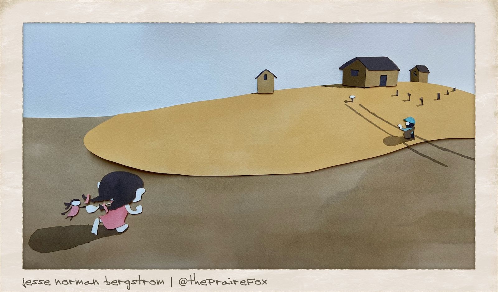
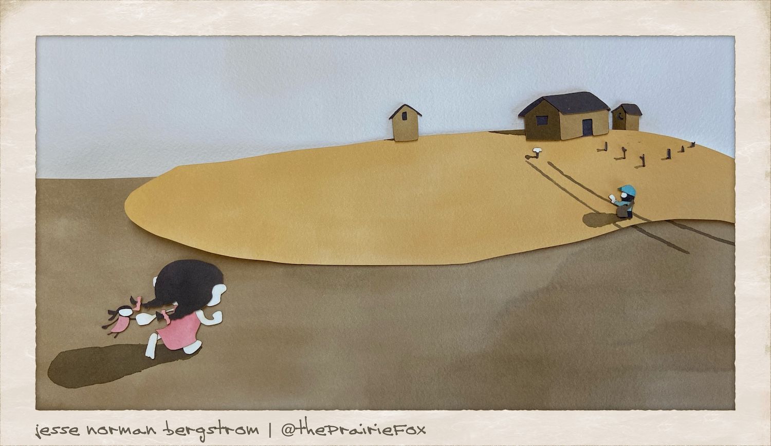
        Okay, here is the first version with everything. Questions abound, would love to hear your thoughts.

        • Do the mountains have TOO much contrast? Are they distracting?
        • Does the color of the girl work? Should she be redder and less orange?
        • Does the person walking convey mailman? I made him slightly blue and added a hat and letter.
        • Does the border work? I thought it added some professionalism... I might be crazy though.

        Thanks for the input.

        Note I will retake the photo playing with lighting as well.

        Photo May 28, 7 15 28 PM.jpg

        -The Prairie Fox
        https://www.instagram.com/theprairiefox
        https://www.theprairiefox.com

        ? carriecopadraws 2 Replies Last reply Reply Quote 2
        • ?
          A Former User @theprairiefox last edited by

          @theprairiefox It's really well done. The only thing I think is a little distracting is the white unpainted parts of the background.

          1 Reply Last reply Reply Quote 1
          • carriecopadraws
            carriecopadraws SVS OG @theprairiefox last edited by

            @theprairiefox This is really interesting! The mountains are a bit distracting. I am wondering if the mountains could have an additional blue wash over them in the same tint as the mailman? That would bring in that color more and might make the mountains more subtle too.

            Very fun to experiment with!

            Carrie Copa
            https://carriecopadraws.com/

            1 Reply Last reply Reply Quote 1
            • M
              Mara Price @theprairiefox last edited by

              @theprairiefox I love the textures and the variation of the color. Love it!

              1 Reply Last reply Reply Quote 1
              • theprairiefox
                theprairiefox last edited by

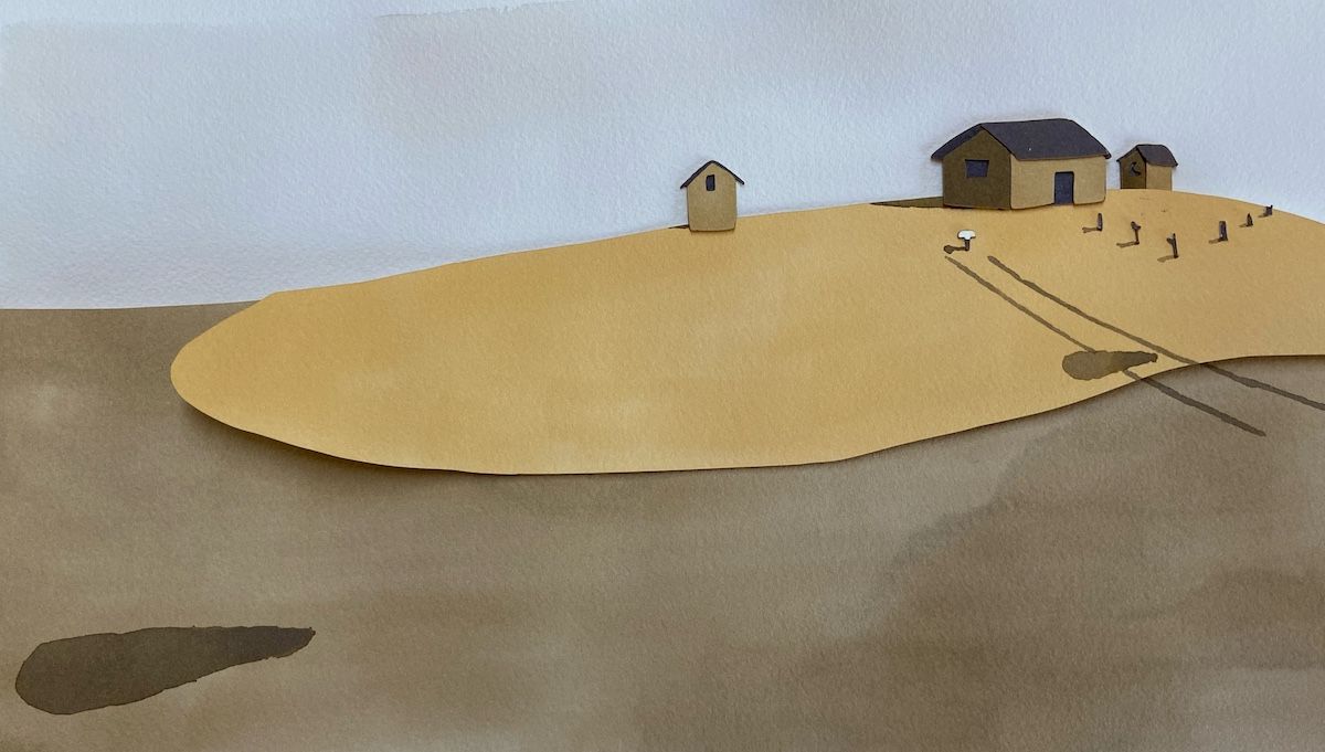
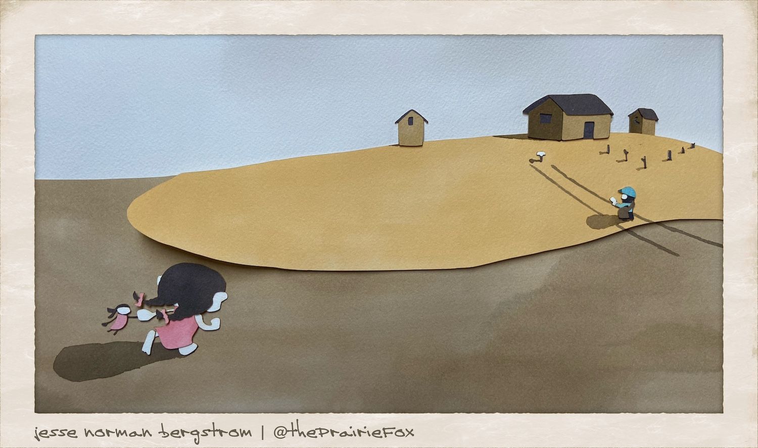
                Here is the landscape for the prairie picture.

                I am going to try to get the characters on today and then I will have to decide which to submit?!?!?

                Photo May 29, 3 37 08 PM.jpg

                -The Prairie Fox
                https://www.instagram.com/theprairiefox
                https://www.theprairiefox.com

                1 Reply Last reply Reply Quote 3
                • theprairiefox
                  theprairiefox last edited by

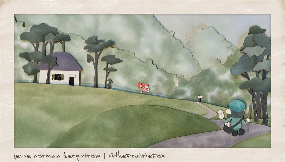
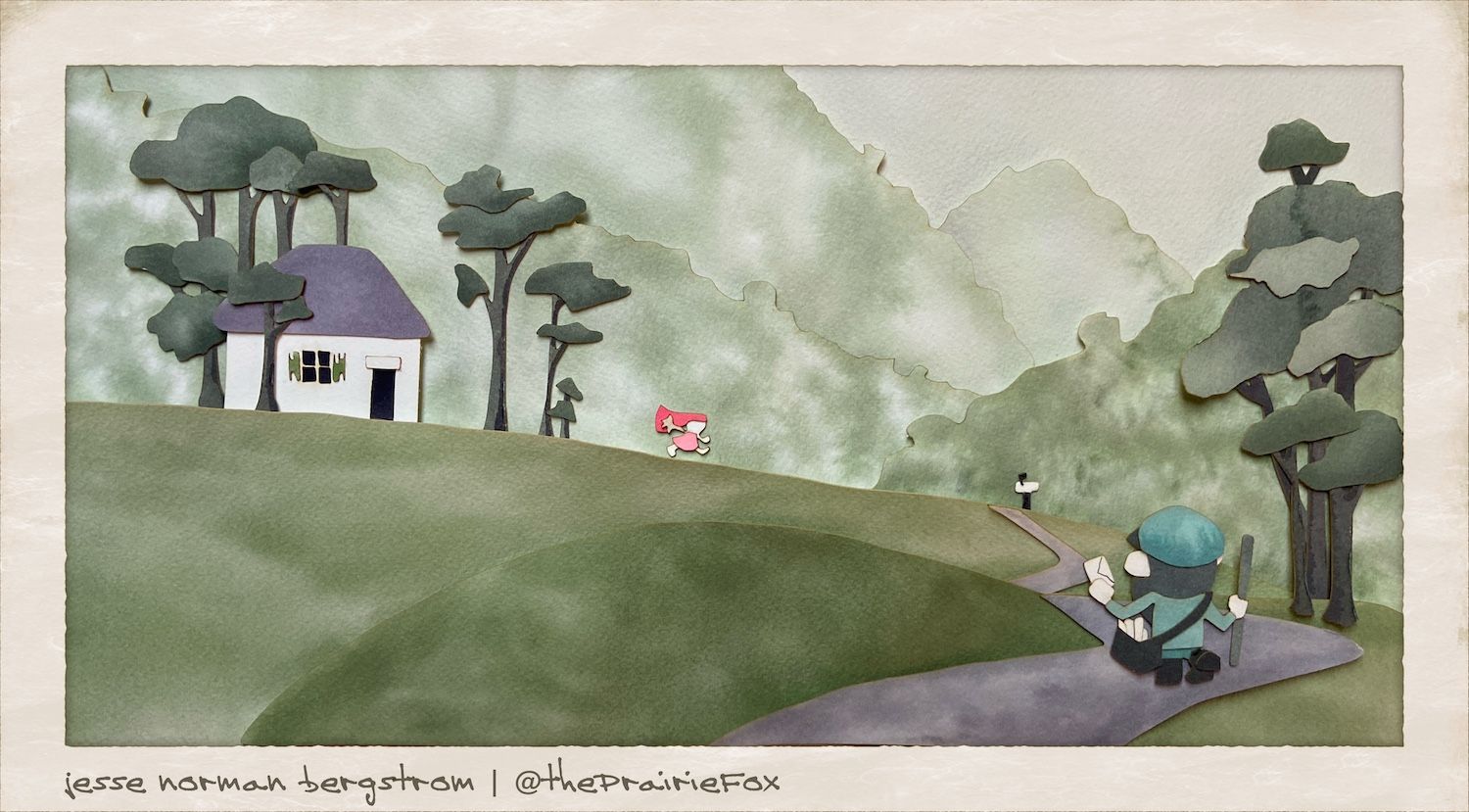
                  Here is the final(ish) for the second one.

                  Any feedback on this one is welcome.

                  Also, which do you think better fits this month's prompt?

                  Photo May 29, 5 33 08 PM (1).jpg

                  -The Prairie Fox
                  https://www.instagram.com/theprairiefox
                  https://www.theprairiefox.com

                  Braxton korilynneillo 2 Replies Last reply Reply Quote 0
                  • Braxton
                    Braxton @theprairiefox last edited by Braxton

                    @theprairiefox looking good! To me the first one (with the little girl small) fits the prompt better, as her scale and distance from the viewer makes her feel more isolated. I do like the greater degree of contrast in the second image though.

                    1 Reply Last reply Reply Quote 1
                    • korilynneillo
                      korilynneillo @theprairiefox last edited by

                      @theprairiefox

                      I think the second is a better image, but the first fits the prompt better. I agree that the mountains are too busy - the postman is also getting lost a little bit, it took me a second to find him. What if you made the postman a similar color to the little girl?

                      instagram: instagram.com/korilynneillo
                      Twitter: @korilynneillo
                      Portfolio/shop: korilynneillo.art

                      1 Reply Last reply Reply Quote 1
                      • theprairiefox
                        theprairiefox last edited by

                        Okay, I cleaned up the mountains. Did a little repositioning. Straightened the house in the prairie scene. And retook the pictures for each.

                        These are final...

                        Let me know which you think is better for the contest this month. I am having a hard time deciding. I will post it up to the main thread tomorrow.

                        Photo May 30, 9 52 17 AM (1).jpg

                        Photo May 30, 8 58 34 AM (1).jpg

                        -The Prairie Fox
                        https://www.instagram.com/theprairiefox
                        https://www.theprairiefox.com

                        1 Reply Last reply Reply Quote 1
                        • TessaW
                          TessaW last edited by

                          I would go with the prairie scene for the contest, currently it's more striking because of the values and color combo and out of the two it feels more like "isolation"- though that could be a subjective read on my part. The mountain scene, I love it overall, but I think it is too contrasted in the textures of the mountains and therefore not quite as striking.

                          That being said, this technique is gorgeous. I'd love to see more of this from you.

                          Website: www.tessawrathall.com

                          Instagram: www.instagram.com/tessawrathall_art/

                          theprairiefox 1 Reply Last reply Reply Quote 1
                          • theprairiefox
                            theprairiefox @TessaW last edited by

                            @TessaW thanks. I really love the depth and texture I was able to do with these. Once past the learning curve it is a pretty simple process as well.

                            I think I will try this for one of my book dummies.

                            I may try mixing the paper cutting with printmaking as well. I love to experiment.

                            -The Prairie Fox
                            https://www.instagram.com/theprairiefox
                            https://www.theprairiefox.com

                            Braxton 1 Reply Last reply Reply Quote 0
                            • Braxton
                              Braxton @theprairiefox last edited by

                              @theprairiefox I agree with everything @TessaW said. Really cool to follow the process!

                              1 Reply Last reply Reply Quote 0
                              • theprairiefox
                                theprairiefox last edited by

                                @TessaW & @Braxton thanks for the responses. I have to agree that I think the prairie has a more isolating feel. I am going to go with that one.

                                I did retake the picture one last time (I thought the girl wasn't straight enough. Here is the 'final final'!

                                Photo May 31, 10 55 24 AM (1).jpg

                                -The Prairie Fox
                                https://www.instagram.com/theprairiefox
                                https://www.theprairiefox.com

                                1 Reply Last reply Reply Quote 1
                                • First post
                                  Last post