Introduction to Prop Design - Looking for fellow 'classmates'
-
@PieterVanDerBeek that looks amazing.
-
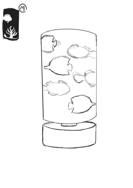
I decided to do a simple design.
-
@Jacy13 Awesome – welcome to the club! :-]
-
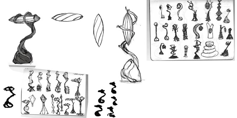  Here is my lamp progress! Any critue welcome, am I getting proportion and shape and harmony and contrast? So much to think about!
 Here is my lamp progress! Any critue welcome, am I getting proportion and shape and harmony and contrast? So much to think about! -
@PieterVanDerBeek I like the extra width and more joints at the bottom, it balances it nicely
-
@charitymunoz I feel like we were on similar brach-lamp vibes! I like how the light looks like a bug and also a blossom at the same time.
-
@Mairin-Kareli I was going for what a squirrel would have in it's nest (my 9yo's suggestion). We determined it would use a lightning bug, but it would have to treat it well, like a pet - hence the grass at the bottom and perchlike structure for the "lamp". I love all the twists and shapes you gave yours!! Great job!
-
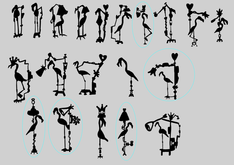
Here is my page of silhouettes! Took me a lot longer than it should have, but it was my first time doing an exercise like this. I hope that each time I do this exercise; I can get a little faster with it.
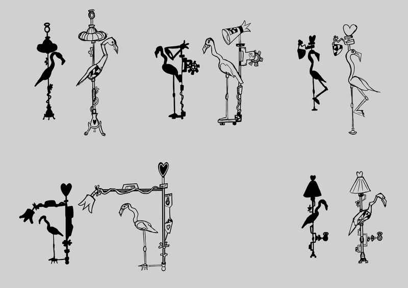
My concept was a flamingo lamp designed for the Queen of Hearts from Alice In Wonderland. I imagined Alice In Wonderland with a steampunk aesthetic. The ones circled in blue are the ones I decided to take to the thumbnail stage

-
@Jacy13 Ooh I love the shapes! :-]
-
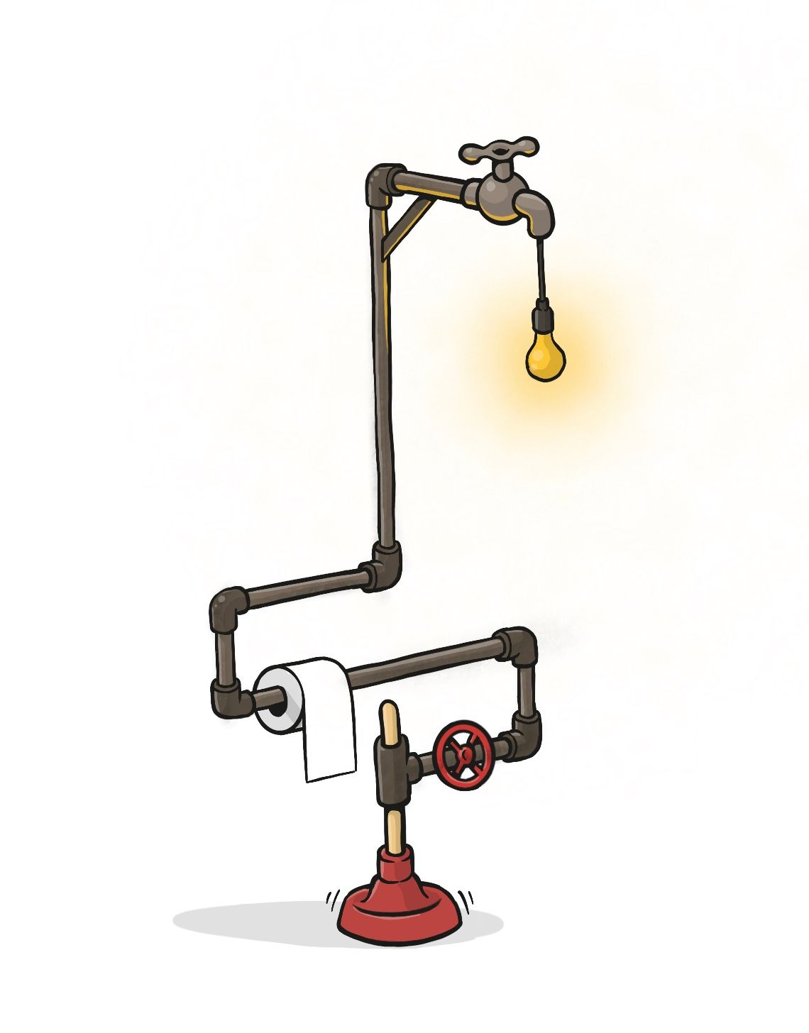
Here's my first render attempt...
-
@charitymunoz cool idea about a squirrels nest!
-
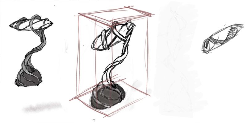 I am really struggling to draw this lamp in 3/4 top down, I have redraw it like 4 times ... I think I picked some tricky shapes! Any help would be appreciated - Thank you!
 -
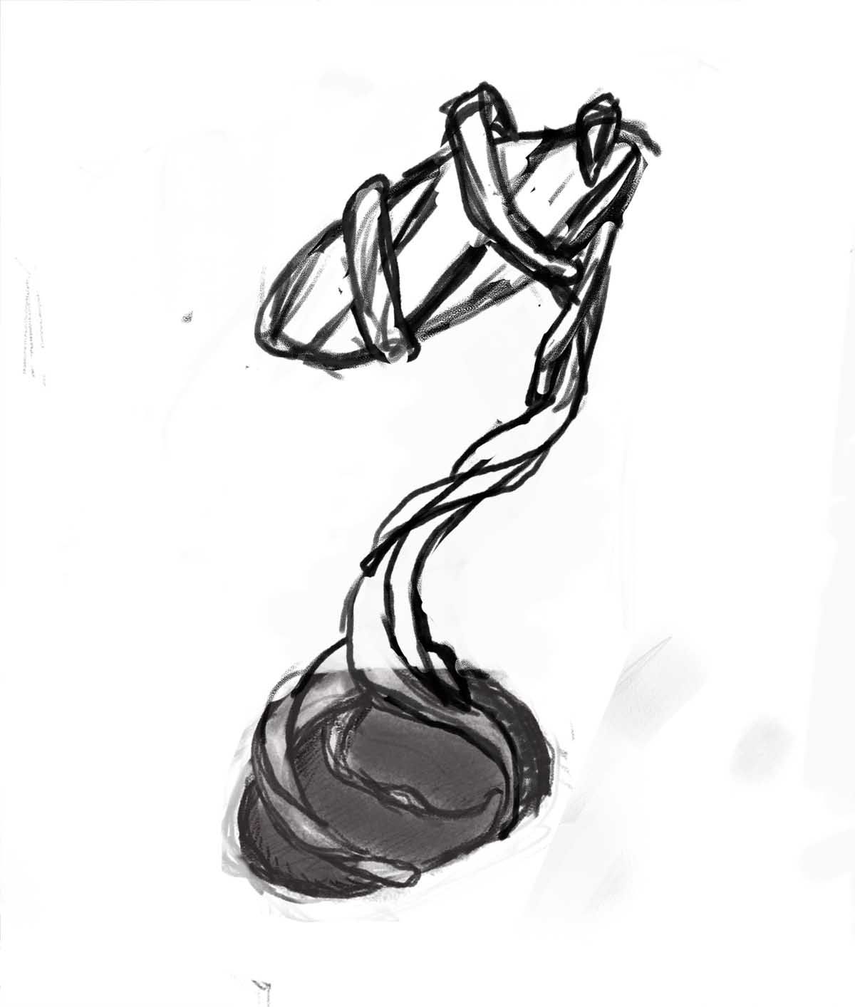 This is the best looking attempt so far. sigh It needs cleaning up obviously, but perspective wise ....
 -
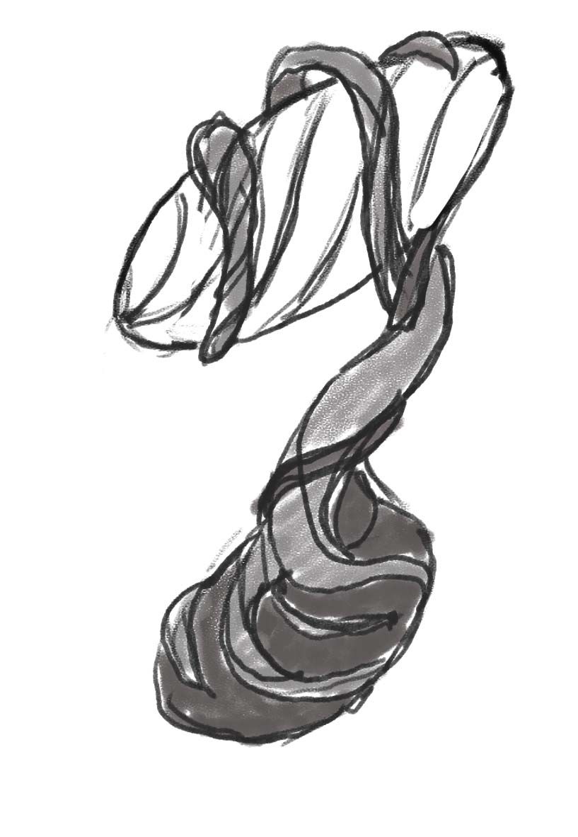 Tried again, OK I will stop spamming this thread now. Thanks for looking
 -
@PieterVanDerBeek Thank you!

-
@PieterVanDerBeek The rendering is looking really nice! I like the simple color choices. Keeps the design clear and easy to read

-
@PieterVanDerBeek i really like how you have kept the rendering simple, the reflected light of the light bulb is done well. The shadow on the plunger could be a little bit darker. Other than that this is awesome.
-
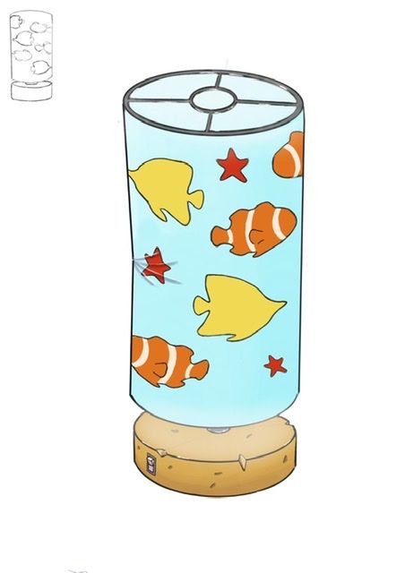
Final rendered piece. What do you think?
-
@robbery I like the little bit of damage, the wrinkle the chip in the base. Those details really give the object a story - a history.
-
Here are my five thumbnail sketches for my lamp design! (might have went a little overboard with the details, oops!) I'm going to have a hard time choosing just one to take to final

