Society of Visual Storytelling

    SVSLearn Forums

    • Register
    • Login
    • Search
    • Recent
    • Tags
    • Popular
    • Users
    • Groups
    • Search

    June Prompt Bongo WIP

    Artwork
    6
    13
    539
    Loading More Posts
    • Oldest to Newest
    • Newest to Oldest
    • Most Votes
    Reply
    • Reply as topic
    Log in to reply
    This topic has been deleted. Only users with topic management privileges can see it.
    • Laurel Aylesworth
      Laurel Aylesworth @K.Flagg last edited by

      @K-Flagg This is great!

      www.laurelaylesworth.com
      instagram.com/laurelaylesworth

      1 Reply Last reply Reply Quote 0
      • K.Flagg
        K.Flagg @Neha Rawat last edited by

        @Neha-Rawat thank you! You are correct, I definitely need to clean up his body angle. It does seem unclear.

        K.Flagg

        1 Reply Last reply Reply Quote 0
        • K.Flagg
          K.Flagg @aprilshin last edited by

          @aprilshin Haha I love the example of Donald. Very good point I will totally fix that 👍

          K.Flagg

          1 Reply Last reply Reply Quote 0
          • Jeremy Ross
            Jeremy Ross @K.Flagg last edited by

            Very nice @K-Flagg, look forward to seeing the finished piece! I particularly like how the tale guides the eye to the prize! Did you use Golden Ratio technique?

            https://www.instagram.com/jeremyrayross
            https://www.jeremyrayross.com/
            https://twitter.com/jeremyrayross
            https://jeremyrayross.substack.com/

            1 Reply Last reply Reply Quote 0
            • K.Flagg
              K.Flagg last edited by

              Okay so.... I cleaned up the sketch a bit and tried to add more humor in Clyde’s expression. I feel like the monkey’s body is still a little hard to read but I think when I color it it will make more sense. I usually work in more of a comic or cartoon style format, I was going to change it up but I tried that last month and it’s the reason my goldfish didn’t make top 16 😅
              I tried to soften up my May entry but Will said it looked like I had 2 styles going on so it was inconsistent. I think I should just stick with my comic style instead of trying to change my style up. what do you guys think?

              8E338F6A-AD32-47C7-B99D-6AB7E33113C3.jpeg

              K.Flagg

              1 Reply Last reply Reply Quote 2
              • K.Flagg
                K.Flagg last edited by

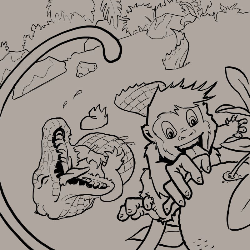
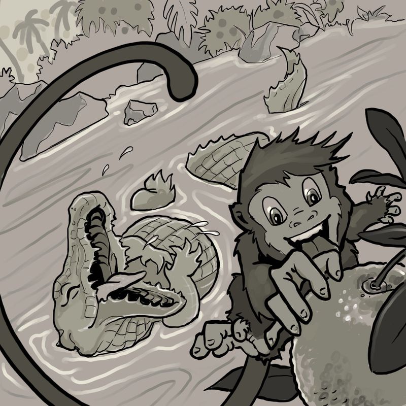
                I did a value study to get a better idea. Of what the finished piece should look like

                02D13240-8D99-4512-9F49-AED2DA55CE90.jpeg

                K.Flagg

                Jeremy Ross 1 Reply Last reply Reply Quote 2
                • Jeremy Ross
                  Jeremy Ross @K.Flagg last edited by

                  Looking good @K-Flagg!

                  https://www.instagram.com/jeremyrayross
                  https://www.jeremyrayross.com/
                  https://twitter.com/jeremyrayross
                  https://jeremyrayross.substack.com/

                  1 Reply Last reply Reply Quote 0
                  • Neha Rawat
                    Neha Rawat last edited by

                    @K-Flagg Good progress! Some suggestions:

                    1. The monkey's far hand has all fingers looking the same. Maybe redraw them so that the thumb looks different and separate from the other 4 fingers?

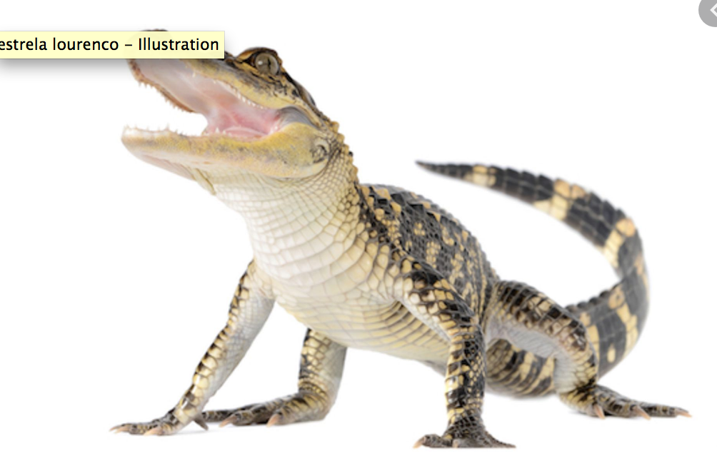
                    2. For the alligator's ventral side, the horizontal lines are continuous and the vertical ones are segmented (see ref pic). You've made it the other way around which makes it look like it's back instead of it's tummy.

                    Screen Shot 2020-06-14 at 10.06.16 am.png

                    https://www.nrbstudio.in/
                    https://www.instagram.com/nrbstudio.in

                    1 Reply Last reply Reply Quote 2
                    • miranda-hoover
                      miranda-hoover last edited by

                      The composition looks great! I love the effect his tail is creating. Getting nitpicky: the structure of Bongo's forward hand seems a bit off--maybe it's too symmetrical? Also, maybe try moving Clyde to the north-west a bit; it seems a bit heavy in the south-east corner (more balanced in your original sketch). I'd play with it a bit, but other than those, the piece looks very nice.

                      https://www.instagram.com/mirananemone

                      1 Reply Last reply Reply Quote 1
                      • K.Flagg
                        K.Flagg last edited by

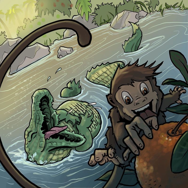
                        Thank you for all of the great ideas, I fixed a few things and did the colors. Here is my finished piece. Thanks for all of the help. 😁

                        62EE81A3-AE96-43E6-B505-A62F29707351.jpeg

                        K.Flagg

                        1 Reply Last reply Reply Quote 2
                        • First post
                          Last post